Dash of Inspiration: Diaries of a Fontaholic, Part 4 (Final)
A Dash of Inspiration, A Cup of Creativity by Doreen
Diaries of a Fontaholic, Part 4 (Final)

Welcome to the Season Finale of ‘Diaries of a Fontaholic’. In today’s segment I’ll share some font tips that can make the difference between a professional greeting card, and a greeting card which looks amateurish … based solely on your choice of font and placement. We’ve chatted before about placement, kerning, etc., so be sure to check out the links below if you are new to the GCU Community Blog for more about fonts.
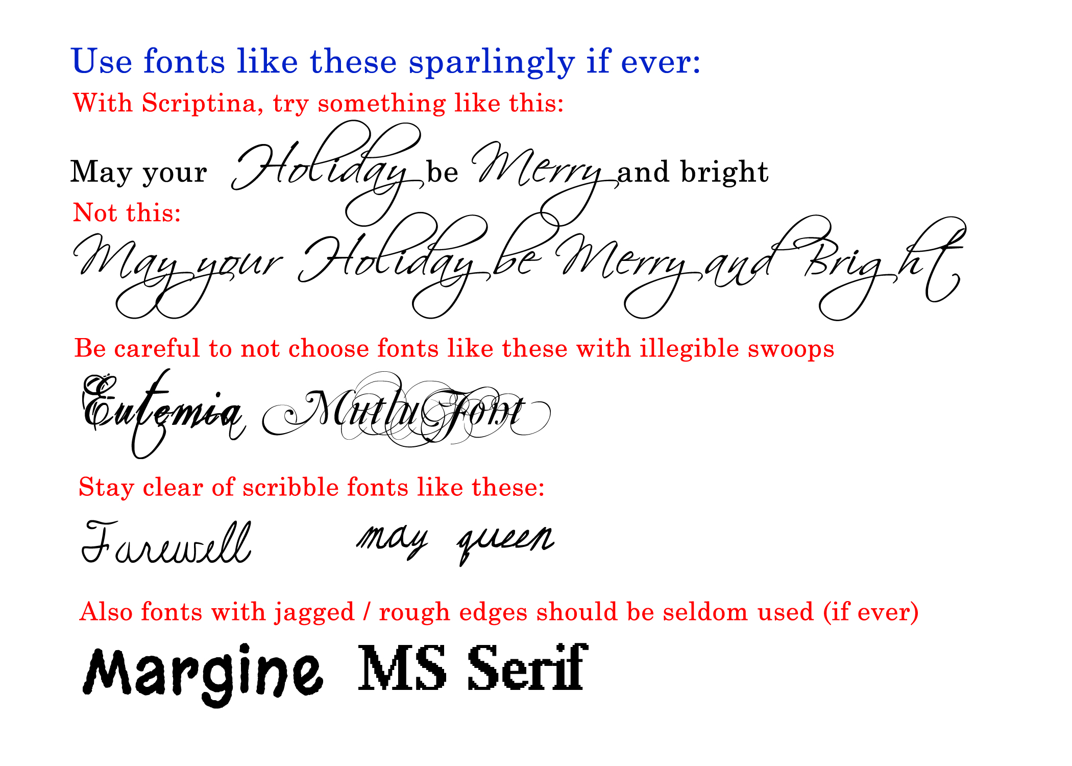
I know many of you are in love with the Scriptina font, and it has it’s uses, but it is one of those which falls into the ‘Use Sparingly’ category. Here’s why … Scrptina is a very ‘loose’ font, with sporadic kerning, so depending on the word(s) it can look terrific or horrible. This is a font best used for the ‘accent’ word on your image and best when combined with a font from what I called in previous posts, a ‘Companion Font’ such as; the Century Font Family.
Most of the ‘Specialty Use’ fonts I introduced last week and those like it, also fall into the use sparingly category. These types of fonts should be ACCENT fonts, not used on all the text. Remember, less is more when it comes to ‘bells and whistles’. Here’s an example of what I mean as an ‘accent font’ rather than using it for all the words on the card design.

We spoke in Diaries of a Fontaholic Part 2 about not using Comic Sans on the front of your cards and I offered many terrific alternatives for humorous card designs. So, check out that post to grab those replacement fonts.
I realize it’s easy to be drawn to those fonts with extra swoops and swirls, but in general fonts like Mutlu and Eutemia are just not legible, and so easily over-done, that even one word on a card front can often make the card go from fantastic to barely average. So be careful. These are the fonts where the swirls continue through every letter, both upper and lower case.
There are also many cards on GCU where artists have chosen to use scribbled fonts. These are rarely (if ever) a good choice, as they are unprofessional and most often not legible. A couple exceptions do exist, where a little of these fonts might apply in small doses, but the many on GCU are using this type of font in place of a script font and it just does not work.
Fonts which have jagged edges or rough edges should also be left behind. These types of fonts often give the appearance of resolution issues in your imagery. One exception is using the Eraser font (offered on Diaries of a Fontaholic Part 3) on a chalkboard, that’s a use where once expects to see that type of ‘chalky edge’.
Here are some links to related articles, if you missed them, you might want to tune in:
Nuts & Bolts Front of Card Text
Hope you enjoyed the Finale of Diaries of a Fontaholic … See you next week for more inspiration! Now get to work on updating those old cards with better font choices!


