Dash of Inspiration: Composition – Framing/Alignment
A Dash of Inspiration, A Cup of Creativity by Doreen
Composition: Framing/Alignment

Let’s keep this series going with the fifth area in the COMPOSITION grouping of the Submission Guidelines which is:
COMPOSITION: Framing/Alignment
The Submission Guidelines state this:
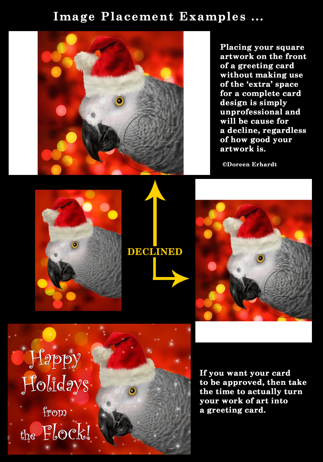
Care should be taken when adding a framed element to an image as well as when adding art to a card front. The format is 5×7 or 7×5 with a 1/4-inch trim line. When adding art to a greeting card front, the completed card must have a feeling of intention in the design. Declines may include, but are not limited to: slapping a square piece of art on a rectangle card surface, odd or unappealing frame techniques or matting such as ovals, poor alignment of the image so that the edges of the card are not evenly spaced, stretching an image as a method to re-size, etc.
So let’s talk about Composition: Framing/Alignment
Image Dimensions: Placing a square image on a rectangle card front without working to transform the image into a 5×7 card design just looks unprofessional, yet artists do it every day. Anytime an artist is going to put their imagery on a product, they absolutely MUST modify the image appropriately to fit the products dimensions. At GCU, this ‘slapping’ of artwork without modifications are no longer acceptable. Here are some visual examples of these types of declines:
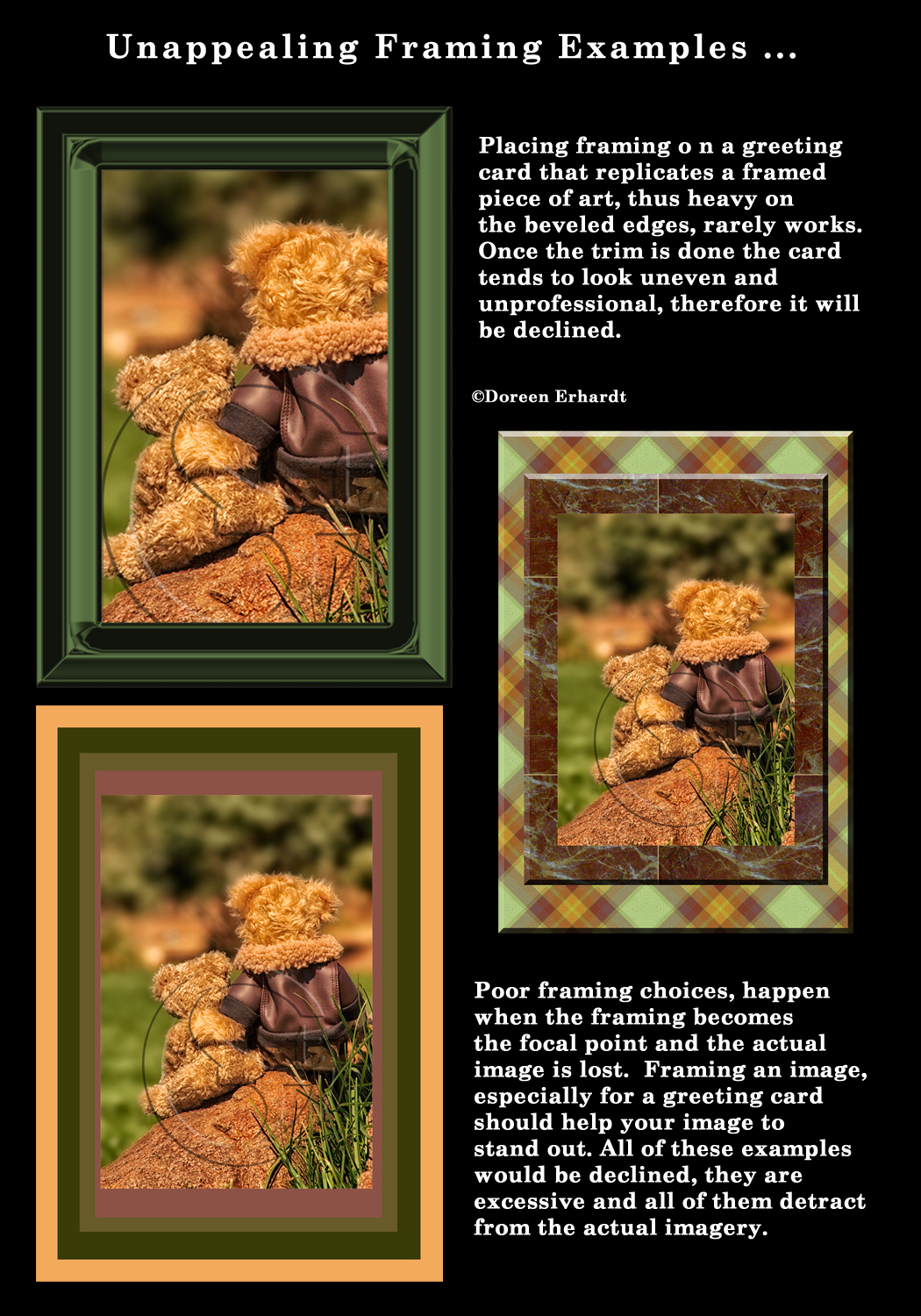
Unappealing Framing Techniques: We’ve discussed the unsightly use of beveled edges before. Beveling, when used with a light hand is perfectly acceptable for some uses, however framing your image on a greeting card with a large thick beveled frame is rarely appealing. Other framing techniques that are considered unappealing would be anything that makes the framing become the focal point rather then enhancing the imagery. Layer upon layer of borders could be considered poor technique as well. Look at these examples:
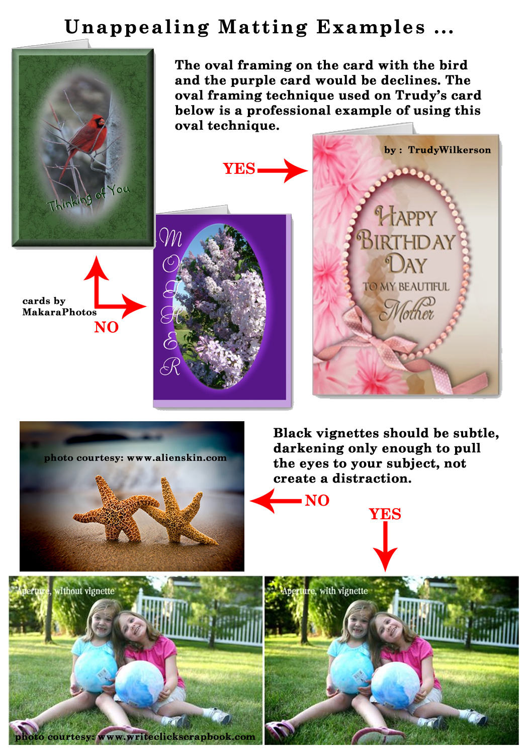
Unappealing Matting Techniques: As a general rule of thumb oval matting on a greeting card is out of date and not likely to be accepted by GCU. Oval frames are very old-fashioned, therefore an exception might be to use an elegant oval frame on a greeting card where you maintain the ‘vintage’ feel throughout the card design or when used to create a very feminine and simple design. In most cases though, oval framing just simply looks like you are trying to cover elements in a photograph that are otherwise distractions. It’s generally inappropriate for animal, landscape and masculine subjects. It can be an acceptable choice for Custom framing since it works sometimes, depending on the overall design for people portraits. Other unappealing matting techniques are unprofessionally applied vignettes. Look at these examples:
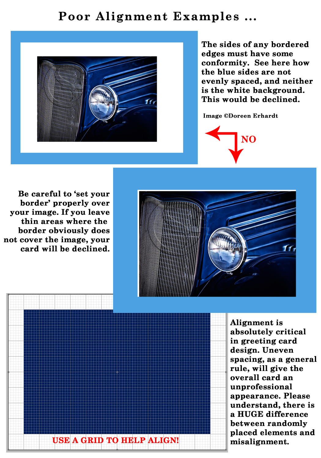
Unevenly Aligned Image: This has a commonality with the Balance of Elements segment. Just as text needs to have some alignment within the design, so do the edges of borders, framing, etc. This is simple to avoid, yet a common mistake that artists need to train their eyes to see. On greeting cards, the ‘alignment’ must look intentional and as a general rule of thumb, at least 3 of 4 sides must be evenly spaced. There are only rare exceptions where the 4th side being uneven looks appealing. A greeting card artist should be using an image creation tool that offers a Grid to lay over your image. This makes even spacing a breeze. Another common mistake that will cause a decline is not making your ‘frame/border’ cover the image equally leaving thin ’empty’ spaces on the card front.
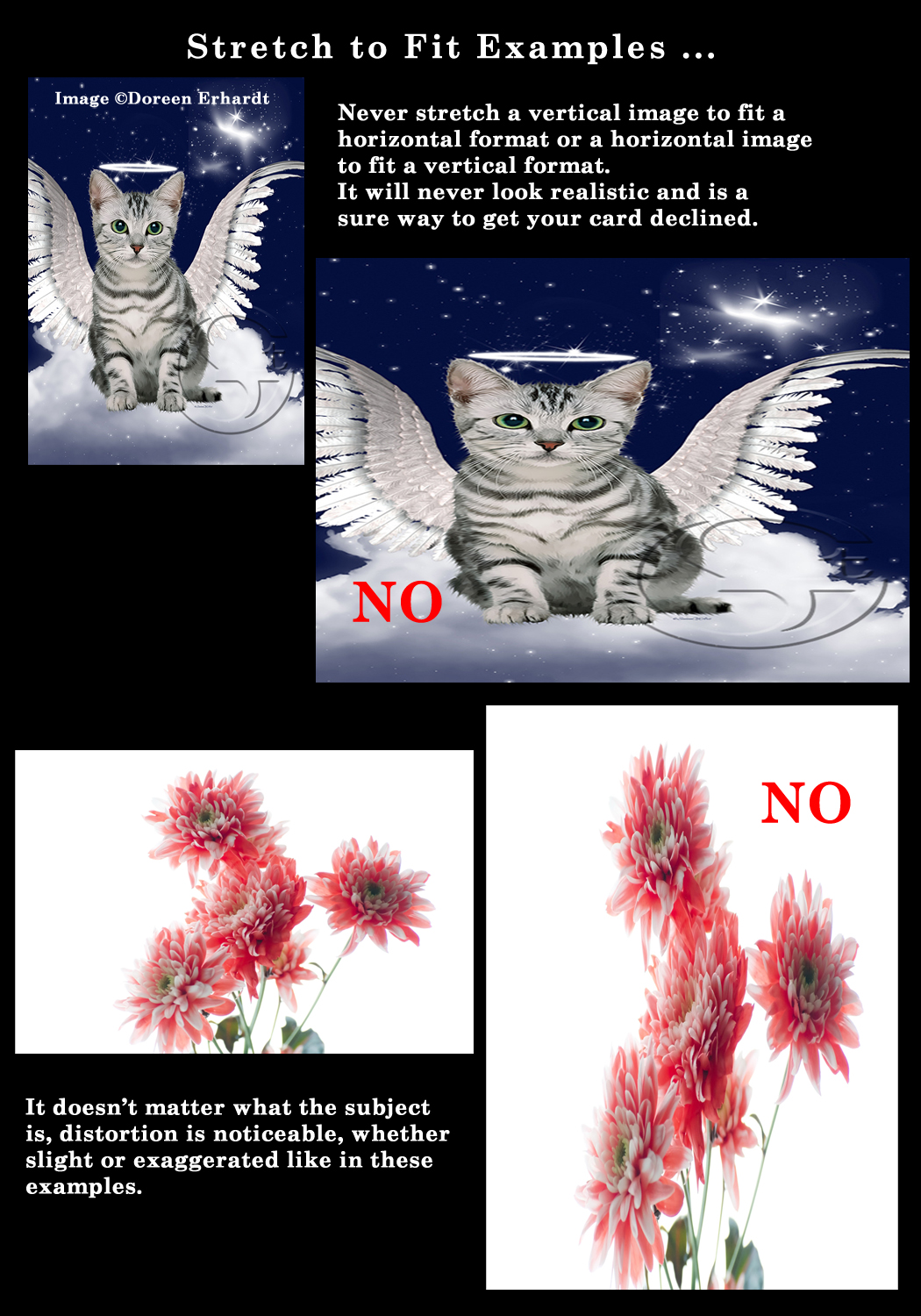
Stretching an Image to Fit: This would seem something that need not be said, however I’m actually surprised how many images I run across on POD sites where people have actually taken a photograph/image and STRETCHED it to fit different dimensions. All I can say is DON’T EVER do that. Not only is it improper resizing, but it cause obvious distortion issues. If you need to change from a horizontal image to fit a vertical format or change a vertical image to fit a horizontal format, then do so via proper cropping and resizing methods.
Here is good reading material on this subject.
Next week we’ll have a quick refresher on Composition: Perspective since we’ve touched on this area before. We’ll then continue on to the next section of the Submission Guidelines: Typography in future installments of this series. Till next week, I hope I’ve inspired you to go look through your store and see if you can weed out any images that the reviewers will find during their weeding which might fit Composition: Framing/Alignment.
For great resources & tips visit the SalonOfArt


Nice tips!
Thanks for stopping by Edward!
Doreen
I don’t know how I missed this one. Very informative. Thank you!
You’re welcome Tracie!
Doreen