Dash of Inspiration: Composition – Perspective
A Dash of Inspiration, A Cup of Creativity by Doreen
Composition: Perspective

Let’s keep this series going with the last area in the COMPOSITION grouping of the Submission Guidelines which is:
COMPOSITION: Perspective
The Submission Guidelines state this:
The horizon line is a theoretical line that represents the eye level of the observer. In general, the horizon line is the same as the horizon (the edge of the land against the sky). Linear perspective is a system for drawing objects that use lines and vanishing points to determine how much an object’s apparent size changes with space in relation to the horizon line, giving the piece depth. Declines may include, but are not limited to: the ocean tilted and “falling out of the image”, vertical lines not being vertical, tilting buildings, and windows, etc.
We’ve recently discussed this topic in a previous post, but to keep things all together in this series we’ll use some of the examples of previous posts here as well.
Tilted Horizons: If you’ve ever taken a beginner’s drawing class, one of the first things you’ll be taught when learning how to draw is to first establish your Horizon Line by drawing a faint horizontal line on the paper. In photography, the subject of today’s discussion, the same theory applies when framing through the viewfinder. A Straight Horizon is one of the first things taught in a beginning photography class.
Looking at a photograph with a tilted horizon causes havoc in our brain due to conflicting input between the inner ear and the brain. So our brain wants to tilt our head to straighten the horizon, yet our inner ear keeps sending out input that we are already level. Customers are not drawn to crooked horizons, so it’s no wonder GCU is declining them as unmarketable.

No matter how gorgeous a photograph is, if the horizon is crooked, the photo is useless. There is no stock agency and no publishing company that will accept a photograph with a horizon line that is falling out of the image … and neither will GCU.

Photo courtesy of Lauren – The crooked horizon in this image deems it unmarketable.
In landscape and scenic photography, the horizon line comes into play any time there is water meeting land, water meeting sky, sky meeting land, land meeting mountains, you get the idea. It doesn’t matter how slight the horizon is off, if it’s not straight it’s not acceptable. The amateur photographer may say, “but the subject is straight and I couldn’t get both the subject and the horizon straight.” Then take the photo for your scrapbook, but don’t attempt to get the photograph accepted as a marketable image. If you can’t relocate your position and perspective to get a straight horizon, don’t bother taking the photograph.
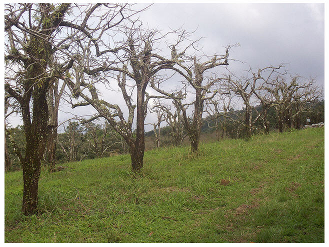
Photo courtesy of Hudson Tavares – Just because the trees are straight, does not make this crooked horizon photograph marketable.
Titled Vertical Lines: As a general rule of thumb, tilting buildings in a photograph used for a greeting card will be a consistent decline at GCU. Even if well-done, a tilted building on a small 5×7 card leaves the viewer feeling disoriented, it’s just not a marketable concept for the greeting card market. It doesn’t matter if the hillside is slanted and therefore so is it cottage, it’s all perspective and this overlaps with the Submission Guidelines category, Composition: Unprofessional.

Here are a couple of good reading/refresher articles on the subject:
Next week we’ll begin our journey into Typography. Till next week, I hope I’ve inspired you to go look through your store and see if you can weed out any images that the reviewers will find during their weeding which might fit Composition: Framing/Alignment.
For great resources & tips visit the SalonOfArt


