Dash of Inspiration: Typography – Effects
A Dash of Inspiration, A Cup of Creativity by Doreen
Typography: Effects

Let’s keep this series going by moving into the TYPOGRAPHY grouping of the Submission Guidelines, and next up is:
TYPOGRAPHY: Effects
The Submission Guidelines state this:
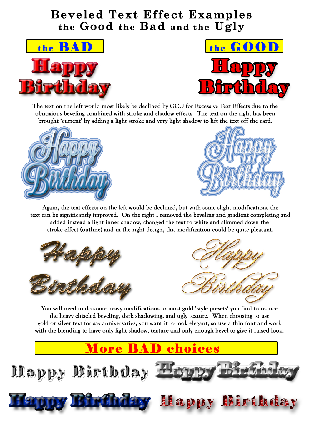
Keep your text effects to a minimum, if you choose to use them. Once in awhile a slight shadow or thin outline (stroke) can lift the text off the background for a finished look. In general, using effects such as beveling and outer glow can go from “adding the right touch” to “excessive and unpleasant use” in a hurry. Declines may include, but are not limited to: excessive beveling on the text, excessive glow, deep shadows which cause the text to become blurry, thick strokes, filtering, and styles used on text which appear unprofessional, any text which draws so much attention that the image is lost, etc.
Sometimes it’s hard to resist the urge to apply cool and awesome effects to your text, but on greeting cards these effects must be used with a very light hand or it simply overwhelms the design. Design trends apply to typography as they do to any other phase of design, so greeting card designers must pay attention in order to stay current and create designs which are marketable in today’s greeting card market.
Beveled Text: Now there’s an effect that is long past it’s expiration date. Excessive beveling of text went out in the late 90s/early 2000s and though there are still some uses for a slight beveling of your text, they are rare. Today’s typography trends are much more minimalistic with simple, uniform edges which have no effects whatsoever, with the occasional subtle shadow or outline.
- An exception to beveled text can be when creating a realistic metallic text such as; gold and silver. Be very picky when you choose a metallic ‘style effect’, most will require significant adjustments to reduce the heavy overly done effects.
- If you choose to add a bevel, try a variety of font choices. These effects look radically different from one font to another. On some it may look slight and appealing whereas on a thicker, bolder font it will look bulky and quite unsightly. Metallic text looks best when used on a thin, elegant font choice.
Glows and Shadows: Just like beveling, these effects can make or break a design. Shadows, when done well and applied with a light touch, can lift text off the page creating almost a 3-D look and classy feel to your design. However, it’s often used to excess creating one of two extremes, a blurry blob around your text which looks like an ink smear when printed or a too-heavy dark and bulky line equally disturbing to look at.
Similarly, glow effects can sometimes be the right tool for enhancing text in a difficult to see area, however most of the time you are better off using the glow effect to back-light the area behind the text resulting in your words being more clearly legible rather than the common mistake of using light colored ‘glow balls’ around your text.
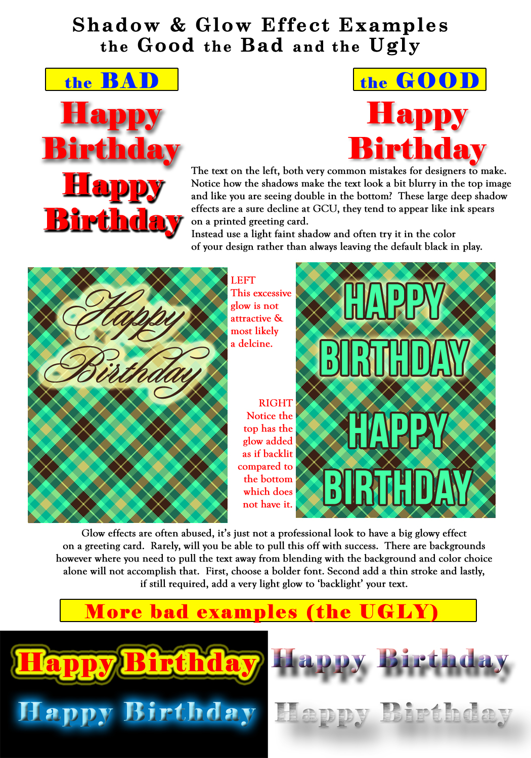
The bottom line is that any use of effects on text which distorts, impacts legibility, causes the text to appear blurry, or is so excessively executed to the extent it screams for the spotlight and fights with the other elements within your design is cause for a decline. So choose wisely.
Next week we’ll continue on our Typography journey into Font Color . Till next week, I hope I’ve inspired you to go look through your store and see if you can weed out any images that the reviewers will find during their weeding which might fit TYPOGRAPHY: Excessive Effects … and if so, best get to reworking the text on those cards before the reviewers get to them and decline them!
For great resources & tips visit the SalonOfArt


As counter productive as it sounds, after reading this article I can’t wait to try using some glow effects! I’ve stayed completely away from that one because I didn’t understand how to use it, but seeing your example helps me realize there is a place for it if used correctly. Thank you 😀
I’m sure you’ll put those glow effects to good use! All the filters and effects in programs like Photoshop can be used with great success, trouble is too many just start slapping these filters and effects on with no adjustments and that’s the key. Good luck and I’d love to see the results!
Doreen
Great refresher, thank you for the visuals Doreen!
You’re welcome Janet. Thanks for stopping by.
Doreen