Dash of Inspiration: Typography – Color
A Dash of Inspiration, A Cup of Creativity by Doreen
Typography: Color

Let’s keep this series going by moving into the TYPOGRAPHY grouping of the Submission Guidelines, and next up is:
TYPOGRAPHY: Color
The Submission Guidelines state this:
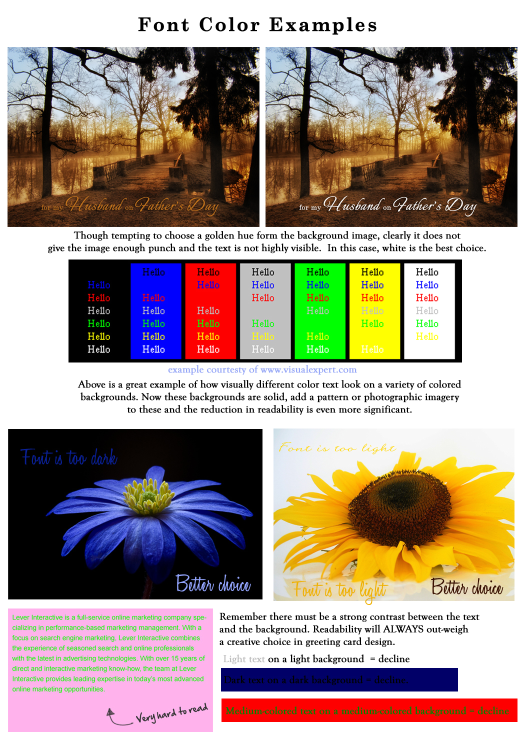
Again, text needs to be very legible. Using a pretty blue on a bright purple background is not only illegible, it’s unappealing. Stick to colors which harmonize with your image and are light or dark enough to be clearly legible. Declines may include, but are not limited to: colors which clash and cause chaos within the design, colors that cause it to be illegible, too dark, too light, etc.
Inexperienced greeting card designers have a tendency to want the text color to be some color within the design when it may not be as legible or standout as well as a simple choice of white or black. Here are some simple tips to follow from the professionals:
- Medium-colored text + medium-colored background = low legibility. To obtain the best legibility, choose either a very light font on a very dark background or a very dark font color on a very light background.
- When a customer can’t read text instantly, they will not engage and will move on to a different card.
- Contrast between the font color and the background color is very important, so evaluate your background color and choose a high-contrast color for your text.
- If you simply must choose more than one text color for your image, be careful to not turn a good image into a chaotic one by making the wrong color choices.
- Nothing ruins a good design like a font with a fully saturated bright color on a medium-colored background. Bright colors are hard to read, and can really look amateurish when used in excess and/or on a busy or colored background.
- Just like a good design, reference one of the readily available color palettes when necessary to ensure your text stands out within your design.
Clashing Colors: As with choosing colors for any design, many colors tend to clash visually, just like some patterns clash with each other. When you choose a color for your text be careful to choose complimentary colors within the image and color wheel. Too many colors in the text combination can cause chaos within a design. In a busy design, even adding a single colored text of a color not prominent within the design can cause chaos.
Too Light/Too Dark: Again, remember that the color of your text, combined with your font choice has a lot to do with the legibility of the text on your card. If your text is too light on a light background, it becomes difficult to read. Same goes for using a dark colored text on a dark background. Within a greeting card design, legibility of the message is of utmost importance.
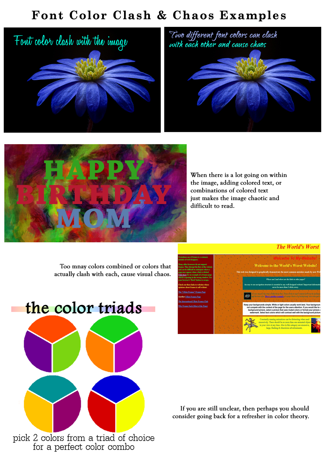
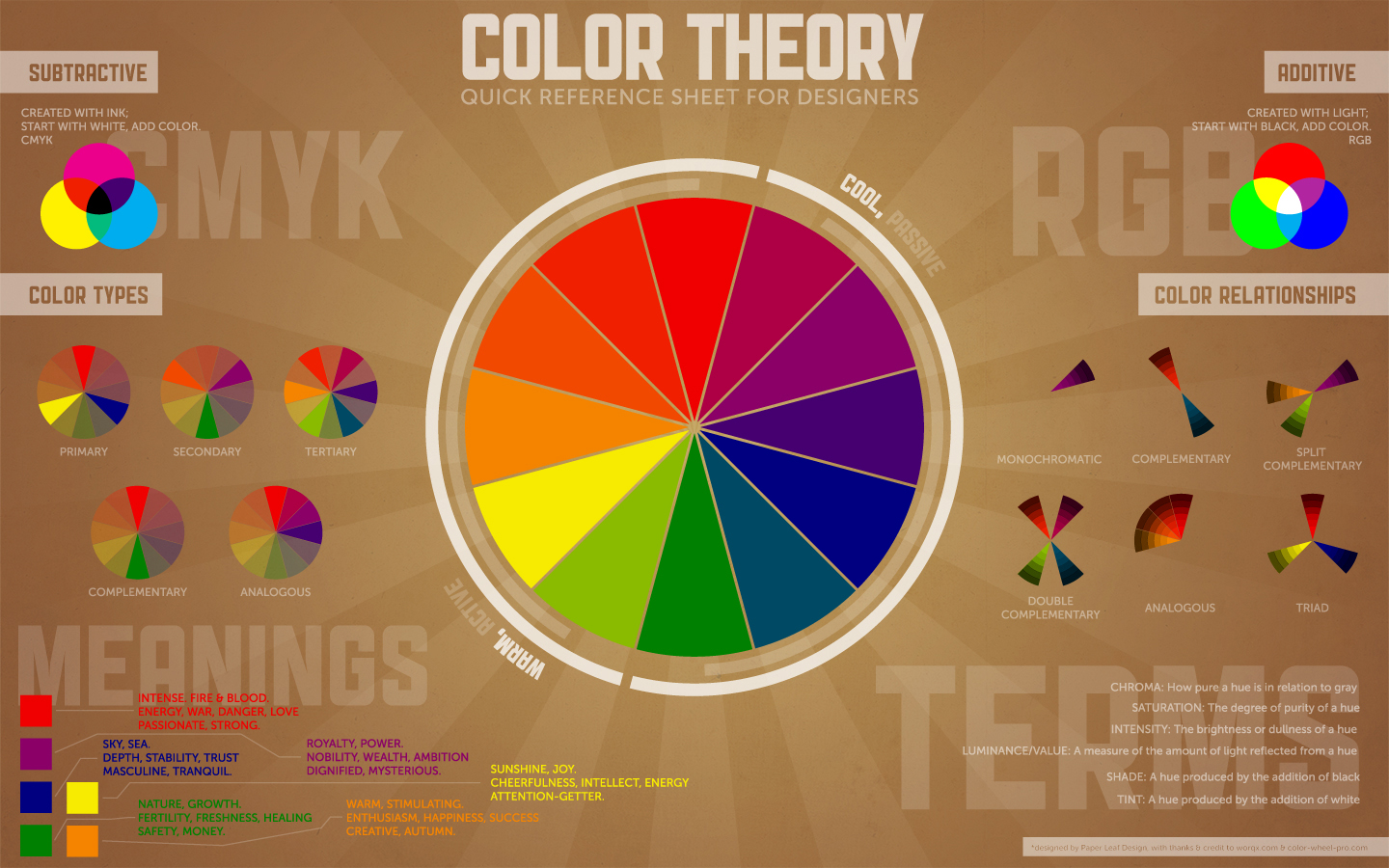
When all else fails, it may be time to go back for a refresher course in color theory.
Here is a link to Color Theory
Next week we’ll continue on our Typography journey into Text Placement to finish up the Typography section . Till next week, I hope I’ve inspired you to go look through your store and see if you can weed out any images that the reviewers will find during their weeding which might fit TYPOGRAPHY: Font Color issues … and if so, best get to reworking the text on those cards before the reviewers get to them and decline them!
For great resources & tips visit the SalonOfArt
Nothing ruins a good font like a fully saturated neon green or red fill. These colors are hard to read, and just look amateurish. So tone down those saturation levels, and go easy on your viewers eyes. Also, if you’re going with white text on black, it’s a good ideas to tone down the the brightness to 80 or 90.
Choosing the right fonts, and using them correctly is a simple way to help raise the overall production value and make it more professional. So the next time you’re in the edit room, consider these tips, and take your project to the next level.


LOVE this!
Glad you found it useful Tracie!
Doreen