Dash of Inspiration: Typography – Text Placement
A Dash of Inspiration, A Cup of Creativity by Doreen
Typography: Text Placement

Let’s keep this series going by completing the TYPOGRAPHY grouping of the Submission Guidelines, and last up is:
TYPOGRAPHY: Text Placement
The Submission Guidelines state this:
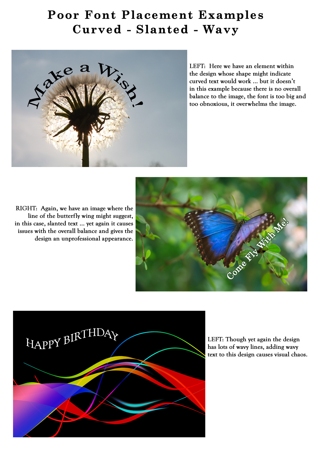
When designing a greeting card, your text placement should not be an afterthought. The best place for the text to reside on your design needs to be well thought out. Your message needs to be part of the composition NOT just stuck wherever there is space left! Do not use slanted or curved text without choosing a font that translates well when tilted or curved and you’ve become an expert in this technique which can make or break a design. Nine out of ten designs look unprofessional when the text is done this way . . . so unless you know what you are doing, don’t do it. Declines may include, but are not limited to: Curved, tilted, wavy or slanted text, text broken up and randomly placed all over the image, text which is placed across a face or important part of the image, etc.
This may be the most common Typography area where artists will receive returns and/or declines. As stated in the guidelines, when you slap text over the image rather than placing it where it’s easy to read and well-balanced with the elements in the design, the card simply looks unprofessional.
Not mentioned, but also a cause for decline if not done well is vertical text which does not work the majority of the time. When it’s pulled off, it’s done so with a very legible font and using all upper case letters for readability. In most cases you are better off creating the text normally and then turning the text 90-degrees to run along the edge of the card rather than stacking the letters on top of each other.
Curved / Tilted / Slanted Text: It is very rare for curved, slanted, wavy or tilted text to work within a greeting card design. When it does, it does so because it’s following the lines and theme of the design. Still, this is a common mistake for the inexperienced greeting card designer to tilt the text in some way with no real connection to the image and no balance in the overall design. First let’s look at some GCU cards from artists who know how and when to curve/tilt/slant/wave the text using techniques which result in a professional and great design.


(Row One, L to R: Great Scott Designs, Nancy’s Nook; Row Two, L to R: Red Rose Digital Art, Clara Chandler, Doreen Erhardt)
Here are some examples which are not acceptable choices for your cards.
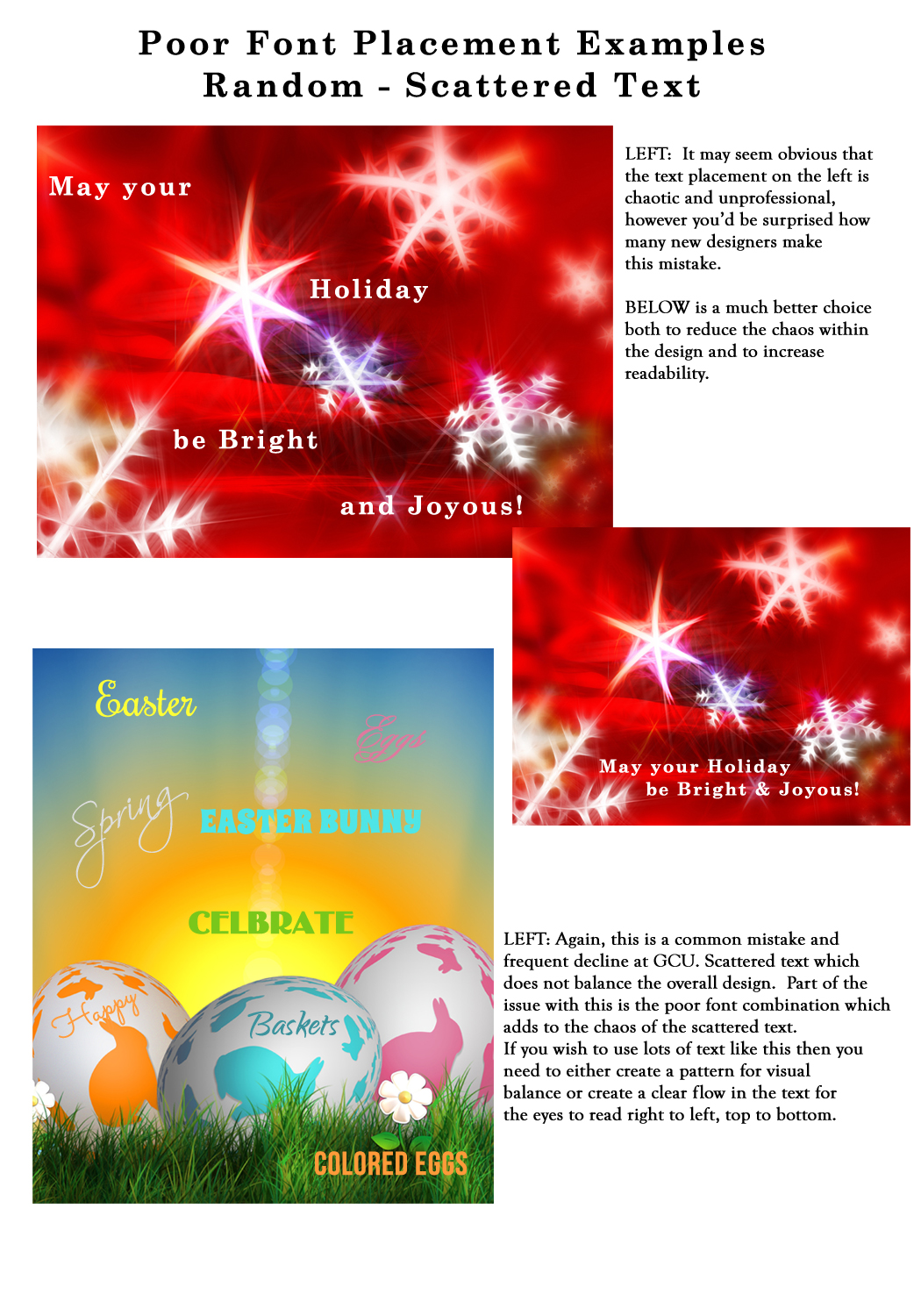
Randomly Placed / Scattered Text: Always remember when creating your design that the viewer reads from right to left and from top to bottom, so when you randomly scatter text all over an image which does not follow any clearly defined pattern or maintain readability, you’ve created chaos. Here are some examples of well-thought-out professional techniques which create a feeling of balance and in some cases even a pattern emerges.


(L to R: Maria Dryfhout, Catherine Sherman, Julie Alvarez)
And here are some examples of poor choices:
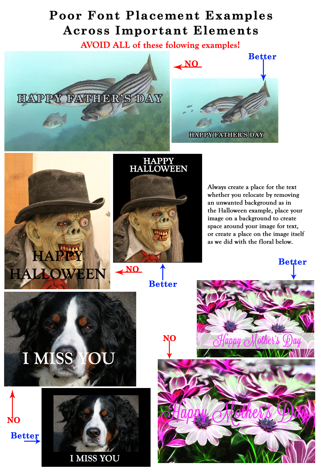
Placement Over Important Elements: Never, never, never place your text across the main subject of your image. Not only does it usually make it hard to read, it is distracting and gives the strong impression that an amateur created the card rather than a professional. IF you choose to have your text run the entire length of your design or through the middle, then you need to plan your card AROUND the text.
If you are using an image where there is no obvious place for the text, then make one. Either add a place or redesign using a version of the image which is smaller and leaves room for the message.
Next week we’ll move on to the next category in the Submission Guidelines: Image Quality. Till next week, I hope I’ve inspired you to go look through your store and see if you can weed out any images that the reviewers will find during their weeding which might fit TYPOGRAPHY: Text Placement issues … and if so, best get to reworking the text on those cards before the reviewers get to them and decline them!
For great resources & tips visit the SalonOfArt


Oh yaaaaayyyyyyy! You used my Fathers Day card as a GOOD example! I’m so excited! =) I get a lot of sales of that particular card also! =) http://artist.greetingcarduniverse.com/nancysnook
My pleasure Nancy, it happened to be a rare example of when it works to slant text 🙂
Doreen
I love that you always give visual examples. It makes it so much easier to remember. Another invaluable article. Thank you 🙂
Thank you Tracie! I too feel the visual examples are important so that there is no misunderstanding of what the guidelines are trying to say … happy to hear they are working.
Doreen
Great post! I’m wondering, though, whether you really meant to write that folks read from “right to left”? I presume you meant “left to right”? Or do you really mean that folks’ eyes start in the upper right hand corner when they’re looking at cards?
LOL! Good catch Stacia … I meant my other left. You are correct, of course I meant Left to Right, apparently my brain was reversed the morning I wrote this 🙂 Thanks for the correction!
Doreen
No problem! I am grateful for all of your postings. You put a lot of work into them, and they are helpful to so many of us!
Hi Ms. Corrie, I would like to thank you for all of the positive feedback and links. I am very new and would like to learn as much as I can to become a professional greeting card writer. Thank you for the tips on this page, it helps a lot. The girl, with a touch of dyslexia:) but I love, to write. Love, Michelle
Thank you for the tips. The examples really help to make the guidelines clear.
You are most welcome, Sarah – and – welcome to GCU!