Dash of Inspiration: Marketability – Photo Card Area
A Dash of Inspiration, A Cup of Creativity by Doreen
Marketability: Photo Card Area

Let’s keep this series going by heading into the last grouping of the Submission Guidelines; Marketability and next up is Photo Card Area.
MARKETABILITY: Photo Card Area
The Submission Guidelines state this: On photo card designs, the photo area should serve as the focal point of the overall design. Compositional emphasis should be on the photo, not other elements on the card. Maximize the photo size as the focal point. Specifically: Entire photo area (a single photo or multiple photos) should ideally use 1/3 to 1/2 of the card’s surface. If design is used to create multiple cards, elements should vary and be appropriate by occasion, age, relation, and gender.
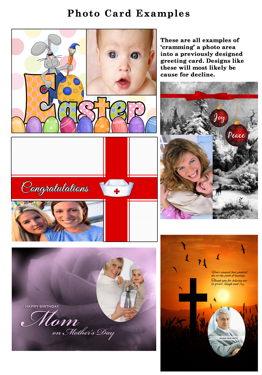
A mistake many artists make is trying to ‘shove’ a photo area into an existing ‘standard’ design. Though this works occasionally, most of the time the photo card tends to look as though this was the technique used and therefore just isn’t a good photo card. Here are examples of this type of card, all of which would most likely be declined.

By: Penny Cork – This is an outstanding design, so obviously created as a well thought out photo card. It’s a perfect magazine cover.

By: ©Doreen Erhardt – A very popular holiday photo card created to give the customer a ‘year at a glance’ style for their annual season’s greetings.
Photo cards which sell well, therefore highly marketable, are those designed specifically as photo cards. The photo area and the custom text are the focal points of the design. There are some great examples below of various types of photo card styles. As always there are exceptions to the rules, in this case exceptions to the 1/3 to ½ of the card’s surface being dedicated to the photo area. Look at those examples and you can see, these were designed with ‘smaller’ photo areas in mind to compliment the overall design.
Two good examples of when breaking the 1/3 to ½ of the card’s surface actually works and all elements blend beautifully with each other to create a marketable photo card.

By: Anura Design Studio

By: Debbie Fieno
Here are some great tips:
Nuts & Bolts: Photo Cards
Blast From the Past: Tips for Photo Cards
Dash of Inspiration: Custom Front of Card Tips
Next week we’ll continue in the final group of the Submission Guidelines: MARKETABILITY and talk about Creative Use Policy. Till next week, I hope I’ve inspired you to create better Photo Cards.
For great resources & tips visit the SalonOfArt


