Nuts and Bolts: Superscript & Ordinal Numbers
March 18, 2016

Nuts & Bolts – Superscript & Ordinal Numbers
First things first, a few basic definitions …
Ordinal Numbers – words representing position or rank in a sequential order. The order may be of size, importance, chronology, and so on. 1st or first.
Ordinal Indicators – indicating the order or position in a series: st, nd, rd, th.
Superscript – of a letter, figure, or symbol, written or printed above the line.
Ordinal numbers are commonly used in birthdays and anniversaries so we see them quite often in greeting card designs. 1st, 2nd, 3rd, 4th, etc or written as superscript, 1st, 2nd, 3rd, 4th
While commonly acceptable to be inline (not superscript) in verse, on the front cover design of a greeting card, moving forward (effective 4/1/16, no fooling!) GCU will require artists to represent ordinal indicators in superscript. Existing cards (approved prior to 4/1/16) that do not comply may be returned for edits at GCU’s discretion.
Superscript is something you as an artist must create in your design. This can be achieved by using your applications superscript formatting function or creating superscript text as its own text element and placing it accordingly. This can be easily achieved with Stock Card Creation (BigStock created cards). Simply create a second text field for the ordinal indicator and place it accordingly.
Here are some references on superscript formatting for Photoshop and Illustrator. If you use a different program look to their How To instructions.
Sometimes your chosen font may not work or look pleasing as ordinal indicators so consider choosing a different font for your entire design OR a different font for the ordinal indicators themselves.
Ordinal indicators are typically lowercase letters, however depending on the design GCU will consider lowercase (th) or uppercase (TH) as the artists design choice and appropriateness will be determined by the review team on a card by card basis.
Here are some well done examples by GCU artists:
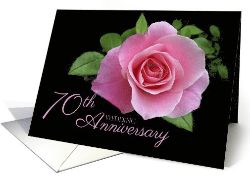
Doreen Erhardt
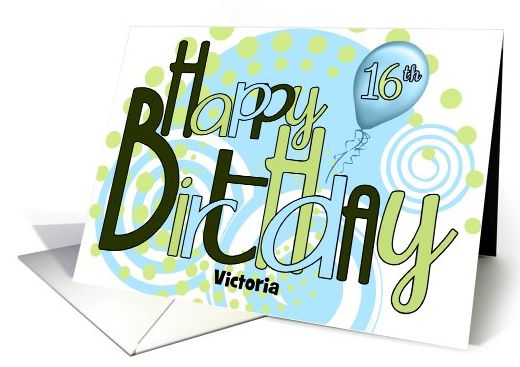
Eugenia Bacon

PamJArts
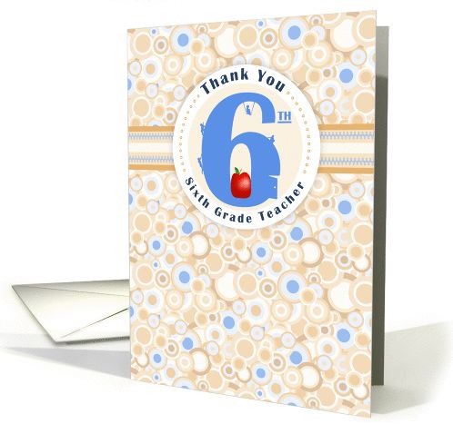
Sun at Night Studios using upper case TH is very fitting here:
This can even be accomplished with two separate custom text fields as done here by CWD Designs:

This is just one of the many Golden Rules of Typography of which you can read more here. Ultimately this will give your designs a more polished, and professional look that is second to none!
Share this:

One Comment
leave one →


Whew! Much work ahead. I’ve been working on this since you first posted and have a long way to go.
I was wondering if there is a way in the custom text tool to create these superscripts without making two custom text boxes?
Thanks, Kati