Nuts and Bolts: Storewide Facelift

The only way I had the confidence that EVERY card would be reviewed was to set the view to Tile in my Manage Cards areas and then work on them within each of the major categories: Announcements, Birthday, Business, Collections, Holidays, Invitations, Occasions – working in one section at a time and in order, so as to not miss a card. Each card was opened, checked and the following adjustments were made as needed:
– Unique and descriptive without truncating to a second line when possible.
– No dashes, slashes or characters.
– Proper capitalization.
– Recipient(s) and Occasion was depicted with relationship specific identifier showing first.
– If blank “Blank All Occasion” text added.
– The word “CARD” was removed as GCU automatically adds this to all titles.
– If the card had a Photo area – “Custom Photo” text was added or Custom if only card front text was editable.
– Colors and descriptive words for the artwork were included.
– Recipient(s) and Occasion text included.
– Each keyword or keyword phrase separated by a comma and a space, avoiding repetitive wording.
Artist Notes (Card Description):
– Each written to register GREEN in the uniqueness factor. Remember this is key with the new SEO requirements. If your cards indicate RED “Not Unique: Not eligible for Google indexing.” This means your cards have most likely stop selling at the rate they used to due to no longer being indexed by Google; therefore your cards are not being found by shoppers when searched for outside of GCU. Green is the goal, sometimes with large series, I accepted yellow on a few.
-For those cards of mine where I wanted to offer credit to the 3rd party creative and it was a large enough series to cause this mention of credit to skew the uniqueness factor from improving, I placed the credit in the Image By field and removed it from the description.
Inside the Card:
The inside and/or Custom Tool areas were checked on every card as well.
– Ellipsis were checked to make sure they were a) needed, b) properly spaced and c) properly continued from card front to verse area.
– Font size, choice and color were re-reviewed for legibility and professionalism.
– Extra spacing was removed and replaced with proper Message Alignment, Vertical Alignment and Line Spacing choices.
– Looked for proper punctuation and capitalization in verses.
Custom Front Cards:
– Text boxes did not touch each other, fall on or over the yellow safety line and did not overlay elements in my design which may make the customer’s text illegible.
– Photo card areas were just a pinch outside the transparent area I created for the customer’s photo, were not on or over the yellow safety line and did not touch each other if there were more than one.
-Custom text did not truncate or have extenders touching the text box.
Imagery and Typography:
Considering I joined GCU in 2009 and it was my first time creating greeting cards, I had hundreds of old cards which in addition to all of the above, really needed face-lifts – so each card was reviewed and updated when necessary for the following:
– Poorly placed or illegible card front text and/or bad font choices.
– The awful out-dated beveling effects were removed on both text, framing, borders and elements.
– Edge allowances checked.
– Imagery was spot checked and had color/contrast/saturation improvements as needed.
– Then made the same image/typography updates to all cards of the series when applicable.
The results of my efforts have already proved to be amazing. Every day I see those old cards coming through in sales notifications shortly after adjustments were made, indicating not only were the cards looking more professional, but that my meta-tag data was working!
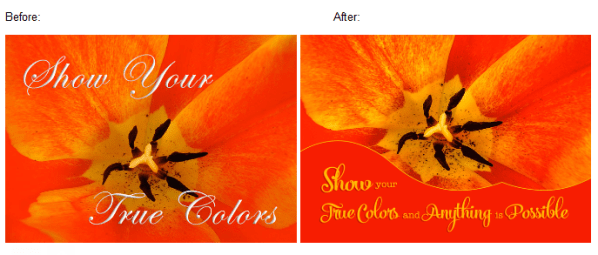
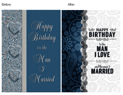
See some of the differences below.
PID 656976 – My Santa painting itself had more detail pulled out and was then framed in a window environment with ‘snow drifts’ for the text placement. Font choice improved and all the ugly beveling gone, gone, gone!


I hope this inspires other artists to do the same!
GCU NOTES: these are all requirements, tips and tricks that have been shared on the blog, in the Submission Guidelines and in the review team’s toolkit as feedback for artists.
Here is a helpful read on Edit or New Submission and a related read about card editing by GCU artist Stephanie Laird.
Amazing job, Doreen! Impressive work and fortitude. Certainly a labor of love. Perhaps a good resolution for other artists to take on for 2018.
GCU Community Manager


Thank you for this detailed account of the process you used Doreen ! Very informative . Gives one an incentive to go “clean house.” 😊
You’re welcome Michelle! Good luck!
As a newbie, I learned a lot from your post and am now going through my cards to make sure I’m starting off right. It took a while to understand about the green thumbs up (read that three times), but thanks to your post, I am now going in the right direction. It’s also cool to see how you are updating your original designs, keywords and notes, to be ready for 2018 sales. Thanks, Doreen.
Hi Doreen, I have been working on my stores since way back too. The hardest part for me has been the artist notes, having so many cards, it makes it tough to get the green light, it really keeps me thinking! 🙂 So, just want to thank you for sharing your process, it’s very helpful. Take care, Laurie
You are welcome, Laurie. You are exactly right about that! LOL! I found on those huge series, that I would work on this Artist Notes for the series ONLY until I stopped getting green light that day and move on. Then the next day – fresh mind and all that – I’d go do some more in that series, applying the same ‘rule’ – go until I’m stuck again. Thesaurus is also a handy tool for those big series. 😀 Good luck to you!
I never thought to use the thesaurus, so there you go again sharing another good tip! 🙂
Here are some other tips, Laurie:
I find moving the order around and switching up a few words helps.
BTW we are working on something that should make updating Artist Notes Uniqueness Rating much easier. Stay tuned!
Wonderful news, Mindy, thank you!
Thank you for the tip, Mindy! I appreciate any help I can get like I say to Doreen, I really have to put on my thinking cap for the artist’s notes! 🙂 Also, thank you for working on making the uniqueness rating easier. (That is really exciting, I can’t wait) Thank’s again to Doreen and you for all your help! Laurie