Nuts and Bolts: Stock Card Creations – Unmatched Image Card Tips
May 3, 2019

Nuts & Bolts – Stock Card Creations – Unmatched Image Card Tips
On the heels of the relaunch of Stock Card Creations, we bring you a guest post from GCU artist, Doreen Erhardt of Salon of Art and Exclusive Creations, loaded with tips on updating unmatched cards with a new stock image.
See the announcement Stock Card Creations Online.
Doreen shares …
I volunteered as ‘guinea pig’ for Mindy and Nasser to ‘test’ the changes to this tool and library of images before it went live, so I may have picked up a few things that might be helpful.
Back in January in anticipation of unknown changes to the stock cards I had created ways to copy/save both front and inside verse images of the approved cards to use as a reference. If you can still do this –
or are an artist who followed my example back in January – this is a helpful tool to make sure you get your previously approved card front text and verse recreated properly which will ensure your resubmit
with a new image will fly through.
The next thing I did was to enter all my cards into a spreadsheet format with a visual and PID. Here is where I recorded potential options to swap my images by recording the (new) stock image number. Usually I would collect up to three possible replacements (stock images). Having more than one option ensured that one of them would work the best to keep the ‘feel’ of the card and support the text placement.
When you find an image that is close to what you are looking for, look at it’s title and consider entering some of the title into the search field to narrow down more images which might be a more exact match
than the broader search was finding. What you might have called a cat in a hat, some photographers might call a kitty in a cap. So continue to refine your search. Don’t just ‘settle’ for the first image you
come across.
Determine the value of the card. Has it sold? If so, frequently? I deleted about 8 out of approx. 150 (unmatched) cards if a suitable replacement stock image could not be found.
REVIEW, REVIEW, REVIEW before resubmitting. Remember, although stock cards may now be returned for edits, if the issue is on the card front, you will have to start over and completely redesign the
whole card, just to add a comma. This is why you want to make sure you follow your previously approved card front text EXACTLY as it was on the approved version.
A new feature to this revised tool is that we can match background colors along with choosing text colors to match the image. To do this, once the image you have chosen is up in the creation tool, hit your
keyboard’s PrtScr (print screen) button and paste the image into a new file in Photoshop or other design software. Use the color picker to click on various areas of the image and simply copy the Hex#.
In order to get your text to line up properly when using more than one text box, create a text box with a line. Place this as an ‘invisible’ line, line up your different text boxes and then once it looks good in
preview mode, delete the text box with the line.
Here is a visual of the HEX code color sample:

Another thing to remember when working with text boxes is that once you type your text and choose the font/size you want – size the box to the minimum length and depth possible.
When you are sizing the box with text inside and see the ‘slide bar’ show on the right, it’s too small. Size enough that the slide bar doesn’t show and you’ll have a better chance of seeing the text placed where you wanted it when viewing in the preview screen.
Also keep in mind that unlike the Custom Front Text tool, text boxes on Stock Card Creations can overlap. This allows for more creativity when it comes to adding card front text. If you choose to experiment with this, play with the alignment of each text box to snuggle them in better. Some aligned left, some right, some center can often create a lovely line of text in two different fonts.
Example:

Go into this process with an open and willing mind. No design tool is easy to use. There are idiosyncrasies in all software and getting frustrated with them is a waste of time, not to mention, takes
the fun out of the process. Instead, pay attention to those oddities and learn your own workarounds.
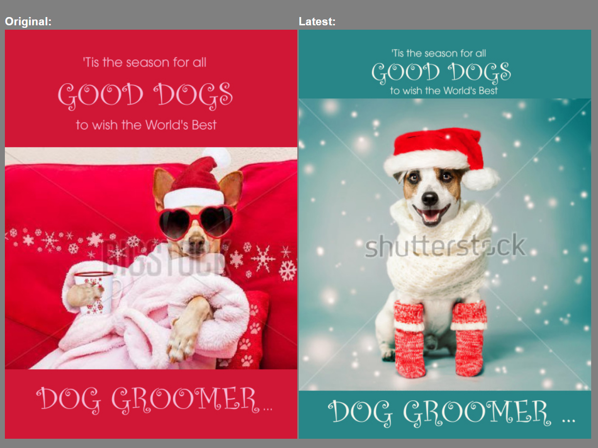
Here are some comparatives of before (original stock image) and after (with a new stock image) cards:


Additional Tips:
1. Where to start?
Consider starting with your best selling stock cards or upcoming seasonal cards to get them back online quickly. (IE: Mother’s Day, Graduation, Father’s Day)
2. Can’t find a suitable substitute image?
If you cannot find a suitable replacement stock image consider one of these alternatives:
a) Use Your Own Image – You cannot replace a stock card image with your own image. You will need to create and submit a new card (standard). In the Notes to Reviewer on your new submission, please add a note like “this card is a replacement for stock card pid#xxxxx as I could not find a suitable replacement stock image”. Finally please delete the original stock card.
See how artist Laughing Hippo Studio has made a new submission with his own image here:

b) Purchase the Stock Image – if a card has proven to be a hot seller for you, consider purchasing the commercial usage license for the stock image and make your own card (standard). You cannot replace a stock card image with your own image. You will need to create and submit a new card (standard). In the Notes to Reviewer on your new submission, please add a note like “this card is a replacement for stock card pid#xxxxx as I could not find a suitable replacement stock image so I have purchased the commercial usage license for this stock image from xyz provider”. Finally please delete the original stock card.
c) Remove the Card – if the card has no to low sales, consider deleting it and not replacing it.
The difference is made in the details!
Mindy
GCU Community Manager
GCU Community Manager
Share this:

No comments yet

