Nuts and Bolts: Inside Verse Font Size.
August 9, 2019

Nuts & Bolts – Inside Verse Font Size
There are many things to consider when deciding what font size to use for your inside verse. Here are two important considerations that may not have come to mind.
Age of Recipient – consider the age of your recipient(s). If it’s for an elderly birthday (100 years old) or anniversary (50th wedding anniversary), consider a larger font size to aid with legibility. You can even note this as an added feature in the Artist Notes section like “large font size in inside verse for easy reading”. CAPS can be a bonus here too.
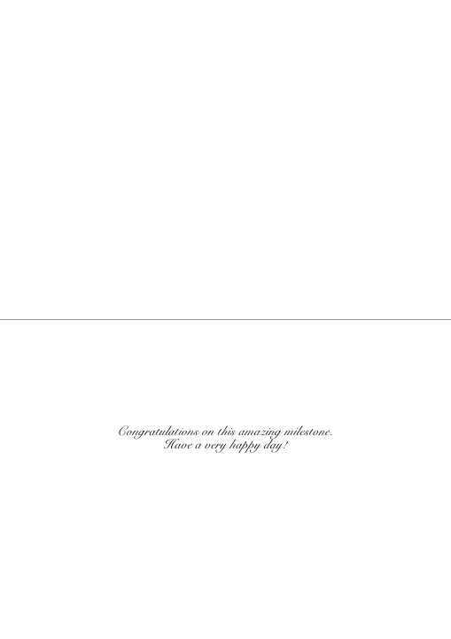
size 16 (Snell Roundhand) too small and wispy:
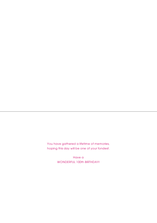
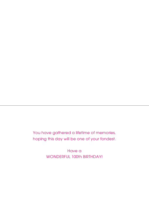
size 18 (BibleScpt) legibility increased:

size 10 (Avant Garde) a little small:
size 14 (Avant Garde) clear and bold:
Length of Inside Verse – if your inside verse is short and sweet it may look somewhat lost on the inside of the card. Especially if it is a one liner. Consider using a larger font size to add balance and presence.
size 12 (Avant Garde):

size 18 (Avant Garde):

Please note some fonts styles are too small to be used under a certain size:
The difference is made in the details!
Mindy
GCU Community Manager
GCU Community Manager
Share this:

No comments yet

