Nuts and Bolts: Curved Text
Nuts & Bolts – Curved Text
As part of an overall design, greeting cards present an additional challenge / opportunity with text. The placement, color, size, font choice and more are just as important as the primary design and should not be an after-thought.
It should work and flow with the design giving a clear intention as to why this style was chosen. It should be done sparingly and with professional execution. We stress that this type of effect on text for professional greeting cards requires a learning curve that artists need to explore on their own.
We’d like to share some important considerations on a very difficult typography technique: Curved Text.
1. When in line with the design, curved text is allowable whereas warped text rarely is.
2. Slanted text simply never works – period.
3. Script fonts may only work out when they are not slanted.
4. Kerning adjustments are almost always required for minor adjustments, as is tilting the text a wee bit one direction or another after the Arc feature is applied.
5. See the Typography – Placement Submission Guideline with examples specifically:
Curved / Tilted / Slanted Text: It is very rare for curved, slanted, wavy or tilted text to work within a greeting card design. When it does, it does so because it’s following the lines and theme of the design. Still, this is a common mistake for the inexperienced greeting card designer to tilt the text in some way with no real connection to the image and no balance in the overall design.
6. Some prior advice from Corrie re: Front of Card Text specifically:
Do not warp, twist, bend, wave or otherwise mess around with your text. If you want to curve your text like I showed you in my second example card (the baby shower invitation), then you need to learn Adobe Illustrator. Text effects may look okay on a website banner, but you will not attract shoppers when you put that scrunched, higgledy-piggledy, warped and waved text on a greeting card. It doesn’t look professional. Don’t do it.
UPDATE to above: If you wish to create curves, twists, arcs, and bends to your text, then tools like Adobe Illustrator and/or Photoshop are necessary for your design arsenal – as are finding wonderful teaching videos online showing you how to use these tools to create professional quality curves on your card front text.
Now some examples:
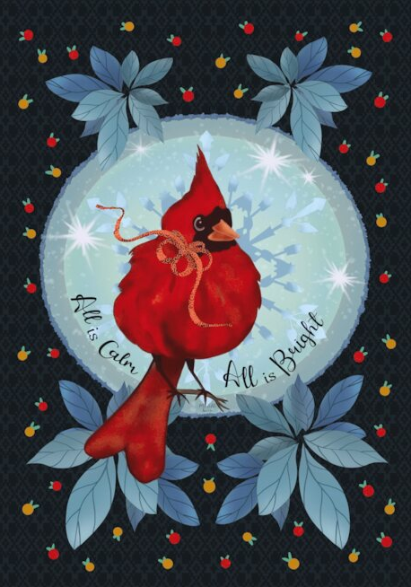
BEFORE
The curved text is not meeting the marketability standards for professionalism as it does not follow the curve of the circle with enough precision. We would love to see this card back if you can edit the curved text. additional notes: the horizontal line alignment is not exact in this case but works with the design and the off center tail position. If the tail were perfectly centered then the text would need to also be perfectly aligned on each side.
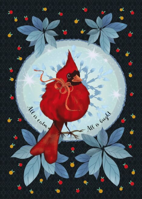
AFTER
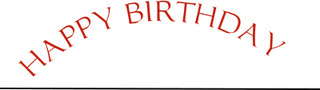
Additional considerations of what is NOT allowable:
1. Using italic, forward leaning fonts, can look skewed and unprofessional especially when curved using the Warp Text ‘Arc’ feature in some software programs that causes greater distortion. This was created using the Warp tool Arc feature in Photoshop.
2. Curved text that does not precisely start and end on the same horizontal alignment, unless the rotation is purposefully different to work within the design.(This curve was created using the path tool in Photoshop)
3. Odd spacing between letters can occur when you curve text in certain fonts, so the kerning will need further adjustment. Notice the ‘Birt’ spacing as compared with the balance of the letters.(This curve was created using the path tool in Photoshop)

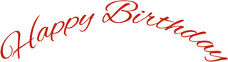
Here are three wonderful examples of circular, curved, and wavy text that have been done with care, purpose, and all WORK:
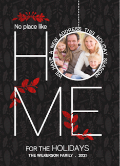

The difference is made in the details!
Mindy
GCU Community Manager


