Nuts and Bolts: Orientation Edits
Nuts & Bolts – Orientation Edits
Some designs, especially when you want to include cover text, beg for an alternative orientation – vertical vs horizontal, or vice versa.
Here is a good example of a card by GCU artist Trudy Wilkerson.
Reviewer’s request:
This is not meeting marketability standards, we don’t see this being a very competitive design. Additionally, the text and the center art seem a little crowded into the landscape orientation, with much blank space to the left and right and we wonder if a portrait orientation might work better. Also, please note the two custom fonts are two different font styles on the card front.
We are returning it to give you the opportunity to make some edits of you wish.
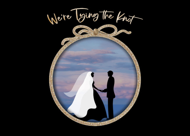
Original Image:
Trudy’s response:
I have no idea what I was thinking doing this card horizontally instead of vertically…;-( LOL, I’m hoping you will like this one better. Happy Wednesday! FYI: The plan is to do almost the same for Renewing Vows except the Silhouette bride’s dress will not be flowing and will have a shorter veil. Also, I plan on doing one matching this as a thank you card, saying We Tied the Knot and opening will allow them to place their wedding photo inside the knot circle.
Revised Image:

See here for other examples and tips on orientation considerations.
Thank you to Trudy for trying a new perspective that resulted in a more balanced design which also resulted in a wonderful photo card variation.

The difference is made in the details!
Mindy
GCU Community Manager


