Rainbow Connection: Pantone Color of the year 2023 – Viva Magenta!

Each year, the Pantone Color Institute chooses a particular color as the “Color of the Year.” This color is meant to reflect the current state of the world and cultural trends, and it is often used in fashion, design, and other industries. The process of choosing the color of the year involves a team of experts who study various factors, including fashion, entertainment, art, politics, and social media. They look for emerging color trends and select a color that they believe will be relevant and influential in the year ahead. The color is then announced in the fall, and it becomes widely used in various industries in the following year.

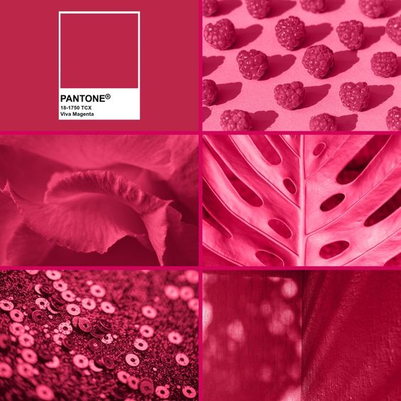
Pantone’s Color of the Year, Viva Magenta 18-1750, vibrates with vim and vigor. It is a shade rooted in nature descending from the red family and expressive of a new signal of strength. Viva Magenta is brave and fearless, and a pulsating color whose exuberance promotes a joyous and optimistic celebration, writing a new narrative.
This year’s Color of the Year is powerful and empowering. It is a new animated red that revels in pure joy, encouraging experimentation and self-expression without restraint, an electrifying, and a boundaryless shade that is manifesting as a stand-out statement. PANTONE 18-1750 Viva Magenta welcomes anyone and everyone with the same verve for life and rebellious spirit. It is a color that is audacious, full of wit and inclusive of all.

Read more about the Pantone Color of 2023 on their site (click here).
What is Magenta?
Magenta is a vibrant, reddish-purple color. It is a mixture of red and blue, with a little bit of purple mixed in. In the printing process, magenta is one of the four primary colors along with cyan, yellow, and black. These colors are used in combination to create a wide range of colors in printed materials. In the spectrum of visible light, magenta is located between red and violet. It is often associated with creativity, energy, and passion.
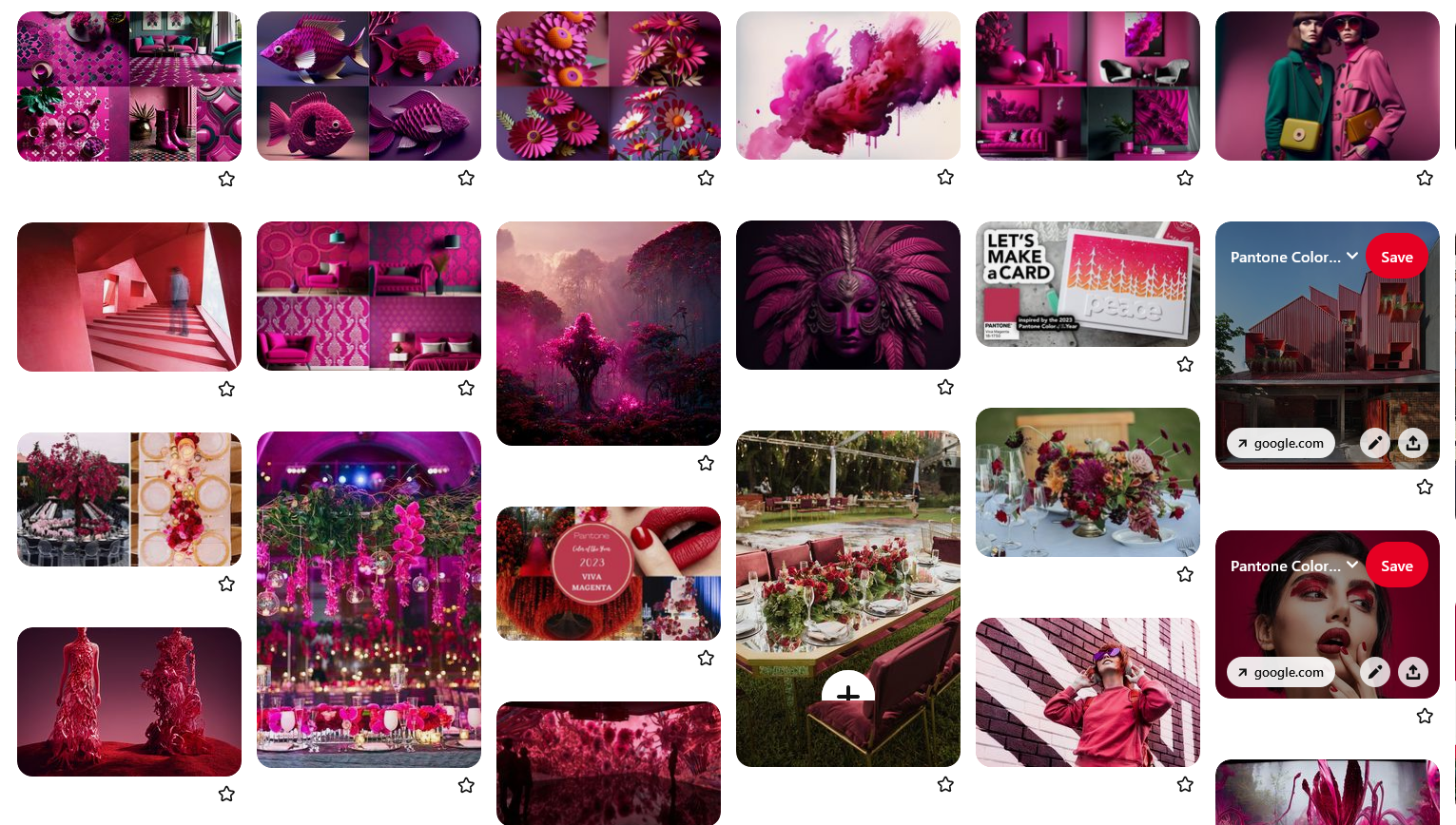
Check out GCU’s special Viva Magenta Pinterest Mood Board
Read all about Magenta’s Bloody Past:
The color magenta was first created in 1859 by the French chemist François-Emmanuel Verguin, who was trying to make a new dye. He mixed fuchsine, a red dye, with aniline, a colorless solvent, to create the color, which he called “fuchsine rose.” This color was later renamed magenta, after the Battle of Magenta, which took place near the Italian city of the same name. In this battle, which was part of the Second Italian War of Independence, the French and Sardinian armies defeated the Austrians. The color was used to celebrate this victory, and it became associated with the French and Italian nationalistic movements of the time. Today, magenta is widely used in various industries, including fashion, art, and design.
Magenta is a vibrant, reddish-purple color that is often associated with creativity, energy, and passion. It is commonly used in fashion, art, and design, and it has been featured in a number of high-profile events and projects over the years. One famous example of the use of magenta is the cover of the Rolling Stones’ album “Tattoo You,” which features a bright magenta background with the band’s name written in white. Magenta has also been used in a number of movies and television shows, including the popular series “Stranger Things,” in which the character Eleven is often seen wearing a magenta dress. In addition to these uses, magenta is also often used in branding and advertising, as it is a color that is attention-grabbing and stands out from the crowd.

Magenta in the field of Optics:
In the field of optics, magenta is one of the three primary colors of light, along with green and blue. These colors are used in various technologies, including televisions, computer monitors, and smartphones, to produce a wide range of colors. When light is shone through a prism or other device that can break it up into its component colors, the spectrum of visible light is produced, with red on one end and violet on the other. Magenta is located between red and violet in this spectrum. In display technologies, the primary colors of light are used in combination to create a wide range of colors. For example, in a television or computer monitor, the pixels are made up of tiny red, green, and blue lights, which can be combined in different ways to produce a wide range of colors. By using magenta, green, and blue light in this way, it is possible to produce a wide range of colors on a display.
In conclusion, whether you love it or hate it, there’s no denying that magenta is a memorable and impactful choice for the Pantone color of the year.


