Dash of Inspiration: Vertical Text Etiquette
A Dash of Inspiration, A Cup of Creativity by Doreen
Vertical Text Etiquette

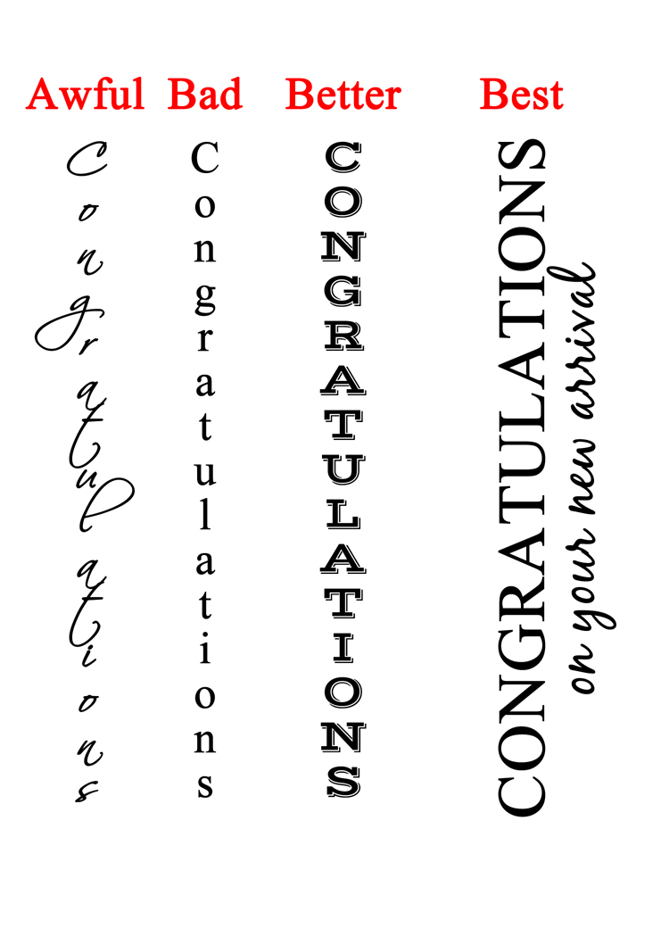
Today I realized there were two areas of typography we have not touched on yet, one of them is vertical text. How to use it on greeting card images while still pulling off a professional design that will hold strong in the public marketplace. There are some really simply things to avoid, many sadly are seen prominently on old designs at GCU prior to the implementation of their submission guidelines.
When creating vertical text, keep these thoughts in mind:
- Never use script fonts, they are illegible.
- Never use italic.
- Letters are designed to sit side by side not on top of one another, therefore mismatched spacing and alignment causes will create readability problems.
- Never use lower case letters, these are awkward because the ascender and descenders make the spacing appear uneven and the varied size of the characters create the visual of a stack which looks precarious.
- Don’t overdo it. As with all typography ‘effects’ a little goes a long way. Do not create multiple lines of vertical text, or even multiple words on the same line.
To create vertical text as an accent in your design following these simple tips:
- Always use upper case letters.
- Choose a block style font for the best chance at having it look stacked and spaced evenly.
- Only choose one word to feature as vertical text unless you use the rotation method.
- Avoid vertical text all together by choosing a more professional look which is to simply rotate your text rather than stacking it.
If you have fallen victim to this poor typography choice, you may want to go fix those old cards on GCU and bring them up to current standards which will meet the submission guidelines.
Next week we’ll talk about text alignment. So, until then … Learn … Create … Inspire!


