Dash of Inspiration: Typography – Legibility
A Dash of Inspiration, A Cup of Creativity by Doreen
Typography: Legiility

Let’s keep this series going by moving into the TYPOGRAPHY grouping of the Submission Guidelines, and next up is:
TYPOGRAPHY: Legibility
The Submission Guidelines state this:
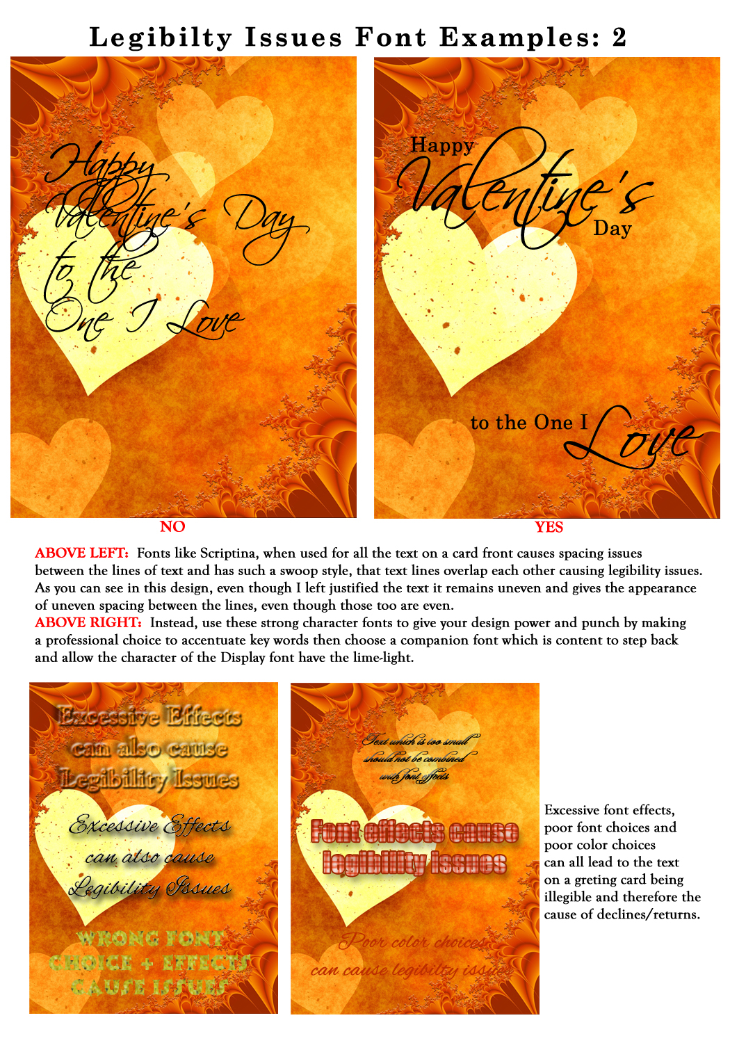
Occasionally there’s a need for a font that screams character, often referred to as Display typefaces, which includes everything from Comic Sans and bunny fonts to the Scriptina font. Applied sparingly these fonts can add a much-needed dash of spice or elegance to a design, but they can quickly become obnoxious if used throughout the design. Greeting card fonts need to be clearly legible. Declines may include, but are not limited to: text which is too small, written over cluttered areas within the image and/or text which overlaps other text, etc.
It may seem at first glance that legibility and readability are the same thing, but they are not.
Legibility refers to the design of the typeface, as in the width of the strokes, whether or not it has serifs, the presence of type design elements etc. It is easy to tell one letter-form from another in a legible typeface. For instance, decorative typefaces have low legibility because they are primarily meant to be seen at a glance, rather than read at length.
Conversely, typefaces designed for books and newspapers have very high legibility. You need to design the overall legibility based on the function of the text within your design. It seems like an obvious issue for GCU to have in the guidelines and one which none of us should ever be caught doing, but there are many artists who still make these mistakes and their cards may soon be tagged for decline or return due to legibility issues.
- As a general rule of thumb, if you can’t clearly read the text in the large view, it’s too small and therefore not marketable. If a customer can’t read the text, they won’t buy the card.
- When you need to keep the text small, due to space issues, consider staying away from script and/or decorative fonts. Stick with a font that works well in small print such as Sans-Serif and Serif font families like these: Century, Georgia, Times Roman, Arial, and Tahoma which all work well in small type.
- NEVER slap text across the face of a photograph or through any important element within the artwork or photo. Not only does this cause legibility issues, but it’s overall appearance is unprofessional and will get your cards declined. ALWAYS find a way to add the text to your card front which looks intentional and is clearly legible.

- Use fonts which scream character as accent points within your design, never use them for all the text on a design. They become difficult to read and overwhelm the card with chaos. Go back and review Font Combinations and make a good choice in your design to show a bit of character rather than overpowering your design with decorative text.
- Just because a font’s funky character works well for your imagery does not mean that it will be legible, so be careful when making your font choices. Choose typefaces with conventional letter-forms. Fonts composed of unique shapes, artistic deformations, excessive ornamentation or other fancy design elements cause the reader to have to process what they are looking at first, instead of just taking in the message. Artistic choice should never come at the cost of immediate comprehension in a greeting card design.
- Using fonts with strong character traits, such as Scriptina, can also cause issues with text alignment and spacing, both of which cause further issues with both legibility and balance within your design. Readability is the dynamic interaction of the font’s style, size, tracking, leading, color and other properties all of which combine to give the viewer one overall impression. They should all add up to a typographic style which has a strong degree of readability. In most cases, communication comes before style, so resolve readability first.
- Always be careful when choosing ‘font effects’, they can cause legibility issues, particularly when used in excess and/or when used with small type. Font effects will be touched on in detail next week, but these include shadow effects, beveling, and adding style presets.
- Contrast is one of the most critical factors in enhancing the visual aspects of your design. Text should be placed with the best possible contrast. For many older people light lettering—either white or light yellow—on a dark background, usually black, is easier to read than black lettering on a white or light yellow background.
- Leading (Space Between Lines of Text) – The recommended spacing between lines of text is 1.5, rather than single space. Many people who are visually impaired have difficulty finding the beginning of the next line when single spacing is used.
- As with any form of creating, break the rules ONLY after you completely understand the rules. Knowing the basics will help you make intelligent choices about what rules to break and how to break them.
Next week we’ll continue on our Typography journey into Font Effects . Till next week, I hope I’ve inspired you to go look through your store and see if you can weed out any images that the reviewers will find during their weeding which might fit TYPOGRAPHY: Font Legibility declines. Now’s the time to improve those card fonts before the weeding team declines them for the reasons we’ve talked about.
For great resources & tips visit the SalonOfArt


Thank you, Doreen! Another great and helpful article!
Another helpful article. Thank you!
Thanks for stopping by Steppeland and Tracie! Glad it was helpful to both of you.
Doreen