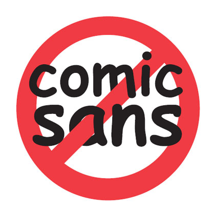
Tips and Tricks: Comic Sans
Today, we’re talking about one of the most maligned fonts out there … Comic Sans. Why is this font so despised? Short answer, because it’s been overused and abused for too long and there are many more fonts out there that have more style. If you want the long answer, check out the history of Comic Sans.
Comic Sans is one of the fonts offered at GCU, probably because it’s inoffensive and commonplace. However, for your front of card designs, the last font you should be using is Comic Sans. There are many other sans serif type fonts, many free for commercial use, that are better. However, if you choose to use Comic Sans – while a poor design choice – it’s your decision to make.
Recently, an artist received a Decline on a card. The font used on the front was Comic Sans. This has created some question as to whether GCU Reviewers are now commonly rejecting cards using Comic Sans and even some artists have expressed fear that older cards using Comic Sans will now be Returned for Edits or deleted from stores.
Don’t panic.
GCU has no official standing against Comic Sans in the Submission Guidelines.
We’ve spoken to Mindy (a GCU Administrator) who assures us there is no policy against Comic Sans and Reviewers are not routinely rejecting cards using this font. Just be certain any card designs you create are marketable and appealing.
If you’d like to have alternatives to Comic Sans, here are a bunch of commercial free Sans Serif fonts you can download and add to you designer’s toolbox.


Thank you for this clarification, and for the resource for replacement type fonts.
The word “awesome” is right behind the font “Comic Sans.” Anything overused makes it to the top of the annoying list. Thanks for the font link and this post. I love the site!