Dash of Inspiration: Typography Terms
A Dash of Inspiration, A Cup of Creativity by Doreen
 Typography Terms
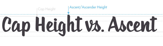
Last week, I ran across this great reference tool of Typography Terms and found it so useful, I wanted to pass it on in the hopes some of you might also find it handy. The visual examples and short, sweet definitions make it so much easier to remember how each of these terms apply when I’m designing.
10 Typography Terms Every Designer Should Know
If you are new to greeting Card Design at GCU, or an old pro who wants a little fresher now and then, be sure to bookmark the GCU Community Blog for all our Typography tips:.
Since we’re on the subject, here are a few font specials going on right now you might like to take advantage of:
The Wallington Typeface by Zeune Ink Foundry
Heroe Std by Lián Types
Mr Chalk by Thinkdust
Don’t forget, if you’re looking for great fonts, our blog posts over the past few years are filled with wonderful font choices and many of them are free.
So until next week … Learn … Create … Inspire!


Thank you for sharing this–I found the part in the article describing the difference between serif and sans serif helpful. I had read about it before, but never quite understood. Now I finally get it.
You’re welcome Tracie, glad to hear it was useful to you!
Thanks Doreen. As always the information you share is so useful. Appreciate your expertise and candor.
Kati