Nuts and Bolts: Text Capitalization

Nuts & Bolts: Text Capitalization
A short phrase or one line of text on the cover of a greeting card for the most part serves as a title or an introduction to a story. It should be pleasing to the eye and work with the overall composition. Aside from typographic considerations your use of capitalization plays into the composition and balance of elements of your design. The use of upper and lower case letters can make or break your cover design. So let’s talk about capitalization.
Below are some basic tips that the Review Team will look for you to consider in your designs and will be applied on a card by card basis per the overall composition.
Sentence Case: this is what’s used in everyday writing, only capitalizing the first letter of the first word in a heading – like you would in a sentence. Proper nouns also have a capital.
For example:
My love for you is never-ending.
Title Case: This is a vexing matter, and policies vary. The usual advice is to capitalize only the “important” words. But this isn’t really very helpful. Aren’t all words in a title important?
The following rules for capitalizing titles are virtually universal.
. Capitalize the title’s first and last word.
. Capitalize all adjectives, adverbs, and nouns.
. Capitalize all pronouns (including it).
. Capitalize all verbs, including the verb to be in all forms (is, are, was, has been, etc.).
. Capitalize no, not, and the interjection O (e.g., How Long Must I Wait, O Lord?).
. Do not capitalize an article (a, an, the) unless it is first or last in the title.
. Do not capitalize a coordinating conjunction (and, or, nor, but, for, yet, so) unless it is first or last in the title.
. Do not capitalize the word to, with or without an infinitive, unless it is first or last in the title.
Otherwise, styles, methods, and opinions vary; for instance, certain short conjunctions (e.g.,as, if, how, that) are capped by some, lower cased by others.
For example:
All Caps, not ideal: Grandpa, I Wish You Only The Best On Your Special Day
Upper & Lower, ideal: Grandpa, I Wish you only the Best on your Special Day
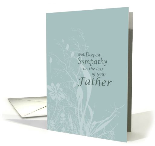
A tasteful design by Sandra Rose where the “less important” words are in lower case:
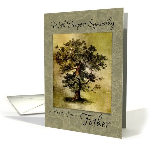
and similarly by Marcee J. Duggar:
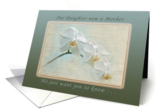
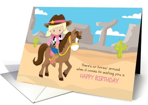
A nice example by Michael Peychich with title case in the upper text and sentence case in the lower text:
The use of ALL CAPS can add interest and emphasis but should be used with great care and intent as they can be overpowering and be perceived as SHOUTING. The font style chosen when using all caps is also a consideration on the mood that is sets. A script font, for example, does not lend itself to all capital letters.
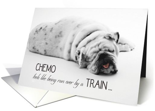
This card by Barbara Schreiber is well done, with select words in all caps for emphasis and a light font chosen for lower case text providing balance, (here is a great post on pairing fonts):
and another nice example by Liz Van Steenburgh:
Special Note: While your Card Title provides valuable data to search engines GCU also displays them on the site. Card Titles are in fact just that, titles. Shoppers are put off by a title that looks like a jumble of keywords and therefore proper upper and lower case lettering should be used for a consistent and professional look for shoppers.
Incorrect Title: cute green cat in a box birthday for cat lover
Correct Title: Birthday for Cat Lover a Cute Green Cat in a Box
Put as much thought into your use of capitalization as you do into choosing a font style and colors. They are all important elements into your overall design. The difference is made in the details.


