Say Less, Mean More (Part Two).
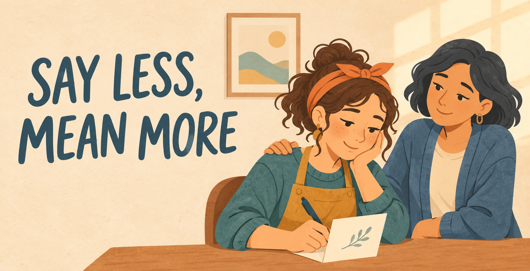
A Practical Guide to Quiet-Support Cards
In Part One, we explored cards for the difficult in-between moments: the long illness, the exhausting wait, the grief anniversary, the overwhelmed friend and the caregiver everyone assumes is coping.
Now comes the difficult part for the artist: what do we actually put on the card?
Quiet-support cards require a light touch. Too much optimism can feel dismissive. Too much solemnity can make a personal difficulty feel like a funeral. A vague message may say almost nothing, while an overly specific one can presume far too much.
The goal is not to write the perfect answer. It is to offer recognition without adding pressure.
Begin by Removing the Recipient’s Homework
Some familiar phrases are kindly intended but can quietly hand the recipient another job.
“Stay strong” asks them to perform strength.
“Keep smiling” asks them to look happier.
“Everything happens for a reason” asks them to find meaning before they may be ready—or implies that suffering is somehow necessary.
“Let me know if you need anything” asks an exhausted person to identify a need, decide who can meet it and make the request.
“You’ll be back to normal soon” makes a promise that may not be possible.
None of these phrases is always wrong. Context and relationships matter. But when we are designing for an unknown customer and recipient, low-pressure language is often safer and more useful.
Try messages that ask for nothing:
- No need to answer. I’m thinking of you.
- You don’t have to be brave with me.
- There is no correct way to get through this.
- I haven’t forgotten.
- I’m here for the messy middle, too.
- Sending company, not advice.
- Today is allowed to be difficult.
- I wish I could make it lighter. Since I can’t, I’ll help you carry it.
- You are allowed to be tired of being strong.
- This card comes with no expectations attached.
Make the Message Specific Without Diagnosing the Recipient
Specific cards are easier to find and more meaningful to send. However, specificity should describe the situation without telling the recipient what they feel.
Instead of:
I know exactly how heartbroken you are.
Try:
I know this day may carry a lot. I’m thinking of you.
Instead of:
You must be terrified while you wait for your results.
Try:
Waiting for answers is hard. You don’t have to wait alone.
Instead of:
You’re an amazing caregiver and so strong.
Try:
You give so much of yourself. I hope you feel how deeply you are appreciated.
The second versions leave room for the recipient’s actual experience.

Give the Front and Inside Different Jobs
A strong card front creates recognition. The inside completes the emotional thought.
Here are several structures GCU artists can adapt.
The Quiet Declaration
Front: Still here.
Inside: On the ordinary days, the difficult days and the days when you don’t want to talk.
The No-Pressure Card
Front: No reply required.
Inside: This is simply a small reminder that you are loved.
The Difficult Anniversary
Front: Some dates carry more than others.
Inside: I remembered. I’m thinking of you today.
The Waiting Card
Front: For the space between knowing and not knowing.
Inside: I’m beside you while you wait.
The Caregiver Card
Front: For the one who keeps showing up.
Inside: I see how much you carry, including the parts no one else notices.
The Chronic-Illness Card
Front: No miracle cures enclosed.
Inside: Just love, belief and company—with no expiry date.
The Overwhelmed-Friend Card
Front: You may remain unavailable.
Inside: Our friendship is not a subscription you forgot to renew.
Move Beyond Flowers and Sunsets
Nature can be beautiful and appropriate, but quiet support offers much more visual territory.
Consider:
- Two mismatched characters sharing a bench
- A small light left on in a window
- An animal keeping watch beside a sleeping companion
- A snail matching someone else’s pace
- A character holding an umbrella without trying to stop the rain
- A cup of tea placed quietly outside a closed door
- A boat anchored safely while the water remains rough
- Two ghosts sitting together in companionable silence
- A knight temporarily putting down her armour
- A tangled thread with one loose end gently held
- A tiny creature carrying one corner of an enormous load
- A fantasy guardian keeping watch outside a cave
- An unqualified but determined animal running the “support department”
Colour can help set the emotional volume. Muted blue, moss green, warm grey, dusky violet and soft ochre can feel calm without becoming colourless. A small area of warm light can suggest care without promising that every cloud is about to vanish.
The standard GCU card format is all you need. The emotional effect comes from the front illustration, composition, colour and the relationship between the front message and inside text—not from special finishes or paper engineering.
Yes, Quiet Support Can Be Funny
Some people reach for humour precisely when life is difficult. A funny support card can provide a moment of relief without pretending the problem is amusing.
The distinction matters: the joke should recognise the awkwardness, helplessness or devotion of the sender, not make the recipient or their situation the punchline.
The Blanket Fortress
Front: A character peering suspiciously from an elaborate nest of blankets.
Inside: I have brought snacks and no follow-up questions.
Communications Disabled
Front: A cat sitting squarely on a telephone.
Inside: No need to call. The cat has disabled communications.
The Slow Response Team
Front: A determined snail carrying a tiny first-aid kit.
Inside: I came as quickly as emotionally possible.
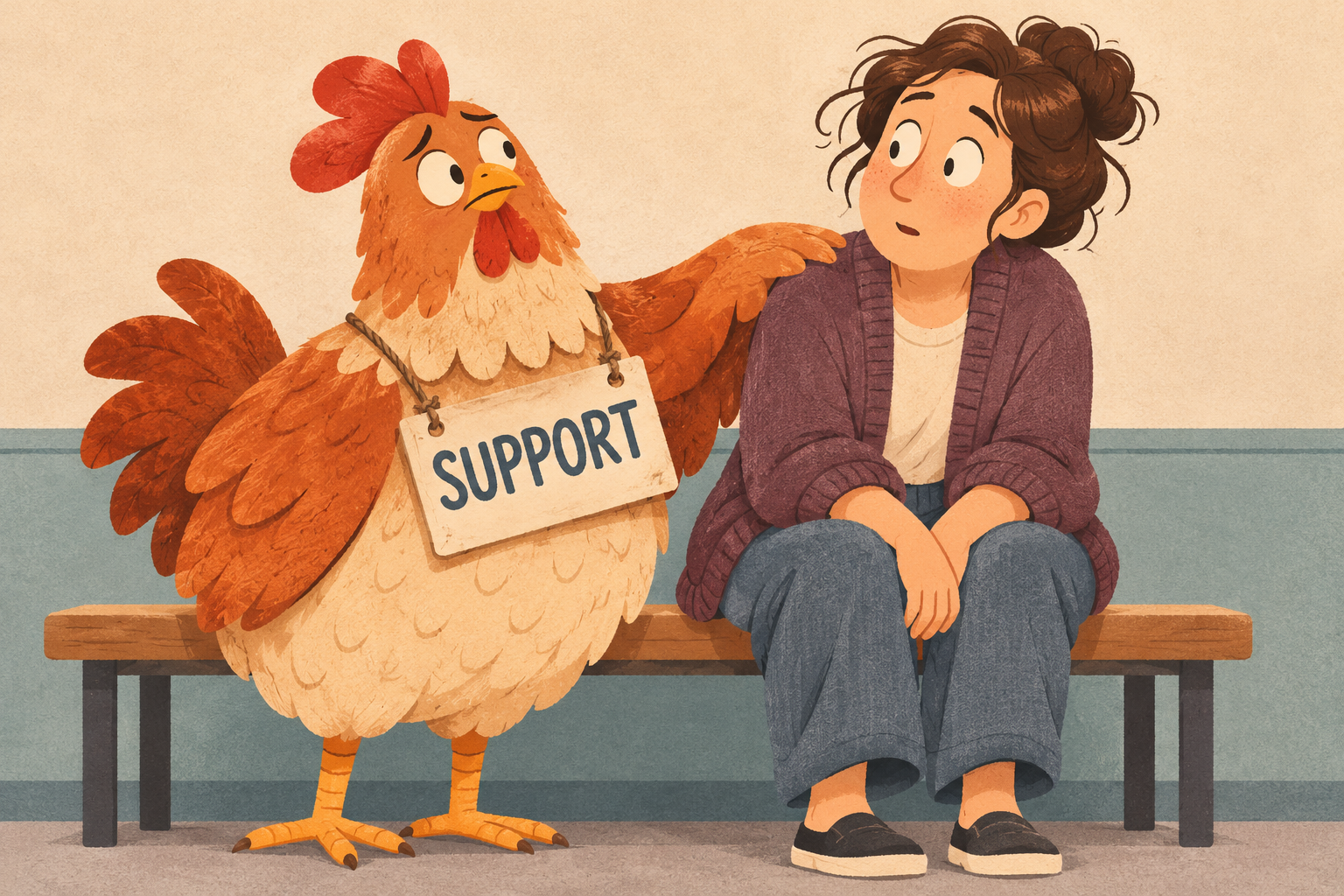
The Support Chicken
Front: A bewildered chicken wearing a crooked badge marked SUPPORT.
Inside: I don’t know what to say, but apparently I’m staying.
The Advice-Free Zone
Front: A dragon guarding a pile of unwanted self-help books.
Inside: I have protected you from advice. You’re welcome.
The Emergency Friend
Front: A tiny knight arriving with a dented shield, biscuits and no visible plan.
Inside: I cannot fix this, but I did bring provisions.
This gentler kind of humour can work especially well for close friends, siblings, adult children and people who would feel uncomfortable receiving a very solemn card.
Build Small Collections, Not One Universal Card
One design should not try to cover illness, grief, divorce, caregiver fatigue and every bad week imaginable. A small coordinated collection can be much stronger.
For example, an artist might create a six-card Still Here collection:
- No Reply Required — for an overwhelmed friend
- While You Wait — for tests, results or uncertain news
- I Remembered Today — for a grief anniversary
- For the One Who Carries So Much — for a caregiver
- No Advice, Just Company — for a difficult period
- Still Here — for long-term illness or ongoing support
The cards could share a palette or recurring pair of characters while using different situations and wording. This makes the collection visually recognisable without forcing every emotional need into the same generic message.
A Final Five-Question Check
Before publishing a quiet-support design, ask:
- Does the message acknowledge the situation without claiming to understand it completely?
- Does it avoid promising that everything will improve?
- Does it place an emotional obligation on the recipient?
- Could it feel dismissive if the difficulty continues for a long time?
- Does the artwork offer companionship rather than compulsory cheerfulness?
Question three is deliberately phrased as a trap. If the answer is yes, look again at the wording. Does the recipient have to reply, smile, stay strong, be grateful or reassure the sender? If so, the message may need one more edit.
The Smallest Honest Promise
Artists often feel that an important card needs an important statement. Quiet-support cards prove otherwise.
The strongest promise may be the smallest one we can honestly make:
I cannot fix this. I will not pretend it is easy. I am still here.
That message will not suit every difficult occasion or every recipient. But for the customer searching for words that do not overpromise, advise or disappear behind a cheerful cliché, it may be exactly the card they hoped to find.
Happy Designing!
Corrie


