Skip to content

Nuts and Bolts: Dedicate Yourself to the Details V

September 14, 2018

nuts-and-bolts-head

Nuts & Bolts – Dedicate Yourself to the Details V
 
Dedicate yourself to the details.  Strive for quality.  Create a design and work it a few different ways to see what looks best.  The same goes for a verse.  Let the words flow and take it a few different ways, then boil it down to one that resonates best with the image and occasion.


The majority of people do not hit the nail on the head on the first try.  You should let concepts and designs marinate.  Give them ample time and attention to be the best that they can be.  Get feedback from others as well.  Sometimes we’re too close or married to it to be objective.


Here is a wonderful example of a re-worked card by artist Angela Castillo of FairyGirlCards, dedicated to improvement, marketability and attention to detail:


Before:

The reviewer’s request:


1. ELLIPSIS USAGE – The correct punctuation when using an ellipsis is to leave a space after the last word and before the ellipsis, or vice versa at the beginning of a continuation of a sentence. For example ”I was just thinking … ” or ”… about your birthday” Including a space in between each mark ”. . .” as well as no spaces in between ”…” are both allowable and most importantly ellipses ALWAYS consist of exactly 3 marks – no more, no less. If you end your cover verse with an ellipsis you should begin your inside verse with an ellipsis as it indicates that the card front sentence finishes on the inside verse. An ellipsis should not be used to continue a sentence that both starts and ends on the card front. Lastly note, the first word following an ellipsis, and the required space, should begin with a lowercase letter unless the first word is a proper name or the pronoun I.  Please see https://gcucommunity.com/2016/02/19/nuts-and-bolts-punctuation-ellipsis-abused-misunderstood/ 

2. TYPOGRAPHY – Text Placement
https://gcucommunity.com/2013/06/24/dash-of-inspiration-typography-text-placement/ The text on this card lacks professionalism, therefore no longer meets our marketability standards. Please be sure your font choice, font color, text placement, text effects and legibility of the text are all up to our marketability standards. For examples and tips, visit these links: https://gcucommunity.com/?s=typography

Please edit your cover text and re-submit for our re-review. Thank you.

After:


Well done, Angela! With the shaded text box, the cover text really shines and is so much easier to read.


The difference is made in the details!


Mindy
GCU Community Manager


Wanted New Cards: Loss of Mother during Childbirth

September 13, 2018

wanted new cards head

Wanted Cards: Loss of Mother during Childbirth


Surprisingly the maternal mortality rate in the U.S. is quite high. It is a horrible thought but it’s a reality.  Moms die during childbirth for a variety of reasons.  There are instances when the baby survives, and times when the baby does not survive.  Friends and family struggle to find the right words during such a time of profound grief and loss.


Greeting cards with an extra special caring touch will help people find the right words to reach out and extend comfort and concern to those impacted.

Please consider creating cards for the following new categories with all of them having many relation specific subcategories:


Please do some research online about the issues, emotions and desires of bereaved family members during these difficult times.  There are many good resources like this article on maternal mortality and this on dad raising quads.


IMPORTANT NOTE:
Please use great care and sensitivity creating these cards.  The reviewers will be accomodating on verses and not require them to be so literal as long as they speak to the occasion, sentiment and relation accordingly.


Freebie Wednesday: Wild Creatures Font

September 12, 2018

Freebie Wednesday:


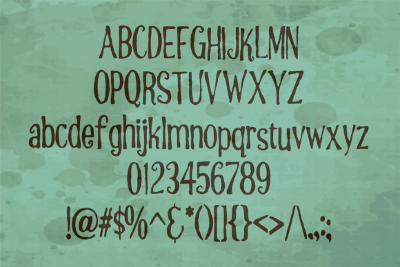
Wild Creatures Font (designed by Ana’s Font) is a beautiful brush font and totally free for the rest of this week!


This product comes with a complete commercial license.


Rainbow Connection: Pantone Color Trends Spring/Summer 2019 (part 1)

September 11, 2018


Each season the team at the Pantone Color Institute creates the Pantone Fashion Color Trend Report; a color overview highlighting the top colors fashion designers showing at NY Fashion Week will be featuring in their collections for the upcoming season. With color on the catwalk a key indicator of the color stories we can expect to see showing up across all areas of design, the Pantone Fashion Color Trend Report is your easily accessible guide to the season’s most important color trends.

PANTONE 15-1264
Turmeric
Turmeric is an enlivening orange that infuses a hint of pungency into the palette.

PANTONE 16-1546
Living Coral
Living Coral is an affable and animating shade whose golden undertone gives it a softer edge.


PANTONE 18-2045
Pink Peacock
The tantalizingly theatrical Pink Peacock fans out to a feast for the eyes.


Nuts and Bolts: Update Winter Holiday YEAR specific cards

September 7, 2018


Nuts & Bolts – Update Winter Holiday YEAR specific cards 
 
Winter holiday card sales have already begun.  Do you offer Year Specific designs?  Be sure not to miss out on sales or worse, have your card taken offline because you’ve neglected to update it for the new year.
 
Not only should images be updated but also card titles, keywords and artist notes.  This even applies to custom front designs to make them more marketable and avoid shopper errors.


Please take the time now to update your designs before 9/17.  After 9/17/18, GCU will take any outdated cards offline.
 
Christmas cards should reflect the current year (2018) and New Year cards should reflect the coming or new year (2019).
 
TIP: A quick way to pinpoint the bulk of your related cards is to search your storefront entering in the search box “<holiday name year>” ie: “christmas 2017”, “new year 2018”.


The difference is made in the details!


Mindy
GCU Community Manager

Wanted New Cards: Specific New Home Congrats

September 6, 2018

wanted new cards head

Wanted Cards – Specific New Home Congrats
 
GCU offers many new home congratulations cards.  With many people purchasing second homes, downsizing or different scenery we have added many subcategories for specific new homes.


Please consider creating cards for these new subcategories:


>> New Country Home
>> New Lake House
>> New Beach House
>> New Fixer-Upper Home
>> New Home Abroad
>> New Vacation Home


We’d like you to create at least one card for these categories using the Stock Cards function (Bigstock) or your own graphic designs.

Remember, when you’re submitting your new card, add a little note about the intended category in your Notes to Reviewers. Be inventive,  be clever, be creative. Go for it!

Freebie Wednesday: Autumn Spice Font

September 5, 2018

Freebie Wednesday:


Autumn Spice Font (designed by On The Mark Designs) is this weeks free font on offer at The Hungry JPEG. Don’t wait too long, the offer expires in 6 days!


This product comes with a complete commercial license.


Rainbow Connection: Sage

September 4, 2018


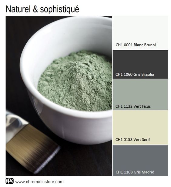
Sage is a grey-green resembling that of dried sage leaves. As a quaternary color, it is an equal mix of the tertiary colors citron and slate (both confusingly also known as olive in different sources). The hex RGB color value of the Sage swatch at right is BCB88A. (source: Wikipedia)


Dash of Inspiration: September 2018 Design Challenge

September 4, 2018
  • DashInspirationBanner_2015

Remember that great color of the year from Pantone© in our January Challenge? It’s back, only this month it will become the feature of your Holiday Season designs ………………………………………………………………

Theme: Ultra Violet Holiday Season

Requirements:

  • The Ultra Violet Pantone© color of the year for 2018 must be primary in your imagery. Color of the Year for 2018 PANTONE© 18-3838 Ultra Violet
  • Write your own verse/message, be creative and write a message that clearly speaks to your imagery, the holiday category and recipient.
  • Blank verse will not be considered for entry in this challenge.

……………………………………………………………

Entry Deadline: Sunday, September 30th

……………………………………………………………

How to Enter: Post the PID (card number) and the URL (public storefront link – please WAIT for the card to be available in the public marketplace, please DO NOT post a link to your Manage Cards area) as a post in the challenge blog. We’ll forward your entry to the jury.

……………………………………………………………….

Category:

Any Christmas category that is well-suited for your Ultra Violet Color of the Year design.

…………………………………………………………….

Rules:

  • Submission must meet GCU’s Submission Guidelines and be Approved through the usual Review Cycle– Fast Track your submission with this in the Notes to Reviewer: September Design Challenge Submission here is the link to the blog post: (include THIS blog post URL)
  • Only ONE card per artist per challenge.
  • Submissions must be NEW, no existing designs.
  • Your entry must meet the Challenge Requirements and Theme or it will not be included in the challenge.
  • Stock Card Creations entries will not be accepted.
  • Your designs should differ from those already offered in the category of your choice to offer shoppers a variety of choices, not more of the same.

……………………………………………………………………

BLIND Judging: We hope each of you enters every month. Entries are submitted anonymously for judging by the GCU Challenge Jury which means that before and during the challenge, judges do not have any way of knowing what artist is behind each entry. This eliminates any and all concerns with ‘favoritism’. Results will post on the Community Blog. The jury will judge the entries on the following criteria:

  • How well the card meets the Challenge Requirements and Theme.
  • How well the card speaks to the Category the artist chooses for the card submission.
  • Creativity, Execution and Marketability.

……………………………………………………………………

Winners: 1st Place:

  • The winning designer’s card and store will be featured on the GCU Public Blog the blog which customers view and follow.
  • As well as featured on the GCU Public Facebook Page nearly 56,000 followers, now THAT’S exposure!
  • The winning card will be Design of the Day following the announcement of the winners (within 48-hours).

    EXCEPTION: Horizontal (landscape) cards may not be featured as DOD due to GCU Home Page space restrictions. In these cases, GCU will choose a different vertically oriented card from your store to feature as DOD. Thank you for your understanding and apologies for this limitation.

  • The winning card will be added to the Greeting Card Universe Design Challenge Winners Pinterest Board – currently GCU’s Pinterest Page followers: 2K!
  • The winning card, should the artist choose, may be referenced in a new series by the winning artist and he/she may Fast Track all cards in the new series (being sure to give the Challenge URL and winning card PID in your Notes to Reviewer for each card in this series).
  • Winning card will be included in a marketing email to over 100,000 customers!
  • NEW starting this month, GCU will create a Meet the Team board for the winning artist under the Pinterest GCU account where the winning artist will be able to pin and promote her own storefront and all that makes them a unique card designer and one of GCU’s artistic community team member.
  • Winning card will be posted on GCU’s Instagram with 2,000 followers and counting!
  • GCU will create a Meet the Team board for the winning artist under the Pinterest GCU account where the winning artist will be able to pin and promote her own storefront and all that makes them a unique card designer and one of GCU’s artistic community team member.

2nd Place:

  • Your submission will be Design of the Day the following week of announcing the Challenge winners (within 7-days).

    EXCEPTION: Horizontal (landscape) cards may not be featured as DOD due to GCU Home Page space restrictions. In these cases, GCU will choose a different vertically oriented card from your store to feature as DOD. Thank you for your understanding and apologies for this limitation.

  • Your card will be added to the Greeting Card Universe Design Challenge Winners Pinterest Board.
  • Winning card will be included in a marketing email to over 100,000 customers!
  • Winning card will be posted on GCU’s Instagram with 2,000 followers and counting!

………………………………………………………………………

Tips:

Check out these tips, tricks, freebies, and tutorials from our own GCU Community Blog which might be helpful in this month’s Challenge.

pantone-color-of-the-year-00-1512592323

Color of the Year for 2018 PANTONE© 18-3838 Ultra Violet
HEX #645394 | CMYK 72, 77, 11, 1 | RGB 100, 83, 148

Color of the Year for 2018 PANTONE© 18-3838 Ultra Violet

………………………………………………………………………

Be inspired to create and learn something new!

Nuts and Bolts: Be Encouraged, Not Discouraged

August 31, 2018

nuts-and-bolts-head

Nuts & Bolts – Be Encouraged, Not Discouraged
 
We are pleased to bring you a guest post by GCU artist Trudy Wilkerson of Trudy’s Impressions.  Trudy shares her recent experience of having her GCU store re-reviewed.  Here she shares some excellent insight into her 10 year journey with GCU, how she regrouped and reflected after the storewide re-review, and some encouraging words.


Trudy shares …

I began my journey with GCU in December of 2008.  At that time, I knew zilch about designing greeting cards.  I had recently retired from selling real estate after 27 years and knew I had to find something where I could work from home and make money.   Better yet, finding something that would allow me to get my creative juices going and enjoy designing right from my home. That’s when I discovered GCU and knew it would be a perfect fit.

I remember to this day how I felt when my very first card was sold.  I was ecstatic thinking someone would actually want to buy one of my cards.  Going forward, I self-taught myself on a daily basis the ins and outs of what flies and what doesn’t and began educating myself in designing and learning a host of different programs to help assist me in my new efforts.   At the beginning of 2018 I managed to grow my stock to around 5,000 give or take. However, when I would look back at my designs during the early years especially, I would literally cringe and ask myself, which is better to have in my store, quantity or quality.  The answer, of course, was quality. I knew I had to be pro-active and do something to weed out and/or correct many of my older cards.

Then out of the blue GCU’s reviewers notified me that they were going to begin a long process of reviewing my cards from day one and literally clean house. The house cleaning began.  Card after card, thousands of them went through the review process. Many cards were simply deleted and many they gave me the opportunity to redesign using different fonts and making the images more interesting.  Also, during that time of restoration of my store, I was able to revisit the keywords, descriptions and last but not least, improve the verses.

Although this was an enormous undertaking on my part, it gave me such a lift knowing I was making changes for the good and that the outcome would be advantageous for me which would result in future sales.

Allow me to share with you a few things and tips I learned from our hard-working reviewers.

  1. They really do know what they are talking about.

  2. We shouldn’t be insulted when they return the card for edits.

  3. Take advantage of their suggestions and advice.  (There were times when I thought it looked great the way it was, but still changed it as per their request only to discover they were right, it did look better.)

  1. Know that they have your best interest at heart and want you to succeed.

  2. Don’t hesitate to ask them questions if you are not quite clear on what they want.

  3. Lastly, realize that they too are going through that long process with us while making sure our cards look the best they can be.

I am a firm believer is this quote: Anything worth having is worth working for!

Hopefully, what you can take away from that quote is simply, your hard work will pay off for you.  Don’t get hung up on looking for excuses why your cards are not selling as well as you hoped for but instead look for resolutions to improve them which will lead to better sales

My advice to those of you who are going through this long somewhat laborious process and also to those who will be doing the same in the near future, is simply this:

Be encouraged by this opportunity to revise your cards . . . NOT discouraged!

My Tips:

  1. Revisit the design and ask yourself, what does a buyer see when looking at this card?  Does it have something that sparks his interest? Is the color drab and needs a punch? Think like a buyer!  Would you want to buy it?

  2. Change the title if need be or simply make the tile a lot more interesting by changing the font, size and placement.  Those things make a huge difference in their appearance.

  3. Here’s a few before and after cards.  Even the slightest change can make a big difference

  1. Recheck your keywords and make sure they apply to the image.  Unfortunately, I was shocked when I reviewed many of my older cards where I found a limited amount of keywords and some were not even applicable to the image.

  2. Be sure your title really defines what the card is about.

  3. Be descriptive of the card under Artist’s Notes but don’t overdo it.

  4. Finally, the verse!  When I read the verses from my older cards, again I was in shock how cheesy they were.  Simplify them if they are too heavy.  Sometimes less is more. Perhaps the best choice is a simple but powerful punch-line.  However, some do require a verse that stirs the soul. What I try to do now is think when I’m writing a verse, what I would want to read in a card for me if it were from a husband, mother or my daughter.  Or what would I want to express to them. What would I want them to know? Write from your heart and you can’t go wrong

I’ll end with this:  By no stretch of the imagination do I feel I’m proficient in what I do but I’m hoping that perhaps I have encouraged you to strive to improve your designs by making them the best that  you can. GCU’s community of reviewers and artists are always there ready to help guide you. I wish you all much success as you continue to make magic with your designs.


The difference is made in the details!


Mindy
GCU Community Manager