Nuts and Bolts: Good Gets Great Before Making a Series.

Before I continue with this series I made a few adjustment. I darkened the background and brightened the type so it pops a little more. I also changed “stellar” to “awesome”. I figured more kids say awesome than stellar. I also got rid of the grain texture I thought it was too busy with everything else that’s going on and replaced it with a subtle circular pattern. On the inside verse I changed cluster to galaxy and spectacular to stellar. Can you please look it over and give me your thoughts.


Great job, Ron. As usual, your work is out of this world!
GCU Community Manager
Share this:

Wanted New Cards: From Realtor.
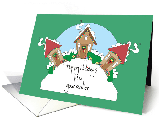
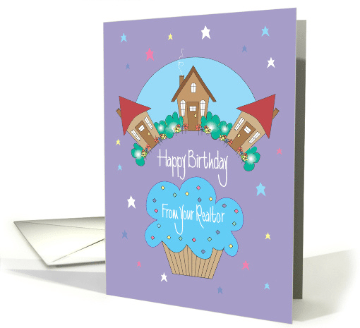
We’d like you to create at least one card for these categories using the Stock Cards function (Bigstock) or your own graphic designs.
Remember, when you’re submitting your new card, add a little note about the intended category in your Notes to Reviewers. Be inventive, be clever, be creative. Go for it!
Share this:

Freebie Wednesday – Watercolor Christmas Vectors
Freebie Wednesday:
Christmas is almost upon us and Freepik is offering a very festive and free stocking stuffer in the form of Watercolor Christmas vectors (a bit late for this year, but maybe for next year’s Christmas designs):


All items are free for commercial use.
Share this:

Rainbow Connection: Color Forecasts for Spring/Summer 2018

Here are some more Color Forecasts for Spring/Summer 2018


Share this:

Nuts and Bolts: 2017 Best Nine Instagram
GCU Community Manager
Share this:

Wanted New Cards: New Year’s from Pet.
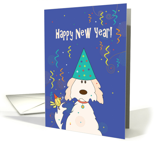
We’d like you to create at least one card for these categories using the Stock Cards function (Bigstock) or your own graphic designs.
Remember, when you’re submitting your new card, add a little note about the intended category in your Notes to Reviewers. Be inventive, be clever, be creative. Go for it!
Share this:

Freebie Wednesday – Festive Freebies!
Freebie Wednesday:
The Hungry JPEG has some festive Freebies for your design arsenal! (click on image to go to page)


All items are free for personal and commercial use!
Share this:

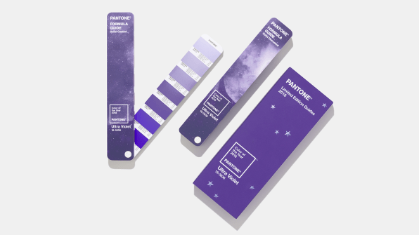
Rainbow Connection: Pantone Color 2018 – Ultra Violet
The official color of 2018 is a saturated, intense, blue-toned shade of purple called Ultra Violet, also known as Pantone 18-3838.

“Purple is a complex color,” says Lee Eiseman, executive director of the Pantone Color Institute. “We’re in a complex time; this is a complex color.”
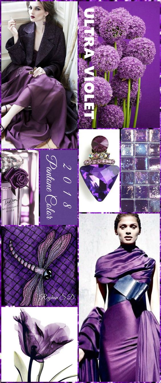
Purple, of all the colors in the spectrum, embodies this situation best, as Pantone explains. “[Ultra Violet] is a very provocative shade, but it’s also a thoughtful color–it sounds like a bit of an oxymoron,” Eiseman says. “This is the kind of color attached, historically, to originality, ingenuity, and visionary thinking. These are the elements we need to create a meaningful future. Inventiveness and imagination is something we seek in our personal lives and business worlds. People are looking for that ‘magic bullet,’ and this shade is the perfect shade to lead right into it . . . It’s intriguing, fascinating, and magical.”
Share this:

Nuts and Bolts: Annual Traditions in Design.
Today’s guest post comes from GCU artist Barbara Schreiber of BarbaraSchreiberCardstore and BarbarasWatercolorsCardstore. Barbara has created a new holiday card design featuring a bird or birds just about every year since she joined in 2008 . Such a wonderful tradition she has started for herself (and GCU). Shoppers tend to like a particular artist’s style and come back year after year to see what’s new, so adding fresh content for the same holiday is a great idea. Barbara sure isn’t resting on her laurels, she’s decking the halls with them!
From Barbara:
Creating a Christmas card with a bird each year was not planned. I have always loved birds and their fuzzy, delicate feathers (when they huff and puff and inflate their chests in the cold in order to remain warm) so in the beginning it was just a nice Christmas subject. Then the next year when I pondered about the upcoming Christmas designs, I thought – why not another bird? Since then I try to add one bird a year and it has become a tradition with me.
Has this become a seasonal tradition that you look forward to? Or is the pressure on if you’re not feeling inspired?
I still love birds and look forward to making my yearly Christmas design. If I am not feeling inspired, I browse the net, look at birds in the nature and inspiration then comes. I try to paint what I love, or what appeals to me. Birds are always great subjects, they range from cute-overload to serious subjects.
How early in the year do you start working on the next christmas bird?
I start working on Christmas designs during the summer holidays. I don’t like pressure and like to take my time thinking about designs and then painting them.
Any comments on the makings / inspiration in general or on any of the other specific christmas bird cards?
Being a German I love the traditional German Christmas, which is more muted than the American one. So nature, snow, quiet winter landscapes appeal to me as a Christmas design. I love vintage images, the feeling of how Christmas was a long time ago. I also like to try out something new – a new color, or technique, or point of view, so it never gets boring. The most important thing is that I create a design that appeals to me and that I enjoy making. If a design is halfhearted, it ends in the wastebasket.
Are the bird cards the only Christmas cards you create for the year or do you create different Christmas designs?
No, I create different Christmas designs. This year I also did a series of a flying angel with trumpet over Bethlehem, a chalkboard series, a traditional vintage nativity scene and a wreath.

It depends on the design, but I make about 10 to over 100 cards in a like image series. Especially the Christmas designs. It becomes very tedious and boring uploading all those cards that look alike (and I stopped trying to be original in the card description and artists notes for each and every card, I just do not have the patience for that) but Christmas is an important holiday with many sales. Depending on the design and space available for text, I check which categories would be fitting. As Christmas is family time, I try to have as many family relationships as possible.
Your submissions seem to be somewhat methodical, meaning they come in organized batches so you seem to be quite organized and focused. Any tricks on staying organized in your creation & submission process?
I stay focused and work on one design alone, even if there are several other designs floating around in my head waiting to be put to paper. I stick to that design and only start working on another design once the first card series is completed. I try to work on my cards daily, even if sometimes I can only manage 3 or 4 uploads a day. Otherwise, I am not very organized, my work space is a chaotic mess.
Which is your favorite and why?
My favorite card is always the one I am currently working on. My tastes and preferences change over the years, colors and styles that appealed to me 10 years ago do not necessarily appeal in the same way to me now. That’s what makes it so interesting: the process of creating does not remain constant but changes.

GCU Community Manager
Share this:

Wanted New Cards: CNY Year of the Dog – Relations
We’d like you to create at least one card for these categories using the Stock Cards function (Bigstock) or your own graphic designs.
Remember, when you’re submitting your new card, add a little note about the intended category in your Notes to Reviewers. Be inventive, be clever, be creative. Go for it!


