Rainbow Connection: Vintage American Signs

Here are some Vintage American Signs made into color palettes for you:


Share this:

Nuts and Bolts: Design Challenge Tips

Nuts & Bolts – Design Challenge Tips
We are pleased to bring you a guest post by GCU artist Betsy Bush of Dragonfire Graphics and Birthday Cards Cafe:
Greetings fellow GCU designers,
I hope everyone is having a wonderful day so far! I feel so privileged to be writing to you in the Nuts and Bolts section of the Community Blog. I am here to offer some tips I use when designing for the Community Design Challenges that GCU offers each month.
I appreciate so much the time and effort Doreen puts into bringing these challenges to us. Also, the time of the judges and Mindy for trying to give us a fun and creative way to design new cards to bring us more greeting card sales success! Before I begin I just want to give you my statistics of the designs I have entered into the challenges since they began. I have entered 27 contests, placed either 1st or 2nd in 11 of them, and 18 of the 27 designs have seen sales. A few of which have seen many sales. I tell you this because I am so thrilled to have these designs to offer that I would have never had if it had not been for the challenges. You can see all the winning entries on GCU’s Design Challenge Pinterest board.
I really want to encourage everyone to take the time to enter these challenges. They are fun, interesting, and I believe they give us a chance to try new things, learn new things, and give us practice on our skills. OK, onto the tips!
Read and Reread the Challenge Requirements:
This tip stems from my not doing this! I entered a design in which I completely missed the MAIN requirement of the challenge due to my faulty Evelyn Wood reading skills! (Does anyone remember who Evelyn Wood is?) Anyway, just a few minutes can save you a lot of work. I did end up with a fun design as a result, but this isn’t something you want to have happen if it is close to the challenge deadline!
Embrace the Theme:
Try to give the latest theme a really good think. Don’t just jump in and create for the sake of getting it done. Ask yourself, “What can I do differently to really make my design POP!”
Use your life experience and think about how the theme may pertain to something you experienced that could be used in your design and verse.
Research:
When trying to think of a different angle, don’t be afraid to search for something new, under addressed or offbeat. An occasion, a religion, a cultural event, etc.
Become really familiar with your subject matter so you can do the occasion justice.
Thanks to the Peace challenge I can tell you all about Native American Day, a day I had never heard of before, because I did extensive research on it when I decided this would be the focus of the design.
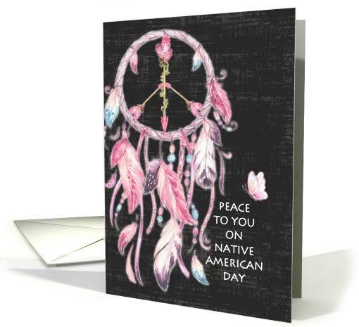
The next tip takes me to how I came to choose Native American Day.
Scour your Resources:
This is exactly what I did when the Peace challenge came about. Many times I let my resources give me inspiration for a design. I found a dreamcatcher made of feathers and it led me to research Native American culture and I found Native American Day. And, if you’re like me you just can’t wait for the latest email of the new offerings
from the HungryJpeg, Design Cuts, or any of the numerous design resource sites. Definitely an addiction of mine! A resource you may have not ever noticed in your files may become the shining star of a Design Challenge win!
Take your Time:
When creating your design, second guess everything you have done. Make sure it is up to your standards. Ask yourself, what can I add? What can I take away? What is making this design stand out?
For the April 2015 Kid’s Imagination, Create A New Animal theme, my design folder has 126 files dedicated to creating that design! The reason being, I worked SO hard on the first design I created and it just didn’t cut the mustard, so it was back to the drawing board! It may seem like wasted time but it wasn’t. I learned so much about combining elements and using photoshop tools I never used before.

Inside Verse:
Don’t forget to take your time with your inside verse, as well! We all know matching the sentiment to the design is key. I always try to imagine I am the recipient and am reading the inside. Try different ways to make a play on words, or puns, if the sentiment needs
lightness or humor. If a serious occasion, I don’t like to be too somber, just supportive and sympathetic.
Big Stock Creations:
We all know how awesome it is to have a resource like BigStock in our design toolkits.
When using their photos for the challenges, the judges are looking for serious attention to adding appropriate verse to the picture. Here again comes the time for taking your time.
Look at the picture you have chosen and really think about what it is telling you and how you can relay that message to the customer to make them want to chose your design.
All of these tips may sound like second nature, but it never hurts to have a reminder.
Take care, I look forward to many artists’ Design Challenge entries in the future!
Challenge yourself and you won’t be disappointed!
See all the Design Challenges posted.
And, as Mindy always reminds us: “The difference is made in the details.”
GCU Community Manager
Share this:

Wanted New Cards: Thank you for your Patience


We’d like you to create at least one card for these categories using the Stock Cards function (Bigstock) or your own graphic designs.
Remember, when you’re submitting your new card, add a little note about the intended category in your Notes to Reviewers. Be inventive, be clever, be creative. Go for it!
Share this:

Font Frenzy: Karliyna Script


Karliyna Script comes with 400+ glyphs. The alternative characters were divided into several Open Type features such as Swash, Stylistic Sets, Stylistic Alternates, Contextual Alternates and comes with a complete Commercial License.
Share this:

Nuts and Bolts: Inside Verse Considerations * Line Breaks


GCU Community Manager
Share this:

Wanted New Cards: Male Friendship Cards
We’d like you to create at least one card for these categories using the Stock Cards function (Bigstock) or your own graphic designs.
Remember, when you’re submitting your new card, add a little note about the intended category in your Notes to Reviewers. Be inventive, be clever, be creative. Go for it!
Share this:

Rainbow Connection: The Color of Androids
Here are some Color Pallettes I created with pictures I found on the internet – this weeks subject are Androids:


Share this:

Dash of Inspiration: August 2017 Design Challenge

The judging is in-process for last month’s first Big Stock Challenge and hope you had fun with that twist. Let’s get to this month’s challenge with another twist. We’ve had you pick idioms in past challenges and this month, we chose ONE idiom for all entrants to use in their design.
……………………………………………………………
Theme: Tickled Pink
Requirements:
- Tickled Pink – the idiom – must be part of the message of your new creation. Phrases.org defines it as: “It’s the figurative sense of the word that means ‘to give pleasure or gratify’. The tickling pink concept is of enjoyment great enough to make the recipient glow with pleasure.”
- Blank verse will not be considered for entry in this challenge.
……………………………………………………………
Entry Deadline: Thursday, August 31st
……………………………………………………………
How to Enter: Post the PID (card number) and the URL (public storefront link – please WAIT for the card to be available in the public marketplace, please DO NOT post a link to your Manage Cards area) as a post in the challenge blog. We’ll forward your entry to the jury.
……………………………………………………………….
Category:
Any category that is well-suited for your Tickled Pink design.
…………………………………………………………….
Rules:
- Submission must meet GCU’s Submission Guidelines and be Approved through the usual Review Cycle– Fast Track your submission with this in the Notes to Reviewer: August Design Challenge Submission here is the link to the blog post: (include THIS blog post URL)
- Only ONE card per artist per challenge.
- Submissions must be NEW, no existing designs.
- Your entry must meet the Challenge Requirements and Theme or it will not be included in the challenge.
- Stock Card Creations entries will not be accepted.
- Your designs should differ from those already offered in the category of your choice to offer shoppers a variety of choices, not more of the same.
……………………………………………………………………
BLIND Judging: We hope each of you enters every month. Entries are submitted anonymously for judging by the GCU Challenge Jury which means that before and during the challenge, judges do not have any way of knowing what artist is behind each entry. This eliminates any and all concerns with ‘favoritism’. Results will post on the Community Blog. The jury will judge the entries on the following criteria:
- How well the card meets the Challenge Requirements and Theme.
- How well the card speaks to the Category the artist chooses for the card submission.
- Creativity, Execution and Marketability.
……………………………………………………………………
Winners: 1st Place:
- The winning designer’s card and store will be featured on the GCU Public Blog – the blog which customers view and follow.
- As well as featured on the GCU Public Facebook Page – nearly 46,000 followers, now THAT’S exposure!
- The winning card will be Design of the Day following the announcement of the winners (within 48-hours).
EXCEPTION: Horizontal (landscape) cards may not be featured as DOD due to GCU Home Page space restrictions. In these cases, GCU will choose a different vertically oriented card from your store to feature as DOD. Thank you for your understanding and apologies for this limitation.
- The winning card will be added to the Greeting Card Universe Design Challenge Winners Pinterest Board – currently GCU’s Pinterest Page followers: 2K!
- The winning card, should the artist choose, may be referenced in a new series by the winning artist and he/she may Fast Track all cards in the new series (being sure to give the Challenge URL and winning card PID in your Notes to Reviewer for each card in this series).
- Winning card will be included in a marketing email to over 100,000 customers!
- NEW starting this month, GCU will create a Meet the Team board for the winning artist under the Pinterest GCU account where the winning artist will be able to pin and promote her own storefront and all that makes them a unique card designer and one of GCU’s artistic community team member.
-
Winning card will be posted on GCU’s Instagram with 2,000 followers and counting!
- GCU will create a Meet the Team board for the winning artist under the Pinterest GCU account where the winning artist will be able to pin and promote her own storefront and all that makes them a unique card designer and one of GCU’s artistic community team member.
2nd Place:
- Your submission will be Design of the Day the following week of announcing the Challenge winners (within 7-days).
EXCEPTION: Horizontal (landscape) cards may not be featured as DOD due to GCU Home Page space restrictions. In these cases, GCU will choose a different vertically oriented card from your store to feature as DOD. Thank you for your understanding and apologies for this limitation.
- Your card will be added to the Greeting Card Universe Design Challenge Winners Pinterest Board.
- Winning card will be included in a marketing email to over 100,000 customers!
-
Winning card will be posted on GCU’s Instagram with 2,000 followers and counting!
………………………………………………………………………
Tips:
Check out these tips, tricks, freebies, and tutorials from our own GCU Community Blog which might be helpful in this month’s Challenge.
- Inspiration Station: What to Say
- Nuts and Bolts: Writing Funny Greeting Cards
- Dash of Inspiration: It’s All in the Type
………………………………………………………………………
Be inspired to create and learn something new!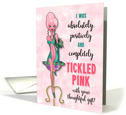
Share this:

Nuts and Bolts: Inside Verse Considerations * Alignment

GCU Community Manager
Share this:

We’d like you to create at least one card for these categories using the Stock Cards function (Bigstock) or your own graphic designs.
Remember, when you’re submitting your new card, add a little note about the intended category in your Notes to Reviewers. Be inventive, be clever, be creative. Go for it!


