Freebie Wednesday
Freebie Wednesday:
Here are some Freebies for your design arsenal – as always, be sure to thoroughly read and follow the contributors TOU (Terms of Use), and to offer that link in your Notes to Reviewer when you utilize 3rd party resources.
Design Cuts offers a set of free Floral Illustrations, Flower Stock Photo and High Resolution Textures.
This freebie pack includes some amazing design resources from Annie Sauvage, Roman Jusdado, Vector-Hut and Retro Supply! This includes paper textures, floral illustrations, an editable stock photo of flowers, and a beautiful glowing lights graphic.
File types: this freebie pack contains .PNG, .JPG and .PSB files

If you are looking for a new quality Font that’s 100% free for commercial use be sure to check out Font Squirrel.
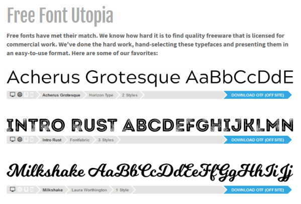
Bukhari Script is a bold monoline cursive font created by Mikrojihad Inc. It’s also called “Mouse Lettering Typeface” because it was created from a bold line with a computer mouse. Perfect for various design projects from posters, business cards, badges to t-shirt design. Bukhari Script contains almost 380 glyphs with several OpenType Features. Free for personal and commercial use!

And the last freebie for today are these 10 Coffee Paper Textures from PixelBuddha.

Share this:

Nuts and Bolts: Intellectual Property

There are many images, phrases, lyrics that are intellectual property and cannot be used on cards offered on GCU. GCU tends to take a more conservative IP position on product submissions compared to other POD sites. The review team will review IP considerations on card submissions, however it is the artist’s responsibility to first do their due diligence before designing and submitting. As a rule of thumb, if in doubt, leave it out.


GCU Community Manager
Share this:

Wanted New Cards: Church Christmas Luncheon


We’d like you to create at least one card for these categories using the Stock Cards function (Bigstock) or your own graphic designs.
Remember, when you’re submitting your new card, add a little note about the intended category in your Notes to Reviewers. Be inventive, be clever, be creative. Go for it!
Share this:

Rainbow Connection: The Color of Art Beads

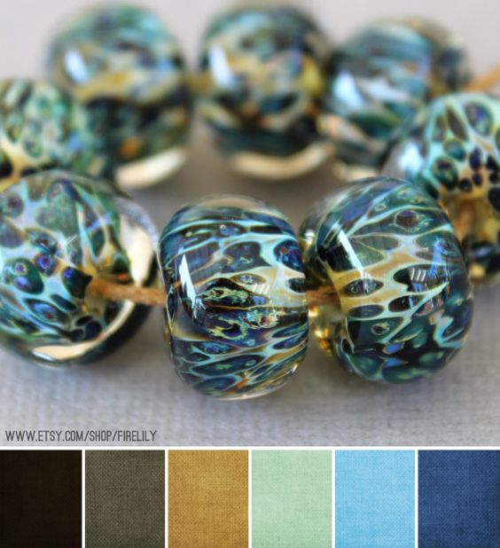
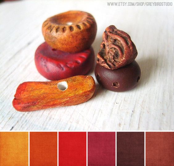
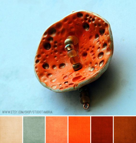
Here are some Color Pallettes I found on Pinterest – this weeks subject are Art Beads:




Share this:

Font Frenzy: The Black Cats SVG Mini Bundle

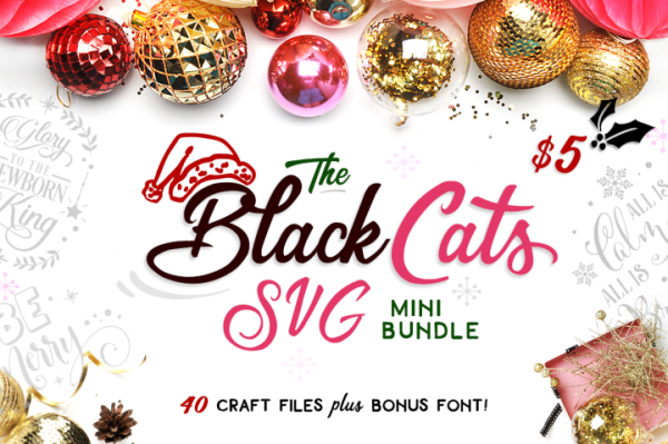
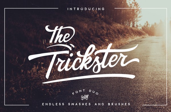
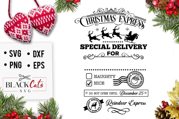
Grab The BlackCatsSVG Mini Bundle that includes a total of 40 Christmas craft files (in SVG, DXF, EPS, PNG formats) plus a bonus PUA encoded font!! This festive collection is normally priced at $95, but for this week ONLY you can get everything for just $5 — that’s over 94% OFF!But don’t wait too long, this pack is only available for JUST 2 more days!! Commercial license included.
Share this:

Nuts and Bolts: A Sense of Community.

GCU Community Manager
Share this:

Wanted New Cards: Graduation PhD Nuclear Engineering
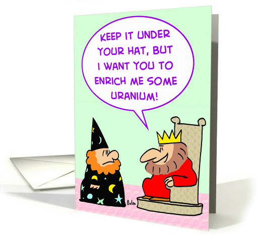
If the field or subject area you’ve designed for is not listed please submit your card in the >>Other category.
We’d like you to create at least one card for these categories using the Stock Cards function (Bigstock) or your own graphic designs.
Remember, when you’re submitting your new card, add a little note about the intended category in your Notes to Reviewers. Be inventive, be clever, be creative. Go for it!
Share this:

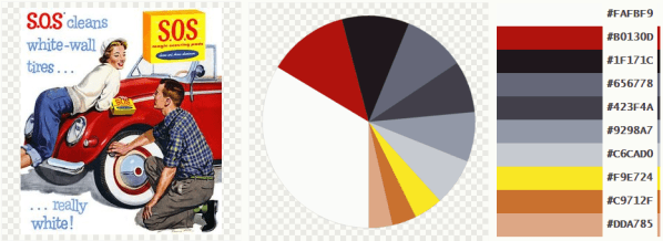
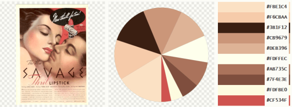
Rainbow Connection: Vintage Advertisments
Here are some Color Pallettes I created with pictures I found on the internet – this weeks subject are Vintage Advertisements:



Share this:

It’s not just the picture on the front of the greeting card that sells it – the message inside the card is usually the deal clincher or the deal breaker. Some shoppers prefer blank cards. The majority buy cards whose verses reflect their own feelings and emotions, and send the exact message they want to convey to the recipient.
Creating the perfect verse to go with your fabulous design isn’t easy for everyone, so here are some tips to help you craft an attractive message.
In General
- When writing greeting card verse – and by verse, I don’t mean poems exclusively, I’m simply referring to the text outside/inside the card – make sure what you write is appropriate to the occasion and the overall “feel” of the card. Study the front image. What does it say to you?
- When you’re starting to write, don’t get too hung up on grammar, spelling, etc. Just jot down your thoughts. Play around with ideas. Think about the occasion and the intended recipient. Is the card supposed to make the recipient laugh? Smile? Catch their breath? Feel better? Always keep the recipient in mind.
- Use ordinary language and a conversational style (unless you’re designing for very formal occasions such as wedding announcements). Shoppers prefer a down-to-earth voice to a forced or awkward formality.
- Stick to the point and get your message across without rambling or getting off topic.
- When you think your verse is ready, read it aloud. Here’s where you’ll catch clumsy phrasing, incorrect grammar, and phrases that just don’t sound right.
- If possible, read the verse to a friend or family member who will give you an honest assessment.
- Put yourself in the shopper’s place. If you were standing at a card rack in a shop, would you pick up this card? If you looked at the inside verse, would you be tempted to buy?
- Make certain to correct all spelling and grammar mistakes BEFORE submitting the card for review.
The Three P’s
There are three types of greeting card verse: Poetry, Prose, and Punchline.
Poetry: Rhymed, metered verse. See an example below. While poetry in greeting cards has fallen somewhat out of fashion these days, there are still shoppers who find sentimental or comic poetry appealing. Consider the theme of your design. What message would a shopper want to send to a recipient? In the example below, the theme is “reconciliation.” Both the image and the verse beautifully reflect that theme.

Silly me, silly you, what the heck did we both do? Wanna take another chance and rekindle our romance? (Inside Verse: I’m ready to kiss and make up … are you?)
Prose: Not rhymed. A written message meant to reflect the shopper’s feelings and thoughts. This type of verse is preferred by many shoppers. In the example below, the artist has created the verse as if the shopper were speaking directly to the recipient, sharing feelings of sympathy at the loss of a loved one. Consider the occasion your card is intended to address. What would you say to someone at such a time? Speaking from the heart is always a winner.

Inside Verse: I know for certain that we never lose the people we love, even to death. They continue to participate in every act, thought and decision we make. Their love leaves an indelible imprint in our memories. We find comfort in knowing that our lives have been enriched by having shared their love.
Punchline: Humorous verse, often with the the joke set up on the outside of the card, and the punchline delivered on the inside (though not always). See the example below. Obviously, the purpose of humorous cards is to make both shopper and recipient laugh. Consider how best to accomplish this goal with your design. Is there a play on words you can make? Some way to add zing to your visual joke? Try not to be too corny unless designing cards for younger children.

Inside Verse: So eat a whole cake, a whole gallon of ice cream, and have yourself a happy birthday!
I’m sure you can find many, many more examples of these three types of verses.
Don’t settle for generic, ho hum verses that could be found on any old card. Make your cards stand out. Be unique. Use your personal voice and your creativity to set yourself apart from the crowd. Write verses that are relevant to your design, appealing, and heartfelt, and your sales will soar!
Share this:

Wanted New Cards: Sports Specific College Acceptance.

We’d like you to create at least one card for these categories using the Stock Cards function (Bigstock) or your own graphic designs.
Remember, when you’re submitting your new card, add a little note about the intended category in your Notes to Reviewers. Be inventive, be clever, be creative. Go for it!


