Nuts and Bolts: Private Gallery

Many newbies and some experienced artists haven’t used their shop’s Private Gallery before and there can be some confusion if, for example, a card is placed by the Review Team into your Private Gallery and you can’t find it. Don’t panic! In this article, we’ll tell you everything you need to know.
Activating Your Private Gallery
- When you are logged into your GCU account, go to Manage Store.
- On the left, you’ll see a list of orange headers. Beneath these headers are options. You want: Look & Design > Store Layout & Content.
- You will now see two columns in green – one says Sidebar, the other Wide Column. Find Private Gallery under Sidebar. Make sure the box is checked.
- SAVE change by clicking the orange button on the lower right. This will make your Private Gallery visible.
What Is the Private Gallery For?
- Customer requests
- A card you’ve designed for your own use
- A card you or a customer need to order in a hurry
- Cards you’ve designed that you don’t want to go through the review process. When uploading a card, by clicking Make Available in Private Gallery Only, the card will still be reviewed. The card will only NOT be reviewed if you also click Waive Review. Be aware that cards which are not reviewed become your financial responsibility if returned by a customer, so think carefully before you decide
- Cards that don’t fit GCU’s Submission Guidelines and/or have been Declined, but you want to sell yourself anyway. Note that cards in the Private Gallery will not show up in site-specific searches nor can browsing customers find them. The Private Gallery is private.
- If you’re an artist who uses GCU as a fulfillment partner, printing your cards so you can sell them off-line in brick and mortar stores and other venues, the Private Gallery is an option
Yes, if you sell a card from your Private Gallery, you will be paid at the usual commission rate.
Just make sure you activate your Private Gallery regardless of whether you intend to use it or not. You never know what might come up and you don’t want to be left scratching your head in confusion.
Share this:

Dash of Inspiration: Typography the “Golden Rules”
A Dash of Inspiration, A Cup of Creativity by Doreen
 There are some basic rules and important aspects of typography, we’ll refer to them here as the ‘Golden Rules’, which span the written word industries; regardless of whether it’s newspaper, magazine, or greeting cards. As designers working in the written word, it’s important that we are not only familiar with, but become experienced in applying these ‘rules’ to our own greeting card designs.
GCU will not accept cards which are serious offenders of ignoring these basic guidelines, as the result is simply not a professional looking greeting card. Typography is not an ‘after-thought’ that you slap on an image and call it a greeting card. Your text is a critical design element and should look as though it’s addition was well thought out. Follow these ‘Golden Rules’ and not only will your typography have a much better chance at being approved by the GCU Review Team, but you will have significantly improved the marketability of your card.
………………………………………….
1- Character Spacing
As designers we can’t shrug our shoulders and say “It’s just the way the font looks” when character spacing is off. Whether it’s between all the letters, only between a letter and a special character like an apostrophe, or it’s only the spacing between words; all of these are critical to achieve professional looking typography, and all of these ‘spacing issues’ are adjustable.
Tracking is about controlling the uniform spacing between all the letters in a piece of text, while kerning refers to the spacing between two specific letters.
Kerning – The definition:  The process of adjusting the spacing between individual characters to achieve a pleasing result.
Tracking – The definition: Where kerning adjusts the spacing between two characters, tracking adjusts the letter-spacing uniformly over a range of characters.
Do not worry about making kerning or tracking adjustments until you settle on your font choice for that given design, as each typeface demands its own attention to the adjusting of space between some or all of the characters. Such as the apostrophe in Mother’s Day.
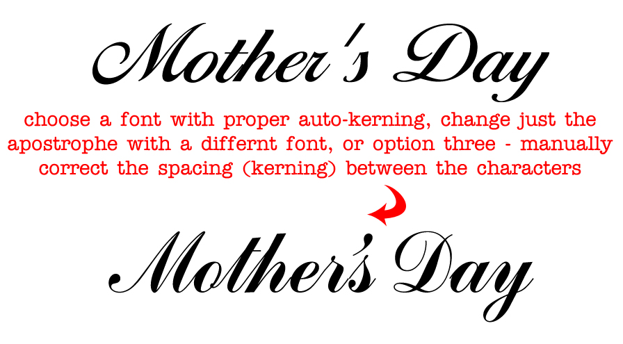
– Sometimes the spacing between characters, may be visually pleasing, BUT the space between words and/or the spacing between letters and special characters need significant improvements.
– Adjust kerning in Photoshop (and most Adobe design software) by:
To use a font’s built-in kerning information for selected characters, select Metrics for the Kerning option in the Character panel.
To automatically adjust the spacing between selected characters based on their shapes, select Optical for the Kerning option in the Character panel.
To adjust kerning manually, place an insertion point between two characters, and set the desired value for the Kerning option in the Character panel. (Note that if a range of text is selected, you can’t manually Kern the text. Instead, use tracking.) If you work in a program which does not allow adjustments (all Adobe software and most word processing software allow for kerning), then you must choose a different font which offers more natural spacing between letters.
………………………………………….
2- Use Superscript indicators for example: Fourth = 4th not 4th
………………………………………….
3- Connect Script Characters: Make sure to properly adjust fonts which have extended lines at the end of each letter so that when kerned, the letters connect to flow smoothly from one to the next, tying the word together. When this is ignored, the typography looks almost staccato, and certainly amateurish.
………………………………………….
4- Breathing Space: Allowing ‘breathing space’ for your text within the design is critical to how your overall card will look when printed.
This means leaving a little ‘breathing room’ between the end or beginning of your lines of text and the trim line (yellow safety zone in Print Margin Preview), as well as room to breathe away from the card’s fold line.
This should also be applied to critical elements within the design. Allowing a bit of space between image elements and text not only creates better balance, but can also improve both the legibility of your text and the feel of the message are portraying on the card.
………………………………………….
5- Line Spacing: The space between lines of text is also important to the overall look and feel of your typography. Too close and it looks cramped, often becoming illegible. Too far apart – from one line to the next – causes a disconnect and changes the overall feel of your message. Leading is the space between lines of text and is generally measured from baseline to baseline of each sentence. The general rule is to allow a leading that is 2 points above the font’s height. So for example, if you are using a 10pt font then the line space (leading) should be 12pts. This can vary depending on the font – different fonts need different line spacing. For those of you who love math, line spacing should be 120–145% of the point size.
………………………………………….
6- Verse Line Breaks: Line breaks in your message, both on the card front text and your inside verse, should break to reflect natural speech patterns. Rarely, does it ever make for a professional sounding greeting card to all the words to auto-wrap inside the card.
For example THIS:
Wishing you a day
that is filled with beauty
and a year
filled with happiness. ——> correct
NOT THIS:
Wishing you a
day that is filled with
beauty and a
year filled with happiness. ——> incorrect
On card front text, sometimes you may need to recast your phrase (start over) in order to make the text read properly and work well within the design. The example on the far left leaves the viewer hanging on the ‘aaaaaa’ as if we’ve lost our train of thought completely. The middle example breaks as we would speak this phrase, with a short pause before the “a Happy Birthday”. The example on the far right is even better for this design. The message has been recast to change the verbiage and a spot was created for all the text to be housed in the same location which gives the overall card front a balanced and professional look.
 ………………………………………….
7- Choose Recipient-Friendly Fonts: Script (cursive) fonts for example are not appropriate for children under 8-years-old.
Avoid using fonts which are too rough, too ‘shaky hand looking’ in their appearance (such as this example). They are difficult to read and very amateurish – though non-cursive versions are often acceptable on cards for small children.

…………………………………………
8- Use Curly Apostrophe/Quotes: Use curly quotes (and apostrophes) which match the font characters better, look professional and are more legible. The straight quotes came from the typewriter days. In digital creation tools of today, you can always get curly quotes.
If you use a program, such as; Photoshop, go to Edit > Preferences > Type > turn Smart Quotes ‘on’ by checking the box. Not all fonts are created to respond to Smart Quotes, but many do. When the font you wish to use does not allow for curly verses straight apostrophe or quotes, then highlight just those characters and change them to a font which does support this improvement. See example above.
…………………………………………
So until next week … Learn … Create … Inspire!
Share this:

Wanted: New Cards – Congratulations, Graduation, Military

Every week we showcase a GCU category that has few or no cards. We’d like you to create at least one card for this category using the Stock Cards function (Bigstock) or your own graphic designs.
Remember, when you’re submitting your new card, add a little note about the intended category in your Notes to Reviewers – cards submitted for underused categories are much more likely to be approved provided they follow the Submission Guidelines. Be inventive, be clever, be creative. Good luck!
Today we have multiple sub-categories lacking cards (less than 10 cards):
Occasions – Congratulations – Graduation – Trade/Vocational/Career School – Military – Academy/Navy
Occasions – Congratulations – Graduation – Trade/Vocational/Career School- Military – General Military
Occasions – Congratulations – Graduation – Trade/Vocational/Career School – Military – Boot Camp/Marine
Occasions – Congratulations – Graduation – Trade/Vocational/Career School – Military – Boot Camp/Navy
Occasions – Congratulations – Graduation – Trade/Vocational/Career School – Military – Basic Training/Marine

Share this:

Design Spotlight: Mort Originals

Our Design Spotlight falls today on Paula Mort Mortimer of Mort Originals, a GCU artist who joined in January 2015. Her lively use of color is nice!
_________________________

To create my card, first I chose four colors of small “Sticky Notes”. I designed a Neon background pattern with the stickies. Next I scattered colored paper clips on top. Office Work is seldom seen as exciting. Instead, it’s usually depicted as drab and boring. That’s why I made this card as vibrant as possible!
I myself am a Secretary/Administrative Professional. Creating Greeting Cards in my spare time is a wonderful way for me to express my artistic side. Photography is one of my passions in life and I’m thrilled to be able to turn my photographs into Cards that I can share with the “Universe”. Thank you for giving me the chance!
Share this:


If you’re a member of the Design Cuts community — membership is free if you’re not — don’t miss this great tutorial on How to Use Alternate and Extra Characters with Your Fonts. The advice goes for any font with extra characters, often flourishes, ligatures and swashes, extras or alternate characters. Scroll down past the font examples to get to the tutorial. Have fun!
Share this:

Dash of Inspiration: Cool Finds
A Dash of Inspiration, A Cup of Creativity by Doreen
 Artists refine their skills and continuously improve their technique by being open to learning new tips, tricks and sometimes even expanding into a different media. This week I found some great tutorials which may be of interest to you, so I wanted to share and who knows, you may be inspired to try something new.
………………………………………………………
PHOTOSHOP users
This is a wonderful tutorial for every photographer who has Photoshop at their fingertips. Taking a great composition of the perfect moment doesn’t always mean you have the perfect ‘greeting card ready photo’. If there are ugly distractions, poor shadow or highlight areas, a missing element – any of these can make your perfect moment image worthless as a marketable product, but, what if you could correct those minor details and create a WOW-worthy card?
Five Easy Photo Retouching Tips and Tricks
………………………………………………………
Corel PaintShopPro users
Combine multiple images using Paintshop Pro video tutorial.
………………………………………………………
Here are some cool tricks for the painters out there.
Tips for Making Trees with Watercolor
And I found this great list of 50 Best Blogs for Watercolor Artists I thought some of you might enjoy.
………………………………………………………
So until next week … Learn … Create … Inspire and PROMOTE!

Share this:

Wanted: New Cards – Mother’s Day, For Egg Donor
Every Friday from now on, we’ll be showcasing a GCU category that has few or no cards. We’d like you to create at least one card for this category using the Stock Cards function (Bigstock) or your own graphic designs.
Remember, when you’re submitting your new card, add a little note about the intended category in your Notes to Reviewers – cards submitted for underused categories are much more likely to be approved provided they follow the Submission Guidelines. Be inventive, be clever, be creative. Good luck!
Today’s category with 2 cards is:
Holidays – Mother’s Day – For Egg Donor

Share this:

Tips and Tricks: Free Glitter Patterns and St
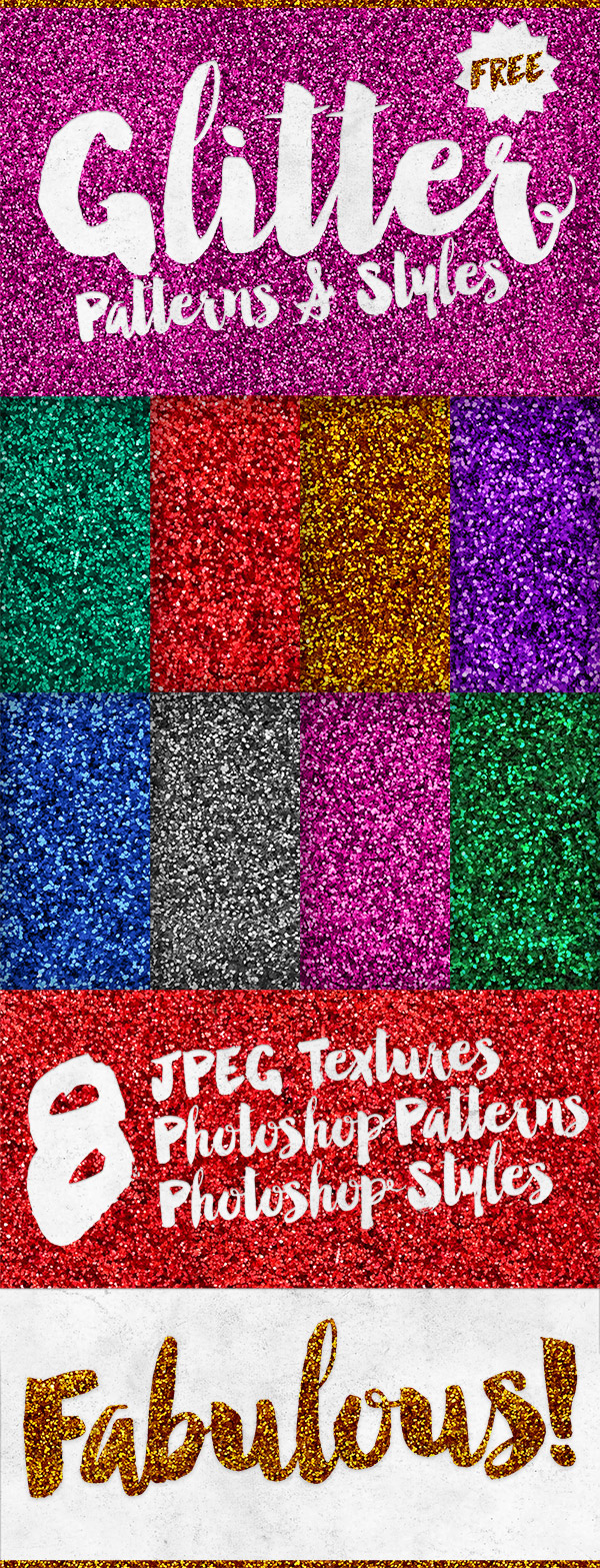
Our friends at Spoon Graphics are offering 9 Free Glitter Patterns and Styles for Photoshop + JPG textures. One click adds to layers. Instructions provided. Have fun!
Share this:

Tips and Tricks: Make Your Own Fonts Free

Ever wanted to try your hand – no pun intended – at making your own fonts from yours or someone else’s handwriting (for example)? Make Use Of’s Everything You Need to Know About Making Your Own Font Free offers an instructive article explaining how to do just that and includes resources for more in-depth learning. Why would you wan to? Because you’d have fonts that were absolutely unique. Try it out and have fun!
Share this:

Tips and Tricks: Photoshop and Illustrator Tutorials

In need of tutorials from basic function to more advanced? This archive at Digital Arts has what you need! You can also learn how to design T-shirts, vinyl stickers, etc. Exploring other parts of the sits reveals articles on art and design trends, web fonts, organizing projects, etc. Set aside a few hours and learn something new!


