Critique Clinic – July 6-8, 2012

How does it work? For three days a week (Friday-Sunday midnight), I will open the clinic to any artist who wants an honest peer review and critique of a card which gets plenty of clicks but no sales, so something’s probably not quite right, or you’ve got a new design you want to test drive, or you’re unsure about the marketability of a card. Or perhaps you’re a newbie who isn’t sure if a recently submitted card is up to a marketable standard. Anyone is welcome to participate. In fact, I encourage everyone to at least look at the cards in question and read the critique comments – you may learn something. The purpose of the clinic is to help artists improve the commercial appeal and marketability of their cards.
THE RULES
- ONE card per artist only.
- Card must be for sale at Greeting Card Universe.
- We will take an unlimited number of artists, including those who have submitted recently, HOWEVER I reserve the right to close a clinic for the day if the submissions become overwhelming. If the clinic has been closed, and you submit a card, your comment will be deleted.
- To submit a card for critique, post a link to the card at GCU in the comments section of this clinic post. Allowances will be made if you’ve had a card declined, or made a new design you’d like advice on. Give us the link where we can see the card, such as your private gallery, Flickr, etc.
- Any artist is free to comment and/or give a critique of a submitted card. HOWEVER, post-and-run comments like “great card” or “you suck” will not be tolerated, nor will abuse. Criticism should be constructive, not destructive. Play nice or you will be banned.
- I also won’t tolerate temper tantrums if you decide your “artistic integrity” is being stepped on because you asked for a critique, and someone told you the photo you’re using isn’t in focus. If you can’t take honest criticism, don’t submit. Once gets you a warning; twice and you’re banned from submitting in the future.
- Artists who critique may do so by giving their opinion, posting an example of another card, or pointing the submitter to a video, on-line article, or other helpful suggestion.
- Don’t forget that artists who are giving you tips and helpful advice are volunteering their time and trouble. Be nice. A link back to their store on your website or blog is appreciated (but not mandatory).
- You are free not to take any advice offered. There’s no guarantee any card will be a bestseller, so don’t come into the clinic with unrealistic expectations.
- Rules may change as we go along and we see how things turn out, okay?
So without any further ado, I declare this week’s Critique Clinic open!
Share this:

Font Frenzy: Something Old, Something New

Today, I’d like to let you know about a cool tool you can use when you’re looking for a font similar to another font, but not the same. For example, Scriptina.
Yes, we all know and love Scriptina, but it can get a little tedious and overused at times. How do you find a font similar to Scriptina that’s just as pretty and versatile? Well, your first stop in your quest should be Identifont.
Identifont allows you to enter certain criteria to try and identify a font by appearance – ever seen an advertisement and wonder what font it is? – OR enter a font name and get links to fonts that are similar in appearance.
You won’t find “free” fonts here. The links are to commercial font sites. HOWEVER, I have no problem paying for a font I know I’ll use a lot in my designs – it’s an investment in my business – and many fonts are reasonably priced.
At Identifont, you can also search for fonts if you only know part of the name, search by designer name or publisher, and search for fonts that contain a particular symbol or picture.
We were talking about Scriptina…
One of the fonts similar to Scriptina is Ability, which I find rather appealing. It’s like Scriptina but the flourishes are a bit less exaggerated. You can get all 6 fonts in the Ability family or buy them individually, and the price is very affordable – from $9 each or $35 for all 6 fonts. A sample is below:

Another Scriptina substitute is Fluence, a font family in three weights. It’s rounder and more open than Scriptina, which I think gives it a more contemporary, slightly less formal feel. Currently at MyFonts, it’s $10 per font or all 3 for $22.50. See sample below:

Identifont gives you numerous choices of where to find and buy a font.
If you find yourself in the rut of using the same fonts over and over again, head over to Identifont and see if you can find a substitute to freshen up your designs and clear the cobwebs away.
Share this:

Happy Fourth of July!
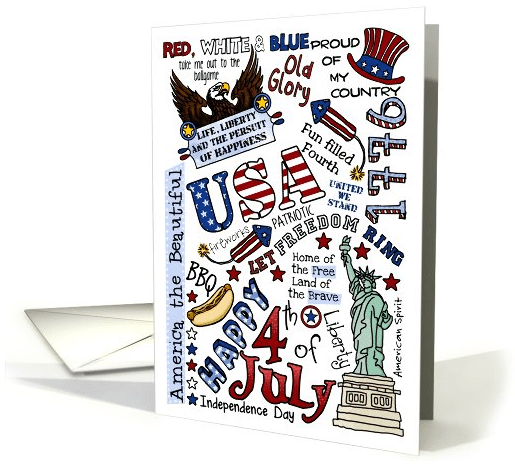
“You have to love a nation that celebrates its independence every July 4, not with a parade of guns, tanks, and soldiers who file by the White House in a show of strength and muscle, but with family picnics where kids throw Frisbees, the potato salad gets iffy, and the flies die from happiness. You may think you have overeaten, but it is patriotism.”
Erma Bombeck
Share this:

Blast From the Past: Artist’s Notes

Since Doreen gave us some wonderful and very trendy Christmas card color combinations yesterday, I thought I’d remind everyone about the need for Artist’s Notes to include a product description. The more you describe your card, the better search engines will index it. So here’s an encore post from last year to help you along:
ARTIST’S NOTES:
A Reason You May Be Invisible to Potential Buyers
Let’s talk about the Artist’s Notes field, shall we? This field accompanies every single card you make at Greeting Card Universe, yet many of us (myself included) don’t always take advantage of it. I’ve also seen artists use this field to add some puzzling, irrelevant information to their cards. Few of us use it properly, which is big shame, because the Artist’s Notes field is a lot more important than you think.
Why? Well, there are two reasons. One has to do with shoppers, the other with search engines (that SEO thing, but don’t run away – I swear it isn’t that complicated).
I’ll start with SEO (which stands for Search Engine Optimization). Simply put, search engines use complex algorithms to determine a web page’s place (ranking) when it comes up in search results.
So that part is pretty clear, but what can you do to improve your web page’s ranking, and make it appear higher in the list of results? And why is should you care?
You need to care because each and every one of your cards sits on its own web page. Yes, those pages are hosted on GCU, but there are still individual pages, each of which will be indexed by search engines. For example, when someone does a search on Google for “purple elephant niece’s 14th birthday card,” your lovely lavender elephant 14th birthday for niece greeting card on GCU will come up in the results. Where your card appears in the results – on page one, two, three, or page two million – will likely affect your sales.
Being number one on page one is preferred (much like an Olympic athlete would much rather win gold than bronze, or nothing at all).
How do you improve that ranking? Search engines are constantly tweaking and changing their algorithms so they can offer the most relevant results in a search. Exactly WHAT criteria is used by a search engine is secret and complex. However, I can tell you that while good and relevant keywords remain an important part of allowing your cards to be indexed properly, it’s HOW you use those keywords that will affect you the most.
Search engines love original content. Let me repeat that because it’s important to our discussion – search engines LOVE original content. What that means is, while search engines will definitely use strings of keywords as part of their ranking system, they tend to give preference to sites that use those keywords as part of original content.

Inside Verse: “Hope you gobble till you wobble!” – artist Corrie Kuipers
I’ll give you an example. This is a card I recently designed and uploaded (yes, I’m kind of late for this year’s Thanksgiving, but I tend to work a year ahead). It’s a “Happy Thanksgiving from all of us” card.
These are the keywords I used: thanksgiving card from all of us, thanksgiving card from group, turkey, happy thanksgiving, gobble till you wobble, pilgrims, thanksgiving dinner, feast, harvest.
So far, so good. HOWEVER, to take maximum advantage, I now include a brief description in the Artist’s Notes, using as many keywords as possible in a relevant way.
Here’s what it says: “A turkey pilgrim pair stands on top of a “subway art” inspired banner in autumn colors with a Thanksgiving feast mini word cloud on a light wood grain background. A playful and trendy Thanksgiving card that can be sent by a group.”
Notice how I’ve covered my bases in the description?
That will make the search engines happy.
It will make shoppers happy, too. This is the second reason you shoud be using your Artist’s Notes this way. Have you ever seen a catalog that didn’t have product descriptions, just pictures and prices? Of course not! And if you put on your shopper’s hat, you’ll realize that someone shopping for greeting cards really likes to see a nice description of what they’re buying. It just make your design that much more attractive.
Unless you’ve only got a few cards in your store, I’m not advocating you go back and add descriptions like that to all your greeting cards at GCU. Lord knows, I sure can’t. Not enough hours in the day! But since I learned this trick, I will be adding product descriptions to my cards from now on.
Writing good, relevant product descriptions is, I admit, not for everyone. To help you out, tomorrow I’ll be posting another Nuts & Bolts, this one explaining how to write a product description, what to include, and what to avoid.
Share this:

Dash of Inspiration – Christmas in July, Part 1
A Dash of Inspiration, A Cup of Creativity by Doreen
Christmas in July, Part I

I know that most of you are busy enjoying summer and all the fun the warm weather months offer, but as we’ve said many times before; designers must work up to six-months in advance of holidays in order for their designs to make it to market in time for consumers to find them – and in our case search engines to find them. So, like it or not, July we will be focusing on holiday inspiration so that even though the snow is still months away, you can get in the mood to work on your Holiday Card designs this month!
One of the beautiful things about holiday card making is that though color trends come and go each year, there are buyers for just about every color combination; regardless of current trends. We’ll start this first week with some fun and different color combinations I made up for you to use in your holiday designs. I’ve also listed some great links to the coming season’s trends such as; Black & Gold representing the year of the dragon is ‘in’ this year for tree and room decorations – enjoy these lovely color combos!

For those of you who can switch your frame of mind to the holiday season; you will no doubt be rewarded by early sales. Remember, many of those terrific ‘bulk’ sales come very early in the season.
For the next four Mondays in July, the Dash of Inspiration will be offering inspiration and design freebies to help you get those new 2012 Holiday Cards on the market! ENJOY!
Top 12 Holiday Trends for 2012
Keeping Up With the Joneses: Christmas Decorating Trends for 2012
(Editor’s Note: Get your new cards noticed by search engines quicker by including a detailed description in the Artist’s Notes – and don’t forget to add the colors and color combinations! If you’re using a “trendy” color scheme, search engines will see your description as relevant to a current hot topic, and index it faster.)
Share this:

Critique Clinic – June 29-July 1, 2012
How does it work? For three days a week (Friday-Sunday midnight), I will open the clinic to any artist who wants an honest peer review and critique of a card which gets plenty of clicks but no sales, so something’s probably not quite right, or you’ve got a new design you want to test drive, or you’re unsure about the marketability of a card. Or perhaps you’re a newbie who isn’t sure if a recently submitted card is up to a marketable standard. Anyone is welcome to participate. In fact, I encourage everyone to at least look at the cards in question and read the critique comments – you may learn something. The purpose of the clinic is to help artists improve the commercial appeal and marketability of their cards.
THE RULES
- ONE card per artist only.
- Card must be for sale at Greeting Card Universe.
- We will take an unlimited number of artists, including those who have submitted recently, HOWEVER I reserve the right to close a clinic for the day if the submissions become overwhelming. If the clinic has been closed, and you submit a card, your comment will be deleted.
- To submit a card for critique, post a link to the card at GCU in the comments section of this clinic post. Allowances will be made if you’ve had a card declined, or made a new design you’d like advice on. Give us the link where we can see the card, such as your private gallery, Flickr, etc.
- Any artist is free to comment and/or give a critique of a submitted card. HOWEVER, post-and-run comments like “great card” or “you suck” will not be tolerated, nor will abuse. Criticism should be constructive, not destructive. Play nice or you will be banned.
- I also won’t tolerate temper tantrums if you decide your “artistic integrity” is being stepped on because you asked for a critique, and someone told you the photo you’re using isn’t in focus. If you can’t take honest criticism, don’t submit. Once gets you a warning; twice and you’re banned from submitting in the future.
- Artists who critique may do so by giving their opinion, posting an example of another card, or pointing the submitter to a video, on-line article, or other helpful suggestion.
- Don’t forget that artists who are giving you tips and helpful advice are volunteering their time and trouble. Be nice. A link back to their store on your website or blog is appreciated (but not mandatory).
- You are free not to take any advice offered. There’s no guarantee any card will be a bestseller, so don’t come into the clinic with unrealistic expectations.
- Rules may change as we go along and we see how things turn out, okay?
So without any further ado, I declare this week’s Critique Clinic open!
Share this:

Design Contest: Going for the Gold
The nominations are in, and now the voting will begin in our Design Contest: Going for the Gold.
Participating artists had to nominate not only one of their own sports-related designs, but also another artist’s. I strongly advise both artists to spread the word about the contest via e-mail, social networks like Facebook and Twitter, blogs, etc. Every vote counts!
Here are the cards – you can cast your vote in the poll below. Voting closes on July 4th and I’ll post the winner on July 5th. Good luck!
1.  2.
2. 
3.  4.
4. 
5.  ; 6.
; 6. 
Share this:

Rainbow Connection: Taste the Rainbow

Here’s a good collection of colors that will fit many purposes. The hues are bright and sunny, hinting at tropical climes, while still suitable for diverse designs. Put three or more together for a burst of color – how about a thank you card in violet, red, and orange, or a baby shower invitation featuring green, blue, and orange? Put a little golden yellow into the mix for a rainbow of deliciousness!
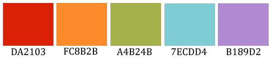
As always, these are RGB colors. I’ve given you the hex numbers to make it easy to use these colors in your favorite graphics editing program. Have fun!
Share this:

Design Spotlight: Tamara Dawn Adams

Today’s Design Spotlight shines on Tamara Dawn Adams who’s been a GCU artist since 2008 – the featured Nurse card is too cute!
_________________________

My “Nurses are Superheroes, Too” card is definitely my most popular card, beating out all the other selections in my store. This card was inspired by the mother of one of my patients who called the nurses “superheroes” for taking care of her child and all that the nurses did to make her child well again.
I’ve been a pediatric nurse for 18 years, working in the same hospital for all of this time. I really love that with this card, I have the ability to allow anybody to thank a nurse with humor and appreciation.
I actually drew this at work, sketching it on a paper towel in pencil, using a cafeteria coffee cup to trace the head. I then traced it onto paper, then went over the pencil line in sharpie. I scanned this image into Adobe Photoshop Elements to clean it up, color it and turned it into this card. Old-fashioned and time consuming, I know. I just bought a Wacom tablet and I look forward to creating more artwork, quicker.
I have always loved to draw, although most of my drawings tend toward the stick figure variety. I have tons of sketches and card ideas swirling in my head at any one time, needing to be put to some kind of use.
I am primarily a photographer, mostly self-taught, although I did take a black and white film photography class in college years ago. I enjoy photographing anything that catches my eye, and I especially love all things in nature, pets, and I also do family portrait photography on the side.
I live in Southern California in the foothills of the San Bernardino mountains. I’m married to a teacher and we have two awesome kids. We like to travel while my husband and kids are on breaks from school, so I can take even more photographs.
I am grateful to Greeting Card Universe for giving me the opportunity to have a creative and fun outlet for my artwork. I am also thankful for the GCU customers for choose my cards with all the other incredible choices that are available.

Share this:

Dash of Inspiration – Finding CU Elements
A Dash of Inspiration, A Cup of Creativity by Doreen
Finding CU Elements
Last week I shared a bit of information on what to look for when reading the TOU for elements to use in derivative designs. It’s important to keep in mind that when/if you try to find Free Clipart, most of what you will find is low in resolution and will serve a very limited purpose in high-resolution card designs. What many of us designers do is to seek out quality Scrapbooking sites and purchase a Commercial license or those which offer CU simply with the purchase of each scrapbook kit (which range from .89-cents to $7.00). So this week I thought I’d share some links to get you rolling on looking for some great additions to your design arsenal.
When browsing these sites, BEFORE you even look to see what they have, head for the TOU section and read their terms – it will save you time. Look for sites which state one or all of the criteria below; and when in doubt contact them with an explanation of how you use the graphics and where you sell – give them links to a couple of your derivative works. When I’ve done this I’ve been given lifetime rights to use their elements in my designs for resale.
- Purchasing a Commercial License as a one-off lifetime fee: This can be a real bargain in the long run if you find a site which offers a style of graphics which suit you and you see new elements are posted frequently. These Lifetime CU licenses can be as little as a one-time fee of $15 and I’ve seen them as high as $250.
- CU4CU products can be used to make items that you offer for sale to others as CU, as long as they are not offered or sold “as is” they have to be changed/transformed into new products in a major way.
- Print On Demand/POD : you can use CU4CU items for POD as long as they are incorporated into your product and flattened when provided to the customer.
- This license will give you permission to use ALL of the Commercial Use Products (which you will have to purchase separately) to create your own CU products.
- This license does not expire. Though we have the right to change the terms of use, we will do so only after a year of the purchase and will not apply the changes retroactively.
Here is last week’s post to help in your research if you missed it: TOU: Terms of Use
So, off you go to get inspired and believe me it’s time well spent to be thorough. Consider your resources as ‘suppliers’ for your business – keep them happy by following their rules, help them network by posting a link on your home websites when you can, and search for the highest quality for the budget you can spend.
Make a list of places you visit; record the link so you can get back to it easily, record the costs involved to use their graphics and the type of graphics they offer before making any decisions.
Give yourself an annual budget or budget a percentage of your quarterly card sales to ‘invest’ in new resources. Eventually you will have resources at your finger tips to create just about anything you can think of and you’ll have the confidence in knowing there is no question as to whether you can sell the designs you create from these sources.
Scraps and the City – Over 60 Scrapping Sites



 GCU Community