Nuts & Bolts – A Winning No as-is Usage Example

Fall is one of my favorite times of year. I love everything about it: cool, crisp air, light jackets and fuzzy sweaters, warm-glowing bonfires, and most of all, the beautiful colors of the changing leaves. My husband and I werefortunate enough to spend some time in Maine last fall and see the trees during peak season and I can honestly say that this midwestern girl was in absolute Heaven. For those who have never been to the New England states in the fall, put it on your bucket list of things to do because it is the epitome of fall color. We explored areas from southern Maine to northern Maine.Thenwe traveled to Woodstock Vermont and followed the Kancamagus Highway back into Maine for one of the most breathtaking sights we have ever seen on any of our adventures. Needless to say, it was one of the best two-week vacations I had ever spent anywhere.
When I returned home, I had those beautiful colors on my mind, and even though I didn’t get best pictures on my trip, I wanted to make a fall leaf themed Thanksgiving card to commemorate my experience. So, as I often do, I went to Pixabay.com (a public domain photo website) in search of some pretty fall leaf pictures. I didn’t have to search long before finding a perfect image.

I loved the little heart in this fall leaf, and I knew GCU had a “no as is” policy, so I knew I would have to make some changes to the image. I decided I would try rotating and cropping the image, then added a fall theme border, along with my message and submitted it for review.

Unfortunately, it did not make the cut during the first round. The reviewer told me I would have to make some other changes because simply adding a border was not enough to pass the “no as is” policy. So, I decided to concentrate on the part of the picture I loved the most. I knew I was really after the leaf with the heart shape, so I decided to cut out the fuzzy lit background and replace it with something else.
I knew I wanted something warm and inviting, something natural looking, maybe something a little rustic. I thought well, what would be more rustic and natural than wood? I could make it look as though the leaf was lying on a floor or on a table as part of a centerpiece. So back to Pixabay I went in search of a plain wood background. There were tons of images to choose from, but I wanted something dark and warm to contrast the bright color of the leaf.
I found a nice warm looking tone for my wood picture and I loved how it was shaded on the edges.
https://pixabay.com/photos/wood-grain-structure-texture-board-2065369/

I rotated my new background and added my leaf and my text. I instantly loved the contrast and the rustic feel of the card so far, but my poor little leaf looked so lonely on the card all by itself. So I decided it needed a few friends. I wanted another leaf or two with some other colors to help bring some life to the image.
So I went back to Pixabay again and looked for an isolated image of a fall leaf. And found this one:
https://pixabay.com/photos/autumn-leaves-leaf-transparent-1768366/

Then I started dropping the other leaf into my card image, but I knew I did not want to take away from my main leaf image. So, I decided to use the other leaf on the corners to take up dead space and give the appearance of other leaves. And I didn’t have to add it many times. I just rotated it in a few directions and by just adding the same leaf a few times, it gave the card a perfect completed look.
So I resubmitted the image on GCU and this time it was approved. Honestly, I was never so happy a card had been declined the first time, because the end result was simply stunning and it was a perfect image to commemorate the time and beauty I experienced in Maine.

GCU Community Manager
Share this:

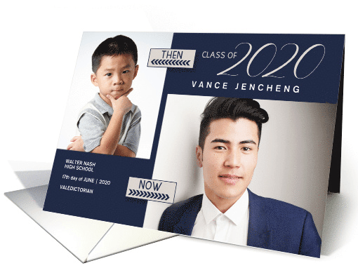
Wanted New Cards: Graduation Announcement Photo Cards

Share this:

Freebie Wednesday: Cacti Clipart.
Freebie Wednesday:
Cute Cacti Cliptart. 18 vector items in a collection of 18 cute cactus characters and simple plants inspired from children’s illustrations. The items are in Ai 10, EPS 10 and PNG format, all vector and editable. It’s free at Creative Fabrica for another 2 days so you better make sure you don’t miss out!


This product comes with a complete commercial license.
Share this:

Rainbow Connection: Humanae Project.

Brazilian photographer Angélica Dass is on a mission to capture examples of every skin color in the world to prove that diversity goes beyond the standard confines of white, black, red and yellow.
Read more about the ongoing Humanae Project here and here:

Watch her TED talk here.
Share this:

Nuts & Bolts – February Design Challenge Deadline.
Theme: Wild about You

See February’s Design Challenge details.
GCU Community Manager
Share this:

Wanted New Cards: Red Egg & Ginger Celebration.
Remember, when you’re submitting your new Stock Card, add a little note about the intended category in your Notes to Reviewers. Be inventive, be clever, be creative. Good luck!
Share this:

Freebie Wednesday: Circous Font
Freebie Wednesday:
The Circous font is a classic rough style font that gives a natural effect like done by hand. This font looks pretty masculine suitable for things related to vintage or classic styles, such as logos, labels, posters, book covers, or anything that needs a classic touch.
This beautiful freebie is brought to you by 24design studios. Only available for a week! As always, commercial license included!


Share this:

Rainbow Connection: Color Palette – Geology Rocks.


Nuts and Bolts: Re-invent your Creativity – No Change, No Gain.
Now that 2020 is upon us, what are your goals to increase profitability within GCU? Do you wish to
increase your sales? Are you hoping to be rewarded for all the long hours you’ve invested in designing?
If the answer to these questions is YES, then allow me to share with you how I have turned things
around and now enjoying the monetary results of my hard work.
admit, I knew zilch about designing cards. Photography was my thing at the time so I started submitting
tons of flowers and bird photos. Popped a title on the top then waited and waited for them to sell. Then I
realized I had to be more creative in what I submitted. That’s when I started my journey with Photoshop
and began to teach myself that program. Little by little my cards became a little more interesting as I
added different elements to my cards.
have added Illustrator to my workload and am presently teaching myself new things to help make
my cards more interesting.
felt they’re getting anywhere in sales, is to stop and begin to think of ways you can REINVENT YOUR CREATIVITY.
We’ve all heard that saying, If you continue to do what you’ve always done, you’ll continue to get the
same results. Think about that? That’s what I discovered. I knew I had to find ways to make my cards
more interesting and stand out.
first one I submitted I had to laugh at the reviewer’s comment which was, “Her face doesn’t match the sweetness your card speaks of, actually she looks a little naughty. Please try to make her expression look sweet.” My thoughts were, yep, she’s right but I can’t do it.

So I researched faces of graphic little girl images online and could see the error in my ways. After picking up ideas how to change her hair and eyes from observing other graphics I redesigned her
and submitted the design for the 2 nd time thinking it was a good improvement, however, the reviewer came back and said, “We’re getting there, much better but still not quite right because
she looks startled, please try again.” My thoughts were, AGAIN, I don’t think I can improve it any more but I was still determined to get it right and attempted to improve it for the 3rd time.
After carefully observing the graphic faces of little girls and getting ideas about what I could do to make them look sweeter, I went back to the drawing board for the 3rd try but this time I had a good feeling I got it right . . . she looks much sweeter and so I submitted it. The reviewer was pleased and approved the card and was very appreciative I put in the effort taking take her advice.

My simple and humble advice to those beginning and those trying to increase their sales is simply look for ways to improve your designs. Use unique fonts for titles and don’t be afraid to change fonts within the title for interest. Placement of the design on the card is huge and doesn’t always have to be centered. Get those creative juices flowing.
Strive to make your cards stand out from the others by having something in the design that grabs the attention of the consumer. It might only be a vivid color. The sky’s the limit.
Research other designs on the internet to get ideas but use your artistic abilities to make them your creation. There are plenty of tutorials and tools out there that can aid in teaching you knew things through Photoshop, Illustrator and other great programs that will help you achieve and be the best you can be in designing your cards.
Bottom line, GET OUT OF THE BOX and start learning new techniques and incorporate new ideas into your designs and you’ll be surprised by what you are capable of. Make it a point every day to learn something new because it will give new life to your designs which equal more sales. So, if you want to be successful and make all those long and hard hours you put into designing pay-off, you MUST keep learning and finding new ways to improve your designs. You can do it!

Thank you to Trudy for sharing her improvement process and not hesitating to step out of the box to
learn something new. And a big thank you for working so well with the GCU review team to make your
submissions marketable and the best that they can be.
GCU Community Manager
Share this:

Wanted New Cards: Thank You Host Football Watching Party

Remember, when you’re submitting your new Stock Card, add a little note about the intended category in your Notes to Reviewers. Be inventive, be clever, be creative. Good luck!


