Nuts and Bolts: Dedicate Yourself to the Details – Text Placement
October 15, 2021
Nuts & Bolts – Dedicate Yourself to the Details – Text Placement
It is often the little details that escape the artist’s eye. It is always a good idea to step away from a design that you have been meticulously working on or ask a brutally honest companion to give it a once over. The review team is certainly a fresh set of eyes and often catches tiny fixes or areas of improvement. GCU is grateful for artists who are open to collaborating with the reviewers on minor adjustments that make a big difference.
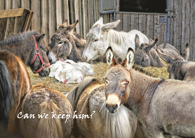
See this example by GCU artist, Eloquence by Ramelle Richardson, with an improvement in text placement leading to a professionally composed design that shines.
Reviewers request for edits:
This is very funny but there are a couple of edits we need before we can approve.
1. The underside of the neck of the donkey in the foreground looks like it needs a little softening on the edge so it blends a little better and does not look pasted on.
2. The text placement is not ideal and we feel a speech bubble from the donkey would be the perfect answer to contain the text and take the humor up to the next level.
Thank you for your consideration.
BEFORE:
AFTER:
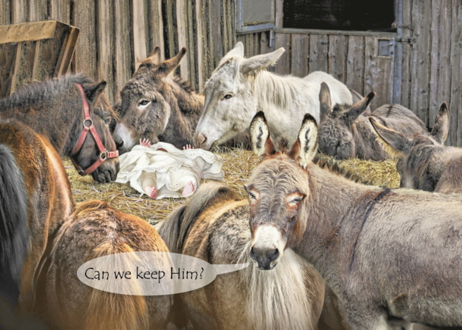
Well done, Ramelle, and thank you for working so well with the review team. Excellent teamwork and LOL!
See the related Submission Guideline for Typography – Text Placement
The difference is made in the details!
Mindy
GCU Community Manager
Share this:

No comments yet

