Fresh Typography Ideas for Greeting Cards (Part One)
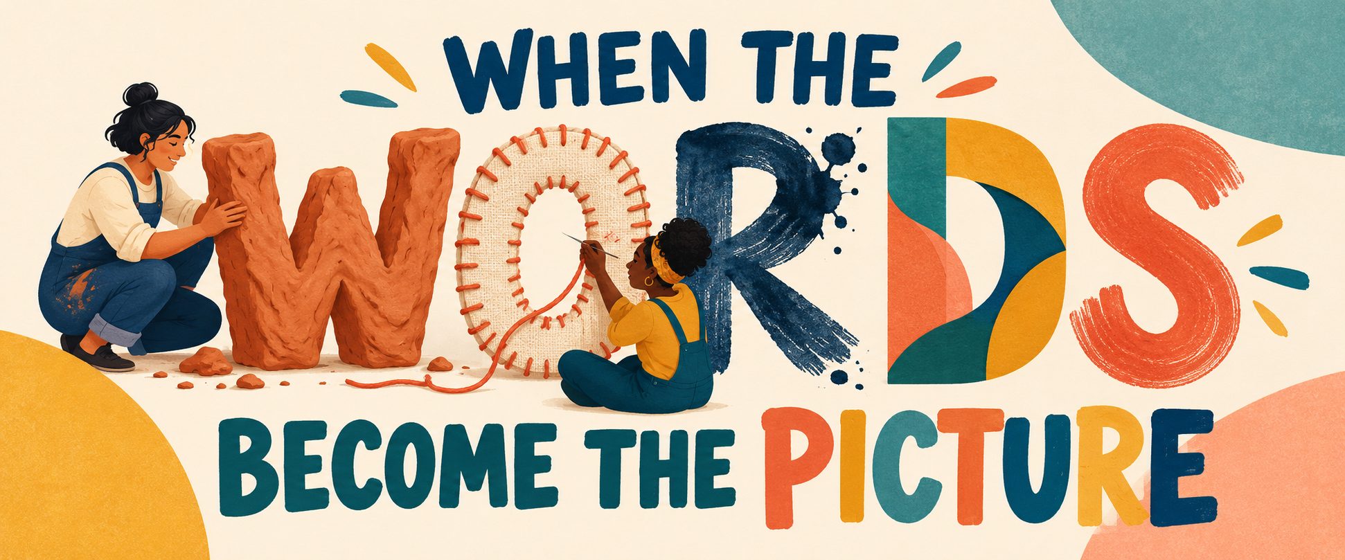
Typography is often treated as the final step in a card design: create the illustration, choose a font and place the greeting somewhere convenient.
But what happens when the words become the illustration?
A fascinating group of new typefaces released in October shows letters being pressed into clay, constructed from lace, interrupted by pools of ink and transformed into decorative patterns. Some look carved, stitched, weathered or mechanically assembled.
The typefaces themselves may be new, but the larger idea is wonderfully useful for greeting-card artists: lettering can suggest material, history and craftsmanship before the customer has read a single word.
You can see several of the recent releases in Creative Boom’s October typography roundup.
Here are five ways to make words the visual focus of a card.
1. Words Carved by Time
Vestige, designed by Claire Wilde, was developed from physical clay impressions of lettering found on old gravestones. The irregularities and weathered edges were deliberately preserved.
That does not mean every card needs to look as though it came from a cemetery—although Halloween artists may already be reaching for their sketchbooks. The broader idea is to make lettering appear as though it belongs to an object with a history.
Image suggestion:
An enormous birthday greeting carved into an ancient stone monument. A tiny archaeologist stands below it, brushing dust from the recipient’s age.
Front:
AN ABSOLUTE
CLASSIC
Inside:
Beautifully preserved and increasingly valuable.
Happy Birthday!
The same technique could be used with tree bark, a castle wall, an old wooden sign, an archaeological fragment or a weathered garden statue.
Christmas version:
Front:
MERRY CHRISTMAS
The greeting is carved into a snow-covered standing stone.
Inside:
I wanted to send something timeless. This was heavier than expected.
The texture can be entirely illustrated. No embossing or specialist printing is necessary—the shadows, chips and worn edges create the illusion.
2. Birthday Wishes Pressed into Clay
Carved and impressed lettering does not have to feel solemn. It can also be warm, handmade and playfully imperfect.
Image suggestion:
The words HAPPY BIRTHDAY are pressed into a large slab of terracotta clay. A small cat has walked across it before the clay dried, leaving pawprints through several letters.
Inside:
The artist would like it noted that the cat was not part of the original design.
For a baker, potter or craft enthusiast, the lettering might be pressed into cookie dough, modelling clay or handmade ceramics.
Front:
YOU WERE MADE
TO BE WONDERFUL
Inside:
Admittedly, the mould was broken shortly afterwards.
Happy Birthday!
Other possibilities include a Christmas greeting pressed into gingerbread, a gardening message stamped into soil or a new-home greeting formed from wet cement while a mischievous animal leaves tracks across it.
3. Greetings Stitched Together
Mourn, by Nina Type, builds its decorative lettering around the structure of bobbin lace. Every character was constructed before lace patterns were woven around it.
This opens up more possibilities than simply placing a message over a lace background. The letters themselves can appear knitted, embroidered, crocheted, patched or held together by thread.
Image suggestion:
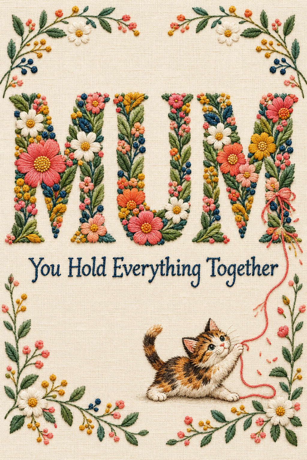
The word MUM is formed from beautiful embroidered flowers. One loose thread trails downward, where a tiny cat is enthusiastically unravelling it.
Front:
MUM
You Hold Everything Together
Inside:
Even when the rest of us are determined to come unravelled.
Happy Mother’s Day.
Christmas version:
Front:
MERRY
The word is formed from tangled red and green thread. A small mouse is trying to finish the final letter with an oversized needle.
Inside:
Wishing you a Christmas that comes together beautifully.
Different materials can help target particular hobbies, recipients and occasions:
- A retirement greeting knitted from wool
- A Valentine assembled from tangled red thread
- A baby greeting sewn from fabric patches
- A friendship message made from friendship bracelets
- A sewing enthusiast’s birthday greeting tangled in measuring tape
- A Christmas greeting constructed from ribbons and bows
4. The Word That Needs Repairs
The new Pen typeface takes inspiration from the small pools of ink created when a pen pauses, hesitates or changes direction. Its concept turns interruption and correction into part of the lettering rather than something to hide.
That is perfect territory for artists who enjoy characters struggling with their own card-making.
Image suggestion:
A medieval nun is illuminating the enormous word PEACE. An ink blot has landed across the final two letters, and she is staring at it with the exhausted patience of someone reconsidering her vocation.
Front:
PEACE
Inside:
It was going rather well until somebody knocked over the ink.
Wishing you a calmer Christmas.
Birthday version:
A small character is painting HAPPY BIRTHDAY, but has squeezed an extra letter into the wrong place and is attempting to cover it with flowers.
Inside:
Another flawless year. Nobody inspect it too closely.
Smudges, corrections, crossed-out letters and little repair attempts can make the lettering feel human while supplying the entire visual joke.
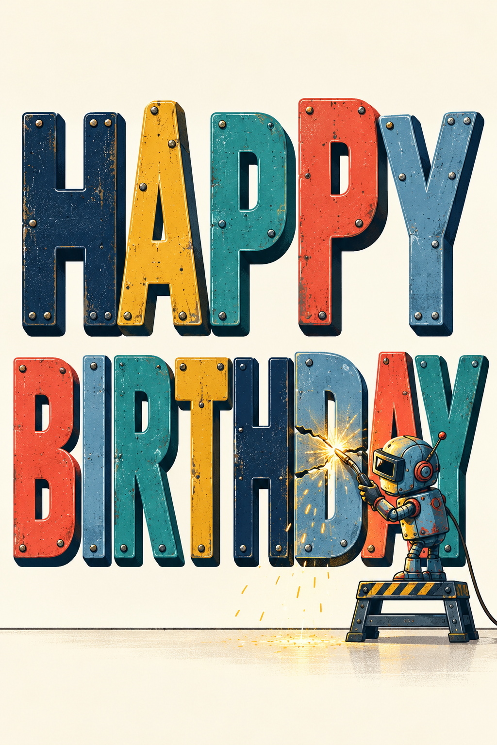
The “repair” could also be tailored to the character. A cat might sit over the mistake. A gnome might paint over it. A robot could weld a broken letter back together. A medieval scribe might transform an ink blot into an elaborate dragon.
5. When Letters Turn into Pattern
Triode by MuirMcNeil sits between typography and visual art. Its components can be layered, offset and combined so that language begins to behave like pattern and texture.
For a greeting card, the trick is to let the word become decorative without making the message impossible to read.
Image suggestion:
The word CELEBRATE is repeated in overlapping transparent colors, forming a bold burst behind one clearly readable central version.
Inside:
I thought I should mention it more than once.
Happy Birthday!
Anniversary version:
Two versions of the word LOVE overlap to create a third color where they meet.
Front:
BETTER TOGETHER
Inside:
Happy Anniversary to a wonderful pair.
This approach can work beautifully with repeated names, ages or short words such as joy, love, cheers, merry and hooray. Keep at least one version crisp and prominent so the greeting still reads clearly at GCU thumbnail size.
Give the Words a Material
You do not need a newly released typeface to explore these ideas. Hand lettering, altered public-domain letterforms, properly licensed fonts and your own illustrated alphabet can all produce the effect.
Before starting the illustration, ask:
- What are the words made from?
- Who made them?
- Are they old, newly constructed or falling apart?
- Has a character interfered with them?
- Can the material connect the card to a particular hobby, recipient or occasion?
Instead of placing a greeting on top of an illustration, make the greeting the object everyone is carving, stitching, painting, repairing or attempting to control.
In Part Two, we will take the idea one step further by giving the lettering movement, emotion and a personality of its own.
Happy Designing!
Corrie


