Fresh Typography Ideas for Greeting Cards (Part Two)
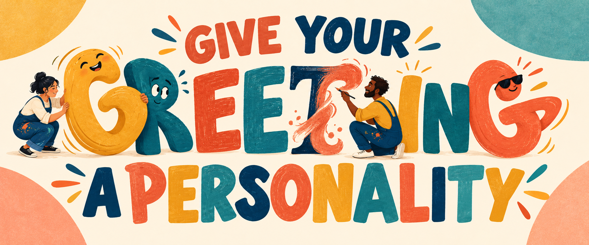
Words That Move, Transform and Misbehave
In Part One, we explored lettering that appeared to be carved, pressed, stitched, layered or handmade.
Now it is time to make the words misbehave.
Recent typography releases include systems that can move between dramatically different styles, letters that sit halfway between reading and visual art, and highly legible typefaces designed to make similar characters easier to distinguish.
For greeting-card artists, the useful lesson is not simply to find a fashionable new font. It is to imagine that the greeting itself has a role in the scene.
The letters can loosen up, fall asleep, run away, panic, celebrate, melt, hide or argue with the illustrated characters. Here are five ways to give a card’s typography a personality of its own.
1. The Greeting That Changes Its Personality
PP Altera is a variable type system built around transformation. Its related styles move between sans serif, serif, ancient, elegant, carved and sharper forms while remaining part of the same family.
A printed GCU card cannot literally animate from one font into another, but it can show the transformation across a single word.
Image suggestion:
The word RETIREMENT begins on the left in rigid office lettering. As it moves across the card, the letters loosen, grow decorative flourishes, put on sunglasses and finally appear to be dancing.
Front:
RETIREMENT
A gradual transition from professional to unavailable.
Inside:
May the transformation be immediate.
Congratulations!
Birthday version:
The word MATURE begins in elegant, dignified serif lettering and gradually turns into unruly hand-drawn letters surrounded by confetti.
Front:
MATURING BEAUTIFULLY
Inside:
Fortunately, nobody specified in which direction.
Happy Birthday!
This treatment is especially useful for cards marking a change: graduation, retirement, a new job, moving house, becoming a parent or emerging triumphantly from a difficult year.
2. Words That Behave Like Their Meaning
Lettering becomes memorable when it appears to experience the action or emotion described by the word.
Image suggestion:
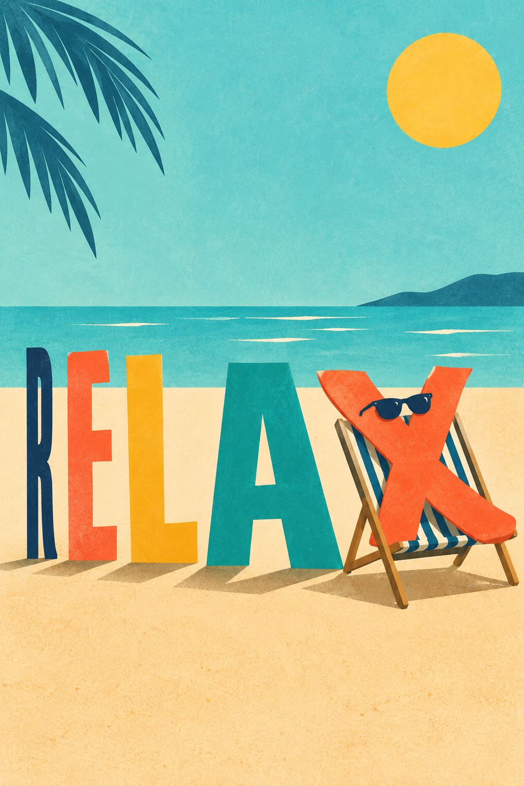
The word RELAX begins in tightly compressed letters. Each letter gradually stretches out until the final “X” is reclining in a deckchair.
Front:
RELAX
Inside:
You have officially earned the right to do absolutely nothing.
Happy Retirement!
A single expressive word can carry the whole design, with one small character providing the final joke.
| Word | Lettering treatment |
|---|---|
| MELTING | Letters slowly dripping into a puddle |
| EXHAUSTED | Letters slumped against one another |
| FABULOUS | Letters posing dramatically under spotlights |
| SURVIVED | Battered letters held together with tape |
| GROW | Letters sprouting leaves and flowers |
| CHEERS | Letters clinking together like glasses |
| FROZEN | Letters trapped inside illustrated ice |
| PANIC | Letters scattering in different directions |
| SPOOKY | Letters attempting to frighten one another |
New Year version:
Front:
SURVIVED
The letters are singed, patched and slightly crooked but still standing.
Inside:
Let’s call that a successful year.
Happy New Year!
3. The Greeting That Is Frightened of Its Own Card
Letters do not always have to be bold and confident. Nervous or reluctant typography can produce an entire series of humorous cards.
Image suggestion:
The word BOO! is hiding behind a gravestone while a tiny ghost tries to coax it into coming out.
Front:
BOO!
Inside:
Sorry. The lettering is a little shy this year.
Happy Halloween!
Christmas version:
The word MERRY is being dragged onto the card by determined elves while the letters cling to the border.
Inside:
Festive participation is compulsory.
Merry Christmas!
Birthday version:
The number representing the recipient’s age is attempting to escape through the side of the composition.
Front:
COME BACK.
WE ALL SAW YOU.
Inside:
Happy Birthday—whether the number likes it or not.
The typography might also be vain, grumpy, sleepy, overly dramatic or convinced that it is the star of the card.
Front:
FABULOUS
One letter has pushed all the others aside and is posing beneath a spotlight.
Inside:
There is always one.
Happy Birthday to my favourite one.
4. Clarity Can Have Character Too
Not every typography-led card needs wildly decorative lettering.
Thalo, designed by Signal Type Foundry, uses open forms and carefully differentiated characters to improve clarity, particularly for dyslexic readers. This is a useful reminder for every card artist: readability is not the enemy of personality.
A clear, generously spaced message can still feel warm, funny or distinctive through its scale, color and arrangement.
Image suggestion:
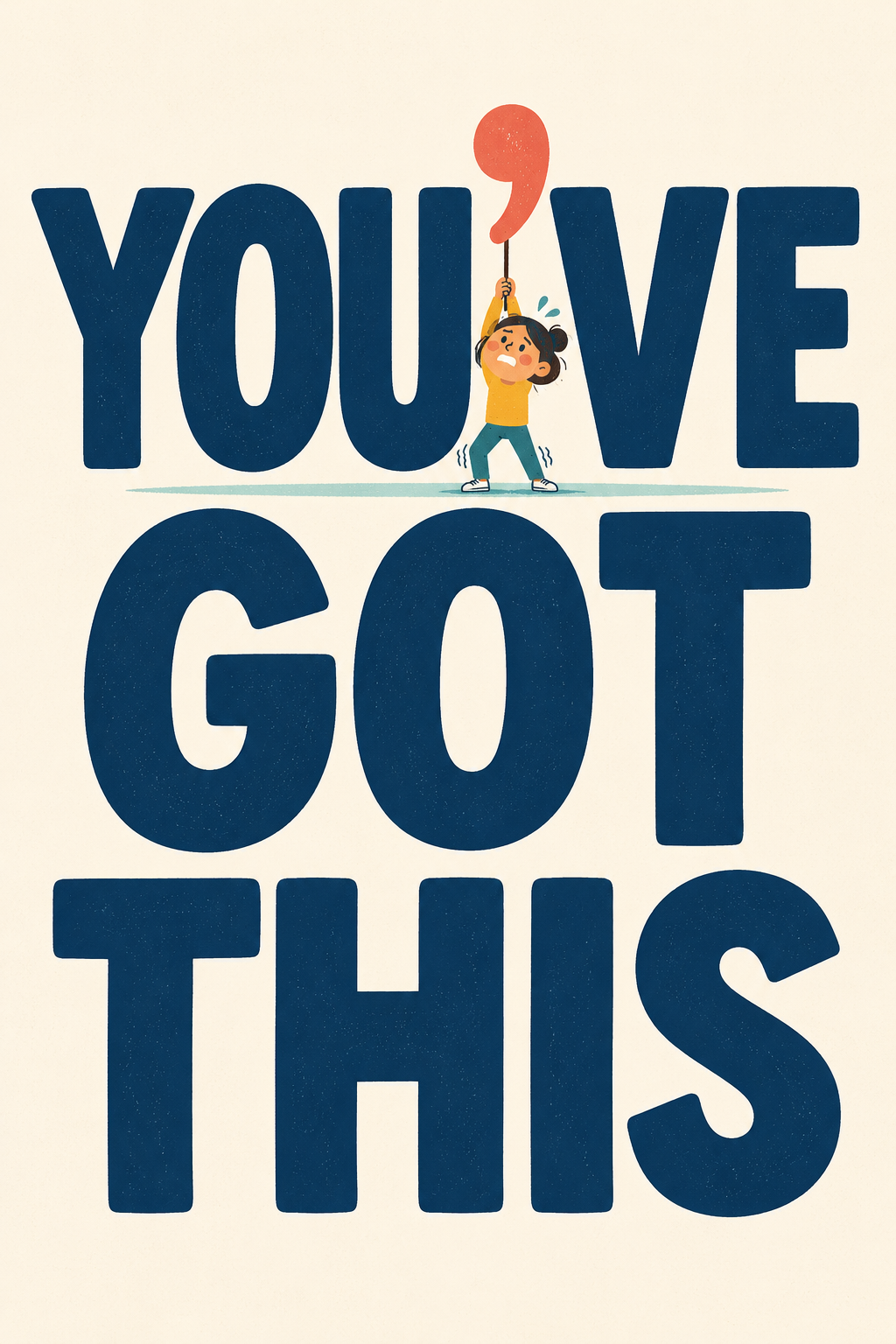
A large, clean YOU’VE GOT THIS occupies most of the card. A small nervous character stands beneath it, holding up the apostrophe.
Inside:
And on the days when you haven’t, I’ve got you.
This could work for encouragement, recovery, exams, difficult treatments, new jobs or any occasion where the recipient should not have to struggle to decipher the sentiment.
Other clear, direct fronts might include:
Front:
ONE DAY AT A TIME
Inside:
And if today is too much, we can try one hour at a time.
Front:
I’M HERE
Inside:
No clever advice. No pressure. Just me.
Front:
YOU DID IT
Inside:
Even during the parts when you were fairly certain you couldn’t.
Congratulations!
The lettering can remain simple while a small character or visual detail adds warmth and individuality.
5. One Enormous Word
Sometimes the most effective typography concept is also the simplest: choose one word, make it enormous and allow a small illustrated detail to complete the story.
Image suggestion:
The word ANCIENT fills almost the entire birthday card. A tiny archaeologist is examining one of the letters through a magnifying glass.
Inside:
Initial findings suggest “extremely well preserved.”
Happy Birthday!
Other combinations might include:
- MERRY with a cat hanging from the final letter
- LOVE with Medusa’s snakes arguing over the decorations
- RETIRED with a tiny worker switching off the last letter
- BRILLIANT with one letter glowing far too brightly
- FABULOUS with an older woman using the word as a catwalk
- SURVIVED with the letters covered in patches and bandages
- CALM with absolute chaos taking place around it
The lettering supplies the visual impact. The character supplies the story.
Cat birthday version:
Front:
SPOILED
A tiny cat sits proudly on top of the enormous word.
Inside:
As you should be.
Happy Birthday!
Medusa Valentine version:
Front:
STUNNING
Medusa stands beneath the word while several snakes hold up mirrors.
Inside:
You stopped me in my tracks.
Happy Valentine’s Day.
Check the Thumbnail Before You Upload
Typography-led designs often look wonderful at full size but become confusing when reduced. Before uploading, view the design at approximately the size customers will first see it in the GCU search results.
Ask:
- Is the central word immediately legible?
- Does the lettering style support its meaning?
- Is one element clearly dominant?
- Will the contrast remain strong when printed?
- Is the small character helping the idea rather than competing with it?
- Does the inside text complete the joke instead of repeating the front?
- Do you have the necessary commercial license for any font used?
Decorative lettering should reward a closer look, but the customer should not need a closer look to understand the occasion.
Let the Greeting Join the Cast
The most useful lesson from new experimental typography is not that every artist needs to purchase the latest fonts.
It is that words can participate in the design.
A greeting can transform from formal to unruly. It can collapse from exhaustion, hide behind a gravestone, escape from its own birthday card or demand more attention than every illustrated character around it.
The next time a design feels as though it needs “a picture beside the words,” try reversing the process.
Make the words enormous. Give them an emotion. Give them something to do.
Then let the greeting join the cast.
Happy Designing!
Corrie


