Throwback Thursday – Nuts and Bolts: Categories

How To Choo-choo-choose the Right Categories
Greeting Card Universe has a dizzying variety of categories including unusual and obscure ones. As a business, this is their strength: the ability to provide cards to fit a customer’s every need. As artists, the category system can be puzzling, confusing and downright frustrating at times. However, don’t tear your hair out. Help is on the way.
The first thing artists need to understand is that GCU’s category system is highly specialized and incredibly specific. Because of this degree of specialization, every greeting card must be designed to fit exactly into its desired category.
This is a difficult concept, I know. No other POD is as stringent. Nobody else seems determined to make you conform. Newcomers especially seem to have a hard time adjusting their thinking. Let me break it down for you as simply as I can: you must categorize a card only by WHAT IT ACTUALLY IS, not what it could be.
For example, you’ve got a beautiful picture of a dewy red rose. You think this image is appropriate for a number of categories like Valentine’s Day and Mother’s Day. You even put “I love you” in a lovely script font on the front. Okay, you’re right – it could fit either category. Problem is, unless the card actually has “Happy Valentine’s Day” or “Happy Mother’s Day” somewhere on it, you cannot put it in those categories. As it stands, if you submit this card as is, you can only put it in Collections >> Flowers & Garden (where there are over 130,000 cards right now).
Repeat after me: WHAT THE CARD ACTUALLY IS, not what it could be.
It sounds counter-intuitive, but it’s actually a very logical system once you wrap your brain around it, and GCU has made category selection even simpler during the card creation process.
Bottom line: think like a shopper, not an artist.
No one is out to stifle your creativity. No one at GCU is deliberately trying to make you cry, I promise. I know the concept can be difficult, and it’s a major reason for card returns. You need to understand that the Reviewers aren’t going to correct categories for you. In rare instances, they might add a second category if you haven’t and it’s appropriate, but do not count on their intervention. It’s YOUR responsibility to get the categories right, and if you don’t…well, you’ll be seeing a lot of those Returned for Edits notifications in your e-mail.
Best advice: don’t try to shoehorn an existing design into a category it doesn’t fit exactly. Seasoned artists know the best way to design cards is to look at the categories first. This can actually help you make future sales – you can find niche or orphan categories that have few or no cards in them, and be able to design cards to fill those categories.
Why should you care about niche and orphan categories? Let’s face it – there are literally thousands and thousands of general birthday cards (over 8000, in fact, as of this writing). Shoppers doing an on-site search or browsing certain categories receive pages and pages of search results. Chances are, if your card isn’t in the first couple of pages, you’ll miss out. Cards in niche and orphan categories don’t have a lot of competition. This is a golden opportunity you shouldn’t miss.
So before you design a card, take a look at the categories list. Just go to the GCU homepage (you’ll see a “Home” link at the top of every page, click the link “Browse Our Entire Selection of Holiday Cards, and you’ll be able to find and click on whatever categories interest you. What makes this list worth your while is that you can instantly how many cards are in each category and sub-category – valuable information for any artist serious about wanting to sell greeting cards.
Sometimes there’s a little confusion when it comes to age- or relationship-specific cards. Let me clarify GCU’s current policy: you should place such cards in the exact category and sub-category that fits it (ie, Happy Mother’s Day to my Birth Mom goes into Holidays >> Mother’s Day >> For Birth Mother) PLUS a collections category if it fits (ie, your Mother’s Day card has a cow on it, so it can also go into Collections >> Animals/Pets >> Farm Animals as the second category.
Now we have to talk about General vs. specific categories. This one can be tricky. Here’s how it works: a general greeting card can be sent to anyone for that occasion (ie, a card that simply says Happy Grandparents Day can be sent to any grandparent, and goes into Holidays >> Grandparents Day >> General Grandparents Day), while a specific greeting card would go into the appropriate sub-category (ie, a card that says Happy Grandparents Day from Your Grandkids goes into Holidays >> Grandparents Day >> From Grandchildren).
A card in either General or a specific category can also go into an appropriate Collections category. However, you cannot put a General card into a specific category. Scratching your head yet? Let’s take my previous example.
The general Happy Grandparents Day card I mentioned… just because a shopper COULD send it as a “missing you” card doesn’t mean you can put it into the Missing You on Grandparents Day subcategory. Only if the card SAYS “missing you”, and then it wouldn’t go into the General category, only into the appropriate subcategory.
Repeat after me again: WHAT THE CARD ACTUALLY IS, not what it could be.
If you grasp this principle, I guarantee you will have less cards returned for edits, and you will save yourself a lot of frustration. Let that be your mantra, and you’ll be all right.
Share this:

Font Frenzy: StateFace

StateFace is a free font featuring all 50 U.S. Stats plus Puerto Rico! While the silhouettes are simplified, they still work very well in this dingbat font, allowing you to make state specific card designs. BONUS: Need to know which letter creates which state? This very handy graph will give you all the info! (Just scroll down the page a little). Have fun!

Share this:

Rainbow Connection: Fresh Colors for 2015

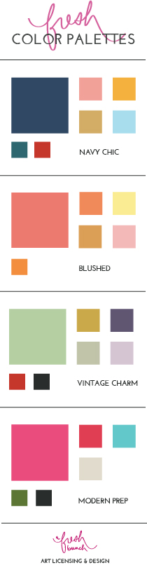
While browsing on Pinterest, I came across these lovely color palettes courtesy of the blog, A Fresh Bunch. These are just lovely colors, vibrant and with a mix and match capability that makes them versatile, too, and suitable for many card designs. I particularly like the Vintage Charm palette. Give ’em a try- just save the image to your hard-drive and open in your graphics editor program – and have fun!
Share this:

Dash of Inspiration: January Design Challenge
A Dash of Inspiration, A Cup of Creativity by Doreen January Design Challenge  Happy New Year, everyone! Today, as I personally begin another 365-day journey around the sun, I’m thrilled to kick off the first of these new challenges … For the past three-years, the GCU Community Blog has been offering tips, tutorials and design freebies to the GCU Artist Community. This New Year has inspired me to take all of you on a new journey with a monthly design challenge. My and GCU’s hope is that many of you will push yourself to step out of your ‘comfort zone’ and challenge yourself to create something completely different which will result in your growth as an artist in some way. I really hope that you will not say “I can’t do that” and instead will go find out HOW by being inspired to learn something new.
………………………………………………………………
Our very FIRST Dash of Inspiration Challenge and we have a TIE for 1st Place!
And our 1st Place WINNERS are: Liz Van Steenburgh with PID 1352750

Liz Van Steenburgh
AND
Rycky Creations with PID 1353796

Rycky Creations
With 2nd Place begin awarded to: Julia Bryant PID 1352648

Runner up: Julia Bryant
These are called challenges for a reason, they will be VERY challenging, here’s why they are different from the Design Challenges of the past:
- No existing designs are allowed. These are challenges to create a NEW card design based on very specific criteria.
- These challenges will be judged similarly to a Juried Show – the judges for these challenges will be a team of GCU experts to choose the best and the finest of the entries they wish to promote. The artist community will not be voting in these challenges, however we do hope they will take the time to comment on the entries and show support for their fellow artists, whether participating, or not in the challenge itself.
- These challenges will be varied, challenging and fun! Very different from month to month, so all of you, regardless of your ‘chosen medium’, will be able to participate in most of them – especially if you’re willing to step up and STRETCH your creativity and skill level.
READY, SET? Let’s GO! JANUARY Design Challenge – Theme: EMPATHY Requirements: Using Typography, Shape and Color ONLY – express Empathy. Empathy – [em-puh-thee] the intellectual identification with or vicarious experiencing of the feelings, thoughts, or attitudes of another. ……………………………………………………………… Entry Deadline: January 26th, 2015 ………………………………………………………………. How to Enter:
- Post the PID (card number) and the URL (public storefront link, please DO NOT post a link to your Manage Cards area) as a post in the challenge blog. We’ll forward your entry to the jury.
………………………………………………………………. Category: ANY – Tip: Encouragement, Remembrance and Sympathy categories are all good choices. ………………………………………………………………. Rules:
- Submission must meet GCU’s Submission Guidelines and be Approved through the usual Review Cycle – Fast Track your submission with this in the Notes to Reviewer: January Design Challenge Submission here is the link to the blog post: (include THIS blog post URL)
- Only ONE card per artist per challenge.
- Submissions must be NEW, no existing designs.
- Your entry must meet the Challenge Requirements and Theme or it will not be included in the challenge.
- Stock Card Creations entries will not be accepted.
…………………………………………………………………… Judging: Entries will be judged by the GCU Challenge Jury with results posting on the Community Blog the week of January 30th. The jury will judge the entries on the following criteria:
- How well the card meets the Challenge Requirements and Theme.
- How well the card speaks to the Category the artist chooses for the card submission.
- Creativity, Execution and Marketability.
…………………………………………………………………… Winners: 1st Place:
- The winning designer’s card and store will be featured on the GCU Public Blog – the blog which customers view and follow.
- As well as featured on the GCU Public Facebook Page – nearly 12,000 followers, now THAT’S exposure!
- The winning card will be Design of the Day following the announcement of the winners (within 48-hours).
- The winning card will be added to the Greeting Card Universe Design Challenge Winners Pinterest Board – currently over 800 followers.
- The winning card, should the artist choose, may be referenced in a new series by the winning artist and he/she may Fast Track all cards in the new series (being sure to give the Challenge URL and winning card PID in your Notes to Reviewer for each card in this series).
2nd Place:
- Your submission will be Design of the Day the following week of announcing the Challenge winners (within 7-days).
- Your card will be added to theGreeting Card Universe Design Challenge Winners Pinterest Board.
All entries will be featured on the GCU Community Blog when the winners are announced. ……………………………………………………………………… Tips: Check out these tips, tricks, freebies, and tutorials which would all be helpful in this month’s Challenge.
- Don’t Fall Into These Traps! The Do’s and Don’ts of Greeting Card Design
- How to Write Greeting Card Verse
- Tools and Resources for Grammar and More!
- It’s All in the Type
There are hundreds of links to fonts for Commercial Use on our blog and most are FREE. If you need a better selection of fonts which work well together for this challenge, then check some of this posts and you might find the perfect font. ……………………………………………………………………… This challenge should INSPIRE you to push the boundaries of typography and verse; and spark your imagination to use shape and color to create visual impact. When all else fails, LEARN SOMETHING NEW! Let the creativity flow and good luck! My card example for the visual for this challenge created using this challenge criteria: 
………………………………………………………………
Participants for this challenge in addition to the above two 1st place winners and 2nd place were:


Share this:

Font Frenzy: Blackboard Font – Lauris Nobilid
Blackboard/chalkboard designs remain popular with shoppers. Along with typography, you’ll need accent graphics to make a well-rounded card, so here’s a 100% free font to perk up your blackboard work – Laurus Nobilis! An example of this useful dingbat font is below. Have fun!

Share this:

Tips and Tricks: 4 Free Artistic Photoshop Actions

Spoon Graphics is offering 4 totally free (and OK for commercial use) Photoshop actions that help you give an artistic flair to your photos. Includes a tutorial for installing and using the Actions. If you’re never used Photoshop Actions before, you are in for a treat. Below you’ll see examples. Don’t forget to note the URL for your Notes to Reviewer. Have fun!

Share this:

Tips and Tricks: Trendy Chevrons
In 2015, chevrons remain one of THE most trendy patterns in all kinds of design work, so if you’re looking to update old cards or create something fresh, you can’t go wrong with chevrons in your background pattern or somewhere on the card! If you don’t know what chevrons are (aka a zig-zag pattern), here’s an example:
![]()
Chevrons come in all widths from wide to narrow, and can be a solid color interspersed with white or two different colors or even multi-colored. A chevron pattern is great for backgrounds done with a subtle tone-on-tone (like light blue and a slightly darker blue). Just be sure if you’re using another graphic, don’t let the chevrons overwhelm.
Check out Chevrons on Pinterest for inspiration.
We’ve gathered together a few resources for you to help in your quest for cool chevrons. As always, double-check the license yourself and note the URL for your Notes to Reviewer when you submit your design.
Free Photoshop Brushes: Chevrons
Attribution required.
Free High Resolution Chevron Patterns in PSD Format
The colors are set but you can easily make a change.
Make a Chevron Pattern in Gimp
Tutorial for GIMP users.
Create a Chevron Pattern in Paint Shop Pro
Another helpful tutorial.
Share this:

Tips and Tricks: Retro Text Effects
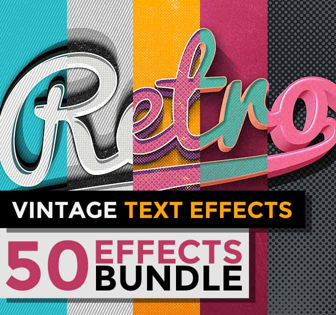
For the next 5 days, Mighty Deals is offering 50 Retro Text Effects (commercial use OK) for just $10! We’ve purchased from them before and they’re legit. The fonts are not included, but you can find many suitable fonts for free or at a low cost. If you’re looking to add some retro pizazz to your designs, check out this deal.
Share this:

Tips and Tricks: Free Christmas Download
Have we got a Christmas gift for you!
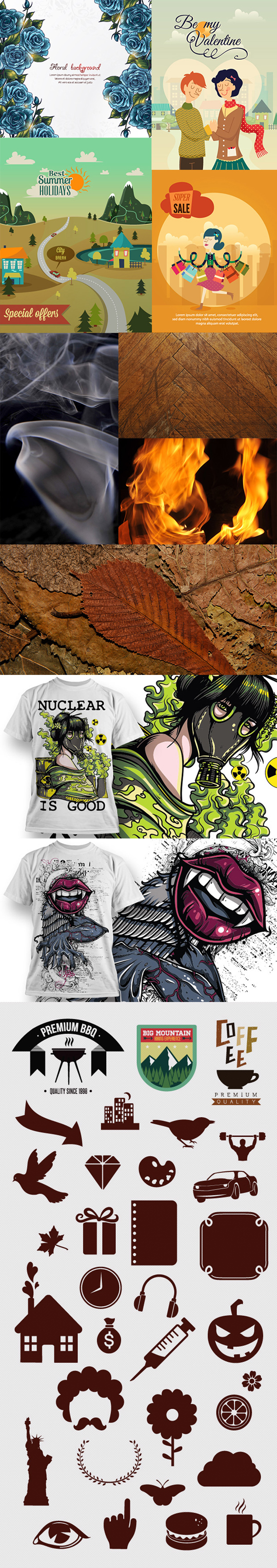
Inky Deals offers all kinds of graphics bundles and fonts for download at discounted prices. We’ve bought from them ourselves and been very satisfied. At the moment, they have a bundle deal. If you check the page, you’ll find a button to download a free sample which includes vector files and textures, etc – 43 premium graphics worth $97. And you get it for FREE! The license says the files have an extended license allowing unlimited commercial use.
Below is a small taste of what’s in the free download.
Share this:

Design Spotlight: Eline W’s Card Store

Our Design Spotlight falls on new artist Eline of Eline W’s Card Store, who joined GCU in November 2014. Her funny drawings make us happy!
_________________________

I am an illustrator/cartoonist, born and still living in the Netherlands.
I have been drawing for as long as I can remember, which is close to fifty years now. When I was twelve or so, I decided I wanted to make my living drawing comic strips. My examples were Lucky Luke (Morris/Goscinny), Guust Flater (Franquin) and Kuifje (Hergé). I went to the Art Academy in Utrecht for a while, but sadly, back then it was not possible to specialize in the arts I was interested in: cartoon-type drawing, animation and comic strips. So I decided to quit the Academy, and basically have been working as a freelance, self-taught illustrator ever since.
I have worked for a variety of media: magazines, newspapers and websites. I also made short animated movies for a few companies. About seven years ago I went to a bit of a rough time, and did not feel like drawing anymore. So I put my drawing
pen to rest, only to pick it up again very recently. And I love it as much as I always did, though that period of rest was good for me in many ways, I find it hard to believe that I did not draw anything at all during those years. It’s very good to be back 🙂
I love designing and drawing greeting cards, I picked this card because it features some cats that have lived with me or my friends, and of course my cat Storm, whom I share an apartment with now.
I work with pen and Indian ink on paper, and colouring is done digitally.
Humour is very important to me in my life as well as in my drawings, I hope my cards will make people smile.


