Tips and Tricks: Free Vector Graphics

If you work in Adobe Illustrator at all, you know about vector files – graphics that can be re-sized without loss of clarity. Vector files are to Illustrator what clip art is to Photoshop and other graphics editing programs.
Freepik offers free vector files, some more useful than others. Do check the individual license for any vector file you want to download. Many are okay for commercial use provided attribution is made, but terms may vary. Always read/understand the Terms of Use and always include a link to the license in your Notes to Reviewers.
Please note that vector files can’t usually be opened in programs other than Illustrator or programs like Illustrator. Below you’ll see an example of the type of files on offer. Have fun!
(Edited to add this top tip from Doreen Erhardt: “Just so you all know, CS-3 can open EPS vector files types and CS-5 can open both EPS and AI vectors, but neither can open SVG files. Also, IF vectors are new to you, you MUST resize them when opening them in Photoshop. So before you click OPEN when the dialog box comes up after download, resize the dpi/ppi to 300 and the dimensions to that which works well as a size for your design.”

Share this:

News: New Blog with Greeting Card Tips

GCU artist Angela Castillo of Fairy Girl Cards has started a new blog called The Card Table, which will feature tips on creating greeting cards and other designs for POD (Print on Demand) and information about trends and marketing. If you have a blog and would like to share links with her, leave your link on this Forum post.
If you’re in the UK and you’re considering branching out into making submissions to traditional greeting card publishers, the Greeting Card Association offers a list of publishers seeking artists. If you’re American and seeking the same, the GCA’s U.S. branch has this list for you. Good luck!
Share this:

Dash of Inspiration: Text Alignment and Balance
A Dash of Inspiration, A Cup of Creativity by Doreen
Text Alignment & Balance

Before typewriters vanished in the 1990s, schools used to offer Typing classes and I’m glad I had the opportunity, because it also taught the students how to align text. Of course who knew at the time the additional benefit of having a typing speed of 82-words-per-minute (in my younger years, now only about 55 WPM), would come in very handy in the computer era which followed! Granted these teachers taught to align text within a document rather than a greeting card, but there really is no difference. The other essential tip which came from those classes was an understanding and sense of ‘balancing’ lines of text. So, this is our top of discussion this week.
“Can you imagine how difficult it would be to find your car in a crowded parking lot if everyone ignored the parking lot stripes and parked in every which direction and angle? Imagine trying to get out of there! Alignment brings order to chaos, in a parking lot and on a piece of paper. How you align type and graphics on a page and in relation to each other can make your layout easier or more difficult to read, foster familiarity, or bring excitement to a stale design.” Quote by Jacci Howard Bear
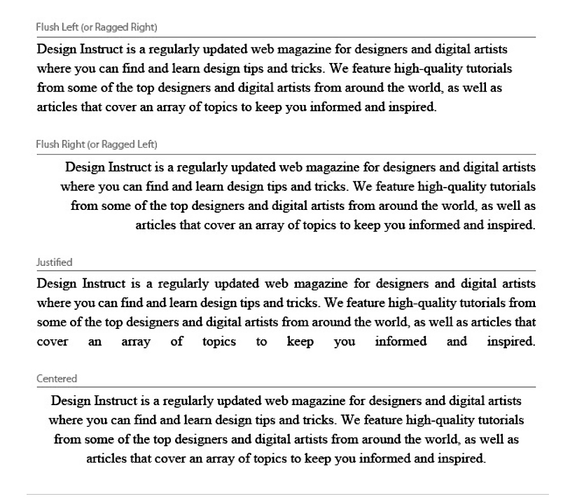
Today, we all use computers to add text to our greeting card images, therefore we have auto tools available to us to left justify, right justify or center our lines of text with each other. Choosing the right alignment for your imagery can be the difference between a wonderful card which grabs attention and a card which will be passed up by potential customers.
- Text needs to have some alignment, both with other text and with the elements making up the flow of design.
- Either left justify (flush left), right justify (flush right) or center your individual lines of text.
- On the screen, italic text almost never seems to align horizontally, especially when centered. This is usually an optical illusion, so beware of making major adjustments here (if any at all!) – do a proof print if you are sure your text is askew before you challenge the auto-alignment features you’ve enabled.
- Full justification is ugly and difficult to read, because the lines are stretched to create even line spacing and the results cause uneven spacing between words – NEVER use this for greeting cards.
For some fun, here you can improve your typing skills and even find out how many words-per-minute you type:
This article is a great visual and tip site which speaks to alignment as well as some other great typography tips. It also has some great screen shops for Working with Typography in Photoshop and Illustrator.
Alignment Brings Order to Chaos By Jacci Howard Bear – This has some wonderful examples and if you keep in mind that desktop publishing is not that different from greeting card design when it comes to typography placement, you can get a lot out of this article.
What does Balance have to do with typography?
The inexperienced designer may just type and ignore where lines of text cutoff allowing the ‘software’ to make the call for carriage returns, thus causing two issues which lack the professional polish we all strive for. 1) The text does not ‘read’ with the verbal rhythm that is necessary for verse; and 2) Visually it will lack harmony to the eye and become ugly and difficult to read – this is especially true with greeting card design where rhythm and harmony are critical. You do not want to ignore these critical areas of design, whether creating card front text or inside verse.
- Speak your message out load and try to create a rhythm in how you present your text in your designs. There is a rhythm to verse, not just to poetry.
- Unless you are using typography techniques where you are applying different fonts or sizes to emphasize certain words in your message, be careful to not make your text ‘top heavy’.
- When you place your text on the imagery, you must balance the text within itself and with all the elements which make up the design.
So until next week … Learn … Create … Inspire!

Wonderful example of using alignment within a design, as well as the importance of balancing the text which speaks your message.

Great example of balance, rhythm and harmony in both the visual and readability of the card front text and inside verse.
Share this:

Critique Clinic – May 30-31 and June 1, 2014

How does it work? For three days a week (Friday-Sunday midnight), I will open the clinic to any artist who wants an honest peer review and critique of a card which gets plenty of clicks but no sales, so something’s probably not quite right, or you’ve got a new design you want to test drive, or you’re unsure about the marketability of a card. Or perhaps you’re a newbie who isn’t sure if a card is up to a marketable standard. Anyone is welcome to participate. In fact, I encourage everyone to at least look at the cards in question and read the critique comments – you may learn something. The purpose of the clinic is to help artists improve the commercial appeal and marketability of their cards.
THE RULES
- ONE card per artist only.
- Card must be intended for sale at Greeting Card Universe.
- To submit a card for critique, post a link to the card at GCU in the comments section of this clinic post. Allowances will be made if you’ve had a card declined, or made a new design you’d like advice on before submission. Give us the link where we can see the card, such as your private gallery, Flickr, Tinypic, etc. If you do give a private gallery link, be sure your private module gallery is ON. Please do not post links to your Manage Cards section – do you really want strangers tinkering with your cards? And please don’t ask us to critique a card that’s pending review – we can’t see it until it’s approved.
- Any artist is free to comment and/or give a critique of a submitted card. HOWEVER, post-and-run comments like “great card” or “you suck” will not be tolerated, nor will abuse. Criticism should be constructive, not destructive. Play nice or you will be banned.
- I also won’t tolerate temper tantrums if you decide your “artistic integrity” is being stepped on because you asked for a critique, and someone told you the photo you’re using isn’t in focus. If you can’t take honest criticism, don’t submit. Once gets you a warning; twice and you’re banned from submitting in the future.
- Artists who critique may do so by giving their opinion, posting an example of another card, or pointing the submitter to a video, on-line article, or other helpful suggestion.
- Don’t forget that artists who are giving you tips and helpful advice are volunteering their time and trouble. Be nice. A link back to their store on your website or blog is appreciated (but not mandatory).
- You are free not to take any advice offered. There’s no guarantee any card will be a bestseller, so don’t come into the clinic with unrealistic expectations.
- Rules may change as we go along and we see how things turn out, okay?
So without any further ado, I declare this week’s Critique Clinic open!
Share this:

Tips and Tricks: Digital Washi Tape
What the heck is washi tape, you ask? It’s a decorative, patterned tape from Japan that’s very much used by crafters, scrapbookers and the homemade card makers to jazz up their designs. I’ve seen some imaginative uses for the stuff. Very trendy! Check out Pinterest: Washi Tape Ideas and Pinterest: Washi Tape Greeting Cards for examples.
If you’d like to create your own digital washi tape, here are some tutorials to help you out. Don’t forget in your product description, use “digital washi tape” or “faux washi tape” to avoid shopper confusion.
You may need to photograph/scan your own piece of blank tape and save it as a PNG on a transparent background. Inexperienced users will probably need to look for a free commercial use brush or PNG file of tape.
How to Make Washi Tape in Photoshop and Elements
Photoshop and Photoshop Elements Tutorial: How to Make Washi Tape (video)
How to Make Digital Washi Tape in GIMP
I’ve been unable to locate tutorials for Paint Shop Pro and Corel Draw … if anybody has a tip, leave it in the comments! 🙂
Share this:

Tips and Tricks: Adobe Illustrator Alternatives
If you’re using/creating vector art- vector images can be re-sized without loss of quality – you already know the files work with Adobe Illustrator. It’s nice to know there are alternatives, some free, some not, for this expensive program.
INKSCAPE is a free vector graphics editing tool that does a lot of the same things Illustrator can. And it works on PC, Mac and Linux!
Read the whole article and get the list at One Extra Pixel: 10 Best Alternatives to Adobe Illustrator
And if you’re looking for alternatives to other Adobe programs, check out Build Your Own Adobe Creative Suite with Free and Cheap Software
Have fun!
Share this:

Design Spotlight: Anita Labrentz

Our Design Spotlight falls today on Anita Labrentz of Eh-Okay Art Cards, a new artist (March 2014) whose humorous style will make you chuckle!
_________________________

I like to create clever & comical cartoons that feature quirky critters doing things that people do, but in their own play-on-words ways. My favorite cartoons are always the ones that make you laugh and see something in a slightly different way than usual, so those are always my goals in creating my own artwork.
Maybe it’s just the Canadian side of me, but all those long hours hibernating from the long winters has to have some kind of consequences! My artwork all began when some American friends on Facebook teased me about the “typical” Canadian things like living in an igloo and having penguins for pets. My first cartoons all featured penguins and polar bears, and soon the menagerie grew to include many more fun and silly critters in all kinds of play-on-words situations.
What better way to depict the humor in life than to share it through my Quirky Critter Art!
Share this:

Dash of Inspiration: Freebies on Memorial Day
A Dash of Inspiration, A Cup of Creativity by Doreen
Freebies on Memorial Day
Since it’s Memorial Day weekend, we’ll keep this short, sweet and all about stuff you can use!
As you know if you follow my Dash of Inspiration posts, I love textures and how they can be layered to add depth and drama to photographs and digital compositions. If you have been looking for a good place to get textures, check out WildTextures.com.
I also LOVE to use old Typewriter fonts which have a distressed feel to them on textured pieces, so here are some of my favorite old typewriter fonts.
Truetypewriter PolyglOTT – created by Sergey Beat
My Underwood – created by Tension Type
Charrington – created by Apostrophic Lab
1942 Report – created by Johan Holmdahl – CAUTION: This font has the ‘illegibility’ factor, so make sure you pay close attention to making your choices legible and don’t over-use this font.
If you’ve yet to experiment with layering textures and painting them onto certain areas of your image, maybe it’s time to try out one of these tutorials and to open you mind to new horizons!
Photoshop Users: How to Use Textures to Enhance Your Photographs
Paint Shop Pro Users: How to Use Textures in PSP
Illustrator Users: Add a Texture in Illustrator
GIMP Users (video)
Next week we’ll return to talk about text alignment. So, until then, Happy Memorial Day … Learn … Create … Inspire!

by Natalie Kinnear

by Stacia Gorge

by Trudy Wilkerson

by Doreen Erhardt
Share this:

Critique Clinic – May 23-25, 2014
How does it work? For three days a week (Friday-Sunday midnight), I will open the clinic to any artist who wants an honest peer review and critique of a card which gets plenty of clicks but no sales, so something’s probably not quite right, or you’ve got a new design you want to test drive, or you’re unsure about the marketability of a card. Or perhaps you’re a newbie who isn’t sure if a card is up to a marketable standard. Anyone is welcome to participate. In fact, I encourage everyone to at least look at the cards in question and read the critique comments – you may learn something. The purpose of the clinic is to help artists improve the commercial appeal and marketability of their cards.
THE RULES
- ONE card per artist only.
- Card must be intended for sale at Greeting Card Universe.
- To submit a card for critique, post a link to the card at GCU in the comments section of this clinic post. Allowances will be made if you’ve had a card declined, or made a new design you’d like advice on before submission. Give us the link where we can see the card, such as your private gallery, Flickr, Tinypic, etc. If you do give a private gallery link, be sure your private module gallery is ON. Please do not post links to your Manage Cards section – do you really want strangers tinkering with your cards? And please don’t ask us to critique a card that’s pending review – we can’t see it until it’s approved.
- Any artist is free to comment and/or give a critique of a submitted card. HOWEVER, post-and-run comments like “great card” or “you suck” will not be tolerated, nor will abuse. Criticism should be constructive, not destructive. Play nice or you will be banned.
- I also won’t tolerate temper tantrums if you decide your “artistic integrity” is being stepped on because you asked for a critique, and someone told you the photo you’re using isn’t in focus. If you can’t take honest criticism, don’t submit. Once gets you a warning; twice and you’re banned from submitting in the future.
- Artists who critique may do so by giving their opinion, posting an example of another card, or pointing the submitter to a video, on-line article, or other helpful suggestion.
- Don’t forget that artists who are giving you tips and helpful advice are volunteering their time and trouble. Be nice. A link back to their store on your website or blog is appreciated (but not mandatory).
- You are free not to take any advice offered. There’s no guarantee any card will be a bestseller, so don’t come into the clinic with unrealistic expectations.
- Rules may change as we go along and we see how things turn out, okay?
So without any further ado, I declare this week’s Critique Clinic open!
Share this:

Tips and Tricks: Public Domain Images
From our friends at Noupe: the Public Domain Archive is a small but growing site of high quality public domain photographs. Here’s the article in its entirety.
Another source of public domain images is Gratisography. Both of these sites are updated weekly.
Remember, any photo you want to use from a public domain site must still meet GCU’s submission requirements AND you will need to include the source (URL) of the image in your Notes to Reviewers. Before you begin, do your research.
Ask yourself these questions:
- Does the image’s license let you to use/distribute it in any way, including commercial?
- Does the image’s quality meet GCU’s Submission Guidelines? (Is it suitable for print?)
- Is the image truly in the public domain? (You can run it through Google to check)
- Does the image include trademarks, products, copyrighted works of art (for example, the Eiffel Tower at night) or people? If so, don’t use it. In the case of people, don’t use it unless a model release is available.
If you have questions about public domain, we suggest you visit the Public Domain Sherpa.
Edited to add this comment from Doreen Erhardt:
“Great finds Corrie, thank you!!
ARTISTS, PLEASE NOTE TOU for PublicDomainArchive:
Downloading and use of images – All Images provided on PublicDomainArchive are bound to Creative Commons Deed CC0 … You are free to adapt and use the Images for commercial purposes without attributing the original author or source.
Under LIMITATIONS: You may not claim ownership of any image in its original state, and you cannot license or sublicense images granting exclusive rights as they are.
Please remember these sites exist for designers like us to create something new, to adapt, to create a derivative work. Therefore taking these images as is and adding a border and text and calling it yours on a greeting card to make money, is considered “claiming ownership in its original state”, so please be creative.
If you need a refresher or examples of derivative works, these might help.
https://gcucommunity.com/2012/01/30/dash-of-inspiration-credit-where-credit-is-due/
https://gcucommunity.com/2013/09/09/dash-of-inspiration-marketability-creative-use-policy/
https://gcucommunity.com/2014/03/17/dash-of-inspiration-dont-be-a-copy-cat/
Thank you Corrie, great sites!”


