
Typography is a growing trend in greeting card design. The text on any card is important – from choosing the right words to deciding on the details like font and placement – however, typography cards rely on the text as the main design element and focal point. Go and have a look at the greeting cards by major card retailers and you’ll see the typography style is increasingly popular.
Here are a couple of examples from GCU artists…


As you see, typography can be done in various styles. The main thing is that the design be visually appealing, which means you’ll need to know what you’re doing. Fortunately, we’ve got you covered in this Typography Tips article.
A couple of TIPS if you want to start designing typography cards…
- Invest in a few really good fonts, particularly script fonts. Free fonts are okay, but the really great ones will require a financial investment. I consider professional fonts well worth the money I’ve spent. If you see a font you really like but can’t afford, look for a font that’s similar that fits your budget. I like MyFonts, but there are many other reputable font retailers out there.
- You’ll also want to look more at handwritten fonts … although on the casual side, the handwritten look is very much in vogue
- Learn how, when and why to use swashes – those curly, swirly, elegant flourishes you find on many script and display fonts (and a few swash-only fonts like Nymphette). A well placed swash or two can really punch up your typograph. Doing it wrong ruins your design. Learn more about How to Use Swashes because yes, there are rules, and yes, you need to understand and follow the rules unless you want to look like an amateur.
- Successfully combining trends like retro/vintage, blackboard/chalkboard and typography will give you an end result that appeals to different shoppers.
- Don’t just put a few words on a card and expect a sales explosion. Typography is as much about what you say as how you say it. The simplest typography would be your message in a frame (see example 1 above). It’s a great message for the occasion. But you’ll notice how different fonts, different colors and a few small design elements make the card special.
- Use scrolls, labels, ribbons, frames and ornaments to augment your design.
Here are some RESOURCES you’ll find handy:
KG Flavor and Frames Five has some very nice frames and ribbons. $5 donation required for commercial use.
Hustle Supply Co. offers lots of vector graphics and vector sets for frames and ribbons and other design elements. They aren’t free, but the prices are affordable if you’re looking to invest.
Free Vector Pack – 85 free for commercial use vectors with a retro/vintage look including frames and ornaments. Attribution required.
Corners and Dividers – A free for commercial use font you can play with.
Free PS Brushes, Clip Art & Vectors – A nice collection of freebies, many are okay for commercial use with attribution. Be sure to check; you’ll find the licensing information on the download page. The Freebies of the Week posts are a compilation of different offerings from around the Internet. Don’t assume it’s free for CU unless it’s stated explicitly in the licensing/TOU.
And finally, I leave you with some inspiration to get your creative juices flowing. Have fun!
![]()
Share this:

Font Frenzy: Ostrich Sans

Ostrich Sans is a free for commercial use, sans serif font in six weights – perfect for pairing with script or display fonts OR there’s a lot you can do with the different weights as a stand-alone design feature. You’ll see examples of this font family below. As always, be sure to check the license yourself. Have fun!

Share this:

Dash of Inspiration: Organizing Resources
A Dash of Inspiration, A Cup of Creativity by Doreen
Organizing Resources

Last week it was requested that I share how I organize all my resources (brushes, vectors, patterns, etc.), so that’s our topic this week. Although I have Adobe Bridge for CS-5, the fact that I keep all my files and resources on external drives rather than on my computer, makes Bridge simply too slow at gathering the files for my taste. I have considered purchasing software which supposedly makes organization of resource files easier, but as so many artists do, ended up developing my own process using the file manager my operating system came with.
My work area is an internal (home) network which looks something like this:
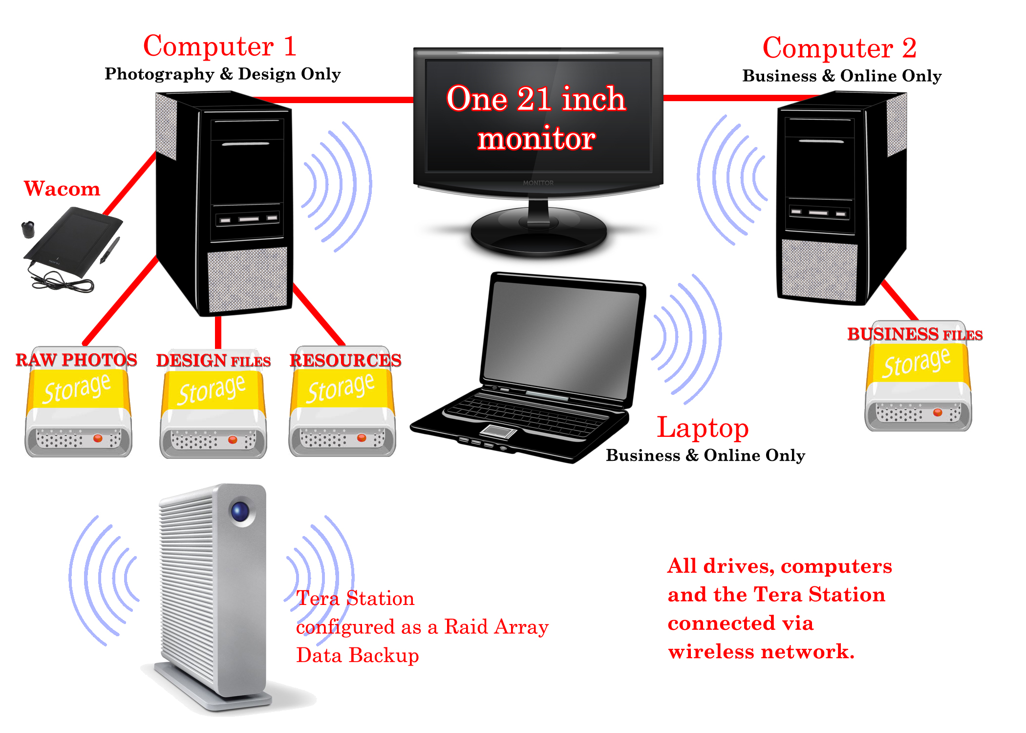
- ALL of my files are stored on external drives. 1 – I use solely for my Raw Camera files. 2 – is dedicated to resource storage. 3 – is dedicated to Design Files (cards, etc) and 4 – is dedicated to business file storage.
- ALL of my drives and computers (laptop included) are connected via a wireless home network so all can be accessed from any computer, anywhere in the house.
- The only files which are actually on any of my computers are the fonts (which I backup on the Tera Station) and installed software.
- Two computers. One is dedicated to photography and design, the other is dedicated to business and online use.
- The Tera Station is configured as a Raid Array and functions as backup for all my external drives and a place for storing common files used by various people in the house making file-sharing a breeze.
Benefits are:
- When a computer fails (and they always do) I never lose files and once the replacement computer arrives, I’m up and running in about an hour since all we have to do is attach the drives and install software.
- I can access any file, any time, on any computer, anywhere in my home.
- Even with the slickest set up to protect from virus/malware/spy-ware, you can never be 100% protected. Therefore by having a computer dedicated to online and one dedicated to design, I am further protecting my design files from exposure to the internet by never accessing the web on that computer.
I personally have found that the only File Organization Tool which is quick and will easily access all storage devices using my home network, is Windows Explorer and currently I’m using Windows 7.
Organizing Resources
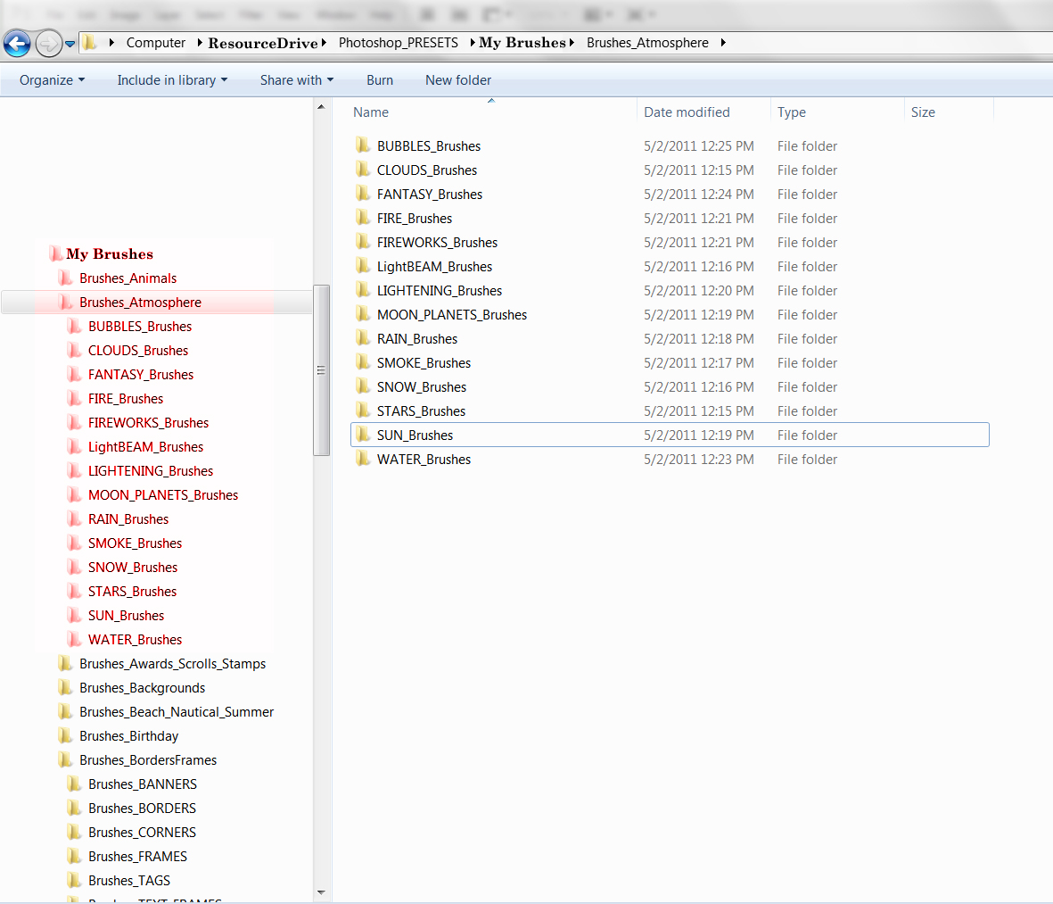
Here is my method to keep resource files organized and easily accessible.
- Choose a file structure which works for you. My downloaded resources look like this: Chalkboard_Halloween_61614_byjzkdesigns_Brusheezy – The 1st section is the ‘category’ also the sub-folder title, the 2nd section is the identifier which will allow it to surface in a search for ‘Chalkboard’ or ‘Halloween’ or both. The 3rd is the date which I process the download (if I had more than one, I add a letter to that 61614A), this gives a unique file name. The 4th is who to credit for the resource. The 5th is where I obtained the resource.
- I have a “My Resources” Folder. Within that folder, I have folders for Brushes, Patterns, Backgrounds, Textures, Overlays, Actions, Gradients, Styles, Public Domain, Fonts, etc. Each of those folders have tiered sub-folders by subject under them and I do keep some consistency for ensuring search accuracy.
- I also have found that the more you can break down these folders into sub-folders, the faster it is to find what you need. So don’t be afraid to have a complex folder structure if it keeps you from having a folder flooded with elements which are too varied and time-consuming to look through.
This system offers me the freedom to do all of these things quickly:
- Search in Explorer for all of one kind of resource when viewed as extra large icons makes it easy to find what I want for my design.
- When I use the element in my design, I copy the file name to a notepad so that when I upload my card, I can quickly go to the site I downloaded the element from, search for my element by creator, copy the URL and add that to my Notes to Reviewer.
- I also have at that time, the name of who to credit for the elements in my Artist Notes.
So, my folder structure looks something like this:
Here are some tips which I’ve found useful:
- Whenever I download TIFF, Photoshop or vector files I open them and re-save as PNG format to 1) to save storage space (file size is small and uncompressed), and 2) to have preview images show up in Explorer when I search.
- When I download brushes and patterns, I put them in a ‘Check’ folder before actually placing them in my resource folders. I do this when there isn’t a visual offered to show the size of the brushes or patterns. Many are created so small that for our usage, designs which are 300dpi, they are useless. Then once every couple of weeks, I’ll open those resources and make the decision to keep or toss. This stops the clutter in my resource folders of tools which do not meet my requirements.
- When it comes to presets, often there are those we use frequently and I simply create a BEST OF folder within my resources or you can set up a library folder, which ever works best for you.
- I’ve found over the years that categorizing by theme/subject rather than by creator or source, works better for me. Try both, decide what works for you.
- I keep all my licenses in one folder making it quick and easy to reference if needed.
Here is a search in My Resources for Chalk – notice that all my folders holding brushes, etc. show up in the search as well as all the image resources. It’s quick and easy to grab and go design.

Now you know my way, here are some other ways of organizing your resource files.
Digital Scrapbook Organization – 3 ways
Organize your Digital Scrapbooking Supplies in Photoshop Elements Organizer
There are also many choices such as iPhoto, Picasa, etc., which allow for better organization, however be very, very careful if you choose to use the editing tools which these programs offer. Most do not produce results which are high quality and non-destructive in application, so commercial designers stay away from these tools.
So until next week … Learn … Create … Inspire!
Share this:

Critique Clinic – June 13-15, 2014

How does it work? For three days a week (Friday-Sunday midnight), I will open the clinic to any artist who wants an honest peer review and critique of a card which gets plenty of clicks but no sales, so something’s probably not quite right, or you’ve got a new design you want to test drive, or you’re unsure about the marketability of a card. Or perhaps you’re a newbie who isn’t sure if a card is up to a marketable standard. Anyone is welcome to participate. In fact, I encourage everyone to at least look at the cards in question and read the critique comments – you may learn something. The purpose of the clinic is to help artists improve the commercial appeal and marketability of their cards.
THE RULES
- ONE card per artist only.
- Card must be intended for sale at Greeting Card Universe.
- To submit a card for critique, post a link to the card at GCU in the comments section of this clinic post. Allowances will be made if you’ve had a card declined, or made a new design you’d like advice on before submission. Give us the link where we can see the card, such as your private gallery, Flickr, Tinypic, etc. If you do give a private gallery link, be sure your private module gallery is ON. Please do not post links to your Manage Cards section – do you really want strangers tinkering with your cards? And please don’t ask us to critique a card that’s pending review – we can’t see it until it’s approved.
- Any artist is free to comment and/or give a critique of a submitted card. HOWEVER, post-and-run comments like “great card” or “you suck” will not be tolerated, nor will abuse. Criticism should be constructive, not destructive. Play nice or you will be banned.
- I also won’t tolerate temper tantrums if you decide your “artistic integrity” is being stepped on because you asked for a critique, and someone told you the photo you’re using isn’t in focus. If you can’t take honest criticism, don’t submit. Once gets you a warning; twice and you’re banned from submitting in the future.
- Artists who critique may do so by giving their opinion, posting an example of another card, or pointing the submitter to a video, on-line article, or other helpful suggestion.
- Don’t forget that artists who are giving you tips and helpful advice are volunteering their time and trouble. Be nice. A link back to their store on your website or blog is appreciated (but not mandatory).
- You are free not to take any advice offered. There’s no guarantee any card will be a bestseller, so don’t come into the clinic with unrealistic expectations.
- Rules may change as we go along and we see how things turn out, okay?
So without any further ado, I declare this week’s Critique Clinic open!
Share this:

Design Spotlight: Caroline Bonne-Müller

Our Design Spotlight falls today on Dutch artist Caroline Bonne-Müller of Cartita Design − we´re such big fans of this artist´s sweet style!
_________________________

The little story about my self: my name is Caroline Bonne-Müller, I am a Dutch artist living in Kuala Lumpur and design greeting cards under the label Cartita Design. I studied fashion in Amsterdam and worked for 14 years as a fashion designer for kids’ collections.
I moved in 2000 to Barcelona where I started to illustrate for greeting cards, mostly painted with acrylics and digital manipulation. In 2013, I moved to Asia where I still live and work.
Share this:

Tips and Tricks: Trendy Retro/Vintage, Part 2

Yesterday, we talked about the retro/vintage look on greeting cards, how this trend can work in your favor, and gave you some inspirational ideas. Today, we’re bringing you some resources to help you achieve the right tone.
The Golden Rules
- When using third party graphics, always check the licensing (Terms of Use or TOU).
- Be sure to include a link to the TOU in your Notes to Reviewers, or your card may be Declined or Returned for Edits.
- Never assume a resource is free to use unless it’s stated in the TOU.
- When in doubt, leave it out.
- Just because I note a resource is free for commercial use here, double-check the license anyway. Sometimes designers change their TOU.
Designer’s Resources
A Collection of Retro and Vintage Patterns for Photoshop
Many of these patterns are free for commercial use, though some require attribution. If you don’t know how to install patterns in Photoshop, here’s a tutorial.
The Graphics Fairy
Hosts a large collection of vintage graphics in color and black and white. Most of the images predate the 1920s, so are in the public domain. Not all are the highest quality necessary for greeting cards, so be choosy. Okay for commercial use. Requires attribution.
Vintage Postcard Set 1 – Photoshop Brushes
Okay for commercial use when making a derivative work.
Vintage Toys – Photoshop Brushes
Okay for commercial use when making a derivative work.
Vintage Paper Brushes
Really nice for background work. Commercial use okay.
Retro Vectors
For Illustrator and other vector friendly graphics software. Most files are okay for commercial use, but you must provide attribution. Be sure to read the TOU for limitations.
Retro Style Fonts
These fonts are free for commercial use, but check the license yourself to be sure.
Have fun!
Share this:

Tips and Tricks: Trendy Retro/Vintage

Nostalgia is very trendy in all kinds of design, so giving greeting cards a retro/vintage look will put you square in the spotlight with shoppers. Use a retro font, vintage images and graphics and/or backgrounds to create the right feel. Below are some Pinterest boards and pins which will give you inspiration in creating your own nostalgic looks. You’ll see a lot of hand made cards showcased, giving you great ideas to adapt and make your own.
Bonus Tip: Pairing retro/vintage images with modern humor is “in.”
![]()
Vintage and Retro Style Cards/Tags
Vintage + Retro Inspired Cards
Have fun! Tomorrow, we’ll be giving you some great resources to help you achieve the retro/vintage look.
Share this:

Dash of Inspiration: Halloween in June
A Dash of Inspiration, A Cup of Creativity by Doreen
Halloween in June
Of all of you have been listening to the advice Corrie and I have offered over the years, then you are all working on Halloween Cards now … right? Any artist new to our community blog, or for those who need a refresher, the greeting card designer must work three to six months in advance of any and every holiday.
Today I offer some great bits and pieces to add to your spooky toolbox which will nicely accompany those ghouls and goblins in your new Halloween designs. All are free for commercial use with attribution and free to download.
Dark Wooden Textured Backgrounds
Rain Shower Photoshop Brush Set
Statik: A Free Bold Style Font
Rays of Light Photoshop Brush Set
Motion Light Effects Brush Set
Light Effect Brushes + Textures Vol 1
Drip Collection – 20 Brushes and Vectors
If you need some inspiration before getting started, Pinterest is a great start!
So until next week … Learn … Create … Inspire!

Share this:

Critique Clinic – June 6-8, 2014
How does it work? For three days a week (Friday-Sunday midnight), I will open the clinic to any artist who wants an honest peer review and critique of a card which gets plenty of clicks but no sales, so something’s probably not quite right, or you’ve got a new design you want to test drive, or you’re unsure about the marketability of a card. Or perhaps you’re a newbie who isn’t sure if a card is up to a marketable standard. Anyone is welcome to participate. In fact, I encourage everyone to at least look at the cards in question and read the critique comments – you may learn something. The purpose of the clinic is to help artists improve the commercial appeal and marketability of their cards.
THE RULES
- ONE card per artist only.
- Card must be intended for sale at Greeting Card Universe.
- To submit a card for critique, post a link to the card at GCU in the comments section of this clinic post. Allowances will be made if you’ve had a card declined, or made a new design you’d like advice on before submission. Give us the link where we can see the card, such as your private gallery, Flickr, Tinypic, etc. If you do give a private gallery link, be sure your private module gallery is ON. Please do not post links to your Manage Cards section – do you really want strangers tinkering with your cards? And please don’t ask us to critique a card that’s pending review – we can’t see it until it’s approved.
- Any artist is free to comment and/or give a critique of a submitted card. HOWEVER, post-and-run comments like “great card” or “you suck” will not be tolerated, nor will abuse. Criticism should be constructive, not destructive. Play nice or you will be banned.
- I also won’t tolerate temper tantrums if you decide your “artistic integrity” is being stepped on because you asked for a critique, and someone told you the photo you’re using isn’t in focus. If you can’t take honest criticism, don’t submit. Once gets you a warning; twice and you’re banned from submitting in the future.
- Artists who critique may do so by giving their opinion, posting an example of another card, or pointing the submitter to a video, on-line article, or other helpful suggestion.
- Don’t forget that artists who are giving you tips and helpful advice are volunteering their time and trouble. Be nice. A link back to their store on your website or blog is appreciated (but not mandatory).
- You are free not to take any advice offered. There’s no guarantee any card will be a bestseller, so don’t come into the clinic with unrealistic expectations.
- Rules may change as we go along and we see how things turn out, okay?
So without any further ado, I declare this week’s Critique Clinic open!
Share this:

Design Spotlight: Erwin Van Hesteren
Our Design Spotlight falls today on Dutch artist Erwin Van Hesteren, who joined GCU in May 2014. We like his style!
_________________________

My name is Erwin van Hesteren, graphic designer from the Netherlands. I design brandmarks, websites, posters etc for companies.
My wish was to design something for my own. My passion is making great, funny an adorable illustrtions. And when a friend asked me to design a birth announcement for his daughter I designed a new style by my own..
Since one year I started my own website in the Netherlands. At that site I sell several birthday announcement cards. What I missed in birtday announcement cards were fresh, funny illustrated cards, so I made a unique style in which I illustrated several characters. The customer can change all cards in color and fontstyle.
Next to my own site I design more greetingcards and birthday invitations at a big Dutch website (kaartje2go) similar with GCU.
For now I designed 3 cards at GCU. This card is one of them
The owl was the first character I designed for my collection. In the illustration I use many patterns and textures combined with graphic elements. It seems a bit that I use a 3D program for that, but It’s a 2D image.


