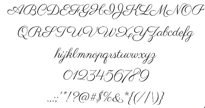
Font Frenzy: Parisienne

When you need a pretty script font that’s incredibly feminine, look no further than Parisienne, which is a connected script font – always a bonus – and has nice curly capitals to play with in your designs. Not super formal, but not informal either. I can see this working on cards for women like Mother’s Day, an aunt’s birthday, etc. Parisienne is free for commercial use. See the example below and have fun!
Share this:

Tips and Tricks: Handy Font Preview

Wordmark.it is a font preview site. You type a word into the black box at the top of the page – where you see “wordmark” when the page first loads – and press the “load fonts” button. The word is shown in every font on your computer, allowing you to preview all your fonts. It’s a very handy tool to have open in your browser when you’re designing cards.
Typetester is a site that allows you to compare one font to another, but the choice is limited to a preset list. Nevertheless, there are some basic fonts here and the tool works well for what it is.
FontBROWSER is another font preview site. You choose from a list of all the fonts on your computer and a predetermined sample text is generated. You need Flash for this one.
Add these useful tools to your designer’s kit and you’ll have an easier time matching a font to your intended design.
Share this:

A Dash of Inspiration, A Cup of Creativity by Doreen
(Doreen’s got another commitment this week, so she asked us to re-run a previous article)
10 Reasons Why Your Photos Might Not Meet Submission Guidelines

1) Poor Lighting
Lighting can make or break a photograph, after all a photograph IS a collection of light. Harsh lighting causes washed out detail in the highlights (whites) and lens flare. Low lighting can cause color shifts, muddy blacks without detail, color noise and blurry edges due to camera shake. On camera flash often causes the a flattening of the image and can create deep unpleasing shadows. Good photographs need to look natural, lighting a photograph is understanding light sources and using them to create mood and depth. Washed out images, those which are dark or lacking in contrast (flat) or those with deep unnatural shadows are most likely not going to meet GCU’s submission guidelines.

To further explore Lighting and Contrast:
Dash of Inspiration: “Highlights & Shadows” – October 24th, 2011
“Blown Highlights” – Photography tip article by DErhardt July 2009
Dash of Inspiration: “Introduction to Contrast in Monochromatic Digital Photos” by SunAtNight
2) Poor Color
Having poor White Balance causes photographs to have ugly and unnatural color casts. In photography, whites need to be white and blacks need to be black. These color shifts can occur when taking the photograph and when scanning artwork, photos, negatives or transparencies. Correcting white balance is simple and can be done any of three ways; a) adjust white balance settings on the camera for the conditions you’re shooting under, b) adjust the color balance in post-processing software, or 3) use external filters on your camera lens prior to shooting.

To further explore Color Balance & Correction Filters:
Dash of Inspiration: “The Color of Light” posted on November 1st, 2011
“Traditional Camera Filter Recommendations” – Photography tip article by DErhardt May 2010
3) Poor Depth of Field
Understand how to use and when to manipulate Depth of Field. Shallow DOF has it’s place, but it certainly is not for every photo. Most SLR cameras have a depth of field preview, easy to use and can be quite the learning tool. Learn how and when to adjust your aperture to gain focal length. Be sure your entire subject falls within the DOF range and make conscious decisions on where the DOF begins to drop off. DOF drop that begins and ends in the wrong place within your composition and your photograph is no longer a winner.

To further explore Depth of Field and Creative Focus Techniques
“Focus on Depth of Field” – Photography tip article by DErhardt August 2009
“the Fundamentals of Focusing Techniques” – photography tip article by DErhardt October 2011
4) Not Getting the BEST shot
Learn to observe your subject before you grab the shot. The BEST shot means you choose the best subject – this is really important when shooting floral photography to name one area. Browning petals and those eaten by bugs for example are not good subjects. Position yourself to the subject and light source so that you get the best angle and best lighting on your subject. Take the time to choose the right lens for the job and to add a fill flash if necessary. Challenge yourself to show your subject at it’s BEST!

To further explore Getting the Best Shot:
“Guide to a Winning Photograph” – Photography tip article by DErhardt May 2011
“Flower Photography 101” – photography tip article by DErhardt April 2011
Dash of Inspiration: Floral Photography 101 and Beyond – posted on August 1, 2011
5) Distractions
There is an old saying in photography; “That which does not add to the photograph, detracts from photograph”. Sticks and branches, messy living rooms, poles sticking out of peoples heads – all of these are found in snapshots and take away from an otherwise well-composed photo. When composing look at every element the camera is going to capture and position yourself so that those distractions do not ruin your photograph.

6) Poor Composition
Learn the basic rule of thirds. Until you understand and can successfully apply composition rules, you are not qualified to know how to break the rules! Be aware of your horizon line when composing; if there is a body of water, buildings, street or anything which adds horizontal or vertical lines to your photograph, make sure they are straight. When looking though the viewfinder, either fill the frame with your subject or use basic composition rules to place your subject in a pleasing composition.

To further explore Composition:
Dash of Inspiration: “Better Designs = More Approvals = More Sales” – September 19th, 2011
7) Poor Motion Capture and Camera Shake
Taking photos of moving objects and/or while you are moving is a well-practiced skill. As many of you, when I’m on vacation I might grab a couple of shots out the car window, but only my scrapbook will see those images. In low light condition, use a tripod. You may think you are holding the camera still, but unless your shutter speed is well above the focal length of your lens you’ll have camera shake. Motion capture means that you are showing the motion of a moving subject, so one of three situations are considered successful capture; a) the image shows the moving subject in sharp focus (motion stopped) and the background shows indication of movement, b) the moving subject has motion blur and the background is in sharp focus, or c) stopping motion entirely so both the subject and the surroundings are in focus.

To further explore Capturing Motion:
“Motion Capture Photography” – photography tip article by DErhardt July 2010
8) Poor Flash Techniques
Using a flash is not just turning it on and allowing it to run on whatever power output the default setting of your camera, it’s knowing how to set it for the lighting conditions. Flash causes deep shadows, washed out colors and of course that horrible ‘flash eye’ effect. Learn techniques for adding ‘fill light’ or ‘bounce light’ to your images when necessary; and if you get flash eye, regardless of whether it’s red, yellow or green; learn to fix it in post-processing.

To further explore Flash Techniques:
On-Camera Flash Tips – by Digital-Photography-School
“Get the Red Out” – photography tip article by DErhardt May 2009
9) Resolution Issues
It’s important to understand the resolution your camera is recording at and/or what resolution to scan a negative or photo at in order to produce a quality 1500 x 2100 pixels image at 300 dots per inch (DPI) to meet GCU’s sizing standards. Simply resizing a photo which was recorded at 72dpi and changing it to 300dpi without modifying the pixels dimensions will cause serious resolution issues and your images will have jpg artifacts. Do your homework and don’t size images up! Remember jpgs are a compressed file type, so every time you save that image over itself, you are degrading the quality of the image! Work in an uncompressed format.

To further explore Resolution:
Dash of Inspiration: “Artifacts … The Facts” posted March 19, 2012
“Digital File Types” – photography tip article by DErhardt January 2010
10) Excessive Post-Processing
As a general rule of thumb, post-processing photographs should be that which makes minor adjustments to color, tonal values, saturation, spotting, cropping and sharpness. A heavy hand during any of these adjustments can cause a degradation in quality resulting in color noise, color banding and loss of detail to name a few. In addition, excessive use of digital filters are a sign of ‘an amateur at the wheel’. Learn how to combine ‘effects’ with a light hand and choose your subjects carefully when applying digital filtering.

To further explore Post-processing:
Dash of Inspiration: “Post-Processing Do’s and Don’ts” – posted March 5th, 2012
“From Bland to Grand” – photography tip article by Doreen Erhardt published November 2010
Share this:

Critique Clinic – May 16-18, 2014

How does it work? For three days a week (Friday-Sunday midnight), I will open the clinic to any artist who wants an honest peer review and critique of a card which gets plenty of clicks but no sales, so something’s probably not quite right, or you’ve got a new design you want to test drive, or you’re unsure about the marketability of a card. Or perhaps you’re a newbie who isn’t sure if a card is up to a marketable standard. Anyone is welcome to participate. In fact, I encourage everyone to at least look at the cards in question and read the critique comments – you may learn something. The purpose of the clinic is to help artists improve the commercial appeal and marketability of their cards.
THE RULES
- ONE card per artist only.
- Card must be intended for sale at Greeting Card Universe.
- To submit a card for critique, post a link to the card at GCU in the comments section of this clinic post. Allowances will be made if you’ve had a card declined, or made a new design you’d like advice on before submission. Give us the link where we can see the card, such as your private gallery, Flickr, Tinypic, etc. If you do give a private gallery link, be sure your private module gallery is ON. Please do not post links to your Manage Cards section – do you really want strangers tinkering with your cards? And please don’t ask us to critique a card that’s pending review – we can’t see it until it’s approved.
- Any artist is free to comment and/or give a critique of a submitted card. HOWEVER, post-and-run comments like “great card” or “you suck” will not be tolerated, nor will abuse. Criticism should be constructive, not destructive. Play nice or you will be banned.
- I also won’t tolerate temper tantrums if you decide your “artistic integrity” is being stepped on because you asked for a critique, and someone told you the photo you’re using isn’t in focus. If you can’t take honest criticism, don’t submit. Once gets you a warning; twice and you’re banned from submitting in the future.
- Artists who critique may do so by giving their opinion, posting an example of another card, or pointing the submitter to a video, on-line article, or other helpful suggestion.
- Don’t forget that artists who are giving you tips and helpful advice are volunteering their time and trouble. Be nice. A link back to their store on your website or blog is appreciated (but not mandatory).
- You are free not to take any advice offered. There’s no guarantee any card will be a bestseller, so don’t come into the clinic with unrealistic expectations.
- Rules may change as we go along and we see how things turn out, okay?
So without any further ado, I declare this week’s Critique Clinic open!
Share this:

Font Frenzy: Nautik
This free font is okay for commercial use – Nautik, a serif font with some style and a distinct nautical/maritime feel to it. Pair with the right script font to make a great impression on your cards. See the example below and have fun!

Share this:

Design Spotlight: Nicole Rodriguez

Our Design Spotlight falls today Nicole Rodriguez of Images of His Love, an artist who joined GCU in April 2014. Great photos!
_________________________

One of my all time favorite flowers is the tulip. I love the tulip on this card not only because of the bright and bold colors, but also because it isn’t your typical tulip image. It is unique and so much more beautiful because of it. When I look at the image it brings a smile to my face and to my heart. I created this card with my daughter in mind. She is so bright and beautiful. Also, when she brings a smile to my face and heart. I hope she and my son both know it is okay to not always be typical or fit in. I want them to celebrate their uniqueness.
I am a nature and animal photographer. I love taking pictures! I have grown up in Central Florida and even though it is hot most of the year it is a great place to live and grow up. I am married to a wonderful man whom I have been with since high school. I have been blessed with two amazing children and 6 pets. Our 6 pets are a white lab, 1 cinnamon green cheek conure, 2 gouldian finches, and 3 lovebirds. When I am out in nature taking pictures I feel so peaceful and am so excited to be in that moment. It is wonderful to watch butterflies flit from flower to flower, a fawn running after his/her mom, the sun setting and the moon rising. I think of my images as reminders in nature of God’s love for us. This is why I named my business Images of His Love by Nicole Rodriguez and it warms my heart each time I capture these little reminders in a photo. I am so grateful to be able to share these images with everyone!
Share this:

Dash of Inspiration: Freebies on Mother’s Day
A Dash of Inspiration, A Cup of Creativity by Doreen
Freebies on Mother’s Day
Since it’s Mother’s Day weekend, we’ll keep this short, sweet and all about stuff you can use!
FONTS free for Commercial Use:
DINGBAT Fonts to add to your collection of design elements and for those of you NEW to the world of dingbats, please read up on them first.
Here is a link to a Photoshop Shape Collection of 200 Common People Silhouettes
Lastly, I ran across this PDF a few days ago and thought it may have some useful information for those of you wishing to learn more about photography.
National Geographic Complete Guide to Photography and The Camera
Next week I won’t be around (annual event to host), so I will return on the 26th and we’ll talk about text alignment. So, until then, Happy Mother’s Day … Learn … Create … Inspire!

Share this:

Critique Clinic – May 9-11, 2014
How does it work? For three days a week (Friday-Sunday midnight), I will open the clinic to any artist who wants an honest peer review and critique of a card which gets plenty of clicks but no sales, so something’s probably not quite right, or you’ve got a new design you want to test drive, or you’re unsure about the marketability of a card. Or perhaps you’re a newbie who isn’t sure if a card is up to a marketable standard. Anyone is welcome to participate. In fact, I encourage everyone to at least look at the cards in question and read the critique comments – you may learn something. The purpose of the clinic is to help artists improve the commercial appeal and marketability of their cards.
THE RULES
- ONE card per artist only.
- Card must be intended for sale at Greeting Card Universe.
- To submit a card for critique, post a link to the card at GCU in the comments section of this clinic post. Allowances will be made if you’ve had a card declined, or made a new design you’d like advice on before submission. Give us the link where we can see the card, such as your private gallery, Flickr, Tinypic, etc. If you do give a private gallery link, be sure your private module gallery is ON. Please do not post links to your Manage Cards section – do you really want strangers tinkering with your cards? And please don’t ask us to critique a card that’s pending review – we can’t see it until it’s approved.
- Any artist is free to comment and/or give a critique of a submitted card. HOWEVER, post-and-run comments like “great card” or “you suck” will not be tolerated, nor will abuse. Criticism should be constructive, not destructive. Play nice or you will be banned.
- I also won’t tolerate temper tantrums if you decide your “artistic integrity” is being stepped on because you asked for a critique, and someone told you the photo you’re using isn’t in focus. If you can’t take honest criticism, don’t submit. Once gets you a warning; twice and you’re banned from submitting in the future.
- Artists who critique may do so by giving their opinion, posting an example of another card, or pointing the submitter to a video, on-line article, or other helpful suggestion.
- Don’t forget that artists who are giving you tips and helpful advice are volunteering their time and trouble. Be nice. A link back to their store on your website or blog is appreciated (but not mandatory).
- You are free not to take any advice offered. There’s no guarantee any card will be a bestseller, so don’t come into the clinic with unrealistic expectations.
- Rules may change as we go along and we see how things turn out, okay?
So without any further ado, I declare this week’s Critique Clinic open!
Share this:

Nuts and Bolts: Storefront Banner

BANNERS: A FIRST IMPRESSION
Apart from the background you give your store, and apart from any other bells and whistles, the banner (or header) at the top of your storefront reveals a lot about you as an artist, and equally importantly, you as a business person.
I’ve said it before and I’ll say it again: if you’re designing greeting cards, uploading them to Greeting Card Universe, and trying to sell them to the buying public, then make no mistake – you ARE in business. And any business professional will tell you that first impressions are extremely important.
Typically, a person takes about three seconds to evaluate you at first glance. It’s no different when evaluating your store. When a shopper sees your storefront, the first thing that catches their eye is your banner because it’s right there at the top. In that split-second, the shopper is already forming an opinion of you (and by extension, GCU in general).
Since first impressions are nearly impossible to undo or reverse, you have to make yours a good one right off the bat if you expect shoppers to continue to the even more important (to you, anyway) task of browsing your designs and buying a card.
A good banner will entice shoppers to stay. It will impress them with your professionalism, your individuality, your personality, and give them an idea of what to expect from your card designs. You can’t afford NOT to make a good impression.
Where does a good banner start?
I’ll begin by pointing out that you need toactually make a banner. I can’t tell you how many artists’ storefronts I’ve visited lately, and there was no banner at all! Without a banner, your store looks unfinished and neglected, like you couldn’t be bothered to complete it. A shopper might think that since YOU can’t bring yourself to finish your store, why should THEY bother to stick around and look at your cards? Off they go, taking your potential earnings with them. If you owned a brick and mortar shop, wouldn’t you put a sign on the front to attract customers?
A poorly designed, badly positioned, out of focus, out of proportion, warped and/or wrong sized banner doesn’t do you any favors, either. Banners should be clean, crisp and clear, a synopsis of your design skills or a statement of your professionalism. A banner should be integrated into your storefront (preferable) or at least not be involved in a fight to the death with your background color.
Here are a few examples of good banners:


These banners are pleasant, well designed, and serve as introductions to each artist’s store. There are more good ‘uns out there; I just don’t have room to show them all.
So how do you make a good banner? The same way you make a good (ie, a commercially appealing) greeting card – by using your artistic and designing skills to the best of your ability. Here are some tips that can help steer you in the right direction:
Size matters!
The banner size that displays best is 945×149 pixels. Make sure it’s centered properly.
To Text, or Not to Text…
You’ll definitely want to include your name or your store name, but please… save the “cool” text effects for another project. Text on a banner should be easy to read, not fussy, look pleasing, and be well balanced with other elements in the overall design.
How Much is Too Much?
You shouldn’t try to cram everything but the kitchen sink into your banner. Too many different elements are distracting, not appealing. Strive for balance. If you have a logo (and you should – we’ll get into that another day), integrate it into the composition or make it the focus. Your mantra should be Keep It Simple.
Well Begun is Half Done!
Any art or photographic elements you use in your banner should be crisp, sharp, in focus, detailed without distracting elements, and represent you as an artist or photographer.
Remember, your banner tells a story about you. Make it a story that grabs a shopper’s attention, and leads them to the rest of the tale – purchasing your greeting cards!
Share this:

Font Frenzy: Good Dog
Got a nice hand drawn font for you today – GoodDog is a bit irregular, a bit irreverent, and would look great on designs intended for children (or for children to send to someone else – Mother’s Day, for example). And it’s FREE for commercial use! See an example below. Have fun!