Nuts and Bolts: When To Make Holiday Cards

When To Make Holiday Cards
Time for a little reminder.
It’s a new year, and we’ve already had a couple of holidays come and go. One thing I notice in the New Cards section – which, like most artists, I check out now and then – is that when a holiday approaches, there’s a sudden flurry of cards uploaded for that holiday. I’ve also seen in the Forum when artists make a post about how long it’s taking to get a card reviewed, and how much they want it approved to be in time for a holiday that’s just around the corner.
Also, like many artists, I’ve experienced longer delays in approvals during the Thanksgiving/Christmas season due to the sheer number of new cards being uploaded for those important card-giving holidays.
It’s been stated time and time again that if you want your holiday cards in time to sell, you need to get them done 3-6 months in advance. Why? Because that’s how long it can take for search engines to index your new content. Last minute cards rarely sell since they haven’t been around long enough.
I’ll let you in on a little secret: I, too, make holiday cards at the last minute. I mean, are you really in the mood to make Christmas cards in July? But there’s something I’ve learned over the course of my time as an artist at Greeting Card Universe, and it’s this … even six months is probably not enough lead-in time for most cards.
If we make Christmas cards this year, even if we make them in February, we’re not expecting sales this year. Oh, we may sell one or two to browsing customers, but it’s the second year when we tend to make more sales. The third year is even better. After that, a card’s performance is usually pretty consistent. We’re designing cards for the long haul, looking 2-3 years into the future, not just 3-6 months.
How can you help overcome this gap between designing a card and selling that design? Specific marketing can gain more attention in a more timely fashion. But if you’re content to sit back and do nothing once the initial upload has been made, it can be a couple of years before you begin to see sales of a new card design.
The name of the greeting card game really is PATIENCE.
So observe the 3-6 month lead-in time for new greeting cards if you want. Make your Christmas designs in July if you can (if only to avoid the December rush). But don’t worry if you can’t get cards approved “in time.” You’re well in time for next year’s sales.
Share this:

Dash of Inspiration: Think Spring
A Dash of Inspiration, A Cup of Creativity by Doreen
Think Spring

Short and sweet this round. Earlier this week I stumbled on these delicious Fruit Inspired Color Palettes and pinned them to my color inspiration board. Then this morning I decided they were the perfect thing to share with all of you.
Here are some fun FREEBIES for those bright and cheerful designs – I do my best to ensure that the goodies I offer are for Commercial Use, however it’s up to you to read the Terms of Use.
J’s Action Collection for Photoshop CS+
Springtime Patterns Retro Edition by MysticEmma
Floral Garnish Dingbat Font by Darrian Lynx
Just imagine the colorful designs you can create with this gorgeous selection of colors.

10 Mouthwatering Fruity Color Palettes By Best Design Options
HFF Floral Stencil Dingbat Font
Here is a cheerful and playful font created in 2014, so it’s new and fresh!
Kleymissky Font by Gluk
This font has a modern feel which would go well with bright contemporary designs.
TimeBurner Font by NimaVisual
So, until next week … Learn … Create … Inspire!
Share this:

Critique Clinic – April 4-6, 2014

How does it work? For three days a week (Friday-Sunday midnight), I will open the clinic to any artist who wants an honest peer review and critique of a card which gets plenty of clicks but no sales, so something’s probably not quite right, or you’ve got a new design you want to test drive, or you’re unsure about the marketability of a card. Or perhaps you’re a newbie who isn’t sure if a card is up to a marketable standard. Anyone is welcome to participate. In fact, I encourage everyone to at least look at the cards in question and read the critique comments – you may learn something. The purpose of the clinic is to help artists improve the commercial appeal and marketability of their cards.
THE RULES
- ONE card per artist only.
- Card must be intended for sale at Greeting Card Universe.
- To submit a card for critique, post a link to the card at GCU in the comments section of this clinic post. Allowances will be made if you’ve had a card declined, or made a new design you’d like advice on before submission. Give us the link where we can see the card, such as your private gallery, Flickr, Tinypic, etc. If you do give a private gallery link, be sure your private module gallery is ON. Please do not post links to your Manage Cards section – do you really want strangers tinkering with your cards? And please don’t ask us to critique a card that’s pending review – we can’t see it until it’s approved.
- Any artist is free to comment and/or give a critique of a submitted card. HOWEVER, post-and-run comments like “great card” or “you suck” will not be tolerated, nor will abuse. Criticism should be constructive, not destructive. Play nice or you will be banned.
- I also won’t tolerate temper tantrums if you decide your “artistic integrity” is being stepped on because you asked for a critique, and someone told you the photo you’re using isn’t in focus. If you can’t take honest criticism, don’t submit. Once gets you a warning; twice and you’re banned from submitting in the future.
- Artists who critique may do so by giving their opinion, posting an example of another card, or pointing the submitter to a video, on-line article, or other helpful suggestion.
- Don’t forget that artists who are giving you tips and helpful advice are volunteering their time and trouble. Be nice. A link back to their store on your website or blog is appreciated (but not mandatory).
- You are free not to take any advice offered. There’s no guarantee any card will be a bestseller, so don’t come into the clinic with unrealistic expectations.
- Rules may change as we go along and we see how things turn out, okay?
So without any further ado, I declare this week’s Critique Clinic open!
Share this:

Nuts and Bolts: The Right Image

The Right Image for the Right Greeting Card
You’re an accomplished photographer. You’ve taken the time to not only learn the skills you need to take great photographs, you’ve studied graphics editing techniques. You’ve taken note of how to create great greeting card images and verses. You know that photograph of a tiger you took at the zoo is a modern classic. It ought to sell like hotcakes, but instead it just sits in your store getting clicks, but no sales.
Why? Has the whole world gone blind?
Nope, you’ve just used the right image for the wrong card.
Let me explain. Certain images are timeless, such as beautiful landscapes, flowers, butterflies, waterfalls, rainbows…you know exactly what I’m talking about. As blank notecards, they’ll sell (although in this digital age, at GCU and other PODs you’ll have a LOT of competition). However, if you’re making cards for a purpose, you have to match the photograph to the occasion. Get it right and you’ll create a greeting card that attracts shoppers and prompts them to buy. Get it wrong, and you’ve wasted all that time and effort.
Sometimes it’s a question of appropriateness. Is a picture of your cat yawning appropriate for a sympathy card? Is a picture of a spider’s web with raindrops on it appropriate for a child’s birthday party invitation? Don’t fall into the trap of thinking that because you took a beautiful picture, it will sell if you slap it on anything and everything. Sure, you’ll quickly fill up your store with cards, but you won’t be filling up your pockets with cash.
Before you decide on the purpose of the card you want to create, sit down and have a really good think about whether the image is appropriate for the category you want to put it in. Is it the right fit? Does it send the right message? Does it match the sentiment you want to express? What does the photograph say to you? Think like a shopper, not an artist.
Let’s take the spider photograph I mentioned. If you try to sell that as a child’s party invitation, you’ll be wasting your time. What use can you make of it? Here’s where the right verse comes into play.
Using the right verse can turn a dud into a winner. You could make the spider card into an encouragement card, for example, by putting “I know you feel you’re trapped in a web right now…” and on the inside, “…but you know I’m there for you when you need me.”
Do you see how that works? Let’s take another example: the tiger I first mentioned. Putting “happy birthday” on it is nice, but that doesn’t really do much, does it? How about, “Happy 2nd Birthday, Tiger!” – with front text like that, you could use it for every age up to about 14 or so + a “Happy Birthday, Husband – You’re a Real Tiger!” or even an additional series of cards for male relatives. That’s a lot of potential sales opportunities!
Creating marketable greeting cards (by that I mean, cards that are commercially appealing, that shoppers will actually put down their hard earned money to buy) is about much more than just taking a photo and sticking it on a 5×7 background. Even if you know all the tricks, you still have to give great weight to how best you can use that photo to your advantage.
Don’t think that any decent photograph can be used for any purpose under the sun. It can’t. If you try, you’re doing yourself a disservice. Match the photograph to the occasion and use front text and verse to tie the two together – use the right image for the right card, and you’ll have the perfect package to entice shoppers to buy, buy, buy!
Don’t believe me? Take a look at Doreen Erhardt’s most recent Dash of Inspiration – Cup of Creativity on Monday. The image is absolutely perfect for a retirement card, and the front text she uses ties things up beautifully. Brava! A big winner in my book, and a fine example of right image – right card.
Share this:

Tips and Tricks: Changing Old Card Categories

When we’re doing regular maintenance on our cards, it’s important not to review just the design, but also the category. For example, GCU may have added new, more appropriate categories since you first uploaded your card. While it’s pretty easy to change a card image, changing the category takes a little more effort. Once a card has been approved, the category is no longer editable.
Here’s how to do it the right way, ensuring no hitches.
How to Change a Card’s Category
- Be sure you have the right category or categories in mind.
- Send a note to the Review Team.
- In the subject line of the e-mail, include the card’s PID# with “category change request.”
- If you are changing a series of cards, include the other card’s PID#s in the body of the e-mail. It is very important to list all the individual PID#s of the cards you want to change.
- Remember, the Review Team aren’t detectives. Only by giving them all the right information can you be sure your cards will get up to speed in a timely manner.
And there you have it!
Share this:

Dash of Inspiration: Highlights and Shadows
A Dash of Inspiration, A Cup of Creativity by Doreen
Highlights and Shadows
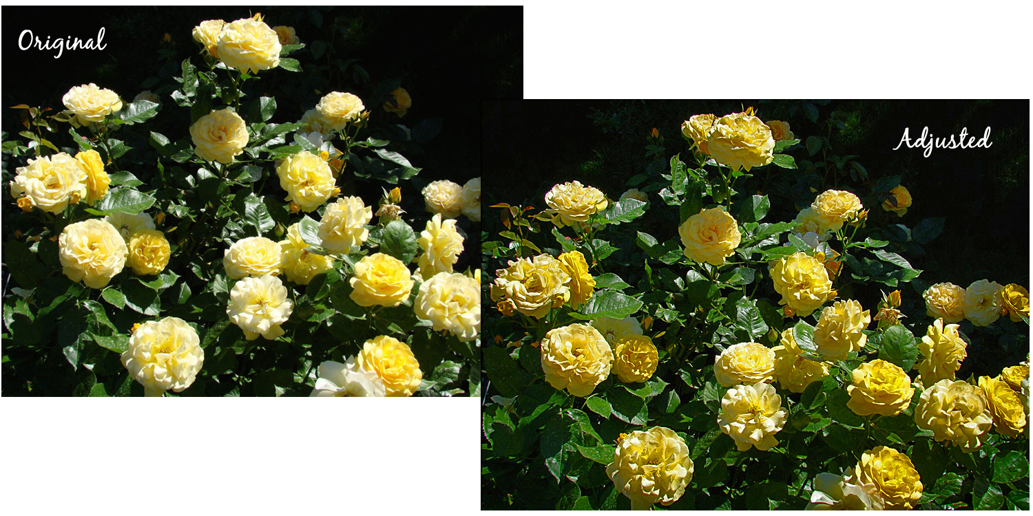
If you’ve had the benefit of photography classes, you know that one of the first things taught is how to recognize overexposure and underexposure in your images. Overexposed areas are most commonly found in your photographs highlights and often mean that you’ve lost all detail in the whites of your image. Underexposed areas are the opposite, usually relate to shadows and that you’ve lost all detail leaving your shadows dark, often muddy, blobs.
Today, I’m not here to teach you how to set your camera to achieve a good balance between highlights and shadows, that’s something you will need to go learn and practice – what I hope to do in this post is give you enough ‘exposure’ to this topic that you will go learn how to recognize the issues (they are cause for declines at GCU), and practice some of the techniques offered to improve your highlights and shadows in post-processing.
Pro Tips: Keep in mind that these types of adjustments are considered destructive, meaning that you are dumping and replacing this data within your image. Therefore, most professionals follow these tips when working with an image:
- Make major color/contrast/exposure adjustments in Camera Raw, Lightroom, or similar programs which are considered non-destructive environments … the image’s original data is preserved.
- Always use the Smart Object feature in Photoshop. This allows you to manipulate the image (including sizing within your design) without making anything permanent. The modifications you make are added as ‘masks’ to that layer.
- Always save your changes as a different file name from your original photograph AND save in a non-destructive file type such as; PSD, TIFF, PNG for example. DO NOT EVER save a JPG or other compressed file type over and over again.
- Shoot in RAW format and the highest resolution capture your camera offers to achieve maximum detail in those highlights and shadows when the image is shot. If incorrectly exposed when shot, you have a better chance of pulling those details out in post-processing.
Notice the example below. I simply took a public domain image, a common image to find on old GCU cards, and aside from the compositional aspects of the photograph which most certainly would be cause for decline, look at the deep shadows and highlights, both which has lost detail, in the Original. Notice that after making a quick adjustment using Shadows/Highlights in Photoshop, I’ve pulled out some nice detail in the shadows and reduced much of the overexposed highlights?
I know many of you use photo post-processing software other than Photoshop and you should go search out your own tutorials for those editing features within the software you use.
Recovering Photo Details Using Shadows/Highlights in Photoshop By John Shaver
Photoshop Elements Adjusting shadows and light
Photoshop Curves Tool: 6 Techniques Every Photographer Must Know
Improving Image Tone With Levels In Photoshop
I would encourage all photographers to dive in and really get a good feel for this area of photography. There is a tremendous resource out there called the internet with millions of great tutorials for the self-taught photo buff.
So, until next week … Learn … Create … Inspire!
Share this:

Critique Clinic – March 28-30, 2014
How does it work? For three days a week (Friday-Sunday midnight), I will open the clinic to any artist who wants an honest peer review and critique of a card which gets plenty of clicks but no sales, so something’s probably not quite right, or you’ve got a new design you want to test drive, or you’re unsure about the marketability of a card. Or perhaps you’re a newbie who isn’t sure if a card is up to a marketable standard. Anyone is welcome to participate. In fact, I encourage everyone to at least look at the cards in question and read the critique comments – you may learn something. The purpose of the clinic is to help artists improve the commercial appeal and marketability of their cards.
THE RULES
- ONE card per artist only.
- Card must be intended for sale at Greeting Card Universe.
- To submit a card for critique, post a link to the card at GCU in the comments section of this clinic post. Allowances will be made if you’ve had a card declined, or made a new design you’d like advice on before submission. Give us the link where we can see the card, such as your private gallery, Flickr, Tinypic, etc. If you do give a private gallery link, be sure your private module gallery is ON. Please do not post links to your Manage Cards section – do you really want strangers tinkering with your cards? And please don’t ask us to critique a card that’s pending review – we can’t see it until it’s approved.
- Any artist is free to comment and/or give a critique of a submitted card. HOWEVER, post-and-run comments like “great card” or “you suck” will not be tolerated, nor will abuse. Criticism should be constructive, not destructive. Play nice or you will be banned.
- I also won’t tolerate temper tantrums if you decide your “artistic integrity” is being stepped on because you asked for a critique, and someone told you the photo you’re using isn’t in focus. If you can’t take honest criticism, don’t submit. Once gets you a warning; twice and you’re banned from submitting in the future.
- Artists who critique may do so by giving their opinion, posting an example of another card, or pointing the submitter to a video, on-line article, or other helpful suggestion.
- Don’t forget that artists who are giving you tips and helpful advice are volunteering their time and trouble. Be nice. A link back to their store on your website or blog is appreciated (but not mandatory).
- You are free not to take any advice offered. There’s no guarantee any card will be a bestseller, so don’t come into the clinic with unrealistic expectations.
- Rules may change as we go along and we see how things turn out, okay?
So without any further ado, I declare this week’s Critique Clinic open!
Share this:

Tips and Tricks: Changing Old Designs
(This was previously run, but the post still illustrates how an old design can be improved and become a good seller, something we should all take a look at from time to time.)
Quite often, when we first start designing greeting cards, we don’t know what we’re doing. We try things. We experiment. We create more from the heart than the head. Sometimes, that totally works and you get a classic card straight out of the gate. Other times, not so much.
We know GCU is slowly but surely weeding through older cards and applying their (relatively) new standards. Cards that no longer fit the bill will be declined. But we say, why wait? Surely you know that by going through older cards yourself, tweaking here, making changes there, using a more critical eye, can only increase your chances of making a sale, especially since you’ve got experience under your belt and can apply the new standards yourself.
Here’s an example of why we should be weeding our old cards:
Alda Monteschio received the following message from an unhappy customer –
“I purchased product # 193559 ‘My Heartfelt Prayers’. I loved the sentiment of the words but the printing was way too light in color. On the front of the card the words got lost in the vines & foliage. Inside card words are printed way too small. As I stated, I loved the sentiment, but was unable to use this card because of the printing. Was disappointed. Had to go out to a store and purchase a card.”
The card looked like this:

This was one of the first designs Alda made for GCU and she’d sold quite a number of them over time. Now being aware of the printing problem (there’s just not enough contrast between the background color and the text color), she quickly revised and updated the design. Here’s the new version:

Much better and a heck of a lot more readable! We’re sure Alda will continue selling this popular card.
When I worked in customer service many years ago, we were taught something that has stuck with me all these years. “For every customer who complains, there are nine others who don’t say a word and just take their business somewhere else.”
Do go back and take a look at older designs. Apply the new standards. Be self critical. By now, you should know if something will print well or not, or if a design has run over the margins, or if the composition is off. Freshen up your cards, do a little spring cleaning, and your sales will soar!
Share this:

Nuts and Bolts: Storefront Banner

BANNERS: A FIRST IMPRESSION
Apart from the background you give your store, and apart from any other bells and whistles, the banner (or header) at the top of your storefront reveals a lot about you as an artist, and equally importantly, you as a business person.
I’ve said it before and I’ll say it again: if you’re designing greeting cards, uploading them to Greeting Card Universe, and trying to sell them to the buying public, then make no mistake – you ARE in business. And any business professional will tell you that first impressions are extremely important.
Typically, a person takes about three seconds to evaluate you at first glance. It’s no different when evaluating your store. When a shopper sees your storefront, the first thing that catches their eye is your banner because it’s right there at the top. In that split-second, the shopper is already forming an opinion of you (and by extension, GCU in general).
Since first impressions are nearly impossible to undo or reverse, you have to make yours a good one right off the bat if you expect shoppers to continue to the even more important (to you, anyway) task of browsing your designs and buying a card.
A good banner will entice shoppers to stay. It will impress them with your professionalism, your individuality, your personality, and give them an idea of what to expect from your card designs. You can’t afford NOT to make a good impression.
Where does a good banner start?
I’ll begin by pointing out that you need toactually make a banner. I can’t tell you how many artists’ storefronts I’ve visited lately, and there was no banner at all! Without a banner, your store looks unfinished and neglected, like you couldn’t be bothered to complete it. A shopper might think that since YOU can’t bring yourself to finish your store, why should THEY bother to stick around and look at your cards? Off they go, taking your potential earnings with them. If you owned a brick and mortar shop, wouldn’t you put a sign on the front to attract customers?
A poorly designed, badly positioned, out of focus, out of proportion, warped and/or wrong sized banner doesn’t do you any favors, either. Banners should be clean, crisp and clear, a synopsis of your design skills or a statement of your professionalism. A banner should be integrated into your storefront (preferable) or at least not be involved in a fight to the death with your background color.
Here are a few examples of good banners:


These banners are pleasant, well designed, and serve as introductions to each artist’s store. There are more good ‘uns out there; I just don’t have room to show them all.
So how do you make a good banner? The same way you make a good (ie, a commercially appealing) greeting card – by using your artistic and designing skills to the best of your ability. Here are some tips that can help steer you in the right direction:
Size matters!
The banner size that displays best is 945×149 pixels. Make sure it’s centered properly.
To Text, or Not to Text…
You’ll definitely want to include your name or your store name, but please… save the “cool” text effects for another project. Text on a banner should be easy to read, not fussy, look pleasing, and be well balanced with other elements in the overall design.
How Much is Too Much?
You shouldn’t try to cram everything but the kitchen sink into your banner. Too many different elements are distracting, not appealing. Strive for balance. If you have a logo (and you should – we’ll get into that another day), integrate it into the composition or make it the focus. Your mantra should be Keep It Simple.
Well Begun is Half Done!
Any art or photographic elements you use in your banner should be crisp, sharp, in focus, detailed without distracting elements, and represent you as an artist or photographer.
Remember, your banner tells a story about you. Make it a story that grabs a shopper’s attention, and leads them to the rest of the tale – purchasing your greeting cards!
Share this:

Dash of Inspiration: Tools to Help Choose Color Palettes
A Dash of Inspiration, A Cup of Creativity by Doreen
Tools to Help Choose Color Palettes
A Dash of Inspiration: Tools to Help Choose Color Palettes
Whether choosing colors for a design or for your storefront, here are some cool color wheel tools which will not only help, but may even make the process fun! Great thing is in most cases they give you the hex number so you can plug those numbers into Photoshop, Illustrator, Elements, etc. and have an accurate color match. You can also save the screen shot of the palette you made (as I did in the examples below) and bring those into your image software, then use the color picker to get the hex number.
The Color Wizard
The color wizard lets you submit your own base color, and then returns a coordinating palette for the one you selected. It offers a set of hue, saturation and tint/shade variations of your color, as well as suggests color schemes to you, based on your color’s complementary color, split complementary colors, analogous colors and other variations … read more and play with it here:
http://www.colorsontheweb.com/colorwizard.asp

Adobe Kuler
You will need an Adobe account to use this next one, but it’s a free account with other benefits. Nice for getting shades and complimentary colors to your base color.
https://kuler.adobe.com/create/color-wheel/

PHOTOCOPA by our friends at Colour Lovers
Do you love those color palettes inspired by a photo? Here’s where you can make your own!
http://www.colourlovers.com/photocopa

So, until next week … Learn … Create … Inspire!


