Design Spotlight: Ivy M. Brown

Our Design Spotlight falls on Ivy Brown of Ivy & Ink – her sweet illustrations and humor will add a little sunshine into your day.
_________________________

Share this:

Tips and Tricks: Tutorials

Tutorials
Photoshop, GIMP, PSP, Corel Draw—these graphics editing programs and others like them are complex, capable of really great things provided you know how to use them. Rather than single out one trick, we’re listing here some of the sites offering tutorials for you to check out.
If you know any other resources you’d like to share, leave a comment! 🙂
PSDtuts
Whether you’re just getting started or an old hand wanting to learn new tricks, this is the place for Adobe Photoshop users.
Adobe Photoshop Tutorials: Best of Smashing Magazine
Lots of interesting things here.
GIMP Tutorials
You’ll find good stuff here from beginner to advanced instruction.
GIMP-Tutorials.net
Plenty of resources here including text to path, making patterns, etc.
Paint Shop Pro Tutorials
This learning center offers tutorials through PSP 9 + user forums.
20 Photoshop Elements Tutorials to Try
Some basic techniques you’ll likely need.
Free Tutorials: Photoshop Elements User
Looks like plenty of video tuts and information for artists using Elements.
Corel Draw Tips
Tutorials and more for beginning and advanced users.
Share this:

News: Wedding Cancelled Category

Here’s a category in need of cards, folks:
Announcements > Wedding Called Off/Cancelled
There are less than 10 cards in that category right now. Etiquette says if you’re cancelling a wedding and invitations have already been sent out, you should send a cancellation notice/apology to your guests. If you’ve already got wedding related cards, it can’t hurt to add one more for this special category.

Share this:

Dash of Inspiration: Small Batch a Day
A Dash of Inspiration, A Cup of Creativity by Doreen
Small Batch a Day

… keeps the mistakes away!
I’ve always been a GCU artist that avoids creating large batches of the same image for various relations and/or ages. Problem is, I tend to get bored – so I multitask to the point where I’m making mistakes or overlooking previous info in the submission fields. Sometimes, I just give up altogether and never finish the series.
One of my New Year’s resolutions was to overcome this issue and create for some of these categories. My first design for age specific birthday, turned into a series well-suited for relationship/age specific categories. Knowing that I’m likely to cause the reviewers and myself time/frustration if I do too many of these at once, I found a good method which works well for me – and the results have been good for the review team too. Zero mistakes and the approvals fly though!
Of course this is assuming your design has been previously approved as a series concept card, be sure to add the PID in your Note to Reviewer and let them know this is previously approved design for an ongoing series.
Thought I’d pass on these tips to anyone who finds these categories as daunting as I have, in the hopes I might inspire you to find a process which gives your mistake free submissions:
- Break down the series into small batches of 12 to 15 cards.
- Make the creative changes to the card front in your design software – ONLY for this first group. That tends to significantly reduce the mistakes made on the design end of the process.
- Since small batches don’t take very long to create from start to finish, take the time to READ each field and make your specific changes to fit each new card.
- Wait at least 4-hours, before uploading the next batch – preferably one batch a day. Give your eyes and brain time to disengage from the visual you’ve been repetitively seeing. We make nonsense errors because our mind begins to tell our eyes what’s there instead of our eyes telling our brain what it sees – the result is that our eyes stop communicating with our brain and we don’t ‘see’ our mistakes.
- If you are a Star Submitter, wait until that batch is approved before uploading the next batch.
This will work for any series you are doing. As long as you keep notes on where you’ve left off and break down the series in a way that makes sense to you.

Okay, here are this week’s FREEBIES! As always, it is your responsibility to read each contributor’s TOU (terms of use) before using.
Soerjaputera Font – this is one of my font choices used on the new series shown in this post.
WE LIKE STRIPED: 30 striped patterns
Stripes are wonderful for so many occasions and can easily be changed to well suit men, women and children.
Hearts for everyone!
So, until next week … Learn … Create … Inspire!
Share this:

Critique Clinic – January 17-19, 2014

How does it work? For three days a week (Friday-Sunday midnight), I will open the clinic to any artist who wants an honest peer review and critique of a card which gets plenty of clicks but no sales, so something’s probably not quite right, or you’ve got a new design you want to test drive, or you’re unsure about the marketability of a card. Or perhaps you’re a newbie who isn’t sure if a card is up to a marketable standard. Anyone is welcome to participate. In fact, I encourage everyone to at least look at the cards in question and read the critique comments – you may learn something. The purpose of the clinic is to help artists improve the commercial appeal and marketability of their cards.
THE RULES
- ONE card per artist only.
- Card must be intended for sale at Greeting Card Universe.
- To submit a card for critique, post a link to the card at GCU in the comments section of this clinic post. Allowances will be made if you’ve had a card declined, or made a new design you’d like advice on before submission. Give us the link where we can see the card, such as your private gallery, Flickr, Tinypic, etc. If you do give a private gallery link, be sure your private module gallery is ON. Please do not post links to your Manage Cards section – do you really want strangers tinkering with your cards? And please don’t ask us to critique a card that’s pending review – we can’t see it until it’s approved.
- Any artist is free to comment and/or give a critique of a submitted card. HOWEVER, post-and-run comments like “great card” or “you suck” will not be tolerated, nor will abuse. Criticism should be constructive, not destructive. Play nice or you will be banned.
- I also won’t tolerate temper tantrums if you decide your “artistic integrity” is being stepped on because you asked for a critique, and someone told you the photo you’re using isn’t in focus. If you can’t take honest criticism, don’t submit. Once gets you a warning; twice and you’re banned from submitting in the future.
- Artists who critique may do so by giving their opinion, posting an example of another card, or pointing the submitter to a video, on-line article, or other helpful suggestion.
- Don’t forget that artists who are giving you tips and helpful advice are volunteering their time and trouble. Be nice. A link back to their store on your website or blog is appreciated (but not mandatory).
- You are free not to take any advice offered. There’s no guarantee any card will be a bestseller, so don’t come into the clinic with unrealistic expectations.
- Rules may change as we go along and we see how things turn out, okay?
So without any further ado, I declare this week’s Critique Clinic open!
Share this:

Design Spotlight: Dianna Conlon Helm
Our Design Spotlight falls on Dianna Conlon Helm of Coneja Cards– she joined GCU in July 2013 and her very colorful, humorous designs are fantastic!
_________________________

My name is Dianna Conlon Helm and I am a self-taught artist who has been designing greeting cards for family and friends since I was a child. During my last year in college, I started putting together card lines to group my cards because they have different personalities. After a few years, I got published by Fantus Paper Products. That all came to a halt when I started my family and my time commitments were too great.
I am a nurse by career, but an artist at heart. I am married, have 3 children and live in Pennsylvania. This year I decided to pull my designs out of storage and I joined Greeting Card Universe. I have two lines displayed in my store, My “From the Carrot Patch” cards” and my “Aunt Mella” cards.
I have a weird and quirky humor. I never like to be too serious and I love to make people laugh and smile. My cards reflect my personality and ideas come into my head continuously. I run around with a little note pad to jot down my ideas, even if they wake me from sleep. My house is filled with sketch books that have my cartoon and card ideas. My husband or children can occasionally hear me laughing to myself, and they know a silly idea has popped into my head.
My “From the Carrot Patch” cards are the ones that feature cute animals, mostly bunnies. As you can see, my store is called “Coneja Cards”. Coneja, in Spanish, means rabbit. Coneja is my family nick name. These cards are painted on watercolor paper in gouache water colors to give a rich, vibrant look. I finish them off in Photoshop to add the borders. They are cards where I have fun with a pun.
My “Aunt Mella” cards are painted on Bristol board. The background designs are done in airbrush and my Aunt Mella character is painted in gouache water colors. I am learning how to use Illustrator to do my background designs instead of using the airbrush, which is a long process. My Aunt Mella is quirky and a bit odd, but I love her to death.
The card I chose to be featured is one of my first bunny designs. It is one of my favorites. It’s one of those cards that makes people say, “Awwwwwwww”.
What I love about greeting cards is that they’re a little piece of art that you can send to someone to make their day a little more special. Opening up a card is like getting a little present!
Share this:

Font Frenzy: Free Commercial Font Sources

Today, we’re not just highlighting a single font, but giving you a link to a great article that will lead you to the Six Best Places to Find Free Commercial Use Fonts. As an unabashed font collector, I’ve heard of all these sources, but it’s been a while since I visited some. Especially recommended is Lost Type – I love that site.
Since designers can change their minds over time, be sure to check the TOU anyway, just to be safe.
And just for the heck of it, here’s 8 Rules for Effective Typography for some good tips on how to use your awesome new fonts.
And oh, because it’s a dismal day but I’m feeling happy and I want to make you happy too, here’s a link to a free commercial use font, Lover’s Quarrel. Fancy script, nice to pair with another font. Check out the example below. Have fun!

Share this:

Nuts and Bolts: Spelling, Grammar and Punctuation, Oh My!

GRAMMAR, SPELLING & PUNCTUATION, OH MY!
Some of the most common errors made by artists involve simple spelling, grammar, and punctuation mistakes that should be avoided before a card is submitted for review. In this article, we’ll try to give you some tips and easy ways to stop wasting time with cards Returned for Edits because of avoidable issues.
Don’t be afraid! 🙂 We’ll do our best to demystify the subject. And please note these tips apply only to the English language. Foreign languages have their own rules.
By trying to fix mistakes before you submit your card, you’re saving yourself and the reviewers a lot of time, effort, and frustration.
Before we begin, let’s first understand that text talk and the informal writing you see in chats, Tumblr, e-mails, forums, and other places is not to be used on greeting cards (this is a general rule). Be correct, unless there’s a reason in your design not to be (like you’re making a joke). This may be a greeting card, but GCU still requires you to do things right. Okay? So let’s begin with…
—Possession Vs. Contraction – The Epic Battle!—
This is probably one that trips up a lot of artists. It’s understandable to confuse possession (your birthday) with a contraction (you’re birthday). What’s right and how can you remember which is which?
Your is possessive. Your bed belongs to you. Your car belongs to you. It is your birthday today.
You’re is a contraction (kind of a language shorthand) for “you are.” See that apostrophe between the -you- and the -re-? That clue tells you the word is a contraction. You’re going to be a year older.
How Do You Tell the Difference?
Simple! Just read aloud the contraction giving the complete verb. If you do that, you can’t fail.
Today’s you’re birthday. “Today’s you are birthday” doesn’t make sense,does it? Therefore you’ve accidentally used a contraction instead of possession. Correct: Today’s your birthday.
Here are some more examples:
Their: Possession. Their house is much nicer than the Smiths.
They’re: Contraction “they are.” They’re the cutest things I ever did see.
There: Location. Indicates a place. Your birthday present is over there.
If you’re having trouble, just remember “HERE and THERE.”
Who’s: Contraction “who is.” Who’s turning twelve today?
Whose: Possession. Whose socks are laying on the floor?
It’s: Contraction “it is.” It’s your birthday!
Its: Possession. Put your worry in its place.
Your: Possession. It’s your birthday.
You’re: Contraction. You’re a year older.
In every one of these examples, if you read the sentence aloud and spell out the contraction – you are, they are, who is, it is – you’ll be able to know immediately whether the word is right or wrong.
—Punctuate to Make Your Point—
Exclamation Points – !
Use one exclamation point at the end of a sentence to indicate excitement, joy, strong emotion. It’s your birthday! Do not use more than one. There are no exceptions in English.
Interrobang – !? or ?!
Looks weird, doesn’t it? The interrobang is a combination of an exclamation point and a question mark. This is nonstandard punctuation that hasn’t been used much since it fell into and out of favor in the 1960s, and should be avoided since there are much better ways to indicate shocked disbelief and surprise (such as your photograph or illustration – a picture’s worth a thousand words, as they say).
Ellipses or the Dot-Dot-Dot – …
This one trips up a lot of people since grammar styles differ from company to company (for example, newspapers use one set of rules, publishing houses may use different ones, etc). Since we’ve already done an article with everything you need to know, go take a gander at Tips & Tricks: Ellipses. The rule of thumb for GCU is – a space between the word and the ellipses and use three dots only. It’s your birthday …
Apostrophe – ‘
If you’ve been reading this article from the beginning, you know an apostrophe indicates a contraction (you’re, it’s, who’s). But the apostrophe also indicates possession: Baby boy’s birth. Little girl’s birthday. But it gets a little tricky when we’re making a plural word possessive that already ends with an S (our boys’ birthdays, indicating the birthdays of more than one boy). In most cases, the apostrophe goes AFTER the S, not before. Mostly this will come into play with holiday names (Nurses’ Day, etc). Check the Wiki or the GCU categories before you make your design permanent and submit it for review.
Also read The Oatmeal: How to Use An Apostrophe for great visual examples.
Quotation Marks – “
Punctuation always goes inside the quotation mark, like this: “Now is the time for all good men to come to the aid of their country.” Don’t put commas or periods outside the quotation marks.
—Let’s Be Careful How We Spell—
Sometimes, words sound the same, but have different meanings and are spelled differently. And since English is a crazy, mixed up language, it can also be hard to spell words correctly when you aren’t sure. So let’s run through a few of the most common errors.
Then Vs. Than
Then refers to time. Now and then, I think of you.
Than makes a comparison. I’d rather have you as a friend than anyone else.
Weird is Not Wierd
The rule of thumb is: “I before E except after C, or when sounded as A, as in neighbor and weigh.”
Lose Vs. Loose
Lose is the opposite of “win.” Did you lose the ballgame today?
Loose means “not tight.” Loosen the nut on that bolt with your wrench.
Whether Vs. Weather
Weather refers to rain, snow, clouds, temperature, etc. What’s the weather like outside today?
Whether expresses doubt or choice. Whether or not it’s your birthday, have some cake.
A Lot is always two words. Always. I miss you a lot when you’re not here.
All right is always two words. Always. Hope you’re feeling all right.
Amirite is not a word. Don’t use it. Am I right that it’s your birthday?
There are a more words commonly misspelled and misused. Here are good resources for you to use. Just remember, when in doubt, check it out!
Top 20 Spelling Mnemonics
Little easy to remember phrases to help you keep in mind how to spell tricky words.
The Secret to Memorizing English Vocabulary and Grammar
More mnemonics + a fun video.
Commonly Misused Words and Phrases
List of Commonly Misused English Words
100 Most Commonly Misspelled Words in English
If you have other resources or tips, please leave a comment and share with your fellow artists. Or if there’s something you’d like to know, just ask! We’re happy to help.
Share this:

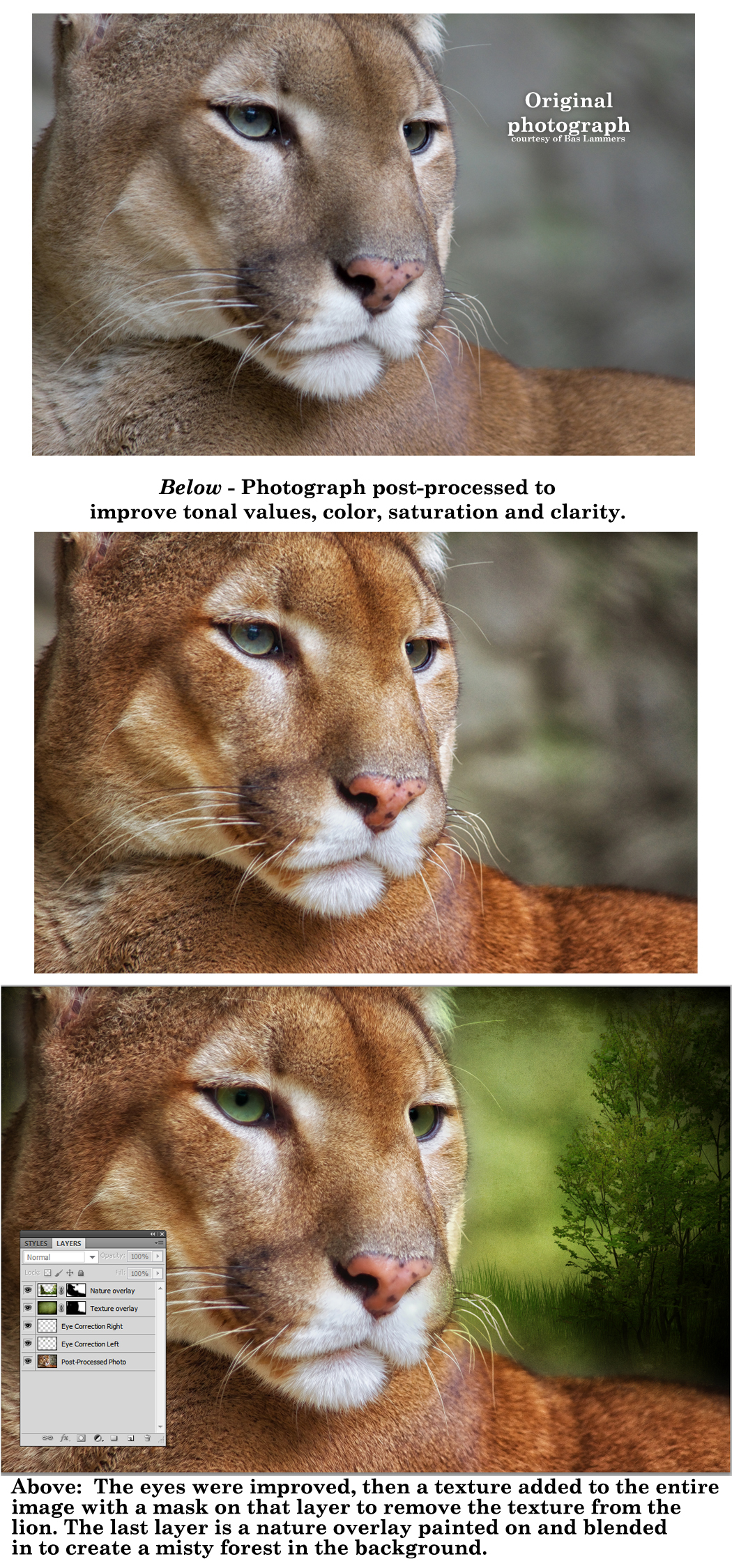
Dash of Inspiration: Textured Overlays
A Dash of Inspiration, A Cup of Creativity by Doreen
Textured Overlays
I’m sure most of you have seen digital artwork with added texture overlays. I am often drawn to this type of art, simply because it can add a tremendous amount of character to a photograph or digital creation – and – character can change the mood of an image and evoke emotion in the viewer.
Of course anytime you create using digital tools, whether creating from scratch or post-processing a photograph, care must be taken to not overdo to the point of having your image declined due to excessive effects. Using textured overlays is no different than using digital filters in that respect.
- Use textured overlays sparingly. As with digital filters, there is such a thing as too much.
- Always apply to a separate layer for complete control of blending elements.
- Mask and paint on (or off) to reveal important elements of the design rather than laying over the entire image.
- It’s often best to layer more than one texture to get the ‘best’ out of the elements in the design.
- Master the process through learning, trial and error. Don’t assume your first attempt is a masterpiece, it’s probably not.
Before offering some links below, here are a couple examples of my creation process using texture overlays to create two pieces which were made to raise funds for my local wildlife rehabilitation center.

Below is a tutorial to get you started and to inspire you to experiment in whatever creation software you use. Also, your freebies for the week … as always be sure to read the CU License TOU. If you didn’t grab last week’s Texture pack, you may want to do that.
Matt Nicolosi Photoshop Texture Layering Tutorial
Worth watching. Matt offers many great tips that are very helpful.
Beautiful Dynamic Brushes for Painting in Photoshop
These beautiful brushes can be used for you to create your own textured overlays.
So, until next week … Learn … Create … Inspire!
Share this:

Critique Clinic – January 10-12, 2014
How does it work? For three days a week (Friday-Sunday midnight), I will open the clinic to any artist who wants an honest peer review and critique of a card which gets plenty of clicks but no sales, so something’s probably not quite right, or you’ve got a new design you want to test drive, or you’re unsure about the marketability of a card. Or perhaps you’re a newbie who isn’t sure if a card is up to a marketable standard. Anyone is welcome to participate. In fact, I encourage everyone to at least look at the cards in question and read the critique comments – you may learn something. The purpose of the clinic is to help artists improve the commercial appeal and marketability of their cards.
THE RULES
- ONE card per artist only.
- Card must be intended for sale at Greeting Card Universe.
- To submit a card for critique, post a link to the card at GCU in the comments section of this clinic post. Allowances will be made if you’ve had a card declined, or made a new design you’d like advice on before submission. Give us the link where we can see the card, such as your private gallery, Flickr, Tinypic, etc. If you do give a private gallery link, be sure your private module gallery is ON. Please do not post links to your Manage Cards section – do you really want strangers tinkering with your cards? And please don’t ask us to critique a card that’s pending review – we can’t see it until it’s approved.
- Any artist is free to comment and/or give a critique of a submitted card. HOWEVER, post-and-run comments like “great card” or “you suck” will not be tolerated, nor will abuse. Criticism should be constructive, not destructive. Play nice or you will be banned.
- I also won’t tolerate temper tantrums if you decide your “artistic integrity” is being stepped on because you asked for a critique, and someone told you the photo you’re using isn’t in focus. If you can’t take honest criticism, don’t submit. Once gets you a warning; twice and you’re banned from submitting in the future.
- Artists who critique may do so by giving their opinion, posting an example of another card, or pointing the submitter to a video, on-line article, or other helpful suggestion.
- Don’t forget that artists who are giving you tips and helpful advice are volunteering their time and trouble. Be nice. A link back to their store on your website or blog is appreciated (but not mandatory).
- You are free not to take any advice offered. There’s no guarantee any card will be a bestseller, so don’t come into the clinic with unrealistic expectations.
- Rules may change as we go along and we see how things turn out, okay?
So without any further ado, I declare this week’s Critique Clinic open!


