Font Frenzy: Snowflakes!

Today, we’re bringing you a couple of free fonts with snowflakes that are free for commercial use (although you should still check the licensing agreement of each font for your own satisfaction). These Faux Snow and WWFlakes snowflakes make wonderful backgrounds and elements for winter or holiday related card designs.Examples and links below. Have fun!


Share this:

Design Spotlight: Madeline Allen

Our Design Spotlight falls on Madeline Allen – looks like she’s been a very busy lady! Let’s spread the word about this new category for terminally ill patients.
_________________________
It’s been 11 months of creating art, writing verses and posting the cards for this much needed category – a final goodbye from the terminally ill to family and friends.
Fellow Artists, Please help share the NEWS of this New Category if you can?
We are getting close to 1,500 now approved cards, and the category needs lots of exposure to let people know that this NEW series now exists at GCU. Anyone wishing to post this to their blog / website can contact me madelineallen@mymts.net and I would place a link to your blog / website from my website SmudgeArt Gallery’s Link Page for you in return. Thank You for your consideration!
This is my favourite card design from this series.

Through my daily work on the series it kept me focused. I believe my dear friend I lost last year stays close by and watches over me daily and gives me gentle reminders to take a break when I’m tired or pushing myself too hard as I sometimes do.
Share this:

Rainbow Connection: Color Palette Source

Angie Sandy is a blog containing lots of inspiration + beautiful color palettes like the one you’ll see below. Try it out to find some new colors to put in your design’s bag of tricks and have fun!

Share this:

Dash of Inspiration: Photographing Snow
A Dash of Inspiration, A Cup of Creativity by Doreen
Photographing Snow

Here at my home in the Sierra Foothills of California, it’s 23 degrees outside with about a foot of snow on the ground this morning, thus my inspiration for sharing some tips on getting great photographs of snow this year. Though snow scenes are beautiful, getting truly marketable photographs is not as easy as it may seem.
Understand Metering for White Subjects
That bright, dramatic snow scene may not be as bright and lovely when you look at the image your camera captured. Understanding how the camera sees brightly lit white subjects, and adjusting for these bright white scenes by making manual adjustments, will be the difference between capturing a marketable greeting card image and a grayish snow scene suited only for the family album.
If you have trained or studied photography, then you’ve heard the term 18% gray. This is what exposure meters in cameras have used as a universal point of reference long before the digital era. White objects reflect nearly 100% of light, black objects reflect almost 0% of light, so in the middle of white and black we have mid-gray. Subjects whose tones ‘average’ what the meter considers mid-gray reflect about 18% of light.
Snow photographs are often muddy or underexposed because the camera, based on what the meter reads, will underexpose the scene by about two stops in an attempt to correct a scene it sees as too bright. The bottom line is, learn how each of your camera’s metering modes see a bright white subject like snow, then test to create a setup formula for you and your equipment so that you can quickly make adjustments to your camera’s settings when the first snow begins to fall.
Light Temperature / Color Casts
Understanding White Balance is another critical step in photography and a must for photographing snow scenes. This is where your camera’s settings adjust for color temperature, therefore the color of light you are shooting in so that the camera can compensate to capture proper color for any given scene.
Auto-presets in cameras are common. You may see Auto, Daylight, Shade, Cloudy, Tungsten, Fluorescent, and Flash choices on your camera. Each of these settings represent a different color of light and the camera adjusts the white balance automatically based on these settings. However; if you set your camera to Daylight how does it know what time of day or what time of year you are shooting at? Both change the color of light. Professional photographers get beautiful true color in their snow scenes by adjusting the white balance in their camera settings. If you shoot in RAW images like I do, white balance editing can be done after the fact, regardless of the camera’s settings when the images were captured. The key is that you need to be aware of how your camera is seeing the light temperature. If your snow scenes have a bluish tint, you need to correct your white balance.
Here is a good reference for The Color of Light
Don’t Overexpose Those Highlights!
Once a scene has been captured with overexposed highlights, there is no magic software trick to bring that detail back. If the detail in your highlights was not captured when the image was taken, your blown highlights can not be fixed and therefore your photograph is not marketable. That’s yet another challenge with snow scenes lit by the sun. Snow scenes are the perfect subject to use Exposure Bracketing. By taking several varying exposures to get the best detail in your whites and shadows, you can just about guarantee that you’ll get a perfect exposure out of those choices.
Capture Falling Snow!
As with any moving subject, you will need to use a shutter speed which is fast enough to freeze the motion of the falling snow. If your shutter speed is too slow, your flakes will appear as streaks in your image and that is not attractive, nor are those images marketable.

So, until next week … Learn … Create … Inspire!
Share this:

Critique Clinic – December 6-8, 2013

How does it work? For three days a week (Friday-Sunday midnight), I will open the clinic to any artist who wants an honest peer review and critique of a card which gets plenty of clicks but no sales, so something’s probably not quite right, or you’ve got a new design you want to test drive, or you’re unsure about the marketability of a card. Or perhaps you’re a newbie who isn’t sure if a card is up to a marketable standard. Anyone is welcome to participate. In fact, I encourage everyone to at least look at the cards in question and read the critique comments – you may learn something. The purpose of the clinic is to help artists improve the commercial appeal and marketability of their cards.
THE RULES
- ONE card per artist only.
- Card must be intended for sale at Greeting Card Universe.
- To submit a card for critique, post a link to the card at GCU in the comments section of this clinic post. Allowances will be made if you’ve had a card declined, or made a new design you’d like advice on before submission. Give us the link where we can see the card, such as your private gallery, Flickr, Tinypic, etc. If you do give a private gallery link, be sure your private module gallery is ON. Please do not post links to your Manage Cards section – do you really want strangers tinkering with your cards? And please don’t ask us to critique a card that’s pending review – we can’t see it until it’s approved.
- Any artist is free to comment and/or give a critique of a submitted card. HOWEVER, post-and-run comments like “great card” or “you suck” will not be tolerated, nor will abuse. Criticism should be constructive, not destructive. Play nice or you will be banned.
- I also won’t tolerate temper tantrums if you decide your “artistic integrity” is being stepped on because you asked for a critique, and someone told you the photo you’re using isn’t in focus. If you can’t take honest criticism, don’t submit. Once gets you a warning; twice and you’re banned from submitting in the future.
- Artists who critique may do so by giving their opinion, posting an example of another card, or pointing the submitter to a video, on-line article, or other helpful suggestion.
- Don’t forget that artists who are giving you tips and helpful advice are volunteering their time and trouble. Be nice. A link back to their store on your website or blog is appreciated (but not mandatory).
- You are free not to take any advice offered. There’s no guarantee any card will be a bestseller, so don’t come into the clinic with unrealistic expectations.
- Rules may change as we go along and we see how things turn out, okay?
So without any further ado, I declare this week’s Critique Clinic open!
Share this:

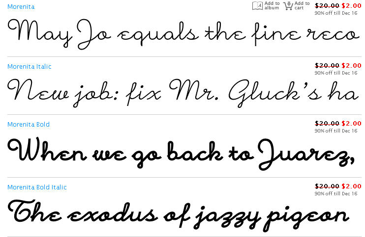
Font Frenzy: Morenita on Sale!
Today, we’re bringing you Morenita, a casual little script font with buckets of character. The font family offers two weights + two italic variations, as you can see from the samples below. Right now, each font is $2 OR you can get the whole package of four fonts for only $7.40! The desktop license allows commercial use, so you’ll be good to go. Have fun!
Share this:

Tips and Tricks: Plaid Patterns

Plaid Patterns

Plaid can make a very interesting background on a card (see some examples on Pinterest). A plaid pattern using soft blues, for example, would do wonderfully for a baby announcement. Or a rugged red plaid for the holidays, a yellow plaid for a sunny birthday greeting—you get the picture.
To help you create your own plaid patterns in your own colors and styles, here are some tutorials. Have fun!
Create a Plaid Pattern in Photoshop
Photoshop Tutorial: How to Create a Plaid Pattern (video)
Super Quick Plaid Patterns in Photoshop or Illustrator
Making Plaid Patterns – Photoshop Elements
All Things Gimp: Somewhat Easy Plaid Tutorial
PSP 9: How to Make Plaid Tutorial
Stripes and Plaids in Paint Shop Pro
Share this:

Design Spotlight: Ramelle Richardson
Our Design Spotlight falls on Ramelle Richardson – in this special edition, she’s hoping to inspire artists by showing how versatile designs can be. Thanks, Ramelle!
_________________________
My latest design is the happy result of an experiment.
For the past year, I have been making my own stickers and images in an effort to avoid using clip art, but I needed a stag or a deer to use for a new Christmas card. So I got out my drawing pad and ink pen and I sketched the image of a leaping deer, photographed it, and then after erasing all the white background, I converted the drawing into PNG form. Then the fun began as I played around with ways to digitally enhance my deer.
I had some photos of granite boulders that I had taken on a recent visit to Manito Park in my hometown of Spokane, Washington. There was an interesting, yellow lichen on the granite which inspired me to use gold colors and the natural texture of rock to create my own “cave painting.”
By overlaying the image of my leaping stag onto the granite and adding a yellowish tint, I found that the deer appeared to have a metallic, golden quality to it. Happy with the unexpected result, I then went on to clone my lone stag into two more deer and created a cave painting that also looked like a landscape. The scene needed a moon, so I borrowed a NASA photograph of the Moon and gave that a golden tint, as I did for the deer. Here’s the finished card:

I was so glad that the Reviewers liked my design and I breathed a sigh of relief that they didn’t think it strange to make a “cave painting” for a Christmas card.
So, I decided to use the same three elements (a close-up photo of granite, the sketch of a deer, and a photo of the Moon) to create a second, very different card in blue tones.
The granite that I chose had some light areas at the top, creating the illusion of snow and mountains; it reminded me of an aerial view of a snowy landscape. This became the backdrop for my flying deer. Again, I added the Moon, but much larger this time to give the impression that the reindeer are about to fly across it’s face.
Now I have two new Christmas designs. Although they are different from each other, I have used the same basic elements in both. This has been a fun experiment, and hopefully a rewarding one as the Christmas Season begins. As it says on the cover of my Flying Reindeer card, “Merry Christmas to All!”

Share this:

Dash of Inspiration: Photography Tips & Tricks
A Dash of Inspiration, A Cup of Creativity by Doreen
Photography Tips & Tricks
I hope all of you who celebrate, had a wonderful Thanksgiving and/or Thanksgivukkah. I am a huge fan of Scott Kelby and being a self-taught digital artist, I have many of his books. Today I browsed his blog and found many great links to photography tips which I thought might be worth a read for many of you who love photography and want to learn more.
44 essential digital camera tips and tricks
Manual focus: what you need to know to get sharp images
8 flash photography mistakes every photographer makes
Learn Photography: classic tips and tutorials for shooting popular subjects
Enhance Your Photography: 10 Simple Steps to Mastering Composition
In addition all photographers, amateur and professional alike, need to be able to professionally execute some very basic digital design techniques if you are using your photographs to make greeting cards.
101 Photoshop tips you have to know
I also found this great article that all photographers should read. As a trained photographer with 25+ years of experience, it’s frustrating to meet someone who calls themselves a professional photographer, yet looking at their photos it’s quite obvious they have yet to learn the basic, though critical, techniques to create quality imagery.
33 myths of the professional photographer
Image courtesy of Enhance Your Photography
So, until next week … Learn … Create … Inspire!
Share this:

Critique Clinic – November 29-30 and December 1, 2013
How does it work? For three days a week (Friday-Sunday midnight), I will open the clinic to any artist who wants an honest peer review and critique of a card which gets plenty of clicks but no sales, so something’s probably not quite right, or you’ve got a new design you want to test drive, or you’re unsure about the marketability of a card. Or perhaps you’re a newbie who isn’t sure if a card is up to a marketable standard. Anyone is welcome to participate. In fact, I encourage everyone to at least look at the cards in question and read the critique comments – you may learn something. The purpose of the clinic is to help artists improve the commercial appeal and marketability of their cards.
THE RULES
- ONE card per artist only.
- Card must be intended for sale at Greeting Card Universe.
- To submit a card for critique, post a link to the card at GCU in the comments section of this clinic post. Allowances will be made if you’ve had a card declined, or made a new design you’d like advice on before submission. Give us the link where we can see the card, such as your private gallery, Flickr, Tinypic, etc. If you do give a private gallery link, be sure your private module gallery is ON. Please do not post links to your Manage Cards section – do you really want strangers tinkering with your cards? And please don’t ask us to critique a card that’s pending review – we can’t see it until it’s approved.
- Any artist is free to comment and/or give a critique of a submitted card. HOWEVER, post-and-run comments like “great card” or “you suck” will not be tolerated, nor will abuse. Criticism should be constructive, not destructive. Play nice or you will be banned.
- I also won’t tolerate temper tantrums if you decide your “artistic integrity” is being stepped on because you asked for a critique, and someone told you the photo you’re using isn’t in focus. If you can’t take honest criticism, don’t submit. Once gets you a warning; twice and you’re banned from submitting in the future.
- Artists who critique may do so by giving their opinion, posting an example of another card, or pointing the submitter to a video, on-line article, or other helpful suggestion.
- Don’t forget that artists who are giving you tips and helpful advice are volunteering their time and trouble. Be nice. A link back to their store on your website or blog is appreciated (but not mandatory).
- You are free not to take any advice offered. There’s no guarantee any card will be a bestseller, so don’t come into the clinic with unrealistic expectations.
- Rules may change as we go along and we see how things turn out, okay?
So without any further ado, I declare this week’s Critique Clinic open!


