Tips and Tricks: Updating Old Card Designs

Recently, GCU artist Barbara Schreiber had a collection of older cards Returned for Edits because of many technical issues. She took the notification as an opportunity to update and refresh a design whose flaws were obvious now that she had more experience as a card designer.
For more on the benefits of refurbishing older cards, see:
Dash of Inspiration: Facelifts for Old Cards
Read what Barbara has to say below.
_________________________
Nobody likes getting those “returned for edit” emails, but I would like to encourage artists who receive those emails to see it as a real opportunity to improve on their designs. I get them also.
My background as a watercolor painting teacher helps me to see things positively. I used to correct my students, and without my correction and pointing out flaws, they would not improve and become better. So having that in mind, I think “ok, here comes an opportunity to improve my design” when I get one of those emails.
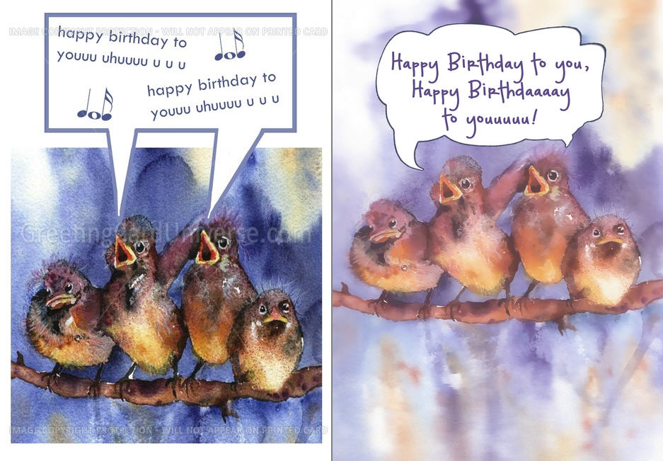
For example the latest batch of emails I received concerning the sparrow design you see here. These cards got returned for several reasons: elements too near the border, speech bubble too near the border, too dark lighting and other flaws.
I made these cards quite some time ago, when I did not use the template and did not have the technical know-how and software I have today. I tackled the issues that were mentioned and while I was at it, improved other flaws that today, having more experience, I could see more clearly.
The results: the cards with the baby and the hand sell quite well (another card series I updated recently), and I hope that the improved sparrows will do the same. The improved cards are worth the extra effort I put into them. They sell better. And I guess that’s something all of us want.
The “before” card is on the left, the “after” card on the right.
Share this:

Dash of Inspiration: Be Inspired
A Dash of Inspiration, A Cup of Creativity by Doreen
Be Inspired

Today I thought I’d share a few sites where you as an artist, can not only be inspired by others, but can inspire other artists. By sharing your knowledge, things you find which inspire you and your own designs, you may not only be inspired to create great things, but … you can be inspiring!
Inspiration (from the Latin inspirare, meaning “to breathe into”) refers to an unconscious burst of creativity in a literary, musical, or other artistic endeavor.
Artists Inspire Artists is a wonderful site. Free to browse, be inspired and free to upload your own art to offer as inspiration to other artists.
Colour Lovers is always a great stop for seeing current and seasonal color trends. I’m often inspired simply by a color palette that sends my imagination off it a new direction.
You the Designer website has various features which can provide inspiration for typography, photography and art/design.
Today’s FREEBIES are some new fonts offered by our friends at Font Squirrel … why are they our friends, you ask? Because you can trust that the fonts offered on Font Squirrel allow CU and most of them are absolutely free!
Vast Shadow – a nice font for those great Chalkboard resources Corrie passed on last week.
Henny Penny – a very fun font which is great for kids and even some bright and cheerful holiday cards.
So, until next week … Learn … Create … Inspire!
Share this:

Critique Clinic – September 27-29, 2013

How does it work? For three days a week (Friday-Sunday midnight), I will open the clinic to any artist who wants an honest peer review and critique of a card which gets plenty of clicks but no sales, so something’s probably not quite right, or you’ve got a new design you want to test drive, or you’re unsure about the marketability of a card. Or perhaps you’re a newbie who isn’t sure if a card is up to a marketable standard. Anyone is welcome to participate. In fact, I encourage everyone to at least look at the cards in question and read the critique comments – you may learn something. The purpose of the clinic is to help artists improve the commercial appeal and marketability of their cards.
THE RULES
- ONE card per artist only.
- Card must be intended for sale at Greeting Card Universe.
- To submit a card for critique, post a link to the card at GCU in the comments section of this clinic post. Allowances will be made if you’ve had a card declined, or made a new design you’d like advice on before submission. Give us the link where we can see the card, such as your private gallery, Flickr, Tinypic, etc. If you do give a private gallery link, be sure your private module gallery is ON. Please do not post links to your Manage Cards section – do you really want strangers tinkering with your cards? And please don’t ask us to critique a card that’s pending review – we can’t see it until it’s approved.
- Any artist is free to comment and/or give a critique of a submitted card. HOWEVER, post-and-run comments like “great card” or “you suck” will not be tolerated, nor will abuse. Criticism should be constructive, not destructive. Play nice or you will be banned.
- I also won’t tolerate temper tantrums if you decide your “artistic integrity” is being stepped on because you asked for a critique, and someone told you the photo you’re using isn’t in focus. If you can’t take honest criticism, don’t submit. Once gets you a warning; twice and you’re banned from submitting in the future.
- Artists who critique may do so by giving their opinion, posting an example of another card, or pointing the submitter to a video, on-line article, or other helpful suggestion.
- Don’t forget that artists who are giving you tips and helpful advice are volunteering their time and trouble. Be nice. A link back to their store on your website or blog is appreciated (but not mandatory).
- You are free not to take any advice offered. There’s no guarantee any card will be a bestseller, so don’t come into the clinic with unrealistic expectations.
- Rules may change as we go along and we see how things turn out, okay?
So without any further ado, I declare this week’s Critique Clinic open!
Share this:

Font Frenzy: Antiqua Shaded on Sale

Antiqua Shaded is a good, basic, slightly old-fashioned font especially useful for chalkboard and blackboard effects. It would pair well with formal script fonts or even sans serif fonts (choose the right ones, though). At the moment, it’s 85% off – from $3.74. Have fun!

Share this:

Tips and Tricks: Chalkboard/Blackboard
CHALKBOARDS AND BLACKBOARDS
One of the hottest design trends at the moment are designs on chalkboards/blackboards. We’ve seen them everywhere from bars to coffee shops to restaurants. Homemade craft signs and wall art. Chalkboard paint. Faux chalkboard labels. You name it. Digitally speaking, designers are making chalkboard fonts and chalkboard graphics more available.
Check Pinterest for inspiration and ideas.
In this point, we’ve rounded up some interesting tutorials to help you with your own chalkboard greeting card designs. If you have other tutorial suggestions, feel free to leave a link in comments.
Make a Chalkboard (Text) Effect in Photoshop
How to Make a Chalkboard Background in Photoshop
Creating a Chalkboard Effect on Text in Photoshop (video)
Blackboard and Chalk Effect with Gimp
Make Your Own Chalkboards in Gimp
Creating a Chalkboard Effect in Illustrator
Using Vintage Images to Create a Chalkboard Effect in PS
For the Photographers: Make a DIY Faux Slate Chalkboard Photo Background
Have fun!
Share this:

Dash of Inspiration: Note to Reviewer (Re-Run)
A Dash of Inspiration, A Cup of Creativity by Doreen
(Editor’s Note: Because there have been recent questions on this topic on the Forum, we’re re-running this excellent and informative post from Doreen on the subject — Corrie)
Note to Reviewer
I never make a card without communicating to the review team through the Note to Reviewer field … and neither should you. We all wish review times would be quicker, well here is one way that if all artists used it, the reviewers would have less work to do per card. Let’s face it, the better we are at our job – that of creating and readying our card for submission – then it goes without saying the reviewers will spend less time per card, benefiting all of us with quicker turn-around times. This field is one-time only, it’s not editable after you submit (no they aren’t going to make it editable) and it’s a private communication between you and the reviewers.
Here is what you should be using the Note to Reviewer field for:
1) If the photograph or artwork is yours … in other words, you have not used elements from any other creator, then at the very least you should state something like this:
“Artwork/Photograph is my own and I hold the copyright”
2) If you have created a card with some of your own creations and added some elements from other creators, then your Notes to Reviewer should look something like this:
“The photograph is my own. Additional elements are from: GoodiesRUs.get here: (insert a link to the actual item you used), and their TOU are here: (insert a link to their TOU).”
OR
“The artwork is my own. Added elements were purchased from … where I hold a Commercial Use License and/or Membership.”
3) If you have used the same basic imagery from a previously approved card, this too should be mentioned. (HOWEVER; you need to understand that any cards created before the Submission Guidelines went in to play are still subject to the guidelines … so just because a card with this image was approved in 2011 does not mean that this approval will get this new card through.)
“This is a previously approved design here: (insert previously approved PID) – I’ve decided to use it for additional categories.”
4) When creating a card for the Wanted Thread and therefore using Fast Track Option, always use the Note to Reviewers Field. Don’t make the reviewers guess WHY you’ve used Fast Track!
“This card was requested on the Wanted Thread here: (insert a link to the forum thread asking for the card you’ve created).”
5) A customer has contacted you and requested a custom card design, therefore you’ve used the Fast Track option.
“This is for Custom Request (paste the Request ID number from Manage Custom Requests).”
OR
“I’ve been contacted outside of GCU to create this card for a customer.”
They say it takes 21 consecutive days to establish a ‘habit’ and have it become routine; so I want to inspire you to start a habit of communicating to the Review Team. Be polite, professional and remember the more information you give them, the easier their job is and the less time they have to spend per card! HAPPY THANKSGIVING!

Lovely card by Sue Nollmeyer
Share this:

Dash of Inspiration: Intellectual Property
A Dash of Inspiration, A Cup of Creativity by Doreen
Marketability: Intellectual Property
We are finally to the last of the Submission Guideline categories, where we’ve been sharing tips and examples to help you better understand them. Last up is today’s topic and that’s:
MARKETABILITY: Intellectual Property
The Submission Guidelines state this: Use of manufactured items such as a Teddy Bear must not infringe on the copyright of the manufacturer and must be of studio quality in the lighting and still-life composition of the photograph. In general, it is best not to use recognizable store-bought items, statues, monuments, national parks, bridges, public buildings, etc., or any sign, vehicle, tool, or product that a) Is recognizable by color, form, design, shape, or location and/or b) Any part of the brand, label or logo is showing in your photos unless you have written permission due to potential copyright infringement.
A surprising amount of people new to the professional design arena attempt to use quotes, song titles & lyrics, movie titles, and poems on and inside their greeting cards. This is infringing on the intellectual property of either those who wrote the words, and/or those who purchased the rights to use those words. You can often use quotes if, and ONLY if, you offer credit WITH the quote – this means if it’s on your card, the ‘by Mr. Data of Star Trek’ needs to be properly placed along with the quote. There are some quotes, such as those by Emily Dickinson which you can never use. So do your research BEFORE you submit your card and offer the link to your findings allow usage in your Note to Reviewer.
Another important area to remember is that much of the Bible/Scripture is copyright protected and you may not use any version of the bible/scripture that is not officially in public domain. You may use the King James version for example, as it is in the public domain.
Using clip art that came with software on your computer or that which you bought on a CD/DVD are more often than not meant for personal use, or when they state business use, are referring to allow use on fliers, business cards, newsletter, etc. for use in your business, NOT to use in your designs for resale. If you want to use clip art for your cards, then find those which have very clear TOU (terms of use) if you can’t find the TOU, don’t use them.
Brushes, Stock, Patterns, Styles & such also fall under this category. Do not use elements that are not authorized for commercial use for resale. If you do use brushes authorized for commercial use you must adhere to the original artist’s Terms of Use (TOU) and the GCU Submission Guidelines. Be aware that URLs are not allowed in Artist Notes. Some designers such as those on deviantART or stock images at places such as Morguefile, require that you give them credit in the art itself in some way rather than just in the notes which do not print with the card. Not following the contributor’s TOU can also cause a decline for violating intellectual property rights.
Here are some good tips on how to give credit for commercial use items:
Dash of Inspiraton: Terms of Use
Dash of Inspiration: Credit Where Credit is Due
Dash of Inspiration: Finding CU Elements
GCU, unlike any other site I know of, has a running list of some of the intellectual property issues as they are announced. For example, you can not use the term Marines, but you can use Marine. GCU often gets hold of these ‘announcements’ and makes them known to the artist community on this running list. You would be wise to never question their decision on these matters. They have the connections and professional network in place to be ‘in the know’ and if it comes to an uncertainty about something in your submission, GCU will always rule on the safe side, a decline, rather than take a chance on infringement.
Reference this list in the Wiki when in doubt: Intellectual Property and Image Rights!
Teddy bears come up often and there is no doubt that there are many teddy bear collectors out there who would love to buy/give cards with these stuffed animals on them, however; you need to be absolutely sure you understand how to research acceptable use, and that do your own homework on whether the teddy bear you are using in your photograph/artwork does not infringe on intellectual property … AND it’s your responsibility to provide that information to the review team via the Note to Reviewer. If you don’t, your card may be declined for intellectual property rights. The majority of toys and stuffed plush animals have copyright protection.
Here is a great resourced on Teddy Bears thanks to a fellow GCU artist and bear lover, Tanya (Moonie) at Moonlake Designs
It seems obvious to say that any famous cartoon characters which are owned by Disney, Hanna-Barbera or the like are absolutely off limits. You may not use their likeness, you may not use their names in your keywords, titles, etc. Same applies to Harley Davidson, Volkswagen, and the list goes on and on.
Sample List of Don’ts for Commercial Use on your Greeting Cards …
- Do Not Photograph or use photographs of: figurines, books, artwork (unless you created the artwork), jigsaw puzzles, or needlepoint created from purchased patterns.
- Do Not Photograph of use photographs of: recognizable products, product labels, brand names, logos, emblems, hood ornaments and the like.
- Do Not Photograph or use photographs of: statues, monuments, national parks, bridges, public buildings, etc., as most of these do not allow photographs to be used, except for editorial purposes and/or you need a property release (written permission) to use the images.
- Do Not Photograph or use photographs of: signs, equipment, vehicles, tools or any product that is recognizable by color, shape, form or design. Specifically, cards that contain references to or images of vehicles cannot be sold on Greeting Card Universe. This includes the manufacturer’s trade dress rights which bars the use of any silhouette, picture, caricature, or reproduction of the shape or appearance of the manufacturer’s vehicle. Car image cards must be abstract or partial in nature so even the defining body lines and profile can not be identified. This is due to “Trade Dress” laws. Antique/Vintage cars of the 20s and 30s will be considered with a softer eye, such as; Model-T but still must not contain any logos, emblems, make & model names.
- Do Not Photograph or use photograph of: people which are recognizable without having a signed model release.
- Do Not Use in ANY form: mottos, insignia, patches, emblems, badges, laws & marks of organizations without knowing for certain the group allows usage.
- Do Not Use in ANY form: Representations of Armed Forces insignia, medals, campaign ribbons, and all other logos and patches for commercial use is in violation of several published copyright restrictions from both the various branches of the Armed Forces and the Department of Defense and cannot be used for commercial purposes.
- Angel Policy for rubber stamps: An Angel Policy clearly defines whether rubber stamps can be used to create products to sell. It will state whether there are any specific restrictions or limitations. Some companies do not have an Angel Policy – this does not mean that there is a ‘free for all’ when it comes to the use of their stamps. It means that their stamps are sold for personal use only and not for commercial gain.
- Do Not Use Verse found on the internet, in books, etc.: By submitting a verse you, the Artist, represent to have complete rights or permission to use/sell the verse. It is your responsibility to insure that the verse does not infringe on the copyright, trademark, patent, trade secret, trade dress, right of publicity or other legal right of any third party. Greeting Card Universe reviews cards for verse quality and appropriateness, but does not research nor decide upon legal rights of the verses / quotes Artists’ use. Any legal implications for verse / quote misuse is the sole responsibility and liability of the submitting artist. It is your responsibility to insure that you have the proper permission or license for commercial use of the verse / quote in this manner, for resale on paper greeting cards and are using proper accreditation if specified.
Till next week, may you be inspired to be creative!
Share this:

Critique Clinic – September 20-22, 2013
How does it work? For three days a week (Friday-Sunday midnight), I will open the clinic to any artist who wants an honest peer review and critique of a card which gets plenty of clicks but no sales, so something’s probably not quite right, or you’ve got a new design you want to test drive, or you’re unsure about the marketability of a card. Or perhaps you’re a newbie who isn’t sure if a card is up to a marketable standard. Anyone is welcome to participate. In fact, I encourage everyone to at least look at the cards in question and read the critique comments – you may learn something. The purpose of the clinic is to help artists improve the commercial appeal and marketability of their cards.
THE RULES
- ONE card per artist only.
- Card must be intended for sale at Greeting Card Universe.
- To submit a card for critique, post a link to the card at GCU in the comments section of this clinic post. Allowances will be made if you’ve had a card declined, or made a new design you’d like advice on before submission. Give us the link where we can see the card, such as your private gallery, Flickr, Tinypic, etc. If you do give a private gallery link, be sure your private module gallery is ON. Please do not post links to your Manage Cards section – do you really want strangers tinkering with your cards? And please don’t ask us to critique a card that’s pending review – we can’t see it until it’s approved.
- Any artist is free to comment and/or give a critique of a submitted card. HOWEVER, post-and-run comments like “great card” or “you suck” will not be tolerated, nor will abuse. Criticism should be constructive, not destructive. Play nice or you will be banned.
- I also won’t tolerate temper tantrums if you decide your “artistic integrity” is being stepped on because you asked for a critique, and someone told you the photo you’re using isn’t in focus. If you can’t take honest criticism, don’t submit. Once gets you a warning; twice and you’re banned from submitting in the future.
- Artists who critique may do so by giving their opinion, posting an example of another card, or pointing the submitter to a video, on-line article, or other helpful suggestion.
- Don’t forget that artists who are giving you tips and helpful advice are volunteering their time and trouble. Be nice. A link back to their store on your website or blog is appreciated (but not mandatory).
- You are free not to take any advice offered. There’s no guarantee any card will be a bestseller, so don’t come into the clinic with unrealistic expectations.
- Rules may change as we go along and we see how things turn out, okay?
So without any further ado, I declare this week’s Critique Clinic open!
Share this:

News: New Category

GCU has added a new sub-category:
Occasions > Get Well/Feel Better > Amputee/Amputation
Let’s be tasteful, folks.
Have fun!
(Edited to add a comment from Mindy:
I have to give credit to the suggesting artist Gina Minton Kearns who has spied the opportunity of this “occasion”. Way to go Gina, thank you!
We have also added:
Occasions >> Congratulations >> Getting your Prosthesis / Prosthetic
Keep in mind amputees are of all different ages and for many different reasons (trauma, disease, congenital / birth defects, etc.).
Please do a little research here and do not just slap “get well on your amputation” text on an image or it will be declined.)
Share this:

Nuts and Bolts: Writing Funny Greeting Cards


Writing Funny Greeting Cards
Humor is a large category in the greeting card market. The public can’t get enough of funny greeting cards for almost any occasion. If you hit on a great joke, that design will keep selling and will become one of your regular earners.
Unfortunately, writing humor isn’t easy. The art of the joke can’t really be taught, but you can learn techniques which will help you bring the right image and the right text together to create a commercially appealing design that attracts customers.
There are a few subjects of humor that work in greeting cards. It’s pretty common to mix a couple of these subjects together (ie, age and insult).
- Visual: A funny image, usually an illustration, but the right photograph works, too. The subject is usually exaggerated for effect and to maximize humor potential.
- Age: Meaning jokes pertaining to the recipient’s age. For cards targeted toward an older recipient, there is usually an insult element (see below).
- Gender: Meaning jokes pertaining to the recipient’s sex, or humor specific to men or women.
- Insult (Slam): Making fun of or insulting the recipient in some way that isn’t offensive (stay away from racial and ethnic slurs, for example).
- Pun or Word Play: Probably one of the most popular. See the example given at the top of this page to get an idea of word play.
- Adult/Sexy: Naughtiness, tasteful nudity (think fig leaves), mild profanity. Adult humor has no place on cards intended for children. Save that for the 18+ crowd.
Where to begin?
Start by familiarizing yourself with your chosen subject. For example, you’ve got a great close up photograph of a tortoise and you want to develop a humorous card incorporating age. If you’re scouting for ideas, first write down everything you can think about to describe a tortoise. Then think about how getting older feels. What can you find in common? Slow, wrinkled, toothless, hairless. There’s a starting place.
Now ask questions. Turn the concept on its head. Try it from different angles. In the tortoise case, can you think of any benefits to getting older? Here’s an example of a text combining age and gender: “As you get older, you’ll notice you have a lot more money to spend … since you won’t need those hair care products anymore!”
It doesn’t hurt to look at old standby jokes either. You can get great ideas for turning stale cliches into fresh funnies. Just keep in mind the recipient’s age. A child of five years old won’t really appreciate or get a joke that’s too sophisticated.
What you must keep in mind through the development stage is “sendability” which means … will a shopper be enticed to visualize signing their name and sending that card to the recipient? We’ve talked before about how greeting card designs stand in for the sender’s thoughts and feelings.
When you think you’ve got a workable idea, take these next steps:
- Check for spelling and grammar issues.
- Read the card aloud, not only to yourself, but try to get other opinions too. Does the joke flow well? Is the phrasing smooth or awkward?
- If your joke is split between the outside (the set-up) and the inside (the punchline), does the split occur at a natural place? It should never feel forced.
- Is the humorous emphasis in the right place?
Tweaking at this stage will bring long-term benefits since there are few things sadder than a joke falling flat. Once you have your design ready, let it sit a couple of days and return to give it a look with fresh eyes. You want to be certain the joke works the way you want it to.
When you’re creating the card, bear in mind:
- Try to keep your color palette away from very sober colors like dark grays or gray-violets.
- Find a font or fonts that match the mood of the card. For instance, on humorous cards, very formal script fonts are probably not your best choice (unless you’re making a deliberate point).
- Certain categories don’t lend themselves to humor, like sympathy or condolence cards.
- Follow GCU’s Submission Guidelines to lessen the chances of your card being Returned for Edits or Declines due to technical faults.
Now you know where to start in your quest to create funny greeting cards. The article below may help you if you’re looking for more information.
Nuts and Bolts: How to Write Greeting Card Verse


