REMINDER: Customer Requests

Recently, we learned that a surprising amount of customer requests are still going unanswered. With holiday sales beginning, more customers than ever will ask for changes to existing designs.
One of the keys to turning an occasional shopper into a dedicated fan is good service. Leaving a customer in limbo doesn’t make good business sense.
Just remember, it’s okay for you to decline a customer’s request for a customized card design, but you should be courteous enough and professional enough to make contact and tell them. And if you decide to go ahead and make the requested change(s) on a card, you should still let the customer know when you’ve received their request.
First contact is your chance to make an excellent impression.
Here are some resources to help you if you’re having trouble communicating with customers:
Custom Request Message Examples
E-mail notifications can disappear (like into your spam filter), so it’s in your best interests to check your Customer Requests regularly to make sure you haven’t missed anything.
When you’re logged into GCU, go to Manage Store. Look under Administrative Settings >> Images and Cards >> Manage Custom Requests. Click on the link to see if you have any pending requests.
Good luck and have fun!
Share this:

REMINDER: Change 2013 to 2014 for Holidays
Attention all artists!
The holiday season is swiftly approaching, which means shoppers are choosing their Christmas and New Year’s Eve cards right now.
If you have any cards from last year that are still sporting 2013, you need to change the date to 2014.
Delaying or waiting until the last minute will only hurt your sales. Even cards with customizable front text—if you’ve used an expired date as a place holder, that’s going to end up costing you sales.
Shoppers simply skip over cards that have an expired date, even if they could change the date themselves. Make alterations now while there’s still time to enjoy the benefit.
Good luck to everybody and we hope you sell lots and lots of cards!
Share this:

Nuts and Bolts: Dealing with Rejection

DEALING WITH REJECTION & EDITING REQUESTS
Artist, photographer, writer — we’ve all had to learn to deal with rejection.
It’s frustrating, humiliating, and can feel insulting when you’ve labored hard to create a masterpiece in your eyes, only to have a total stranger tell you it’s not acceptable for some reason you can’t even fathom. Your first reaction is probably anger: how dare this stupid poo-head tell me my art isn’t good enough!? That’s understandable. But what separates the true professionals from the rest is the ability to understand a rejection isn’t personal, and just move on graciously.
Rather than simply urge artists who take rejection as a personal insult to cultivate a more professional outlook, we’ll address some of the issues that have cropped up again and again on the Forum. Hopefully, you’ll come away from this post with some food for thought and some answers to questions you may have.
Let’s start with the most common reaction to a rejection or request for edit.
But This Same Card/Photograph Sells on Other Sites!
(Or the Apples & Oranges Argument)
Greeting Card Universe has standards by which they judge designs submitted by artists. These standards may feel arbitrary to you. We’ve seen accusations thrown around the Forum by upset artists which include the notion that GCU is stifling creativity or fostering censorship. Nothing is further from the truth. No one is trying to prevent you from creating whatever design tickles your fancy. Just some designs don’t fit GCU’s guidelines and there’s a reason behind their choosiness.
GCU simply knows their customer base very, very well. They know exactly what kind of greeting cards their shoppers are looking for because they’ve got years of data backing them up.
Telling fellow artists that your photographs have been accepted and sold on stock photo sites doesn’t mean anything. Nor does the fact you sell the exact same greeting card on another POD. You can’t compare GCU to any other POD or stock agency. That’s like comparing apples and oranges. GCU only sells greeting cards. That’s their focus. That’s what their customers come to their site to purchase.
Don’t try to use an invalid argument to make what you think is a point. It’s not.
What’s the solution? Rather than waste your time and energy, if you’re really in disagreement with GCU’s decision and a resolution attempt hasn’t worked out, how about uploading your rejected design somewhere else. There are several other PODs to choose from and most GCU artists have accounts at these places too. Besides, it’s good strategy not to put your eggs into one basket.
And now let’s address…
But the Submission Guidelines Are Too Hard!
True, GCU’s Submission Guidelines are technical, particularly for photographers. But every greeting card company has its own standards by which they measure all submissions. GCU is actually very reasonable in their expectations, which are not out of line with other greeting card companies.
If your intention on joining GCU is to have fun playing with snapshots you took with your digital camera and jollied up with graphics effects software, don’t be surprised if those cards receive a “no thank you.”
If you refuse to believe the submission guidelines apply to you for some reason, don’t be surprised to receive rejection notices. The guidelines apply to ALL artists, from the top sellers to the newbies.
However, if you’re willing to learn the guidelines, apply them, and put work into developing your craft as a photographer or artist AND as a greeting card designer, you may do well at GCU.
What’s the solution? If you’ve made an effort and still can’t seem to grasp a particular guideline, try asking for help from your fellow artists on the Forum. Or you can always submit a card design to the weekend Critique Clinic on this blog to receive constructive criticism and advice.
But the Reviewers Aren’t Consistent in Applying the Guidelines!
Because the reviewers are human. They have the same resources at their fingertips as you do – the GCU Wiki, the submission guidelines, the articles about the guidelines Doreen Erhardt has been writing for this blog — but they aren’t robots. Mistakes get made and sometimes things fall through the cracks under the pressure of thousands of cards entering the queue daily.
So stuff happens. An inconsistent review doesn’t mean you get a free pass to do whatever you want. Nor does it mean that GCU’s entire review staff is incompetent. Or that GCU’s submission guidelines are utter garbage (see the Apples and Oranges section above for why this isn’t true).
What’s the solution? If you feel the reviewer has made a genuine error in rejecting your card or asking you to edit something, there are steps you can take.
- Contact the reviewer. Just hit “reply” to the email you received.
- In the subject line, put the PID# of the card. This is very important. If you don’t include the PID# in the subject line, the review team will probably deal with emails that DO have the PID# first. This is because they can quickly bring up the card’s information and deal with the issue much faster than if they have to launch a Sherlock Holmes-type investigation. Remember, this is for YOUR benefit. If you didn’t bother to try to help yourself, don’t complain later.
- Explain the problem politely. Being rude, snarky, nasty, sarcastic or insulting doesn’t get you help any faster. Behaving that way only serves to point out your personal flaws.
But I’ve Sold Fifty Copies of That Same Card Design at GCU In the Past!
The reviewers do not have access to sales data. They can judge only the card you submit (or if this is a housecleaning of your shop’s older designs, the cards you submitted in the past).
If you think a mistake has been made, contact the reviewer via the instructions in the above section.
Be aware that prior sales don’t always mean a card will be reinstated. Mindy (one of GCU’s administrators who takes care of such matters) DOES have access to sales data and a whole lot more. She’ll not only look at if a card has sold and how many copies, she’ll check out other information such as … was that fifty card sale to one customer a year ago? How often do customers click on the card? And other stats. Only then will she make a decision.
What’s the solution? Communicate your concern. Don’t expect an automatic reinstatement.
But Artist X’s Design is Almost Exactly Like Mine and Mine Got Rejected!
GCU began weeding older card designs a while ago, but it’s a very slow process. New card submissions take priority, which is something we think all artists will agree with.
What this means is the older cards which were accepted before the guidelines went into effect don’t always reflect GCU’s current standards. However, all new submissions must meet the guidelines.
Rest assured older cards that don’t meet the guidelines will eventually be weeded out.
What’s the solution? Why are you worrying about other people’s card designs anyway? Focus on your own if you want to be successful.
But I Submitted a Proposal for a Card Design That Was Accepted and When I Uploaded the Rest of the Series, They Got Rejected!
There’s a specific way of dealing with card design proposals. Fast tracking the first card of a series and waiting for pre-approval will save you time, but only if you follow the steps. If you skip a step, you’re shooting yourself in the foot.
Go and read this post: Pre-Approval for Card Series with Fast Track
You will learn everything you need to know to make this technique work for you.
What’s the solution? Check if you skipped a step in the process. If everything’s good on your end, contact the reviewer via the process detailed above and don’t skip any of those steps, either.
But the Reviews Take Forever!
At the current time, between 6-8 weeks. Yes, that’s a long time to wait. And if a card is Returned for Edits or put On Hold (usually for a second opinion), that adds more time.
With so many artists submitting thousands of cards daily, there will be a long wait. Just like at the checkout line in the grocery store at peak times, your cards will be stuck in line. That’s reality. The best way to deal with review times is to move on to another design while you’re waiting for approval. In time, like many GCU artists, you’ll get into a rhythm where you’re steadily submitting new cards and having slightly older cards approved.
Essentially, faster review times will require a group effort from all of us. It’s not just GCU’s responsibility. If artists wouldn’t submit cards with obvious grammatical and spelling errors, there’s half the battle right there. If artists would pay attention to the guidelines and actually apply them, that would be the other half. Until that happy day, we just have to grin and bear it.
What’s the solution? Here are a couple of articles you can read for tips.
Star Submitter
If you become a Star Submitter, you get expedited review times.
Now let’s move to…
But the Reviewer Was Rude to Me!
The reviewers are not rude.
Let’s repeat that: the reviewers are not rude.
How can we be so certain? Because every reviewer is working from the same play-book. GCU provides reviewers with stock replies both as a time saving method and a means to ensure reviewers are giving the same answers to every artist. What you perceive as curt is actually a formal communication style.
When you’re not speaking to someone face to face or even over the phone, you’re missing a lot of emotional context. It’stoo easy to make an assumption that someone is being rude to you when you can’t hear the tone of their voice or see their expression, especially if you’re not used to a formal written communication that lacks emoticons or other visual cues.
Some reviewers add personal notes. Some don’t. Just because a reviewers didn’t lavish you with praise or treat you with kid gloves doesn’t mean they’re rude. They’re giving you the facts. If you find those facts unpalatable, that’s a problem of your perception, not a lack of manners.
What’s the solution? Before flying off the handle, take a step back. Count to ten. Go away for a half hour, do something else, and come back to read the email again. Is the reviewer REALLY being rude by asking you to please remove a distracting element from a photo? The answer is no. You’re allowing your emotions to overrule your logic.
Let’s go on to…
But I’m a Professional Photographer/Artist!
That may be true, but if you are a professional, you’ve dealt with rejection in the past. You know that not every photograph or picture will appeal to everyone. This is a fact. So jumping up to declare how professional you are with X many years of experience and how dare anyone ask you to change anything in your wonderful, amazing, totally perfect artistic design doesn’t impress.
Making threats doesn’t impress either. Nor does whining, nagging, constantly reiterating the same complaints over and over, or putting on a diva act. Want to be treated like a professional? Act like one.
By asking for edits or rejecting a design, GCU is doing an artist the courtesy of treating them like a true professional in their field. In providing the resources to understand and apply their submission guidelines, they’re going the extra mile. Do them the courtesy of conducting yourself in a truly professional manner.
What’s the solution? If you have a difference of opinion with a reviewer, take the steps outlined in the section above.
And finally…
But GCU Wouldn’t Exist Without Me, the Artist!
You can assure yourself that if you ind GCU odious, plenty of other artists do not. Drop the sense of entitlement, please.
Here are the brass tacks. GCU is a privately owned business. We artists are not the owners. As artists, we’re freelancers, not factory workers, and you’re not Norma Rae.
Don’t like the direction GCU is going in? Feel like your creative expression is being stifled? Hate being told what to do in your artistic work? If you find GCU so dreadful, why are you still here? If you think you’re being treated so unfairly, why stick around? There are plenty of other PODs where the rules aren’t so strict and no one will judge you.
If you can’t take criticism or rejection, what the heck are you doing submitting designs intended to be sold on the commercial market?
What’s the solution? If the differences are truly irreconcilable, maybe it’s time to consider looking for another home for your designs. We’ll be sorry to see you leave and wish you good luck in your next endeavors.
We hope you found some answers here that will help you in your interactions with GCU and with your fellow artists.
Share this:

Dash of Inspiration: Graphic Design
A Dash of Inspiration, A Cup of Creativity by Doreen
Graphic Design

I ran across this resource a resource this past week that I thought worth sharing with those of you who like to continue your study in art and design. Graphic Design is perhaps the most basic skill-set a greeting card artist can have. It makes sense, based on the definition.
graph·ic de·sign
noun
noun: graphic design
1. the art or skill of combining text and pictures in advertisements, magazines, or books.
Let’s break it down and take a look at what a Professional Graphic Designer does.
- Graphic designers create layout to announce or sell something, to amuse or persuade someone, to communicate a message … is that not what greeting card design is all about?
- Graphic designers work with photographed, computer-generated, painted or drawn imagery and combine with typography using various typefaces to convey their message … hmm, again the similarity with greeting card design.
- Graphic designers create, choose and lay out design elements with text, as well as carefully placing the so-called ‘white space’ around the elements, to get their message across. The main tools of the graphic designer are images and typography … sound familiar?
Here are some inspirational links to study graphic design:
Educational Resources for Studying Graphic Design by Noupe.com
Teach Yourself Graphic Design: A Self-Study Course Outline The Art Institute Online
20 inspirational sites for graphic designers – from WeGraphics.net
So, until next week … Learn … Create … Inspire!

Share this:

Critique Clinic – October 11-13, 2013

How does it work? For three days a week (Friday-Sunday midnight), I will open the clinic to any artist who wants an honest peer review and critique of a card which gets plenty of clicks but no sales, so something’s probably not quite right, or you’ve got a new design you want to test drive, or you’re unsure about the marketability of a card. Or perhaps you’re a newbie who isn’t sure if a card is up to a marketable standard. Anyone is welcome to participate. In fact, I encourage everyone to at least look at the cards in question and read the critique comments – you may learn something. The purpose of the clinic is to help artists improve the commercial appeal and marketability of their cards.
THE RULES
- ONE card per artist only.
- Card must be intended for sale at Greeting Card Universe.
- To submit a card for critique, post a link to the card at GCU in the comments section of this clinic post. Allowances will be made if you’ve had a card declined, or made a new design you’d like advice on before submission. Give us the link where we can see the card, such as your private gallery, Flickr, Tinypic, etc. If you do give a private gallery link, be sure your private module gallery is ON. Please do not post links to your Manage Cards section – do you really want strangers tinkering with your cards? And please don’t ask us to critique a card that’s pending review – we can’t see it until it’s approved.
- Any artist is free to comment and/or give a critique of a submitted card. HOWEVER, post-and-run comments like “great card” or “you suck” will not be tolerated, nor will abuse. Criticism should be constructive, not destructive. Play nice or you will be banned.
- I also won’t tolerate temper tantrums if you decide your “artistic integrity” is being stepped on because you asked for a critique, and someone told you the photo you’re using isn’t in focus. If you can’t take honest criticism, don’t submit. Once gets you a warning; twice and you’re banned from submitting in the future.
- Artists who critique may do so by giving their opinion, posting an example of another card, or pointing the submitter to a video, on-line article, or other helpful suggestion.
- Don’t forget that artists who are giving you tips and helpful advice are volunteering their time and trouble. Be nice. A link back to their store on your website or blog is appreciated (but not mandatory).
- You are free not to take any advice offered. There’s no guarantee any card will be a bestseller, so don’t come into the clinic with unrealistic expectations.
- Rules may change as we go along and we see how things turn out, okay?
So without any further ado, I declare this week’s Critique Clinic open!
Share this:

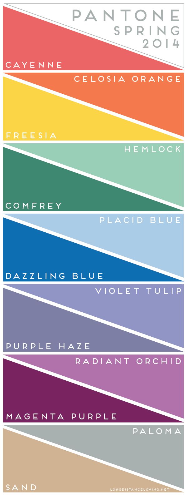
Inspiration Station: More 2014 Trends

Checking Pinterest for design inspiration is always a good idea since you’ll rarely ever come up with no results for a search, especially on design trends. However, there’s also something to be said for checking on what experts think will be the hot trends of 2014, especially in the gift/greeting industry. If nothing else, you may find new colors or new design inspiration in these articles.
G&G Review: Colour, Print, and Pattern Trends for 2014
Yes, it’s UK based, but still relevant if you want to try a new look in your card designs.
Paperworld: Trends 2014-2015
A few interesting colors and color schemes.
Emily Kiddy: Girls Trends Spring/Summer 2014
Get some ideas here for color combos and feminine designs.
Wedding Stationery Trends 2014
Get a jump on next year’s bridal needs.
Greeting Card Association: Tips for Greeting Card Writers and Artists
The U.S. trade association gives expert advice.
Share this:

Font Frenzy: Chalkboard/Blackboard Fonts

We’ve pointed out casual font designer Kimberly Geswein before. She’s prolific, her fonts are usually quite complete (including accents and diacritical marks), and her fonts cost only $5 each for unlimited commercial use. We thank her for her generosity to the artistic community.
She’s recently begun releasing fonts that lend themselves pretty well to Chalkboard/Blackboard designs. Here are the names and links to a few of these fabulous fonts. Check out her site (linked above) and have fun!


Share this:

Tips and Tricks: Checkerboard/Gingham Patterns

CHECKERBOARD & GINGHAM PATTERNS FOR BACKGROUNDS

As an up and coming trend in handmade greeting card design, we’re seeing more “country” and folk art inspired themes. (BONUS: Butterflies are beginning to gain popularity against birds, too. And it looks like Laura Astley-type floral patterns may be making a comeback).
Think bonnet wearing girls in Swiss dotted dresses, sunflowers, cottage roses, kittens, watering cans, etc. but the presentation is a little more sophisticated these days than Holly Hobby.
One of the cornerstones of this trend is checkerboard/gingham patterns used as backgrounds or embellishments. Don’t know what gingham looks like? Take a gander at the background of the card above and check out Pinterest: Gingham and Pinterest: Checkerboard.
These kind of seamless backgrounds are pretty simple to make yourself. We’ve gathered some tutorials for you if you want to try your hand at it. Have fun!
Tablecloth Checks in Paint Shop Pro
Paint Shop Pro Gingham Check Pattern (video)
How to Create Seamless Gingham Patterns in Photoshop (video)
How to Make Gingham in Photoshop
How to Make a Gingham Pattern in Gimp
Tablecloth Check – Adobe Illustrator (video)
Share this:

Dash of Inspiration: 2014 Trends
A Dash of Inspiration, A Cup of Creativity by Doreen
2014 Trends
As designers keeping up on the industry for the latest trends is not only inspirational, it’s smart. Many things go out of style, even in greeting card design. We’ve mentioned in the past that excessive beveled text and elements went out many years ago, that’s a good example of leaving old ‘trends’ behind and focusing on what’s ‘in’ today and applying some of those trends to your designs.
What is a trend? Whether it’s a shape, style, color or pattern … it’s popular and sought after. Trends change from season to season, so as a designer it’s never wise to dive so deep into a trend that you lose your personal style, that which makes your designs unique. What it does mean is to incorporate bits and pieces of seasonal trends in SOME of your seasonal designs. A strong designer must always have those designs which are sustainable, timeless, even classic and unique to them. Trends are just the ‘flavor’ you add to a few special designs. If you apply ‘trends’ to ALL the cards you design for that season, then all those cards will become ‘outdated’ when the trends hit the following year.
Here are some inspirational links for 2014 trends:
 Pinterest is a wonderful place for color and pattern trends. Here are two great boards for inspiration.
Design Trends 2014 – Pinterest
Color & Design Trends 2014 – Pinterest
Gifts & Greetings Review is dedicated to the gifts and greetings cards retail trade.
Most Talked About Trends at London Fashion Week – catwalk trends are always fun to see!
Paperworld has some good trend info for 2014 which translates well into card design.
Trends also happen in Marketing and though as designers, we in general are small business people, most marketing trends can be whittled down to fit our small portion of the marketplace. Here are some interesting articles for Marketing Trends in 2014.
EyeSocialEyes.com – Online Trends Affecting Small Business Marketing as 2014 Approaches
So, until next week … Learn … Create … Inspire!
Share this:

Critique Clinic – October 4-6, 2013
How does it work? For three days a week (Friday-Sunday midnight), I will open the clinic to any artist who wants an honest peer review and critique of a card which gets plenty of clicks but no sales, so something’s probably not quite right, or you’ve got a new design you want to test drive, or you’re unsure about the marketability of a card. Or perhaps you’re a newbie who isn’t sure if a card is up to a marketable standard. Anyone is welcome to participate. In fact, I encourage everyone to at least look at the cards in question and read the critique comments – you may learn something. The purpose of the clinic is to help artists improve the commercial appeal and marketability of their cards.
THE RULES
- ONE card per artist only.
- Card must be intended for sale at Greeting Card Universe.
- To submit a card for critique, post a link to the card at GCU in the comments section of this clinic post. Allowances will be made if you’ve had a card declined, or made a new design you’d like advice on before submission. Give us the link where we can see the card, such as your private gallery, Flickr, Tinypic, etc. If you do give a private gallery link, be sure your private module gallery is ON. Please do not post links to your Manage Cards section – do you really want strangers tinkering with your cards? And please don’t ask us to critique a card that’s pending review – we can’t see it until it’s approved.
- Any artist is free to comment and/or give a critique of a submitted card. HOWEVER, post-and-run comments like “great card” or “you suck” will not be tolerated, nor will abuse. Criticism should be constructive, not destructive. Play nice or you will be banned.
- I also won’t tolerate temper tantrums if you decide your “artistic integrity” is being stepped on because you asked for a critique, and someone told you the photo you’re using isn’t in focus. If you can’t take honest criticism, don’t submit. Once gets you a warning; twice and you’re banned from submitting in the future.
- Artists who critique may do so by giving their opinion, posting an example of another card, or pointing the submitter to a video, on-line article, or other helpful suggestion.
- Don’t forget that artists who are giving you tips and helpful advice are volunteering their time and trouble. Be nice. A link back to their store on your website or blog is appreciated (but not mandatory).
- You are free not to take any advice offered. There’s no guarantee any card will be a bestseller, so don’t come into the clinic with unrealistic expectations.
- Rules may change as we go along and we see how things turn out, okay?
So without any further ado, I declare this week’s Critique Clinic open!


