Tips and Tricks: Google Knows Who You Are

Google Knows Who You Are
Some artists have been recently disconcerted to discover their names coming up in Google searches related to GCU. Most of this sudden onset of Google knowledge isn’t due to the NSA … there was a technical issue that has since been fixed. GCU has made a request to Google for their crawlers to re-index the site. Be patient; this will take a while.
However, there can be another cause. When you’re logged into the site, go to Manage Cards > Artist Profile. Whatever you entered as your Display Name is what will show up automatically in Google searches. If you used your name instead of your business or store name, that may be the reason. If you alter the Display Name, don’t forget to SAVE your changes.
Share this:

Dash of Inspiration: Image Quality Color – Contrast
A Dash of Inspiration, A Cup of Creativity by Doreen
Image Quality: Color/Contrast

Before we get started, I’ve skipped IMAGE QUALITY: Reflections simply because it has a well defined description in the Submission Guidelines for which there is nothing to add to. So, with that said, let’s keep this series going by moving through the IMAGE QUALITY grouping of the Submission Guidelines, and next up is:
IMAGE QUALITY: Color/Contrast
The Submission Guidelines state this:
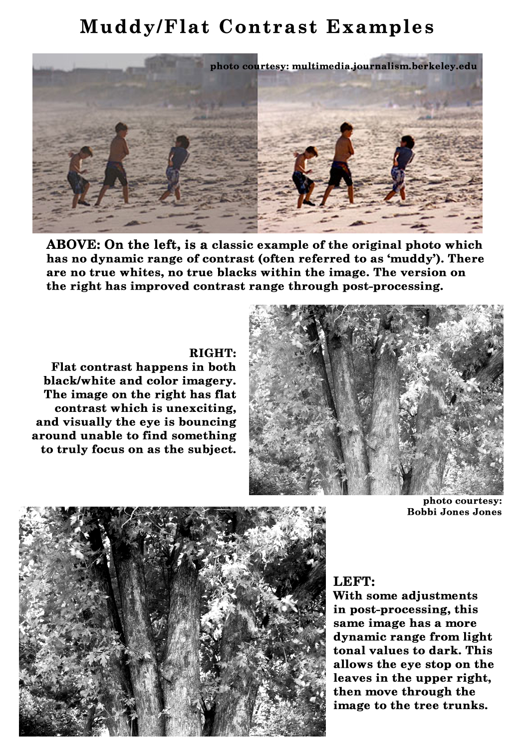
Artwork or photographs which have been unprofessionally scanned or created often have a muddy look or a color cast of magenta, blue, or yellow. This can happen when a photograph is taken if the camera is not set up properly and during scanning if the scanner is not properly calibrated and adjusted. If the whites of your final image are not white and your blacks are not black, your image is not marketable. These color cast variations and dark, muddy tonal values will not reproduce well in print. This applies to all imagery; photography, digital art, scanned artwork and everything in between. Contrast refers to the arrangement of opposite elements; light vs. dark colors, rough vs. smooth textures, large vs. small shapes, etc. in artwork, design and photography to create visual interest, excitement and drama. In photography, this is most often used to describe the balance of levels from light to dark. Declines may include, but are not limited to: muddy imagery, flat contrast, color casts which are unnatural and unpleasant (whether intentional or not), excessive texturing, etc.
For color cast issues on a scanned image, please refer to the Poor Scans Examples
Muddy/Flat Contrast: A flat-contrast scene has colors or tones in which highlights and shadows have very little difference in densities. In other words, all colors or tones within the scene are very similar in appearance. As in all areas of photography and other mediums, there are always exceptions to when a ‘flat’ contrast image is perfectly acceptable, such as; a white cat against a white background may be considered ‘flat’, however as long as the whites are truly white and not closer to gray and there is a definite ‘punch’ in the contrast between the cats eyes with the rest of the image, this would be considered an acceptable exception to the rule.
In color photography, cold colors (bluish) and warm colors (reddish) almost always contrast. Cold colors recede, while warm colors advance. Light colors contrast against dark ones, and a bold color offsets a weak color. When a scene contains mostly dark tones or colors, it is low key. When the image contains mostly light tones, it is high key. Low-key and high-key imagery convey mood and atmosphere. Low key often suggests seriousness and mystery and is often used in sympathy and Halloween cards. High key creates a feeling of delicacy, lightness, and happiness.
High-key color imagery contain large areas of light desaturated/pastel colors with very few middle colors or shadows. A low-key image is created when the scene is dominated by shadows and weak lighting. Low-key pictures tend to have large areas of shadow, few highlights, and degraded colors.
Just because these techniques have a name in the photographic arena, does not mean that by simply telling the reviewer your flat contrast image is High-key or Low-key will get it approved. Always remember, you can not break the rules without a complete understanding and without having mastered how and when to use a High-key or Low-key image intended for a marketable greeting card.
Tips:
- Avoid even front lighting of a subject, which produces little contrast with no shadows and no definition between the subject and the foreground/background.
- Two areas of image editing in post-processing which should be mastered by any and all who create imagery for public sale, particularly photographers, it should be curves and masking.
- Learn to examine your image, identify the lighter and darker part of your image and where they meet, then intelligently use techniques such as; curves, levels, dodging and burning to bring these differences out.
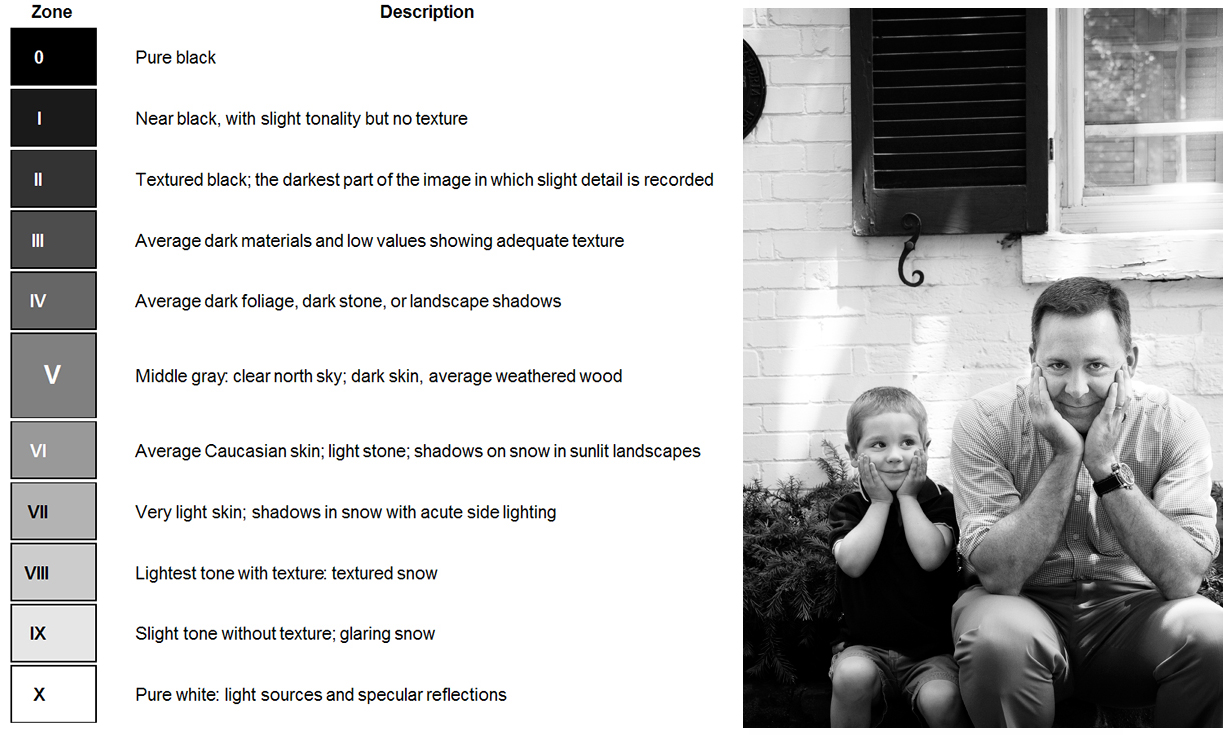
- Spend time studying the Zone System to understand the value of a full tonal range, whether in black-and-white photographs or color.
Color Casts: No matter what the color cast, unless it’s done with an experienced hand and beautifully blended with both the ‘theme’ of the image and technical know-how, color casts are just not appropriate for a marketable image. For example, I’ve never met a purple bear, however I’ve seen many amateur photographs of bears which due to a strong magenta color cast, the black bear is purple instead of black. The key to remember in photography is that you are working in a ‘realistic’ medium, therefore the output, if it still is obviously a photograph, in general will be rejected by the eye of the viewer if skin is yellow/orange, if blacks are blue or purple, and if whites are pink.
Images tinted with an unwanted color caused by incorrect white balance on your camera or scanner are considered unmarketable. Although some color choices can be seen as artistic, it’s fairly easy to recognize the difference between a pleasantly artistic choice and that which simply is unwanted or unattractive.
Tips:
- Shooting inside under florescent lighting (green cast) or tungsten lighting (yellow/orange cast). We used to put a filter on the camera lens to compensate, however with digital cameras most have a setting for various light temperatures.
- Poorly calibrated computer monitors and scanners are frequent causes of unwanted color casts.
- It’s often easy to tell how a color cast occurred by noting whether the entire image has a color shift or only certain areas of the image.
- Learn about color temperature (kelvin scale) – Good reading
- Generally speaking when adding a color cast to an image for mood, it should be lightly tinted and render a soft ‘pastel or sepia’ value to the image, rather than applied thick and heavily. Shades of pinks, lavenders and blues are usually more acceptable to the eye than yellow and green casts, regardless of the subject.
- Your subject makes a huge impact on whether the color cast you add gives an artistic feel or simply looks odd and unnatural.
- Snow is white, not pink, not purple and sometimes under low lighting, blue. If the image is of a deep setting sun with a sky filled with the pinks, orange and reds of sunset then of course those colors in the snow would be acceptable. Same for an image of the snow in twilight, it would take on a blue hue. In general, however, for marketable images, snow does not have heavy color cast unless the lighting in the image supports it.
- Please, when adding a sepia tone, remember that sepia is a slight reddish brown hue not a yellow brown or greenish brown. Back in the days of chemical darkrooms, sepia was a toner in which portrait prints were processed as a final step to give those cool black and white portraits a warmer feel.
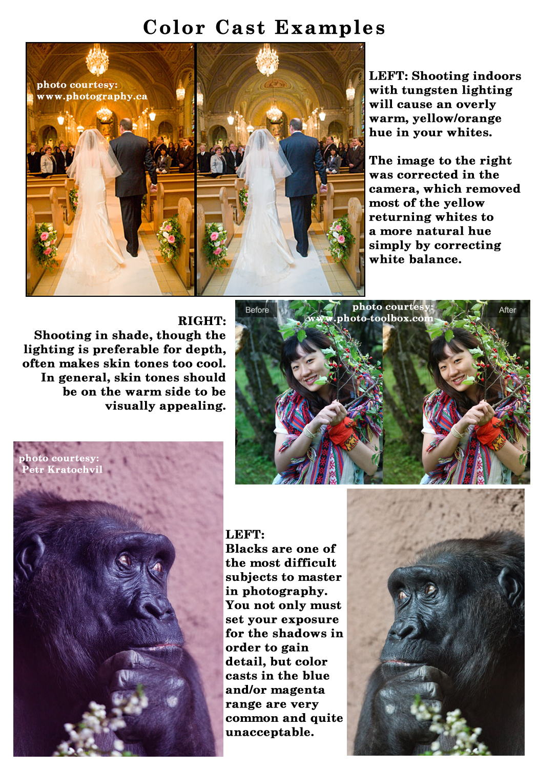
Here are some examples of cards at GCU where a color cast has been intentionally added with marketable results:


Next week we’ll continue through the Submission Guidelines: Image Quality section and discuss Resolution. Till next week, I hope I’ve inspired you to go look through your store and see if you can weed out any images that the reviewers will find during their weeding which might have unacceptable color casts or muddy/flat contrast.
For great resources & tips visit the SalonOfArt
Share this:

Critique Clinic – July 20-21, 2013

How does it work? For three days a week (Friday-Sunday midnight), I will open the clinic to any artist who wants an honest peer review and critique of a card which gets plenty of clicks but no sales, so something’s probably not quite right, or you’ve got a new design you want to test drive, or you’re unsure about the marketability of a card. Or perhaps you’re a newbie who isn’t sure if a card is up to a marketable standard. Anyone is welcome to participate. In fact, I encourage everyone to at least look at the cards in question and read the critique comments – you may learn something. The purpose of the clinic is to help artists improve the commercial appeal and marketability of their cards.
THE RULES
- ONE card per artist only.
- Card must be intended for sale at Greeting Card Universe.
- To submit a card for critique, post a link to the card at GCU in the comments section of this clinic post. Allowances will be made if you’ve had a card declined, or made a new design you’d like advice on before submission. Give us the link where we can see the card, such as your private gallery, Flickr, Tinypic, etc. If you do give a private gallery link, be sure your private module gallery is ON. Please do not post links to your Manage Cards section – do you really want strangers tinkering with your cards? And please don’t ask us to critique a card that’s pending review – we can’t see it until it’s approved.
- Any artist is free to comment and/or give a critique of a submitted card. HOWEVER, post-and-run comments like “great card” or “you suck” will not be tolerated, nor will abuse. Criticism should be constructive, not destructive. Play nice or you will be banned.
- I also won’t tolerate temper tantrums if you decide your “artistic integrity” is being stepped on because you asked for a critique, and someone told you the photo you’re using isn’t in focus. If you can’t take honest criticism, don’t submit. Once gets you a warning; twice and you’re banned from submitting in the future.
- Artists who critique may do so by giving their opinion, posting an example of another card, or pointing the submitter to a video, on-line article, or other helpful suggestion.
- Don’t forget that artists who are giving you tips and helpful advice are volunteering their time and trouble. Be nice. A link back to their store on your website or blog is appreciated (but not mandatory).
- You are free not to take any advice offered. There’s no guarantee any card will be a bestseller, so don’t come into the clinic with unrealistic expectations.
- Rules may change as we go along and we see how things turn out, okay?
So without any further ado, I declare this week’s Critique Clinic open!
Share this:

NEWS: Fast Track Same-Sex Marriage Cards! Limited Time

For a limited time, GCU will allow artists to Fast Track same-sex marriage designs. The categories are:
Announcements > Just Married/Wedding Announcements > Gay/Lesbian
Announcements > Engaged/Getting Married > Gay/Lesbian
Invitations > Wedding > Gay/Lesbian
Congratulations > Wedding/Marriage > Gay/Lesbian
You may Fast Track these designs until July 27, 2013.
For designer’s tips, see this post: New Gay Wedding Categories Need Cards
Include Collections > Gay/Lesbian as your second category.
To avoid delays, don’t forget to include Reviewer’s Notes and be sure to add this information: Per Mindy, okay to Fast Track same-sex marriage cards until 7/27.
Share this:

Font Frenzy: Odstemplik – FREE!

A script font with an old-fashioned elegance, Odstemplik comes regular and italic, and contains many diacritical marks for non-English text. Best of all, it’s public domain, has an OFL license, and is free for commercial use. You can see an example below. Odstemplik would probably work best as a font paired with a simple, sans serif font. Stand-alone, keep it short and simple. Have fun!

Share this:

Tips and Tricks: Commercial Use Photos
Freerange Stock
Our friends at Noupe.com posted an article regarding a somewhat new site called Freerange Stock, a photographic archive. By joining Freerange Stock, you have access to high quality, high resolution photographs that are free for any use, including commercial. If you find the notion interesting, go read the article, visit the site, and decide for yourself.
Caveat: as I’m not an interested party, I haven’t been through the site myself.
At a glance, it seems like members who share their photos also get a share of the site’s AdSense revenue, but you should always, always do a thorough check and make sure you understand all Terms and Conditions before you commit.
(Edited to add: PLEASE CHECK THE COMMENTS on this post to learn why it’s important to read the TOU)
Share this:

NEWS: New Gay Wedding Categories Need Cards!

GCU has added two new categories that are just begging for cards:
Announcements > Just Married/Wedding Announcements > Gay/Lesbian
Announcements > Engaged/Getting Married > Gay/Lesbian
These join existing categories Invitations > Wedding > Gay/Lesbian and Congratulations > Wedding/Marriage > Gay/Lesbian.
Why should you be excited? Because with the recent Supreme Court decisions, public acceptance on the rise, and the continuing legal challenges to same-sex marriage bans on a state level, it looks like more states will be allowing gay/lesbian marriage in the future. Many gay and lesbian couples are flying to a state that allows them to marry and tying the knot, so they need announcements and invitations, and their family/friends need congratulations cards.
A couple of tips to keep in mind as you design cards for these categories:
- Please ditch the rainbows.
- The card design and/or verse will have to reflect the unique category in some way, or you risk having your card declined. Be creative.
- Add Collections > Gay/Lesbian as your second category.
- If your design skills support it, don’t forget to include specially themed gay and lesbian Wedding Attendants/Bridal Party invitations, too (these would go into the usual sub-categories). See the example at the beginning of this post.
Have fun!
Share this:

Dash of Inspiration: Image Quality – Poor Scans
A Dash of Inspiration, A Cup of Creativity by Doreen
Image Quality: Poor Scans
Let’s keep this series going by moving through the IMAGE QUALITY grouping of the Submission Guidelines, and next up is:
IMAGE QUALITY: Poor Scans
The Submission Guidelines state this:
Scanned art and photography must be free of dust and scratches, careless cropping and misalignment upon final upload. Scans must be at minimum the same image size and resolution requirements for any GCU upload. Pay attention to alignment, resolution, color, and contrast when scanning your artwork. Declines may include, but are not limited to: crooked scans, poor color, dirt, dust, scratches, tears, low resolution, pix-elated images, etc.
Scanning artwork in order to achieve a high-quality scan which will reproduce your original art, requires a few critical things.
- That your artwork fits flat on the flatbed scanner or that you have access to a professional quality drum scanner.
- That you scan at a dpi (dots per inch) minimum to EQUAL the output dimensions.
- You understand how to make adjustments to color and tonal values within the scanning device and/or has the post-processing tools, to obtain the closest possible digital reproduction which represents the original art.
For most professional artists, it’s worth the price to have their artwork captured digitally through a professional service. Those of us who sell Giclee fine art prints, have our work scanned by the printing/publishing house, whose professionals know how to get perfect high-resolution scans. This is a fairly costly option however.
Today, with high resolution digital cameras you have some options which can offer a dust-free digital file and a much more affordable option.
- Place the artwork (no framing, no glass) completely flat against a vertical surface such as a wall or door.
- Choose a place with natural, even lighting for best results.
- Temporarily mount it at a level which will make it completely level with the camera on a tripod, using artist’s tape to hold the artwork in place if the artwork is on paper vs. canvas.
- Set up a digital camera (6+ megapixels minimum for greeting card size), choose camera capture settings which are the highest resolution possible (shoot in RAW format if you have that option), and put the camera on a tripod.
- Make sure the camera height is exact so that the artwork is straight and level within the viewfinder. Perspective is critical here!
- Level the tripod, if your tripod does not come with levels use a hand-held one to level horizontally and vertically.
If you have the tools and patience, this can be an inexpensive way to achieve high resolution, dust free digital images from your artwork with great color saturation and tonal values.
Crooked Scans: It’s very common to get a crooked scan and very easy to correct in post-processing. If you do not have the ability to correct a scanned image which is tilted, then you should have your work scanned professionally. Crooked art or photographic scans will not be accepted on greeting cards.
Poor Color: One of the most difficult areas of scanning your artwork or photographic images on a home-based scanner is achieving an accurate and pleasant color match to the original. Color casts of magenta or cyan are very common issues, particularly in older scanner models. Most scanners come with software to allow you to calibrate and adjust color variables. Though frustrating and time-consuming, this is a must if you wish to use your scans professionally.

Dirt, Dust, Scratches, Tears: None of these are acceptable in your greeting card images. It’s nearly impossible to scan a photograph, negative or transparency without visible signs of dust/dirt unless you have a newer model scanner designed for photographic scans which come with interactive software specifically to reduce dust and scratches. Even then, the results will not be perfect on every scan. You really must have software such as Photoshop which allows you to go ‘spot’ your images after scanning. In the old darkroom days, we used fine-tipped paint brushes and spotting inks to touch up darkroom prints.
You must keep all of these issues in mind when working to scan vintage photographs and artwork. You can not submit greeting card images with poor quality, whether they are vintage or not, and expect them to be accepted. Even vintage work requires a certain level of image quality to be acceptable.
Too Low Resolution: Learn about resolution and how to capture via scanning a digital file of the correct size and resolution from your original scan. If you do not completely understand this capture method, you are likely to enlarge your scans well beyond acceptable resolution and they will be declined.
Tips for scanning at the right size/resolution:
- Transparencies and negatives are so small, you need to maintain a maximum resolution so the image can be enlarged as needed. Make sure you’re scanning at a high resolution (2400 dpi is recommended) when scanning either photo slides or negatives that you wish to enlarge later.
- If you’re considering enlarging your scanned image from its original size, then a general rule of thumb is to double the dpi with every doubling in size.
- If you have the negative/transparency, always choose to scan from that rather than scanning a print made FROM the film. Think about it this way … Every generation made from the original film loses some clarity and quality. So: the film is the 1st Generation, the print is the 2nd Generation, the scan is the 3rd Generation and the digital file you are now printing from is a 4th Generation … that’s four generations which have all lost some detail in clarity, tonal values and color along the way.
- Never work in a compressed file mode when scanning. Every time a compressed file type is saved, such as; jpgs, they lose quality in your image. Always scan and work in a non-compressed format such as PNG, TIFF or native Photoshop options.
Example: Scanning 35mm film size – Scanning 1.42 x 0.94 inches (36.0 x 24.0 mm) requires the MINIMUM Scanning Resolution of 1482 dpi (583 pixels/cm). Minimum meaning any cropping requires greater scanning resolution – to print at 7.00 x 5.00 inches at 300 dpi.

Next week we’ll continue through the Submission Guidelines: Image Quality section and discuss Reflections. Till next week, I hope I’ve inspired you to go look through your store and see if you can weed out any images that the reviewers will find during their weeding which might have been poorly scanned.
For great resources & tips visit the SalonOfArt
Share this:

Critique Clinic – July 12-14, 2013
How does it work? For three days a week (Friday-Sunday midnight), I will open the clinic to any artist who wants an honest peer review and critique of a card which gets plenty of clicks but no sales, so something’s probably not quite right, or you’ve got a new design you want to test drive, or you’re unsure about the marketability of a card. Or perhaps you’re a newbie who isn’t sure if a card is up to a marketable standard. Anyone is welcome to participate. In fact, I encourage everyone to at least look at the cards in question and read the critique comments – you may learn something. The purpose of the clinic is to help artists improve the commercial appeal and marketability of their cards.
THE RULES
- ONE card per artist only.
- Card must be intended for sale at Greeting Card Universe.
- To submit a card for critique, post a link to the card at GCU in the comments section of this clinic post. Allowances will be made if you’ve had a card declined, or made a new design you’d like advice on before submission. Give us the link where we can see the card, such as your private gallery, Flickr, Tinypic, etc. If you do give a private gallery link, be sure your private module gallery is ON. Please do not post links to your Manage Cards section – do you really want strangers tinkering with your cards? And please don’t ask us to critique a card that’s pending review – we can’t see it until it’s approved.
- Any artist is free to comment and/or give a critique of a submitted card. HOWEVER, post-and-run comments like “great card” or “you suck” will not be tolerated, nor will abuse. Criticism should be constructive, not destructive. Play nice or you will be banned.
- I also won’t tolerate temper tantrums if you decide your “artistic integrity” is being stepped on because you asked for a critique, and someone told you the photo you’re using isn’t in focus. If you can’t take honest criticism, don’t submit. Once gets you a warning; twice and you’re banned from submitting in the future.
- Artists who critique may do so by giving their opinion, posting an example of another card, or pointing the submitter to a video, on-line article, or other helpful suggestion.
- Don’t forget that artists who are giving you tips and helpful advice are volunteering their time and trouble. Be nice. A link back to their store on your website or blog is appreciated (but not mandatory).
- You are free not to take any advice offered. There’s no guarantee any card will be a bestseller, so don’t come into the clinic with unrealistic expectations.
- Rules may change as we go along and we see how things turn out, okay?
So without any further ado, I declare this week’s Critique Clinic open!
Share this:

Tips and Tricks: When to Post on Social Media
Professional greeting card designer Kate Harper has a wonderful blog where she shares lots of tips and tidbits relating to the business of successfully creating greeting cards. Recently, she shared a graphic she made on the best and worst times to post on social media—meaning the time of day when your followers are most/least likely to see your posts.
How it breaks down for the best:
FACEBOOK: 1-4 p.m.
TWITTER: 1-3 p.m.
PINTEREST: 2-4 p.m. and 8 p.m.-1 a.m.
GOOGLE+: 9-11 a.m.
LINKEDIN: 7-9 a.m. and 5-6 p.m.
Learn more at Kate Harper’s blog: Best time of day to post on social media
These represent your local time. Of course, international artists may be in a different boat. We live in the Netherlands, but our primary card buying audience is in America. You may want to take time zone differences into account in that case. Or not, as you choose.
Thanks to Betsy Bush of Dragonfire Graphics for the heads-up.


