Tips and Tricks: Orphan Categories – Back to School

Orphan Categories: Back to School

The time of year made us start thinking about kids returning to school. It’s a little late for artists to submit cards for this year, but for next year, there are some definitely wide open fields out there.
Occasions > School Days > Back to School has almost 200 cards. However, the sub-categories are virtually empty.
Back to Elementary School
Back to Middle School
Back to High School
Grade Specific
Off to College > General
Off to College > Relationship Specific
These sub-categories have very few cards in them. There’s a niche here waiting for a clever artist to take advantage. Not only designing great cards for these sub-cats, but also promoting the idea on social media and elsewhere. This is how you identify and fill a niche market – find a category that isn’t getting lots of attention, make it yours, and build it up through marketing.
Have fun!
Share this:

Dash of Inspiration: Image Quality – Excessive Effects
A Dash of Inspiration, A Cup of Creativity by Doreen
Image Quality: Excessive Effects

Let’s keep this series going by moving through the IMAGE QUALITY grouping of the Submission Guidelines, and next up is:
IMAGE QUALITY: Excessive Effects
The Submission Guidelines state this:
Artists should use a light hand when using special effect filters and blending options offered in digital software. There are many tutorials on the Internet on the use of the various filters available. Filters are not intended to be used in their default settings; it often takes a lot of tweaking and the use of more than one filter or blending mode to achieve an attractive image. A filter will not save a bad photo. Declines may include, but are not limited to: excessive beveling on objects, text and borders, overuse of digital filters, poorly executed effects, poor blending from masking and background removal, etc.
Excessive Beveling: We chatted about this when we discussed text effects. Same things apply. When it comes to beveling, the difference between pleasing and excessive is a very fine line. In general, beveling is outdated and just not seen in current professional design practices, unless it’s use is barely noticeable. Don’t bevel your image edges, your text, elements within your designs unless your choice is done on a very small portion of your card image and done with a very light touch.
Poor Blending: Many of us like to remove the existing background and replace it with a better choice, or remove the subject from a photograph and create a collage using bits and pieces. I do a lot of this type of creation and GCU accepts them, however; you need to master background removal, masking and blending techniques or your creations will be declined. Leaving bits and pieces of remaining background, halos around the edges, sharp or jagged edges are all signs of poor technique and will result in declines. We’ve already talked about this subject, so here is the article as a refresher and/or reference.
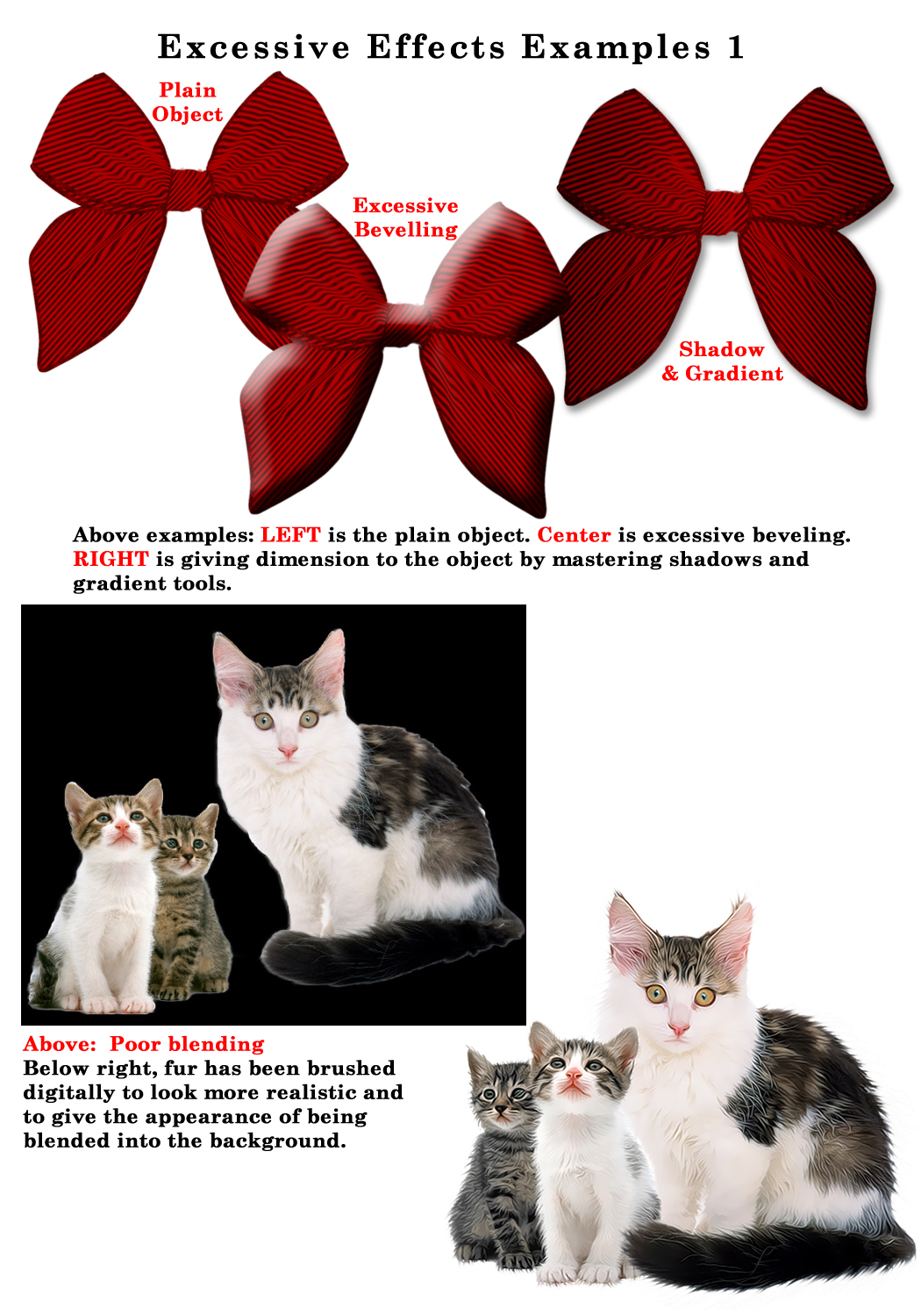
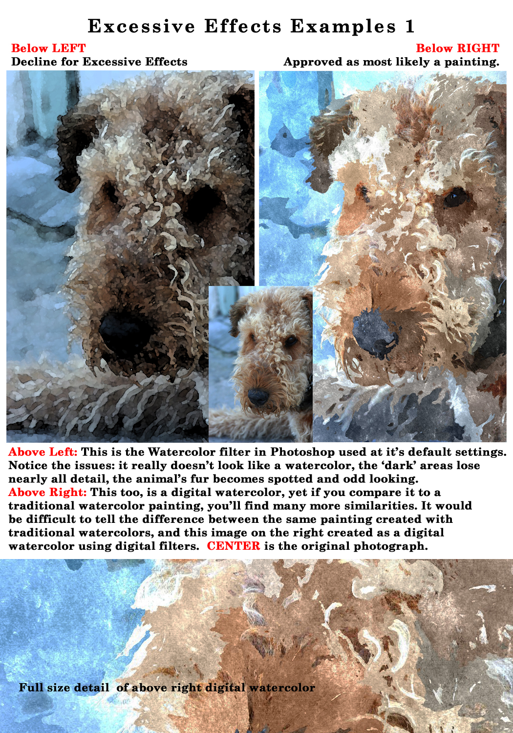
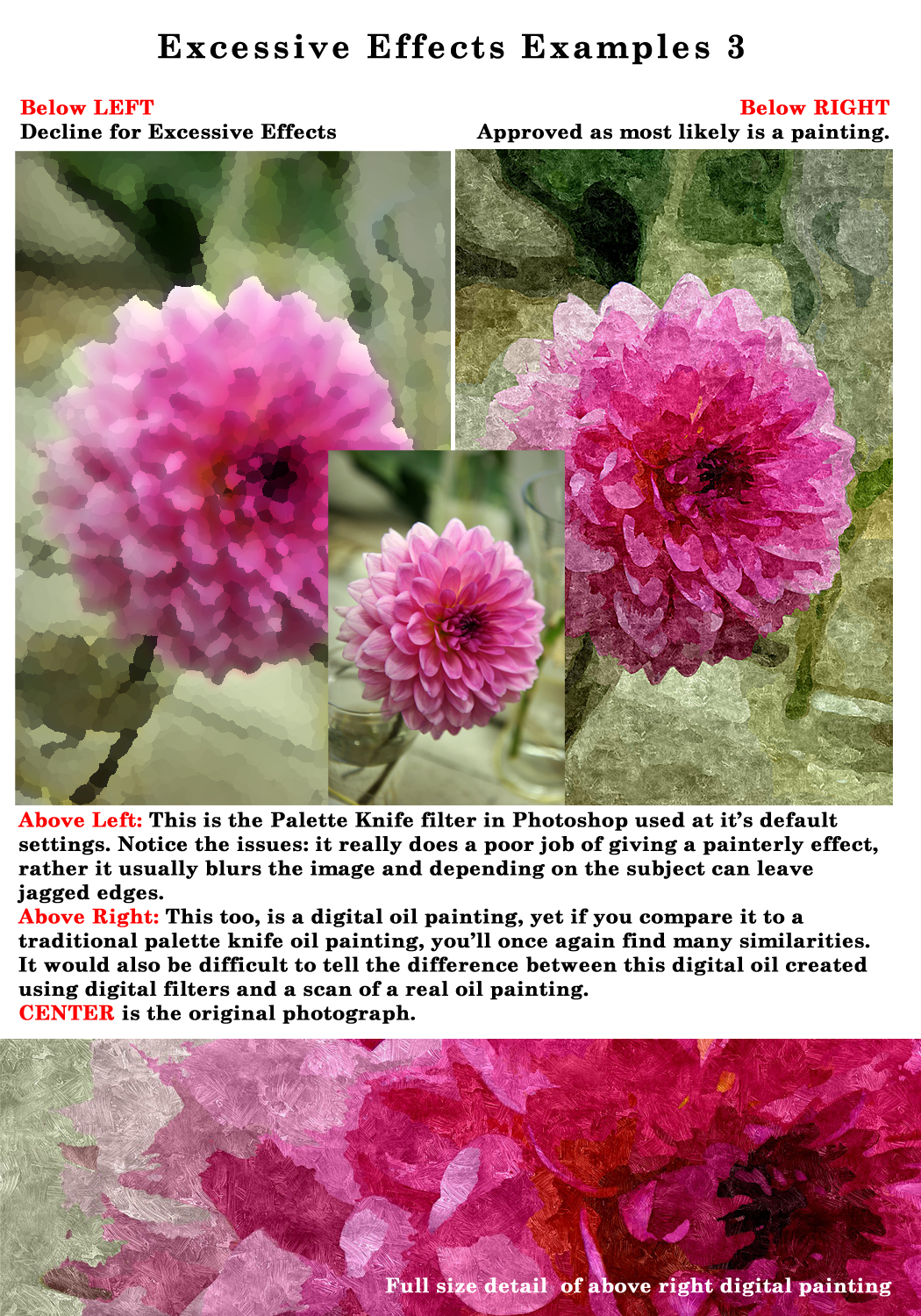
Overuse/Poorly Executed Digital Filters/Effects: Excessive use or poorly executed use of digital filters are a sign of ‘an amateur at the wheel’. Learn how to combine ‘effects’ with a light hand and choose your subjects carefully when applying digital filtering. All digital imaging software offers filters to manipulate the image, such as; Watercolor, Dry Brush, Poster Edge and so on. These are fun to play with and its great to learn what each application does, however, the effects can be very obvious that digital filters were applied and in many cases using factory settings, therefore creating results that are excessive and artificial.
To really make use of these filters and begin to create something unique, you should experiment with combining these filters on separate layers then use your blending tools; such as opacity and masks to calm the effects down. Your goal should be to actually blend the filter with the photograph or completely transform the image into a realistic looking traditional painting, not simply lay the filter on top of the photograph and consider it done. These filters, when painted on and blended in, are great for pulling out texture, blending colors and giving a true painterly look. When layered on with default settings, they are obviously created by the inexperienced digital artist and will most likely be declined, not only by GCU, but by Stock Agencies, Publishing Houses and gallery exhibits.
Tips:
- Stay away from Poster Edges and Posterize effects unless you are recreating a ‘retro poster-type’ effect. These are not filters that can be used on every subject, they are a limited use filter and in most cases your greeting card image will be declined if you use them without understanding their purpose.
- When you choose to use digital filters like the Dry Brush or Watercolor filters in a program like Photoshop, learn to paint these effects on separate layers using layer masks, and only to portions of your image.
- Watch your highlights and shadow areas carefully for loss of detail and make adjustments.
- There are thousands of tutorials out there for all types of imaging software showing various techniques on how to create a realistic painterly effect from photographs. If you want to create these effects, research these tutorials and find a process that works for you to create a real work of art not a piece of art that is very recognizable as having digital filters slapped on top of a photograph.
Next week we’ll finish the Submission Guidelines: Image Quality section by discussing Lighting/Flash Eye. Till next week, I hope I’ve inspired you to go look through your store and see if you can weed out any images that the reviewers will find during their weeding which might have excessive effects.
For great resources & tips visit the SalonOfArt
Share this:

Critique Clinic – August 2-4, 2013

How does it work? For three days a week (Friday-Sunday midnight), I will open the clinic to any artist who wants an honest peer review and critique of a card which gets plenty of clicks but no sales, so something’s probably not quite right, or you’ve got a new design you want to test drive, or you’re unsure about the marketability of a card. Or perhaps you’re a newbie who isn’t sure if a card is up to a marketable standard. Anyone is welcome to participate. In fact, I encourage everyone to at least look at the cards in question and read the critique comments – you may learn something. The purpose of the clinic is to help artists improve the commercial appeal and marketability of their cards.
THE RULES
- ONE card per artist only.
- Card must be intended for sale at Greeting Card Universe.
- To submit a card for critique, post a link to the card at GCU in the comments section of this clinic post. Allowances will be made if you’ve had a card declined, or made a new design you’d like advice on before submission. Give us the link where we can see the card, such as your private gallery, Flickr, Tinypic, etc. If you do give a private gallery link, be sure your private module gallery is ON. Please do not post links to your Manage Cards section – do you really want strangers tinkering with your cards? And please don’t ask us to critique a card that’s pending review – we can’t see it until it’s approved.
- Any artist is free to comment and/or give a critique of a submitted card. HOWEVER, post-and-run comments like “great card” or “you suck” will not be tolerated, nor will abuse. Criticism should be constructive, not destructive. Play nice or you will be banned.
- I also won’t tolerate temper tantrums if you decide your “artistic integrity” is being stepped on because you asked for a critique, and someone told you the photo you’re using isn’t in focus. If you can’t take honest criticism, don’t submit. Once gets you a warning; twice and you’re banned from submitting in the future.
- Artists who critique may do so by giving their opinion, posting an example of another card, or pointing the submitter to a video, on-line article, or other helpful suggestion.
- Don’t forget that artists who are giving you tips and helpful advice are volunteering their time and trouble. Be nice. A link back to their store on your website or blog is appreciated (but not mandatory).
- You are free not to take any advice offered. There’s no guarantee any card will be a bestseller, so don’t come into the clinic with unrealistic expectations.
- Rules may change as we go along and we see how things turn out, okay?
So without any further ado, I declare this week’s Critique Clinic open!
Share this:

Rainbow Connection: 2014 Wedding Color Trends

Artists who create wedding cards in GCU’s many categories may want to refresh older designs or make new cards taking advantage of trendy colors predicted for 2014. Here are a couple of samples of colors that will be very hot next year with brides. For the full story including all the colors you want to know about plus lots of pictures for inspiration, read this article.
Avocado

Monaco

Share this:

Tips and Tricks: The (In)Famous Forum Glitch
The (In)Famous Forum Glitch
We all did it when we first joined GCU. You create a post for the Forum, hit save, then it’s waiting … waiting … waiting … and finally, you get an error message. So you repost. And repost. And sometimes, repost again, and end up with four identical Forum posts. How’d that happen and how can you avoid it?
First, let’s clear up a misconception. GCU uses third-party software for its Forum. That means the company went out and bought a piece of software that was installed on their servers to create the Forum we all know and love. As with any programming, there are bound to be glitches. GCU’s admin knows this particular glitch exists, they’ve investigated what would need to be done to correct it, and that project’s way down near the bottom of their To-Do List. While it’s occasionally inconvenient for artists, especially newbies, fixing the Forum glitch isn’t a priority.
How to Avoid Multiple Duplicate Forum Posts
First, do not re-post. Nine times out of ten, your post has gone through and is there, you just can’t see it yet.
Second, simply backspace from the error page to the Forum’s main page and refresh your browser. You should see the post in the intended sub-category. I usually only need to refresh once; older browsers may need a couple of refreshes to show new content.
That’s it! A very easy solution to a problem that sometimes bugs us. Now that you know, feel free to pass the information onto newbies who meet the Forum glitch. You’ll be doing them – and yourself – a favor.
Share this:

Font Frenzy: Sacramento – FREE!

Sacramento is a free script font with great feminine, retro cool that would work well on its own for shorter phrases or used as emphasis when paired with a simpler font. It has an OFL license, and is okay for commercial use. You can see an example below. Have fun!

Share this:

Dash of Inspiration: Image Quality – Resolution
A Dash of Inspiration, A Cup of Creativity by Doreen
Image Quality: Resolution
Let’s keep this series going by moving through the IMAGE QUALITY grouping of the Submission Guidelines, and next up is:
IMAGE QUALITY: Resolution
The Submission Guidelines state this:
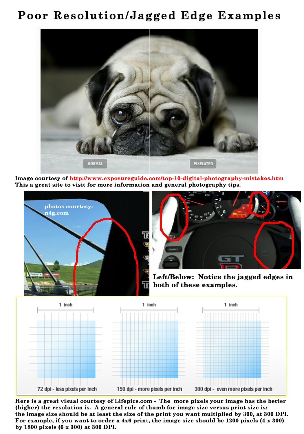
The term resolution can be defined as both the number of pixels per inch in a digitized photograph or piece of art determining width and height. When the resolution is too low, in the case of GCU less than 300 ppi (pixels per inch), it results in both a loss of sharpness and the image gets a “pixelated” look . . . you see the small squares that make the image, or lastly; straight lines show a “staircase” effect so at full-size you see jagged edges. None of these effects will be accepted.
Signs of Resolution Issues: Resolution issues can show up as a ‘blocky’ effect or as digital gurus call it; pixelated – in other words, you can see the pixel squares making up the image. Jagged edges, which often look like a series of stair steps, are another sign of possible resolution issues and often show up when you have ‘up-sized’ an image beyond it’s original dimensions, in other words increased the size of an image beyond that which is was original captured. This applies to digital capture, scanning artwork and/or creating in a digital environment. Jagged edges (also referred to as Jaggies / Aliasing) can also occur with excessive sharpening in digital processing.
Understanding Resolution: I could not have explained better than this quote from Lifepics.com :
“A general rule of thumb for image size versus print size is: the image size should be at least the size of the print you want multiplied by 300, at 300 DPI. For example, if you want to order a 4×6 print, the image size should be 1200 pixels (4 x 300) by 1800 pixels (6 x 300) at 300 DPI. If the image size was half of that (600 by 900), then the 4×6 print would likely come out distorted or pixelated if you were to order a print.“
A common mistake often made is to re-size an image’s dimensions, while keeping the resolution the same. For example you have a clip art piece that is 2×3-inches @ 300 dpi/ppi and you want to use it on your 5×7 greeting card, so you re-size the clip art to 4×6-inches at 300 dpi/ppi … you have now caused pixelization and/or jagged edges. The same would go for taking a 5×7-inch image @ 72 dpi/ppi and changing the 72 to 300 dpi. You CAN NOT ‘enlarge’ an image without causing resolution issues.
Tips:
- Always set your digital camera to capture in the highest resolution available.
- If you are scanning artwork, please refer to the section on Tips for Scanning at the Right Resolution
- Every time you save a file as a JPEG, you compress the image and lose a little quality. And each time you open and close a JPEG (even if you perform no editing on it), you still lose quality. If you plan to make a lot of changes to an image, it’s best to save it initially in an uncompressed format, such as PSD, PNG or TIFF.
- Images can be sized down, but should NEVER be increased in size!
- If your photos have jagged edges straight out of the camera, you should probably turn automatic in-camera sharpening off.
- Remember when dealing with digital photography that it renders in square pixels. Any diagonal line, especially those of high contrast, will render as a series of squares that touch at the corner. If you are not careful with your processing techniques and/or work in a compressed file format, you may cause these diagonal squares to become jagged.
For learning more about image file types, this is a good read.
Next week we’ll continue through the Submission Guidelines: Image Quality section and discuss Excessive Effects. Till next week, I hope I’ve inspired you to go look through your store and see if you can weed out any images that the reviewers will find during their weeding which might have unacceptable resolution issues.
For great resources & tips visit the SalonOfArt
Share this:

Critique Clinic – July 26-28, 2013
How does it work? For three days a week (Friday-Sunday midnight), I will open the clinic to any artist who wants an honest peer review and critique of a card which gets plenty of clicks but no sales, so something’s probably not quite right, or you’ve got a new design you want to test drive, or you’re unsure about the marketability of a card. Or perhaps you’re a newbie who isn’t sure if a card is up to a marketable standard. Anyone is welcome to participate. In fact, I encourage everyone to at least look at the cards in question and read the critique comments – you may learn something. The purpose of the clinic is to help artists improve the commercial appeal and marketability of their cards.
THE RULES
- ONE card per artist only.
- Card must be intended for sale at Greeting Card Universe.
- To submit a card for critique, post a link to the card at GCU in the comments section of this clinic post. Allowances will be made if you’ve had a card declined, or made a new design you’d like advice on before submission. Give us the link where we can see the card, such as your private gallery, Flickr, Tinypic, etc. If you do give a private gallery link, be sure your private module gallery is ON. Please do not post links to your Manage Cards section – do you really want strangers tinkering with your cards? And please don’t ask us to critique a card that’s pending review – we can’t see it until it’s approved.
- Any artist is free to comment and/or give a critique of a submitted card. HOWEVER, post-and-run comments like “great card” or “you suck” will not be tolerated, nor will abuse. Criticism should be constructive, not destructive. Play nice or you will be banned.
- I also won’t tolerate temper tantrums if you decide your “artistic integrity” is being stepped on because you asked for a critique, and someone told you the photo you’re using isn’t in focus. If you can’t take honest criticism, don’t submit. Once gets you a warning; twice and you’re banned from submitting in the future.
- Artists who critique may do so by giving their opinion, posting an example of another card, or pointing the submitter to a video, on-line article, or other helpful suggestion.
- Don’t forget that artists who are giving you tips and helpful advice are volunteering their time and trouble. Be nice. A link back to their store on your website or blog is appreciated (but not mandatory).
- You are free not to take any advice offered. There’s no guarantee any card will be a bestseller, so don’t come into the clinic with unrealistic expectations.
- Rules may change as we go along and we see how things turn out, okay?
So without any further ado, I declare this week’s Critique Clinic open!
Share this:

Tips and Tricks: Getting Referral Links
Getting GCU Referral Links on Pinterest, etc.
GCU gives artists 50 cents per card on sales where the shopper has followed a referral link to the site and is a brand new customer. You can do this through placing the widget on your site(s) or by using the Sell This Card HTML code wherever you can. However, there are times when the Sell This Card code isn’t going to work – like on Pinterest. Or linking to a banner you created promoting your designs on GCU.
What can you do?
_________________________
Shared by Tracie at Photography TK Designs:
“What I’ve been doing is adding the ‘sell this card’ link to the description. Then, once it’s pinned, I edit and replace the source link with the one from the sell this card to make sure it keeps my referral code.
For instance I just pinned this card and Pinterest used this link:
http://www.greetingcarduniverse.com/congratulations-cards/general-congratulation s/colorful-476347
So I replaced the source link with the one from the sell this card with my referral code attached.
You can see what it looks like here: http://pinterest.com/pin/525443481495347747/ “
_________________________
I’ve added some additional information for those not familiar with GCU’s referral program and/or Pinterest.
Where can you find your Artist ID#?
When you’re logged in, go to Manage Cards. You’ll see your Artist ID# just under administrative settings.
How exactly do you alter a link to make it a referral link?
See example above. At the end of the URL (no spaces) add ?gcu=yourartistid
Can you do this for links other than card links?
Actually, you can also do this trick for category searches. Say you’re doing a blog post on 65th Birthday cards for Grandma. Do a search on GCU. Take the URL and alter exactly as you would above. If anybody clicks your link, they’re a new customer, and they buy a card within 30 days, you get the referral credit.
This comes in handy if you’re designing cards for a specific niche. For example, we always put “Corrie Kuipers” as a keyword. An on-site search for “Corrie Kuipers cancer” brings up all cards we’ve created for cancer patients. We can add our artist ID# in the way described above to that URL and use it as a link to get referral bonuses.
How exactly do you change the source of your pin on Pinterest?
When you’re logged in, click on your pin. If you hover your mouse just below the card and above the title, you’ll get a little mini-menu popping up that gives the current URL link – ie, “Visit greetingcarduniverse.com.” Look to the right. You’ll see a little pencil icon. Click it to edit the board, description, and/or source.
Need to know more about GCU’s referral program?
Here’s the Forum post announcing the Sell This Card code.
Here is the Card Seller FAQ.
Share this:

GCU News: Design of the Month Contest – June

DESIGN OF THE MONTH CONTEST – JUNE
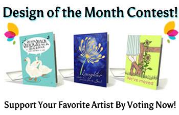
VOTE AND PROMOTE!
To view entries and vote, you must be a fan of GCU’s Facebook page to see the entries and vote. To become a fan, “Like” their FB page. It’s that simple.
Check out the details of the contest.
Share this information with your FB friends, family, and supporters – get links by clicking on your card on the Voting Page. Share with Twitter followers and e-mail, too. Every vote counts! Get out there and start spreading the word with enthusiasm.
VOTE AND PROMOTE!


