Font Frenzy: Grand Hotel – FREE!

Today, we’re bringing you news of a very pretty script font, Grand Hotel. Like most script fonts, it doesn’t do well at very small sizes, but if you keep it no smaller than 24 pt., it’s still quite readable. Best of all, Grand Hotel has an OFL (Open Font License) so it’s free and totally good for commercial use in your designs.
I think this font would do well when used for emphasis and paired with a nice neutral sans serif font.
The alphabet is below. According to the font description, Grand Hotel has full language support, meaning it should contain all the diacritical marks you need for some foreign languages. Enjoy!

Share this:

Tips and Tricks: Alternative to Christmas


Some artists find it impossible to capitalize on Christmas holiday card sales—which is the busiest time of year at GCU since Christmas is a big card-giving holiday—for a number of reasons including religious or personal convictions. That’s cool, we totally respect your decision. This article is meant to offer tips on what might be an alternative to Christmas cards for those seeking a way to boost their sales at that time of year.
Festivus
\A secular holiday created by the writer of the Seinfeld sitcom, Festivus (learn more here) has grown into a pop culture alternative to Christmas. While some Festivus cards do offer traditional Christmas images meant as a tongue-in-cheek homage, you can use Festivus related images instead. See the Festivus cards category.
Tip: When designing Festivus cards, keep the tone light and humorous.
Winter Themes/Snow Scenes
If Santa Claus, elves, reindeer, decorated trees, mistletoe, or nativity scenes aren’t your cup of tea, perhaps generalized winter themes will work better for you. You do not have to say “Merry Christmas” anywhere on the card. You would, however, be expected to include verse such as “happy holidays,” “wishing you the joy of the season,” “season’s greetings” or a more creative holiday-type verse of your choosing to be approved for the right categories.
Tip: Once you’ve got a basic design approved, expand your sales potential by taking advantage of the relationship specific categories AND personalized text and/or photo cards. Yes, it’s tedious, mind numbing work, nobody likes doing it, but the work’s worth the pay-off.

I hope this article has given you some ideas on how to take advantage of the Christmas card rush without compromising your personal beliefs. Good luck and happy designing!
Share this:

A Dash of Inspiration, A Cup of Creativity by Doreen
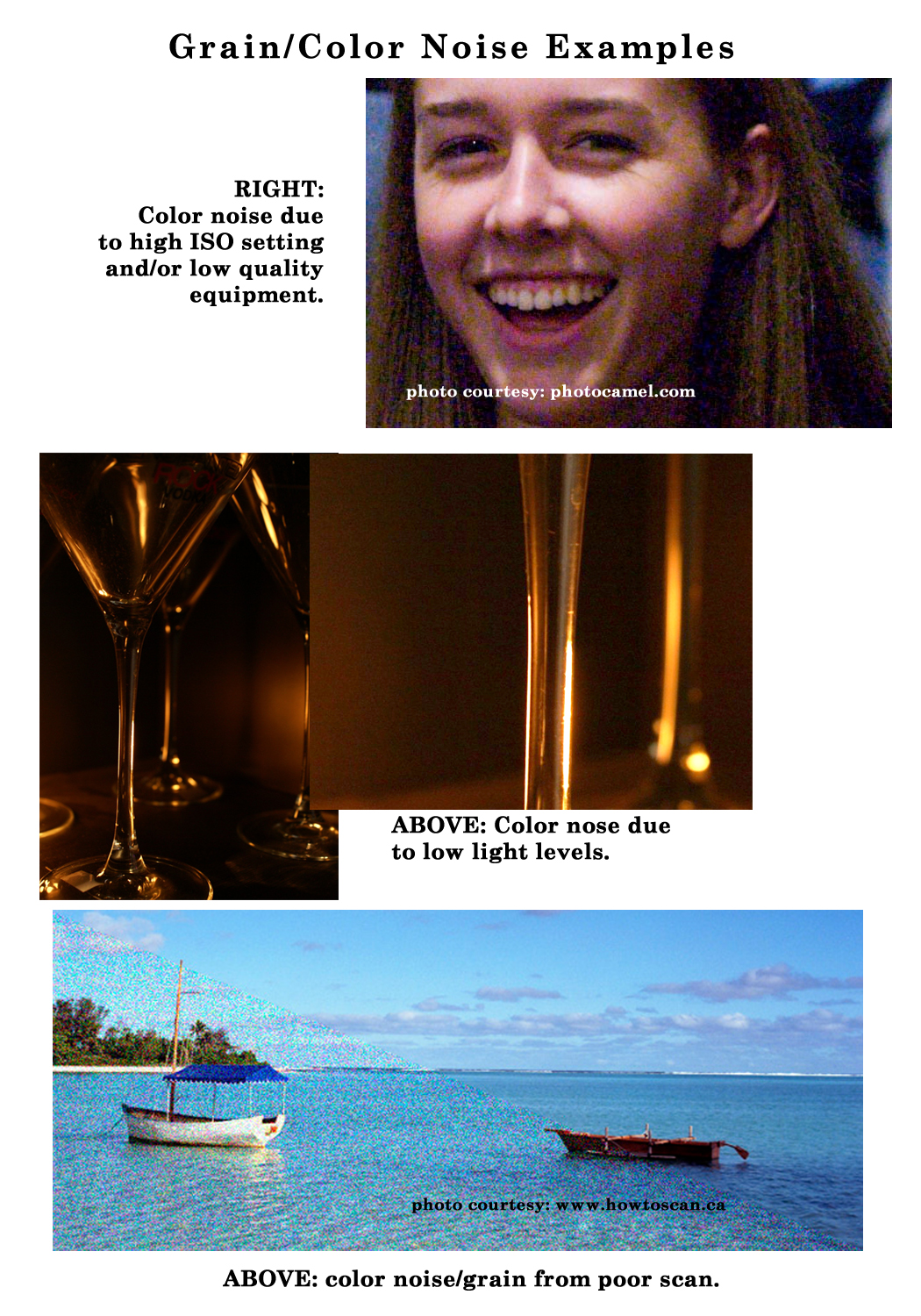
Image Quality: Grain/Color Noise

Let’s keep this series going by moving through the IMAGE QUALITY grouping of the Submission Guidelines, and next up is:
IMAGE QUALITY: Grain/Color Noise
The Submission Guidelines state this:
Grain is found when scanning old photographs or artwork. In this digital age, it tends to be noise that is found in the image. This can be caused by low resolution when scanning artwork or when taking a photograph. It also is visible in photographs that were taken in low light without proper compensation. Color noise can occur when the image has been pushed to exceed its limits in a digital darkroom environment. Any form or intensity of grain and/or noise in artwork or photography will not render well in print on greeting cards and will not be accepted.
Though there are digital post-processing filters which add grain to images, unless they are applied with a light-hand and the resulting image is well-suited to a retro/vintage look, these filters should not be used on your greeting card images. Grain and color noise, whether you consider it an intentional added touch to your card or not, in general gives the viewer the impression of poor image quality and that is why GCU rarely accepts imagery with grain or color noise.
Taking a photograph in low light conditions without using white balance adjustments and/or fill flash will cause quite a bit of noise in your photographs. In today’s digital camera environment, noise is a common problem which usually shows up as speckled pixels in a variety of colors or can also mask itself as grain, both are considered unacceptable. We see these unwanted artifacts more than ever as we move to digital capture. It’s this ‘electronic noise’ that occurs from unwanted fluctuations in the signal of electrons produced in order to convey light to the camera sensor.
Tips to avoid noise in photographs:
- Purchase more recent technology – significant improvements have been made for noise reduction in new cameras and lens.
- Use Manual Mode rather than allowing the camera to switch exposure by itself which often introduces noise.
- Reducing your ISO will reduce digital noise and instead use a mono-pod or tripod when needed.
- Higher-end cameras often have a Noise Reduction setting, turn it on especially for low light conditions and long exposures.
- Remember, the less shadow area in your image, the less chance for noise. So choose your composition well. If shadows are not a necessary part of the image, try to choose a composition angle which offers limited or lighter shadow areas.
- Digital zoom found on lower-end or point-and-shoot cameras are notorious for causing noise.
- Make sure your camera is cool, particularly in hot weather. Thermal reaction is a common cause of noise in photographs.
Next week we’ll continue through the Submission Guidelines: Image Quality section and discuss Poor Scans. Till next week, I hope I’ve inspired you to go look through your store and see if you can weed out any images that the reviewers will find during their weeding which might have grain or color noise issues.
For great resources & tips visit the SalonOfArt
Share this:

Critique Clinic – July 6-7, 2013

How does it work? For three days a week (Friday-Sunday midnight), I will open the clinic to any artist who wants an honest peer review and critique of a card which gets plenty of clicks but no sales, so something’s probably not quite right, or you’ve got a new design you want to test drive, or you’re unsure about the marketability of a card. Or perhaps you’re a newbie who isn’t sure if a card is up to a marketable standard. Anyone is welcome to participate. In fact, I encourage everyone to at least look at the cards in question and read the critique comments – you may learn something. The purpose of the clinic is to help artists improve the commercial appeal and marketability of their cards.
THE RULES
- ONE card per artist only.
- Card must be intended for sale at Greeting Card Universe.
- To submit a card for critique, post a link to the card at GCU in the comments section of this clinic post. Allowances will be made if you’ve had a card declined, or made a new design you’d like advice on before submission. Give us the link where we can see the card, such as your private gallery, Flickr, Tinypic, etc. If you do give a private gallery link, be sure your private module gallery is ON. Please do not post links to your Manage Cards section – do you really want strangers tinkering with your cards? And please don’t ask us to critique a card that’s pending review – we can’t see it until it’s approved.
- Any artist is free to comment and/or give a critique of a submitted card. HOWEVER, post-and-run comments like “great card” or “you suck” will not be tolerated, nor will abuse. Criticism should be constructive, not destructive. Play nice or you will be banned.
- I also won’t tolerate temper tantrums if you decide your “artistic integrity” is being stepped on because you asked for a critique, and someone told you the photo you’re using isn’t in focus. If you can’t take honest criticism, don’t submit. Once gets you a warning; twice and you’re banned from submitting in the future.
- Artists who critique may do so by giving their opinion, posting an example of another card, or pointing the submitter to a video, on-line article, or other helpful suggestion.
- Don’t forget that artists who are giving you tips and helpful advice are volunteering their time and trouble. Be nice. A link back to their store on your website or blog is appreciated (but not mandatory).
- You are free not to take any advice offered. There’s no guarantee any card will be a bestseller, so don’t come into the clinic with unrealistic expectations.
- Rules may change as we go along and we see how things turn out, okay?
So without any further ado, I declare this week’s Critique Clinic open!
Share this:

Tips and Tricks: How to Sell More Cards, Part 4
HOW TO SELL MORE CARDS, PART 4:
Marketing & Promotion—The Basics
Blogs and Websites
The 80/20 rule we’ve talked about will also apply to postings on blogs and websites. No one should create a blog or website based solely on selling because unless you’re a famous artist, the audience for such places is pretty much zero. So what to do? The trick is to use your passions, your hobbies, your interests to engage your audience. Then you soft sell your product (in this case, your greeting cards) by tying your cards into the subject of your post.
The Basics of Blogs
If you’re not comfortable with maintaining a blog with regular posts, don’t start one. You’ll need to post at least once a week. And you don’t have to be a professional writer. If you can write a coherent sentence and put a few coherent sentences together to make a paragraph, you can build a blog.
The Golden Rule: Just like all other marketing strategies, you’ll get more positive results by informing, communicating with, and entertaining your readers than barraging them with spam-like posts about merchandise. You’ll also get big love from search engines because they love fresh, original content.
Find your voice and be yourself. Don’t get too hung up on the formality of writing. Use a conversational style and write about what moves you. Share your knowledge and your passion, offer helpful advice on topics you know a lot about or have experience with, create a how-to, etc. Let your passion be your guide. Use pictures and video if you can to add some life to your posts.
In case you forgot or haven’t seen the post, Cheryl of Golden Jackal Card Store is seeking artist interviews for her blog. Check the Forum thread for details.
Try to tie greeting card designs into relevant posts. If you’re blogging about your niece’s birthday party, add some “happy birthday to my niece” cards to the mix.
It will also help to do guest posts or reciprocal linking on other blogs that share your interests. Many bloggers out there will be willing to at at least hear your proposal. Remember: if you don’t ask, you don’t get. So ask. The worst that can happen is the blog owner tells you no.
Don’t forget about your fellow artists. Some of them have blogs too. Offer reciprocal linking or reciprocal guest posts so you can both benefit. A query in the Forum will probably produce some possibilities.
The longer the blog exists, the more active the blog is, the more informative the content, the better chances you have of attracting and keeping an audience of potential shoppers. You can find more tips here:
How to Create a Blog: A Beginner’s Guide
Top 10 Free On-line Blogging Platforms
The Basics of Websites
Pretty much everything we’ve been saying is true here too. Keep the 80/20 rule in mind.
It’s easy to create mini-websites that put your knowledge out there and lots of free services that allow you to do just that, like Squidoo, Weebly, Wix, etc. The idea is to build a website showcasing your knowledge. Give tips. Talk about how to do something like a hobby. Talk about your passion. And again, tie relevant cards into your posts.
One of the first Squidoo pages I created a couple of years ago contained tips for helping cancer patients. I included as many links to my greeting cards for cancer patients and talked about how positive encouragement and support on my page. Guess what? That page was a big success for me and opened the door for many other pages on different topics of interest to cancer patients, their families, friends, and supporters. Here’s an example of one of my pages:
Gifts for Women Undergoing Chemotherapy
I also share links to this page and those like it on my FB page and on Pinterest. Yes, you can pin websites to Pinterest, and you’d be surprised how many people will re-pin if you’ve got a page that’s interesting and informative.
Another great example is Doreen Erhardt who has built Salon of Art on Weebly, chock full of tips and information of interest to designers and photographers.
Whatever free web page service you choose—and there are a lot out there, just Google “free webpage”–be sure to check the TOS. Some frown on purely commercial websites, but since you’re following the 80/20 rule, that shouldn’t be a problem, right? 🙂 Some basic knowledge of HTML will probably serve you well, but even if you have no experience, most sites offer support or you can always do a quick Google search for instructions.
And this ends the series of How to Sell More Cards. The five biggest things I hope you take away from this series are that a) marketing doesn’t have to be a full-time job unless you want to work it that way; b) anybody can do it; c) be varied in your approach to maximize your chances of success; and d) it’s not as hard as you think; and e) it takes time.
Be patient.
Marketing isn’t a race, it’s a marathon.
Share this:

Tips and Tricks: How to Sell More Cards, Part 3
HOW TO SELL MORE CARDS, PART 3:
Marketing & Promotion—The Basics
Twitter and Pinterest
Today, we’re going to cover Twitter + Pinterest, websites and blogs. Remember what I said about not putting all your eggs into one basket? Well, it’s a good idea to at least have a couple of places where you consistently make your presence known. Consistently. That word, along with relevancy, should be your guiding principles.
Try out what you think will work for you. If over time – I’m talking more 12 months than 30 days – you decide a method isn’t working for you, decide if you want to keep plugging away at it or take on a different strategy.
It’s important to change your mindset. Just like artists need to put on their business hat and look at their designs from a shopper’s perspective, you need to put on your marketing hat and realize that barraging potential shoppers with posts shouting “Me! Me! Pay attention to me!” isn’t going to win you any fans.
Instead of drowning people in a sea of what amounts to promotional spam, change your mindset from ” sell” to “inform.” This is especially important in social media.
The Basics of Twitter
Once again, the 80/20 rule applies (See Part 2). That means 80% of your posts must be about something other than your merchandise. Tying a card link to something going on in the world right now, or to a topic you’re passionate about, or have knowledge about, or other people are talking about, is the way to go.
At first, you may not get much attention. Keep plugging away at making interesting tweets a couple of times a week minimum. Use hashtags and study other people’s hashtags, too. Don’t make the mistake of tweeting only about greeting cards. Get into the habit of tweeting about whatever strikes your fancy. If you can tie it into a relevant card, great. If not, include a link where your followers can learn more.
Take advantage when you can by posting images in your tweets like a photo you took and turned into a greeting card or a graphic you made and put on a card.
It helps a lot to find a niche. Like if you have uncommon greeting cards like pet sympathy, religious themed cards, encouragement for 12-step recovery, etc. Identifying a niche gives you a great opportunity to theme your Twitter and pick up an appreciative audience.
Here are a couple of articles that might help:
The Beginner’s Guide to Market on Twitter in a Genuine Way
Posting Photos on Twitter
The Basics of Pinterest
Pinterest has evolved in the short time the very popular site has been around. If you only know Pinterest from the early days, please take another look. We’ve found it a fun and easy method of promotion.
The 80/20 rule can be somewhat relaxed for Pinterest, but you do want to create and maintain a diverse selection of boards. Don’t just whack in a bunch of greeting cards. Give it some thought. Create individual boards and include greeting cards along with other things you pin.
Certainly, you can have boards highlighting only greeting cards. Don’t be surprised if you don’t get many followers for those. However, individual cards may get re-pinned, so don’t despair. At the very least, you’re putting your brand in another place to be discovered.
Don’t neglect to pin interesting articles from your website and/or blog, too.
Use hashtags. These allow readers to find pins in a specific subject. But please don’t use twenty hashtags per post. Stick to no more than three essential tags. This is one case where you should curb your enthusiasm. And keep in mind that hashtags only work in the description of the pin. Hashtags do not work in the title, board title, board description, account description, or profile names.
Make your text thoughtful – add a little description in an informal way. For example, a wedding invitation with a bouquet of white roses. Your description could be, “Very pretty wedding invite with yummy white roses.”
Don’t worry about linking. If a reader clicks on an image you post, they’ll be taken directly to the origin website of the pin. In other words, pin a card from its GCU page, no worries. A click will always take potential shoppers straight to the source, even if the image has been re-pinned.
Just remember, variety is the key to Pinterest. Pin often, pin wisely, pin imaginatively. Here are some useful tools:
If you’re into analytics, PinPuff and PinReach are Pinterest tools that track your Pinterest influence.
Pinstamatic helps you add notes, quotes, websites, music, other interesting content.
PinAlerts tells you instantly by e-mail notification when someone pins something from your website.
Tomorrow in Part 4, we’ll be covering websites and blogs.
Share this:

Tips and Tricks: How to Sell More Cards, Part 2
HOW TO SELL MORE CARDS, PART 2:
Marketing & Promotion—The Basics
Search Engines & Facebook
Today, we’re focusing on what you can do to add self promotion to your schedule.
First and more importantly: you should look at your marketing efforts as a long-term investment, not a short-term solution. You likely won’t see results right away. It takes time to develop your brand and put yourself out there on the Internet for shoppers to find. But don’t despair—the minutes you spend today will reap future rewards for you.
“But I’m busy!” you say. “I have a lot on my plate!” You’re right, we’re all busting our buns to make a living. But you don’t need to make marketing your full-time job. There are simple, quick things you can do that will add to your promotional repertoire once you’ve established a base to build on.
The effect is cumulative. Once you start the ball rolling, keep giving it momentum. The more product links you’ve got out there, the better your chances at being seen. Just don’t try to put up the contents of your store in one go. 🙂
80/20—The Golden Rule
Whatever you decide to do by way of promotion, keep in mind that the general public has very little interest in hearing solely about your card designs. Sorry. So if you want to get the public’s attention, you’ll need to follow the 80/20 rule: that is, only 20% of your on-line posts on social media or websites or blogs should be about your cards. The other 80% should be about something else. Like what? Whatever you’re passionate about, that’s the best place to start.
The Basics of Happy Search Engines
Search engines are the beating heart of the Internet, and if you want potential shoppers to buy your cards, you need to make them visible. The best way to do this is always include a good title on your cards and always include a description in the Artist’s Notes field. Search engines LOVE original relevant copy like kitties love catnip. Be descriptive. Include such things as trendy color combinations, design elements, etc. Here are a couple of articles you’ll find helpful.
How to Write Product Descriptions
Artist’s Notes and Product Descriptions
How to Write Card Descriptions
Nuts and Bolts: Card Titles
What you want to get are links at other sites that point toward your card. You can spend time promoting your store as a whole, but we’ve found it far more effective to promote individual greeting cards, especially niche cards. Rather than try to woo potential shoppers into paying attention to a general Birthday card, promote a Birthday on the Fourth of July card. You get the idea. Seek out the uncommon—this is GCU’s core strength and as a designer, your biggest edge over the competition. Show shoppers stuff they haven’t seen a million times before.
For more link love, take a minute to check out…
Cheryl of Golden Jackal Card Store has created a Forum thread requesting artists to interview for her blog. This is a great opportunity for artists to get some link love!
All artists have a standing invitation to participate in this blog’s Design Spotlight. Just send me a link to your card on GCU + anything you want to tell us about the card and about yourself. Don’t forget to include links to your websites, social media, and/or places you’d like to promote.
Get involved in Design Contests on this blog, too. That’s another link to your card! And you’ll have an excuse to ask your relatives and peeps for their votes by posting on social media sites and in forums and e-mails.
If you have a website, blog, Facebook business page, Pinterest account, etc., network with your fellow artists. Offer to exchange links. A request posted on the GCU Forum is usually a great place to start.
The Basics of Social Media: Facebook
Where to start? If you’re not much of a writer and don’t feel you can successfully pull off a blog or website, start small with social media and work yourself up.
If you haven’t already, make a Facebook business page.
To get “likes,” ask friends and family + post a request on the GCU Forum in the Facebook Fan Page thread or this more recent FB Business Page thread and offer reciprocal likes to other artists.
Make sure to create an eye catching Cover for your page.
Try to post something at least a few times a week. Follow the Golden Rules (see above). Be smart with your greeting card posts. Is something going on in the world you can highlight with a card? Like the recent Supreme Court ruling striking down DOMA and Prop. 8 in California. If you have gay wedding congratulations cards in your line-up, why not post one on FB with a shout out to your LGBT peeps? When it’s Superbowl season, how about a football themed birthday card? You can also post cards on holidays and even oddball holidays might strike a chord with someone.
Don’t forget to use Facebook hashtags! These little guys may be new to FB, but they’re important.
Take a minute to check out…
The On-Line Store Shares Group – Recently set up by Janet Lee Designs to benefit GCU artists.
The Greeting Card Universe Artists’ Page founded by Eugenia Bacon.
Top Ten Must See Tips to Run a Successful Facebook Business Page
The bottom line? Don’t lose hope! There are lots of things you can do to promote yourself. Fellow artists, if you have any tips to add about marketing on Facebook, please share in a comment. Thanks!
Tomorrow, I’ll continue with Marketing & Self Promotion—The Basics where we’ll be covering Twitter, Pinterest, websites, and yes, blogs.
Share this:

Tips and Tricks: How to Sell More Cards, Part 1
The new commission structure was rolled out yesterday at GCU, causing a lot of discussion. According to Mindy, all artists should have received the e-mail notification. There are a couple of discussion threads on the GCU Forum or a copy of the e-mail here if you’re interested in learning more.
Before we get into the tips, let’s take a second to find out what goals you need to set to achieve your quarterly bonus. As I’m lousy at math, fortunately Sherry at Dog Tags and Combat Boots has done the calculating for us:
“You need to sell:
428 cards for each of quarters 1-3 and 857 cards for quarter 4.
142 cards a month for the first 3Q’s and 286 the 4Q.
5 cards a day 1-3Q and 10 cards a day for 4Q.
There you have it!”
Thanks, Sherry! Now you know what you need to sell each quarter to get that bonus. (Edited to add: looks like Tom Rent has some different numbers, check the Comments of this post). How you achieve your goal is up to you, and hopefully you’ll find some advice on this post that will help you.
HOW TO SELL MORE CARDS, PART 1:
THE FOUNDATION OF SUCCESS
Every success story needs a place to start.
First, offer good, professional, competitive greeting card designs.
This is going to be the #1 most important thing you do and it’s hard work. There’s a lot of information on this blog about finding inspiration, the technical aspects of card design, new colors and fonts, etc. The bottom line here is: don’t be complacent. Art is an evolving thing that changes as you experience new things and get new ideas. Freshen up your imagination, take a gander at upcoming trends, learn your craft. Don’t be satisfied with the so-so.
Second, work ahead of schedule.
We work a year ahead, so we never need to fret about last minute deadlines or review times. This is a very good habit to get into and will serve you well. At minimum, you should be working 4-6 months in advance, not only so you won’t be upset by longer review times, but to give search engines a chance to index your cards.
We’ve started a Holiday Heads-Up Calender in the Nuts and Bolts category to assist you in knowing which holidays to work on and when. April, May and June are available. July is coming soon.
Third, be diverse and find a niche (or two).
All artists should have lots of diversity in their greeting cards. Everybody needs general birthday cards, but there’s a mind boggling amount of competition there. To maximize your sales potential, seek out the lesser known categories. Pay attention to the sold cards displayed on the GCU front page—this will often be your first clue for uncommon categories where customers are actively buying cards but there isn’t s whole lot of competition. In addition, try to match your design specialties with a niche (or two, or three, etc). Finding the right niche will be different for each artist, but when you do identify and take advantage of niches, your sales will increase. And if you’ve found a niche for cards that isn’t represented at GCU, I’m sure Mindy would love to hear about it so she can create a new category.
Fourth, do a little housekeeping.
Go through your backlog of designs starting with the oldest. Use your most critical eye. Are there any cards that don’t fit the standards? Cards that aren’t as appealing as you first thought? Then it’s time to redesign. Do you have cards that receive lots of clicks but no sales? Try submitting to the Critique Clinic here (Fri-Sun) for peer review and advice on what may be lacking and suggestions on how to make your design commercially appealing.
Fifth, make sure to follow all the guidelines.
Following the rules GCU has set will help reduce review times and set you on your way to becoming a Star Submitter, meaning the review times for your cards will be significantly reduced. Apart from the GCU Wiki and Submission guidelines, you can also find these helpful resources here:
Card Submission 101
Designer’s Schedule
Card Designer’s Checklist
Tomorrow, it’s time for Part 2: Marketing and Promotion.
Share this:

NEWS: New Commission Structure

Yesterday, all artists received an e-mail notice regarding a new commission structure at GCU. Below is the text of the message in case you haven’t seen it yet. You can also find it in the Announcements section of the Forum.
_________________________
Dear GCU Artists,
Together we have done great things! Overall GCU has grown each and every year and hand in hand, more artists are getting paid each quarter and are growing their earnings more than ever before. GCU is proud of and grateful for the best artist community in the industry!
To keep focus on growth, GCU continues to invest heavily in many areas of our business that hold great promise for us all like: paid search engine ads (Google, Bing, and Yahoo), paid product feeds (Google Shopping and Amazon Product Ads), SEO optimization, promotions (“always available” free shipping), and forging & supporting key partnerships to better serve and expand into new markets (the UK printing partner and Kodak/Target partnership).
Starting out with one of the highest commissions in the POD industry, GCU has been conscious to not impact artists’ earnings until completely necessary. However, as we continue build our brand through advertising, SEO and strategic partnerships we need to ensure that the company maintains a level of financial integrity that will allow for continued growth.
Effective 7/01/13, we are announcing the following modification to artists’ earnings that will address some necessities:
Rebalance GCU’s earnings and investments
Incent artists to take an active role in self-promotion driving traffic and sales
Reward those artists that engage in self-promotion to drive traffic and sales with continued premium earnings
Allow us to keep GCU storefronts 100% free
Here are the details. In a nutshell, a two-tiered quarterly earnings structure:
Earnings per card will be reduced by 50%. EX: 20% commission on a $3.00 card will now be 10% (30 cents vs 60 cents), and so on
Artist’s earnings ($) will be measured against quarterly earnings thresholds
Artists that meet or exceed the threshold, each quarter, will double their earnings – earning the full premium earnings (100%)
This measurement is done at the end of each quarter as part of payment preparation
The thresholds are the same for all artists
The quarterly earnings thresholds are based on historical data and are realistically achievable, even for part-time, hobby artists
Single Card Price Increase – the majority of GCU’s sales transactions is comprised of single card sales (1 card). We will be increasing the single card price from $3.00 to $3.50. This means that artists will earn more on these transactions – 10 cents more for premium earning artists (70 cents vs 60 cents), 5 cents more for standard earning artists (35 cents vs 30 cents) – helping artists reach the thresholds faster.
Total Quarterly Earnings Thresholds are: 1Q = $150 2Q = $150 3Q = $150 4Q = $300
Examples to help you guess-timate your future earnings …
Meeting Threshold:
– If you earned $355 in 2Q2013 these earnings would be 50% less, $177.50 standard earnings
– The $177.50 meets the 2Q earnings threshold of $150 so you’d earn your double, premium earnings of $355
Not Meeting Threshold:
– If you earned $75 in 2Q2013 these earnings would be 50% less, $37.50 standard earnings
– The $37.50 does NOT meet the 2Q earnings threshold of $150 so earnings remain standard of $37.50 with no additional premium earnings for the quarter
The key takeaway is that for many GCU artists it will be business as usual with the added benefit of earning even more on single card transactions. Additionally we have plans to make it easier and more effective for artists to self promote. Lastly, do not despair, meeting the quarterly thresholds is realistically within reach for artists who are willing to put in the extra effort.
Please know we realize that no matter how we present this change for many it will not be favorably received. Some artists will be upset and leave. That is not our intent. We have explored many alternatives and in order to continue investing in our growth and GCU’s future this is a necessary change.
Thank you for your continued contributions, commitment and understanding through all of our growing pains as we continue to adjust in order to move forward and thrive.
Regards,
Greeting Card Unviverse Team
Share this:

A Dash of Inspiration, A Cup of Creativity by Doreen
Image Quality: Sharpness/Clarity
Let’s keep this series going by moving along into the IMAGE QUALITY grouping of the Submission Guidelines, and first up is:
IMAGE QUALITY: Sharpness/Clarity
The Submission Guidelines state this:
Images, whether photographs, scans of original artwork, or photographs of artwork, must have good clarity with sharp details and edges. This does not mean you can’t have selective focus or add a soft, dreamy effect to photographs which, when well executed can be a technique which provides a professional feel to a photograph. Declines may include, but are not limited to: blurry areas within an image, blurry edges, soft focus if not appropriate and professionally created, lack of depth of field, blurry images due to improper capture of movement, etc.
The majority of images that fall into the area of declines for lack of sharpness/clarity are photographs and those with photographic elements, so this is the primary discussion here, however; it goes without saying that if you have scanned or photographed your artwork and the results are not crisp and sharply focused, those too will be declined.
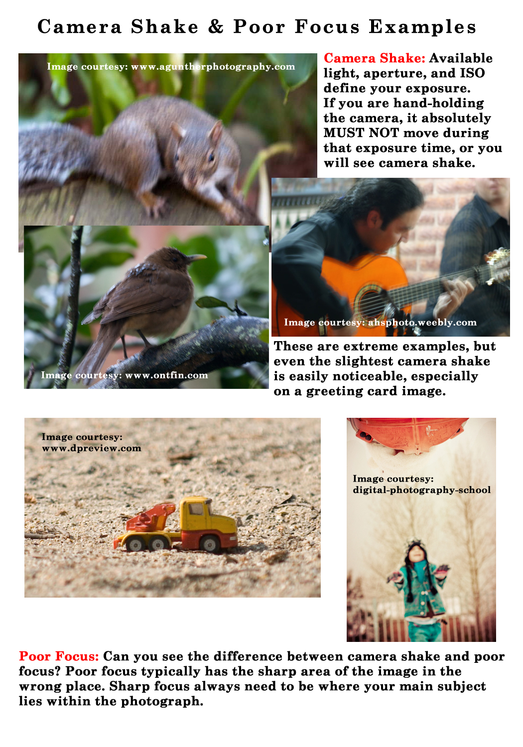
Blurry Areas & Edges : Probably the most commonly made mistake in photography is blurry areas or overall lack of sharpness. The key is knowing what caused the blurry area(s) within the photograph and making corrections when taking the photograph.
Look for camera shake as a culprit. Available light+aperture+ISO will determine the camera’s exposure. ANY movement of even the slightest breath during that exposure can cause camera shake. Identify camera shake problems by looking for these telltale signs:
- Entire image is blurry, not just areas of the photograph
- There is a ‘double image’ effect to the photograph
- Look for blurry streaks throughout the image and can even look jagged.
Poor focus is another area which will cause a blurry area in your image. Rather than seeing an overall blur in the entire image, you’ll see:
- Sharp focus in the wrong area of the image.
- Usually the ‘blurring’ is softer (no, this does not mean you used a soft focusing technique)
Poor Soft Focusing Technique: There are a variety of focusing techniques that professional photographers use to create stunning images. There are terms which are applied to many of these methods, but unless you truly understand the fundamental guidelines behind each of these skills, you will not achieve successful results and your images may be considered blurry rather than pleasing. Look at these examples:

A good read/refresher is The Fundamentals of Focusing Techniques.
Lack of Depth Of Field (DOF): For greeting card photographs, using a shallow DOF can certainly work, however it’s also very easy to create an image that just does not work as a greeting card image. Sometimes it’s the difference between where the DOF drop off is, and sometimes it’s a matter of whether the DOF drop off is slight or significant. To understand the difference, you need to understand DOF … it’s basic photography 101.
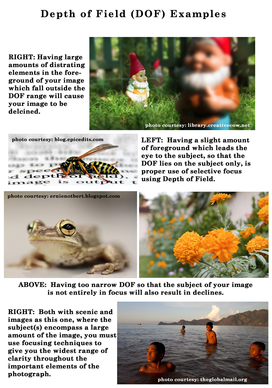
A good read/refresher is Focus on Depth of Field.
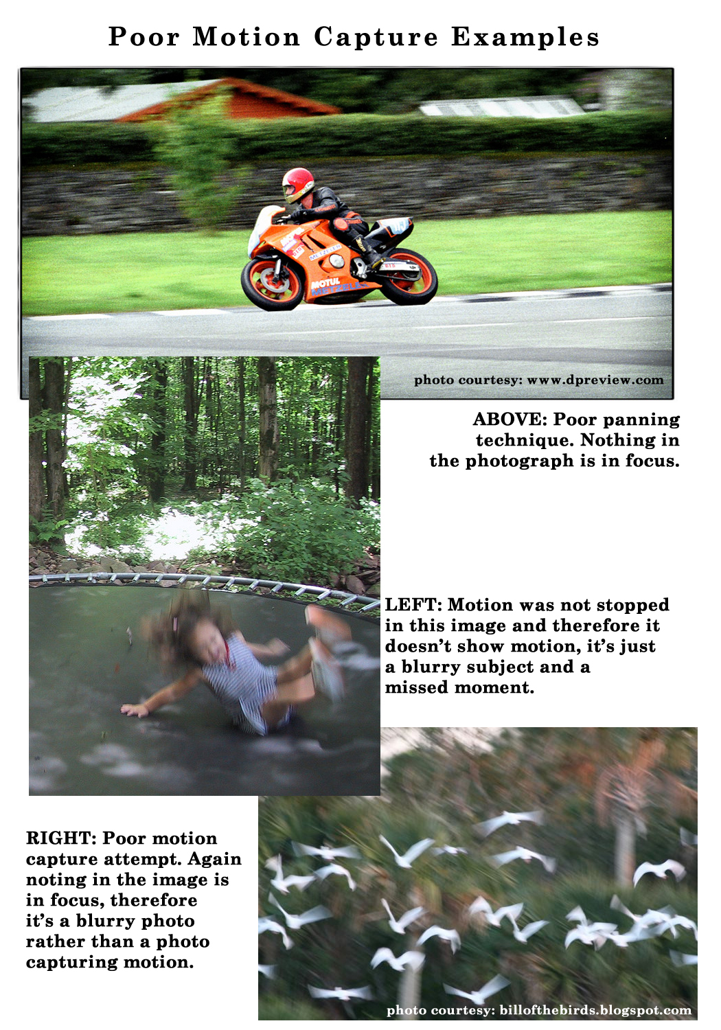
Poor Capture of Movement: Motion capture photography has it’s unique techniques depending on whether you wish to stop motion or capture a feeling of motion and it begins with one question … What is your goal?
Here are some tips to recognize the difference between professional motion capture techniques and those images which had no technique and therefore are poor examples:
- In motion capture photography, SOMETHING in the image always remains in focus.
- When Panning Techniques are used, you get is a fairly sharp subject that stands out against a blurred background, ultimately giving the desired feeling of motion and often with some of the subject showing the motion blur.
- Stopping motion techniques when properly applied, give a feeling of motion because the subject is sharply focused and the surroundings show the signs of movement.
- Motion Blur has been successful when your subject is moving and everything else in the image is still, creating swirling lights or swirls of unrecognizable movement.
For examples of good motion capture and tips: Motion Capture Photography Tips.
Next week we’ll continue through the Submission Guidelines: Image Quality section and discuss Grain/Color Noise. Till next week, I hope I’ve inspired you to go look through your store and see if you can weed out any images that the reviewers will find during their weeding which might have Sharpness/Clarity issues; and if so, best get to reworking the text on those cards before the reviewers get to them and decline them!
For great resources & tips visit the SalonOfArt


