A Dash of Inspiration, A Cup of Creativity by Doreen
Marketability: Occasion/Gender/Age Specific

Let’s keep this series going by heading into the last grouping of the Submission Guidelines; Marketability and first up is Occasion specific, we are going to combine Occasion, Gender & Age since the same ‘rules’ apply to each:
MARKETABILITY: Occasion/Gender/Age Specific
The Submission Guidelines state this:
Occasion Specific: Cards can meet all other requirements and still be declined due to the image not relating to the occasion/category of the card. Unexpected / unrelated subject matter is the artist’s opportunity to make it “work” with a creative verse. Your image, card front text, and inner verse MUST all apply directly to the occasion, gender, relation, and age of the category.
Gender Specific: Cards can meet all other requirements and still be declined due to the image not suiting the gender of the category selected. Pink flowers for example are generally not marketable on a card for a man. Your image, card front text, and inner verse MUST all apply directly to the occasion, gender, relation, and age of the category.
Age Specific: Cards can meet all other requirements and still be declined due to the image not suiting the age of the category selected. Flowers and scenics for example are generally not marketable on a card for ages under 13. Your image, card front text, and inner verse MUST all apply directly to the occasion, gender, relation, and age of the category.
The best advice I received when I first began designing greeting cards which was stepping out of my comfort zone as a gallery exhibit artist and gallery owner, was this: “Greeting card artists design for the occasion/gender/age rather than try to ‘stuff’ an already created piece of art into a category that fits.” I do still create art for art sake, but I acknowledge that not all of my creations are greeting card material. I have fair amount of ‘fine art’ which I sell on art-specific sites and often as blank fine art cards, these pieces just don’t make good choices for occasion, gender, and/or age specific greeting cards.
You know you’ve become a successful greeting card designer when you’ve learned to be able to separate art which looks great on the wall and greeting card design. Though the paths of these two fields of art do occasionally cross, they are very much two separate art forms which have little in common other than the creative process.
The examples I’ll offer in this article are cards at GCU which show a perfect sampling of matching imagery, verse and category.
Occasion Specific: Really this boils down to common sense. Not all imagery should be considered appropriate for all occasion categories, yet this is a mistake some artists make. It is your job as a creative to tie the imagery of your design with text/verse and to category(s) which suit the theme. Photographers often make the mistake of using a scenic photograph for every and all categories. Somber imagery does not portray happy occasions. Cheerful imagery can not portray somber occasions. Learn to interpret the mood and emotions in your image and connect them to categories which represent those feelings.

by FunGraphix – great example of using a design for a perfect category: Welcome to the Club / Group / Team Cards

By: Catherine Sherman – great example of matching the mood of the photo to the text and category: Occasions >> Miss You

By: Doreen Erhardt – great example of creating specifically for an occasion.
Gender Specific: Once again, seems like common sense. As a general rule of thumb, don’t put flowers and bunnies in a basket on cards for men. Don’t put pink and purple on cards for boys. There are always exceptions to the rules, such as red roses tied to a romantic theme are certainly as appropriate for men and they are for woman. All GCU is asking is that you don’t take a picture of daisies and add it to every male and female category they offer. This type of ‘across the board’ category placement is no longer accepted. Put some thought into what gender best serves the card’s purpose.

By: Trudy Wilkerson – great example of making a masculine, working man retirement card.

By: Doreen Erhardt – great example of creating a masculine card theme.

By: Moonlake Designs – beautiful example of a card with feminine persuasion

By Teri Francis – lovely example of a feminine birthday card
Age Specific: Again, it’s been a common mistake for someone to make a birthday card and assign it across the board from age 1 to age 101. Be aware that for most imagery, ages should be broken down for subject matter suitable to the age group. Here are some great examples by age group.
Ages 1 to 5 Examples of cards well suited for kids five and under.

By: Cold Snap Studio

By: Fiona Paterson
Ages 6 to 12 Examples of cards well suited for kids over five and under thirteen.

By: John H. Johnson

By: Lisa Lorenz
Ages 13 to 16 Examples of cards well suited to kids thirteen to sixteen

By Cherie Haines

By Dreaming Mind Cards
None of the above card examples would be accepted for adults. The same applies to cards which are very well suited for an adult audience (and I’m not talking about ‘adult-themed), but those which are floral, landscape, off the wall humor, etc.; all of which are not well suited for children under about seventeen years of age.
Next week we’ll continue in the final group of the Submission Guidelines: MARKETABILITY and venture into examples of what makes a good Photo Card and what would cause declines. Till next week, I hope I’ve inspired you to not only go through your store and see if you can weed out any images that the reviewers will find during their weeding which might be declined due to unsuitable content for the occasion/gender/age specific category.
For great resources & tips visit the SalonOfArt
Share this:

Critique Clinic – August 16-18, 2013

How does it work? For three days a week (Friday-Sunday midnight), I will open the clinic to any artist who wants an honest peer review and critique of a card which gets plenty of clicks but no sales, so something’s probably not quite right, or you’ve got a new design you want to test drive, or you’re unsure about the marketability of a card. Or perhaps you’re a newbie who isn’t sure if a card is up to a marketable standard. Anyone is welcome to participate. In fact, I encourage everyone to at least look at the cards in question and read the critique comments – you may learn something. The purpose of the clinic is to help artists improve the commercial appeal and marketability of their cards.
THE RULES
- ONE card per artist only.
- Card must be intended for sale at Greeting Card Universe.
- To submit a card for critique, post a link to the card at GCU in the comments section of this clinic post. Allowances will be made if you’ve had a card declined, or made a new design you’d like advice on before submission. Give us the link where we can see the card, such as your private gallery, Flickr, Tinypic, etc. If you do give a private gallery link, be sure your private module gallery is ON. Please do not post links to your Manage Cards section – do you really want strangers tinkering with your cards? And please don’t ask us to critique a card that’s pending review – we can’t see it until it’s approved.
- Any artist is free to comment and/or give a critique of a submitted card. HOWEVER, post-and-run comments like “great card” or “you suck” will not be tolerated, nor will abuse. Criticism should be constructive, not destructive. Play nice or you will be banned.
- I also won’t tolerate temper tantrums if you decide your “artistic integrity” is being stepped on because you asked for a critique, and someone told you the photo you’re using isn’t in focus. If you can’t take honest criticism, don’t submit. Once gets you a warning; twice and you’re banned from submitting in the future.
- Artists who critique may do so by giving their opinion, posting an example of another card, or pointing the submitter to a video, on-line article, or other helpful suggestion.
- Don’t forget that artists who are giving you tips and helpful advice are volunteering their time and trouble. Be nice. A link back to their store on your website or blog is appreciated (but not mandatory).
- You are free not to take any advice offered. There’s no guarantee any card will be a bestseller, so don’t come into the clinic with unrealistic expectations.
- Rules may change as we go along and we see how things turn out, okay?
So without any further ado, I declare this week’s Critique Clinic open!
Share this:

Font Frenzy: Enocenta On Sale!

Enocenta is a very pretty connected script font with nice little details. While I wouldn’t use it for large blocks or text that’s very small, it would work wonderfully as emphasis paired with a much plainer sans serif font. You’ll see an example below. Enocenta comes in 10 weights and current prices range from $8.80 to $14.80. Personally, I’d purchase one weight – either the example here (Basic Light) or Basic Regular. Either would work well and they’re $8.80 each until September 19. Have fun!

Share this:

Tips and Tricks: It’s Beginning to Look a Lot Like Pinterest

Many artists have taken up the challenge of marketing and promoting using one of the Internet’s newer tools, Pinterest. Since savvy artists are working on their Christmas cards, here’s some inspiration for you as you create your new designs.

Collection of Christmas Card Boards
There are lots – and we mean LOTS – of pinners out there pinning their favorite Christmas cards. You’ll see everything from store bought to hand made, which will give you a really good idea as to what consumers are actively seeking when it comes to their Christmas cards.
Collection of Hanukkah Card Boards
When we design Christmas cards, we also keep the Jewish holiday Hanukkah in mind. On these boards, you’ll find greeting cards both store bought and handmade specifically for Hanukkah. Lots of inspiration here.
Christmas Decorations
This collection of boards is filled with inspiration for colors, patterns, and other cool stuff related to the holiday.
2013 Christmas
Another collection of inspirational boards centered around this year’s holiday season.
Edited to add:
I had created a group board for anyone who wanted to pin Christmas cards, but after getting clarification from Pinterest directly, it looks like the only people I can invite are those I’m following or who are following me – as in, I have to follow all your boards and you have to follow mine. This wasn’t made clear in Pinterest’s instructions on how to set up a group board. I apologize for the confusion and I’m withdrawing the offer. Not that I don’t like you guys, but I’m sure you’d rather not be forced to follow all my boards just to get pinning privileges to a single group board. Sorry!
Share this:

Design Contest: Simply the Best


Let’s have some fun with our new Design Contest: Simply the Best. We’re looking for your best card design, the one that makes you sit back, smile, and feel satisfied at a job well done. One submission per artist, please. To submit, leave the card’s URL in a comment on this post. Deadline is August 19, 2013.
On August 20, I will open the contest for voting.
The artist who receives the most votes will win a $10 Amazon.com gift certificate OR 5 free card credits.
Good luck!
Share this:

Dash of Inspiration: Image Quality – Lighting/Flash Eye
A Dash of Inspiration, A Cup of Creativity by Doreen
Image Quality: Lighting/Flash Eye
Let’s keep this series going by completing the IMAGE QUALITY grouping of the Submission Guidelines, and last up is:
IMAGE QUALITY: Lighting / Flash-eye
The Submission Guidelines state this:
Photographs must have exceptionally good lighting. Avoid submitting images with deep shadows and blown-out highlights which lose detail in those areas, or red-eye (flash-eye) in photographs of living beings. Declines may include, but are not limited to: blown out highlights, complete loss of detail in important shadows, harsh lighting, very low lighting, flash-eye regardless of the whether the result is red or not, etc.
In addition to the above, GCU asked me to include in this section sunsets and fireworks, both often have issues with lighting.
Deep Shadows/Blown-out Highlights: Photographs must have a full tonal range. Though there are some exceptions to this rule, they are rare and you must fully understand the techniques required to master those exceptions, or you will just end up with a photograph that simply has poor lighting. Shadows and highlights must have detail. Dark black areas which are not silhouettes are generally considered poor exposure. Hot spots, are the highlights (whites) of an image which are commonly referred to as ‘blown-out’. Look at the examples, you’ll see this is when there is nothing left but white, as if the light burned a hole in the image. Tips for avoiding deep shadows and blown-out highlights:
- Every photographer should go through a ‘bonding process’ with their camera to explore and record how much over-exposing and under-exposing their specific camera can handle under different lighting situations, yet still capture detail in both the shadows and highlights. Once you know this, you can …
- Use exposure compensation techniques. In normal daylight, I usually shoot at minus 1-1/3 f/stops, because my Canon7D does a great job under normal daylight conditions (shooting RAW) of capturing detail in both the shadows and highlights if I compensate. Then when I bring the image into my processing tools, I can adjust the lighting to perfection.
- Bracket your exposures and you are nearly guaranteed a perfect result, call it an ‘insurance policy’ for a good shot. Most SLR cameras have this feature built in (and have since the film-based days). All you have to do is turn it on, then based on your findings in the first tip (know your camera), set your SLR to a ‘continuous’ shutter mode so that it takes three pictures each time you hit the shutter AND set your exposure increments. Now each time you shoot, one is exposed as you have set the camera, the 2nd shot is under-exposed by however much you set it for and the 3rd is over-exposed by that same amount. If you are shooting where you will never be able to re-shoot the moment … then BRACKET your exposures … ALWAYS!
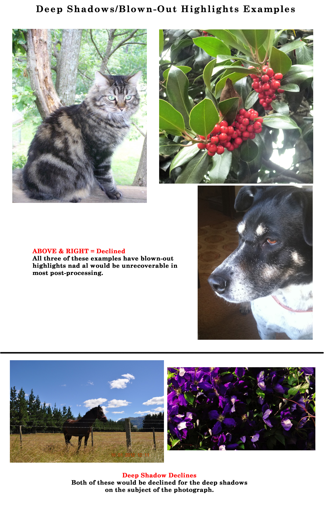
Harsh Lighting: Flash, wrong time of day, and poor placement of both the subject and the camera are all causes of harsh lighting. Basically it’s just about bad choices. These can all make the overall image too bright or areas of the image too bright while other areas fall into deep contrasting shadows. Tips for controlling and avoiding harsh lighting:
- Whenever possible, wait and watch how the lighting changes in the area you are shooting and try to choose a time when lighting is softer, warmer and less harsh.
- Diffuse the light. Learn about filters you can add to your lens which will reduce the lighting.
- Control the light by moving your subject and/or your camera to create a silhouette or strong directional lighting.
- Reflect the light for a ‘bounced light’ effect which is softer. You can bounce a flash, but you can also bounce natural light by positioning yourself and your subject so that the ‘harsh’ light hits a wall and reflects back onto your subject creating a much softer balance between your highlights and shadows.

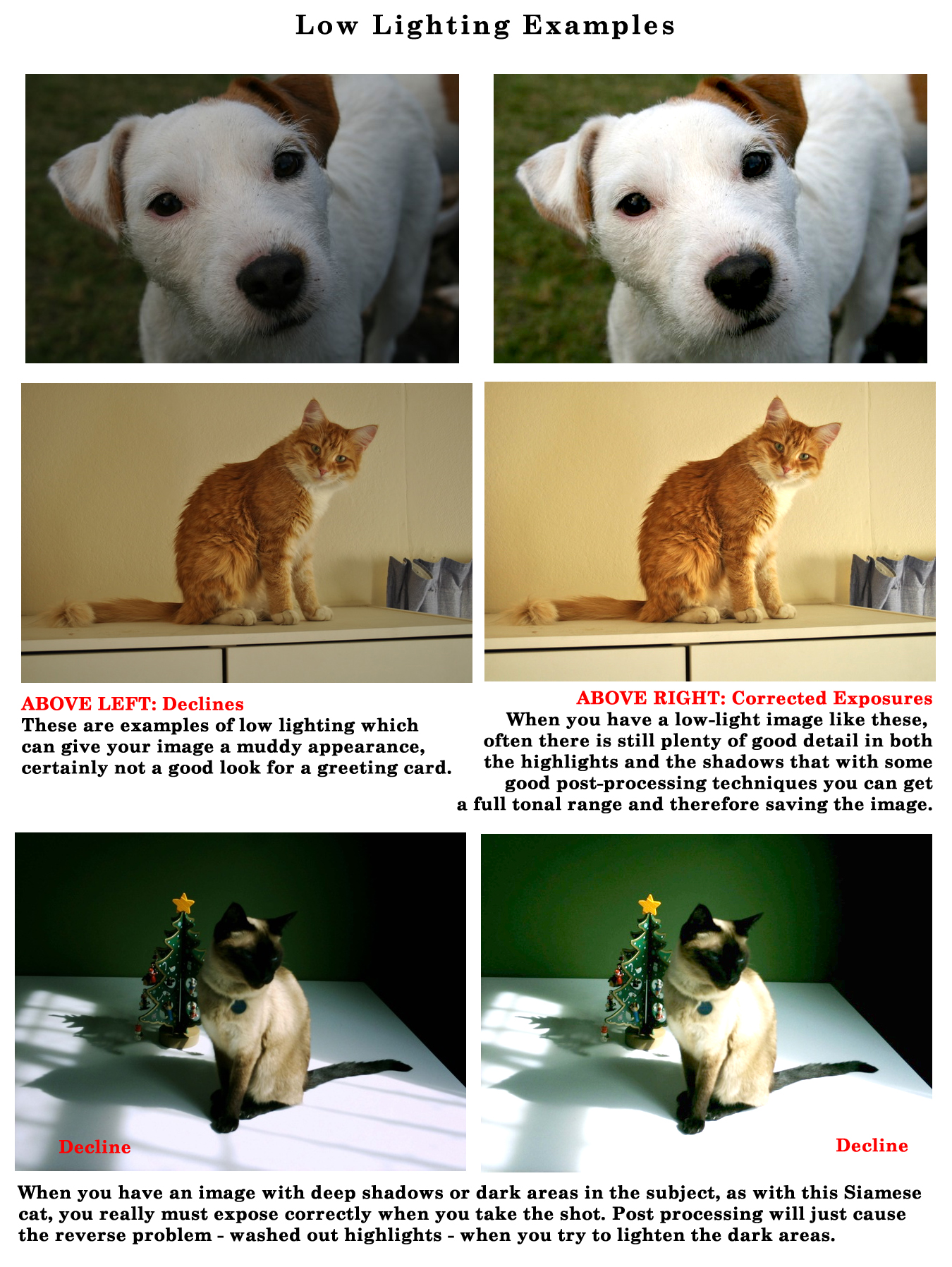
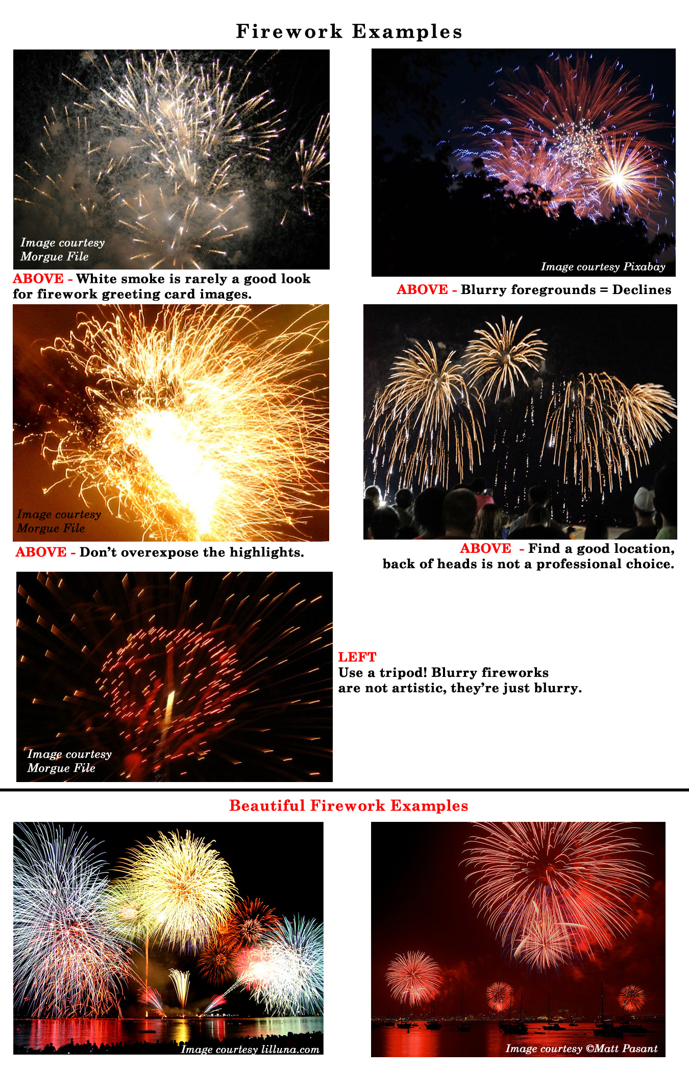
Very Low Lighting: Just as harsh lighting is not acceptable, neither is an image that’s simply too dark. Not only is this usually not attractive, it’s a problem for printing when low lighting causes a lack of contrast and tonal values. Low lighting also causes problems from camera shake when hand-held. Such as a moving subject like fireworks, if you wish to photograph fireworks for your greeting card images, then use a tripod and ensure your exposure captures the detail in the highlights without washing out the sky, AND stops the motion of the fireworks. You may consider poorly lit light swirls from an exposure which is too slow as an artistic move, but at GCU it’s most likely a decline.
Tips for photographing fireworks:
- Keep the camera steady! A tripod is an absolute must, as long exposures are required and camera shake is a common mistake.
- Shoot in manual mode so you can control the shutter speed and aperture separately for great DOF while allowing for long exposures using a low film speed to reduce color noise.
- Stay upwind of the fireworks to avoid the ugly smoke that will cloud your image.
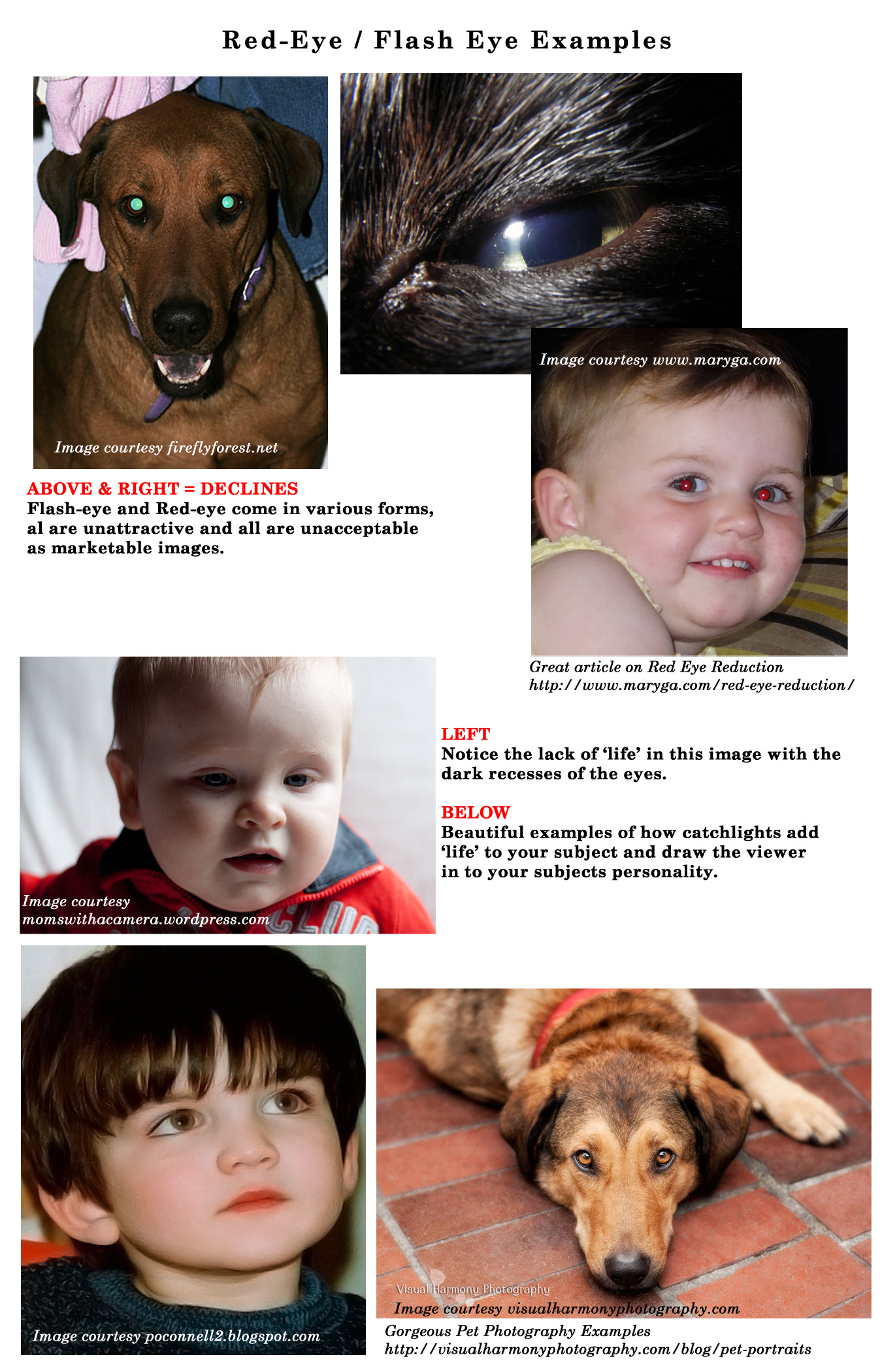
Flash Eye (Red-Eye): Whether the eyes of your living being are yellow, green, red or simply just showing no pupil from the flash, all will be declined. Eyes which do not show pupils and a ‘catch-light’ are considered to look ‘lifeless’ rather than the eyes of a living being with personality. This applies to people as well as animals. Photographers learn early in their training how to avoid ‘flash-eye’ and how to create those all important catch-lights.
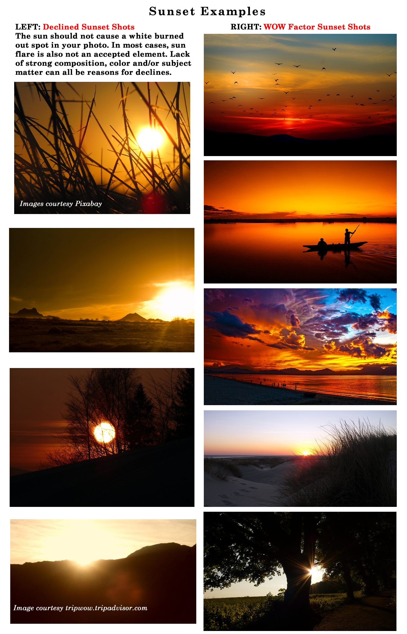
Sunsets: Sunsets are like flowers, every person with a camera shoots them, but not all of them are worthy of anything more than being in your family album. Sunsets need to have a wow factor to stand out in the crowd of today’s competition. If the sun looks as though it has burned a hole in the image, it’s likely to be declined. Tips for creating a sunset photo with that ‘wow’ factor:
- Plan ahead … watch where the sun is setting and scope out (in advance) a place to shoot which includes a beautiful scene to show off the setting sun.
- Put your camera on a tripod and prepare to take exposures frequently throughout the setting of the sun so you can choose the one which best captures the dynamics of the colors offered and the surroundings.
- Keep in mind that some of the most impressive sunset photos do not actually show the sun, just the lighting this time of day creates and spectacular color make impressive statements.
- Remember your Exposure Bracketing! This is a perfect technique to ensure a dynamic result.
- Turn off Auto White Balance if your camera has it. Sunsets should have a warmer tone that auto white balance allows.
- Composition is everything! It’s not the sun in a photograph that creates a great sunset, in most cases it’s the colors, lighting and way you have composed the subject that captures a perfect sunset moment.
Next week we’ll begin the last category in the Submission Guidelines: MARKETABILITY. Till next week, I hope I’ve inspired you to not only go through your store and see if you can weed out any images that the reviewers will find during their weeding which might have lighting issues, but also to keep these things in mind on your next photo shoot.
For great resources & tips visit the SalonOfArt
Share this:

Critique Clinic – August 9-11, 2013
How does it work? For three days a week (Friday-Sunday midnight), I will open the clinic to any artist who wants an honest peer review and critique of a card which gets plenty of clicks but no sales, so something’s probably not quite right, or you’ve got a new design you want to test drive, or you’re unsure about the marketability of a card. Or perhaps you’re a newbie who isn’t sure if a card is up to a marketable standard. Anyone is welcome to participate. In fact, I encourage everyone to at least look at the cards in question and read the critique comments – you may learn something. The purpose of the clinic is to help artists improve the commercial appeal and marketability of their cards.
THE RULES
- ONE card per artist only.
- Card must be intended for sale at Greeting Card Universe.
- To submit a card for critique, post a link to the card at GCU in the comments section of this clinic post. Allowances will be made if you’ve had a card declined, or made a new design you’d like advice on before submission. Give us the link where we can see the card, such as your private gallery, Flickr, Tinypic, etc. If you do give a private gallery link, be sure your private module gallery is ON. Please do not post links to your Manage Cards section – do you really want strangers tinkering with your cards? And please don’t ask us to critique a card that’s pending review – we can’t see it until it’s approved.
- Any artist is free to comment and/or give a critique of a submitted card. HOWEVER, post-and-run comments like “great card” or “you suck” will not be tolerated, nor will abuse. Criticism should be constructive, not destructive. Play nice or you will be banned.
- I also won’t tolerate temper tantrums if you decide your “artistic integrity” is being stepped on because you asked for a critique, and someone told you the photo you’re using isn’t in focus. If you can’t take honest criticism, don’t submit. Once gets you a warning; twice and you’re banned from submitting in the future.
- Artists who critique may do so by giving their opinion, posting an example of another card, or pointing the submitter to a video, on-line article, or other helpful suggestion.
- Don’t forget that artists who are giving you tips and helpful advice are volunteering their time and trouble. Be nice. A link back to their store on your website or blog is appreciated (but not mandatory).
- You are free not to take any advice offered. There’s no guarantee any card will be a bestseller, so don’t come into the clinic with unrealistic expectations.
- Rules may change as we go along and we see how things turn out, okay?
So without any further ado, I declare this week’s Critique Clinic open!
Share this:

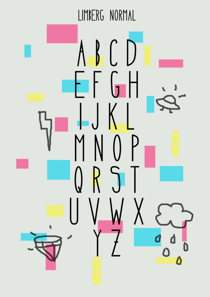
Font Frenzy: Limberg

NEWS: Fast Track Opportunity!

Greeting Card Universe has added some new categories and they’re inviting artists to FAST TRACK cards for these categories. You may Fast Track these cards until August 21, 2013. This is a fabulous opportunity to get cards into your store quickly, so don’t hold back. The categories are:
Invitations >> Bridal Shower >> Gay / Lesbian Wedding Shower
Occasions >> Bridal Shower >> Gay / Lesbian Wedding Shower
Invitations >> Bachelor Party >> Gay / Two Grooms
Invitations >> Bachelorette Party >> Lesbian / Two Brides
Again, you may FAST TRACK designs for these categories only until August 21, 2013.
Share this:

Tips and Tricks: Orphan Categories – Back to School
Orphan Categories: Back to School

The time of year made us start thinking about kids returning to school. It’s a little late for artists to submit cards for this year, but for next year, there are some definitely wide open fields out there.
Occasions > School Days > Back to School has almost 200 cards. However, the sub-categories are virtually empty.
Back to Elementary School
Back to Middle School
Back to High School
Grade Specific
Off to College > General
Off to College > Relationship Specific
These sub-categories have very few cards in them. There’s a niche here waiting for a clever artist to take advantage. Not only designing great cards for these sub-cats, but also promoting the idea on social media and elsewhere. This is how you identify and fill a niche market – find a category that isn’t getting lots of attention, make it yours, and build it up through marketing.
Have fun!


 GCU Community