Critique Clinic – June 29-30, 2013

How does it work? For three days a week (Friday-Sunday midnight), I will open the clinic to any artist who wants an honest peer review and critique of a card which gets plenty of clicks but no sales, so something’s probably not quite right, or you’ve got a new design you want to test drive, or you’re unsure about the marketability of a card. Or perhaps you’re a newbie who isn’t sure if a card is up to a marketable standard. Anyone is welcome to participate. In fact, I encourage everyone to at least look at the cards in question and read the critique comments – you may learn something. The purpose of the clinic is to help artists improve the commercial appeal and marketability of their cards.
THE RULES
- ONE card per artist only.
- Card must be intended for sale at Greeting Card Universe.
- To submit a card for critique, post a link to the card at GCU in the comments section of this clinic post. Allowances will be made if you’ve had a card declined, or made a new design you’d like advice on before submission. Give us the link where we can see the card, such as your private gallery, Flickr, Tinypic, etc. If you do give a private gallery link, be sure your private module gallery is ON. Please do not post links to your Manage Cards section – do you really want strangers tinkering with your cards? And please don’t ask us to critique a card that’s pending review – we can’t see it until it’s approved.
- Any artist is free to comment and/or give a critique of a submitted card. HOWEVER, post-and-run comments like “great card” or “you suck” will not be tolerated, nor will abuse. Criticism should be constructive, not destructive. Play nice or you will be banned.
- I also won’t tolerate temper tantrums if you decide your “artistic integrity” is being stepped on because you asked for a critique, and someone told you the photo you’re using isn’t in focus. If you can’t take honest criticism, don’t submit. Once gets you a warning; twice and you’re banned from submitting in the future.
- Artists who critique may do so by giving their opinion, posting an example of another card, or pointing the submitter to a video, on-line article, or other helpful suggestion.
- Don’t forget that artists who are giving you tips and helpful advice are volunteering their time and trouble. Be nice. A link back to their store on your website or blog is appreciated (but not mandatory).
- You are free not to take any advice offered. There’s no guarantee any card will be a bestseller, so don’t come into the clinic with unrealistic expectations.
- Rules may change as we go along and we see how things turn out, okay?
So without any further ado, I declare this week’s Critique Clinic open!
Share this:

Rainbow Connection: Another Color Palette Resource

Perfect Palette is a great resource for color palettes providing never ending inspiration! Below you’ll find a sample of a palette for Grayed Jade, another hot trendy color. There are lots more, too. Have fun!

Share this:

Design Contest: Free Spree RESULTS

The voting is over and the results are in. After a close and suspenseful contest, Donna Collins is the winner! Congratulations, Donna. A special “high five” to Natalie Kinnear, who came in a close second.
Donna, get in touch and let me know which prize you’d prefer: $10 Amazon.com gift certificate or 5 free card credits.
Share this:

Font Frenzy: P22 Hopper Edward on Sale!

For those artists always looking to beef up their font collections, here’s a nice one: P22 Hopper Edward is a script font based on the handwriting of artist Edward Hopper. The font has quite some style to it, but like Scriptina, I’d use it more for emphasis than lines of text. Or you could make a nice “handwritten letter” background or brush. Right now, you can get the font for $9.98.

Share this:

Rainbow Connection: Minted Roses

In 2013, the #1 color for weddings, engagement parties, reception dinners, and even prom dresses is MINT! Especially in combination with hot shades (like Coral and Mint) or with pretty, feminine rose shades as you see below. The mint and rose combination works especially well when you use mint as a primary color with contrasting rose highlights. Have fun!
Share this:

Dash of Inspiration: Typography – Text Placement
A Dash of Inspiration, A Cup of Creativity by Doreen
Typography: Text Placement

Let’s keep this series going by completing the TYPOGRAPHY grouping of the Submission Guidelines, and last up is:
TYPOGRAPHY: Text Placement
The Submission Guidelines state this:
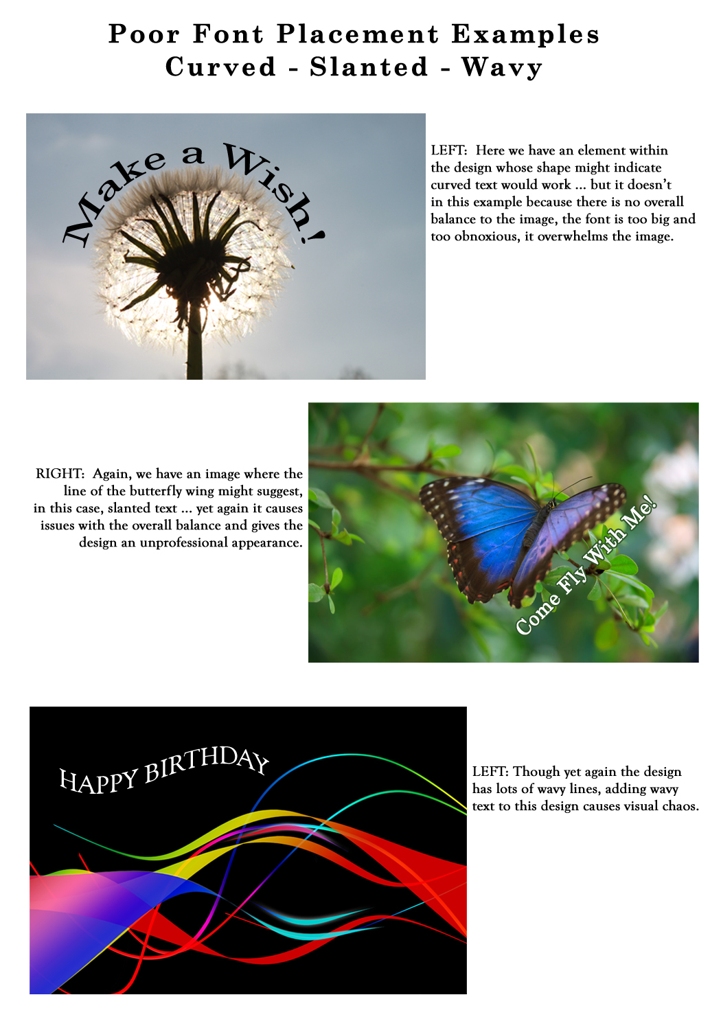
When designing a greeting card, your text placement should not be an afterthought. The best place for the text to reside on your design needs to be well thought out. Your message needs to be part of the composition NOT just stuck wherever there is space left! Do not use slanted or curved text without choosing a font that translates well when tilted or curved and you’ve become an expert in this technique which can make or break a design. Nine out of ten designs look unprofessional when the text is done this way . . . so unless you know what you are doing, don’t do it. Declines may include, but are not limited to: Curved, tilted, wavy or slanted text, text broken up and randomly placed all over the image, text which is placed across a face or important part of the image, etc.
This may be the most common Typography area where artists will receive returns and/or declines. As stated in the guidelines, when you slap text over the image rather than placing it where it’s easy to read and well-balanced with the elements in the design, the card simply looks unprofessional.
Not mentioned, but also a cause for decline if not done well is vertical text which does not work the majority of the time. When it’s pulled off, it’s done so with a very legible font and using all upper case letters for readability. In most cases you are better off creating the text normally and then turning the text 90-degrees to run along the edge of the card rather than stacking the letters on top of each other.
Curved / Tilted / Slanted Text: It is very rare for curved, slanted, wavy or tilted text to work within a greeting card design. When it does, it does so because it’s following the lines and theme of the design. Still, this is a common mistake for the inexperienced greeting card designer to tilt the text in some way with no real connection to the image and no balance in the overall design. First let’s look at some GCU cards from artists who know how and when to curve/tilt/slant/wave the text using techniques which result in a professional and great design.


(Row One, L to R: Great Scott Designs, Nancy’s Nook; Row Two, L to R: Red Rose Digital Art, Clara Chandler, Doreen Erhardt)
Here are some examples which are not acceptable choices for your cards.
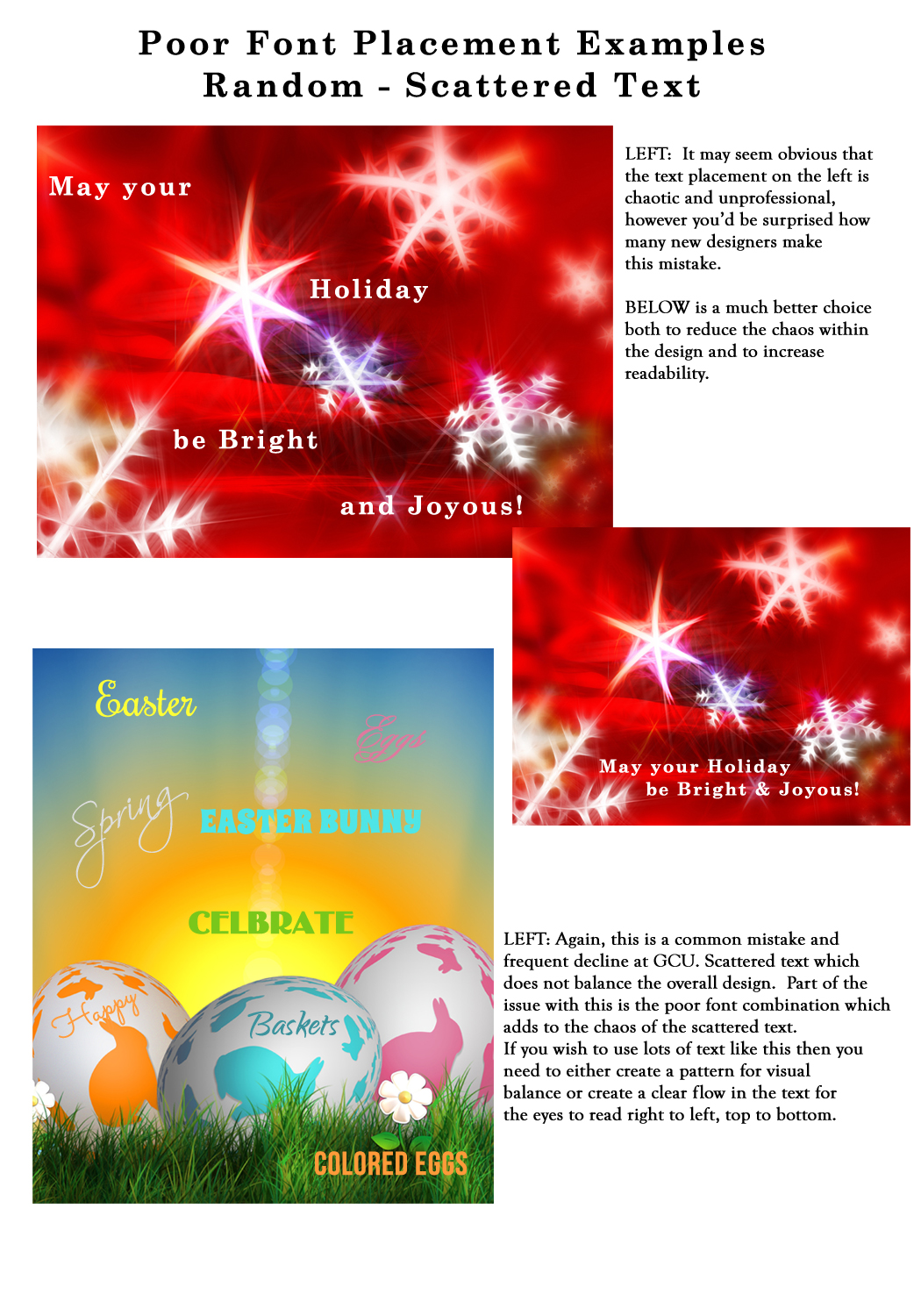
Randomly Placed / Scattered Text: Always remember when creating your design that the viewer reads from right to left and from top to bottom, so when you randomly scatter text all over an image which does not follow any clearly defined pattern or maintain readability, you’ve created chaos. Here are some examples of well-thought-out professional techniques which create a feeling of balance and in some cases even a pattern emerges.


(L to R: Maria Dryfhout, Catherine Sherman, Julie Alvarez)
And here are some examples of poor choices:
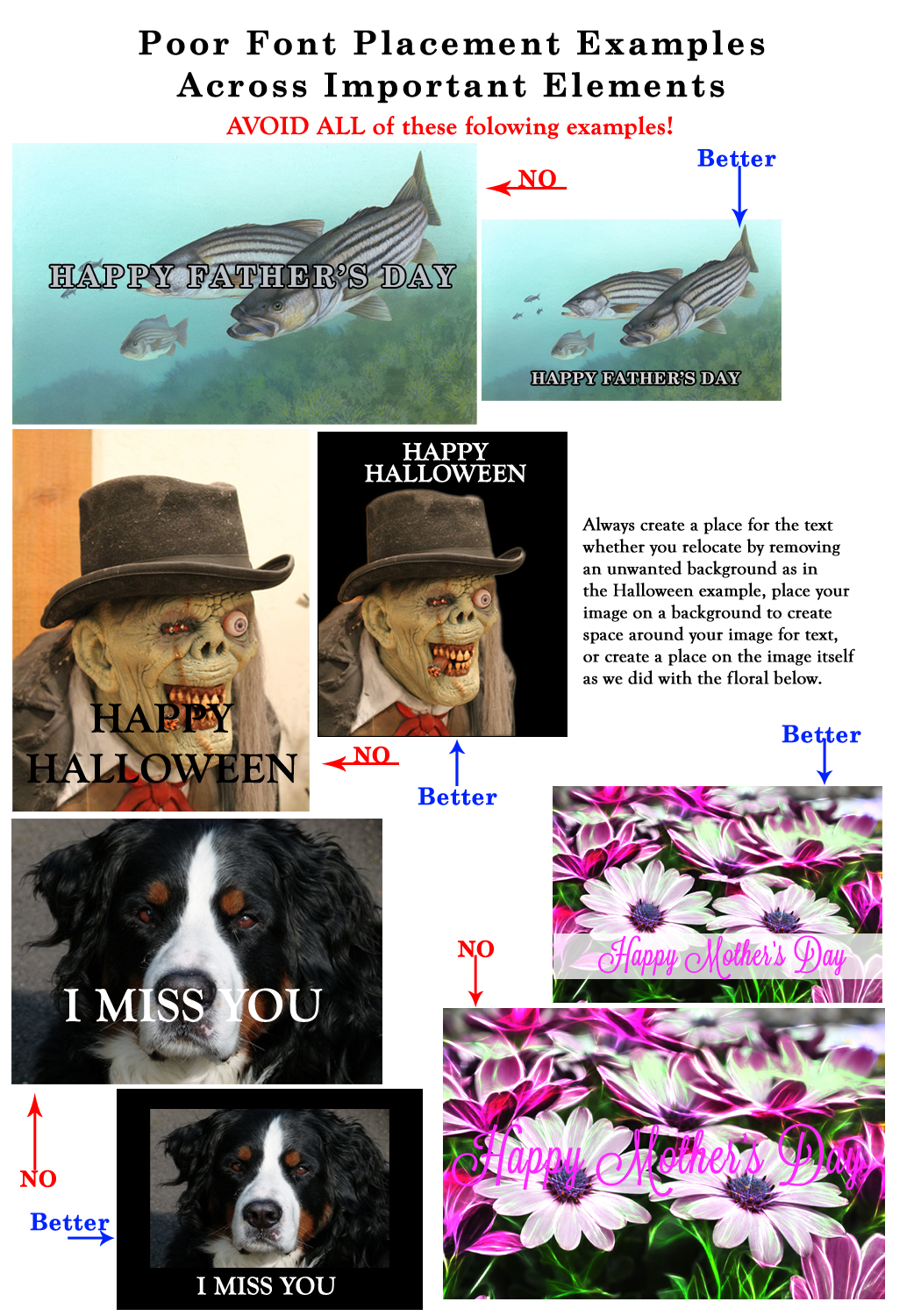
Placement Over Important Elements: Never, never, never place your text across the main subject of your image. Not only does it usually make it hard to read, it is distracting and gives the strong impression that an amateur created the card rather than a professional. IF you choose to have your text run the entire length of your design or through the middle, then you need to plan your card AROUND the text.
If you are using an image where there is no obvious place for the text, then make one. Either add a place or redesign using a version of the image which is smaller and leaves room for the message.
Next week we’ll move on to the next category in the Submission Guidelines: Image Quality. Till next week, I hope I’ve inspired you to go look through your store and see if you can weed out any images that the reviewers will find during their weeding which might fit TYPOGRAPHY: Text Placement issues … and if so, best get to reworking the text on those cards before the reviewers get to them and decline them!
For great resources & tips visit the SalonOfArt
Share this:

Critique Clinic – June 21-23, 2013
How does it work? For three days a week (Friday-Sunday midnight), I will open the clinic to any artist who wants an honest peer review and critique of a card which gets plenty of clicks but no sales, so something’s probably not quite right, or you’ve got a new design you want to test drive, or you’re unsure about the marketability of a card. Or perhaps you’re a newbie who isn’t sure if a card is up to a marketable standard. Anyone is welcome to participate. In fact, I encourage everyone to at least look at the cards in question and read the critique comments – you may learn something. The purpose of the clinic is to help artists improve the commercial appeal and marketability of their cards.
THE RULES
- ONE card per artist only.
- Card must be intended for sale at Greeting Card Universe.
- To submit a card for critique, post a link to the card at GCU in the comments section of this clinic post. Allowances will be made if you’ve had a card declined, or made a new design you’d like advice on before submission. Give us the link where we can see the card, such as your private gallery, Flickr, Tinypic, etc. If you do give a private gallery link, be sure your private module gallery is ON. Please do not post links to your Manage Cards section – do you really want strangers tinkering with your cards? And please don’t ask us to critique a card that’s pending review – we can’t see it until it’s approved.
- Any artist is free to comment and/or give a critique of a submitted card. HOWEVER, post-and-run comments like “great card” or “you suck” will not be tolerated, nor will abuse. Criticism should be constructive, not destructive. Play nice or you will be banned.
- I also won’t tolerate temper tantrums if you decide your “artistic integrity” is being stepped on because you asked for a critique, and someone told you the photo you’re using isn’t in focus. If you can’t take honest criticism, don’t submit. Once gets you a warning; twice and you’re banned from submitting in the future.
- Artists who critique may do so by giving their opinion, posting an example of another card, or pointing the submitter to a video, on-line article, or other helpful suggestion.
- Don’t forget that artists who are giving you tips and helpful advice are volunteering their time and trouble. Be nice. A link back to their store on your website or blog is appreciated (but not mandatory).
- You are free not to take any advice offered. There’s no guarantee any card will be a bestseller, so don’t come into the clinic with unrealistic expectations.
- Rules may change as we go along and we see how things turn out, okay?
So without any further ado, I declare this week’s Critique Clinic open!
Share this:

Design Contest: Free Spree – VOTE!

We had a great response to our Design Contest: Free Spree, and now it’s time to vote!
Every vote counts, so artists should spread the news on their social media sites like Facebook, Twitter, etc. Get your friends involved. Since there are no bonus votes to be had this time around, it’s especially important to go out there and make sure you advertise yourself, since the card with the most votes wins!
Below, you’ll find the list of candidates, and below that, the poll to vote. Voting will continue until June 26. On June 27, I’ll announce the winner. Good luck!
_________________________
1.  2.
2. 
3.  4.
4. 
5.  6.
6. 
7.  8.
8. 
9.  10.
10. 
11.  12.
12. 
13.  14.
14. 
15.  16.
16. 
17.  18.
18. 
19.  20.
20. 
21.  22.
22. 
23.  24.
24. 
25. 
Share this:

Rainbow Connection: Color Resource
A very nice source of color palettes can be found on The Sweetest Occasion, whose Color Palette category is chock full of delicious, trendy schemes. You can see a sample below. Very yummy stuff that’ll get your creative juices flowing!

Image courtesy of The Sweetest Occasion
Share this:

Tips and Tricks: Facebook Hashtags

Recently, Facebook has rolled out hashtags (and they’re still rolling it out gradually to their users as they normally do, so don’t panic if you don’t see it yet. You will, probably in the next few weeks.) Those of you who use Twitter, Tumblr, Pinterest, and Instagram will be familiar with the concept. This is great news for anyone using FB as part of their marketing effort.
Basically, on FB, a hashtag (example: #corriekuipers) works like a clickable search term. What this means for you is that you can expand your marketing by using hashtags.
If you post greeting cards on FB, some suggested hashtags to add to the end of your update are: #yourname or #yourbusinessname, #greetingcarduniverse. Other relevant hashtags such as #upcomingholiday, #occasion, or #art, #photography, etc can be added as desired.
Be careful, though. You don’t want to pile on the hashtags. Adding twenty hashtags to a one line status update would be crazy. Choose your hashtags wisely.
Read more about Facebook hashtags.
Another use for hashtags from a marketing perspective is “eavesdropping” or getting information to target your audience. For example, let’s say you search for hashtags about the Fourth of July (like #fourthofjuly, #fireworks). If you see a lot of people using a specific hashtag, make a FB post with a Fourth of July card and use the same hashtag. By taking advantage of a trend, you can expand your marketing outside your usual circle.
Have fun!
Edited to add tip by Susan Herbst: “It’s also important to note that if your Facebook feeds to your Twitter account, it’ll be helpful to get those hashtags in the first 100 characters or so. Then they do double duty.”
Thanks, Susan!


