Dash of Inspiration: Typography – Legibility
A Dash of Inspiration, A Cup of Creativity by Doreen
Typography: Legiility

Let’s keep this series going by moving into the TYPOGRAPHY grouping of the Submission Guidelines, and next up is:
TYPOGRAPHY: Legibility
The Submission Guidelines state this:
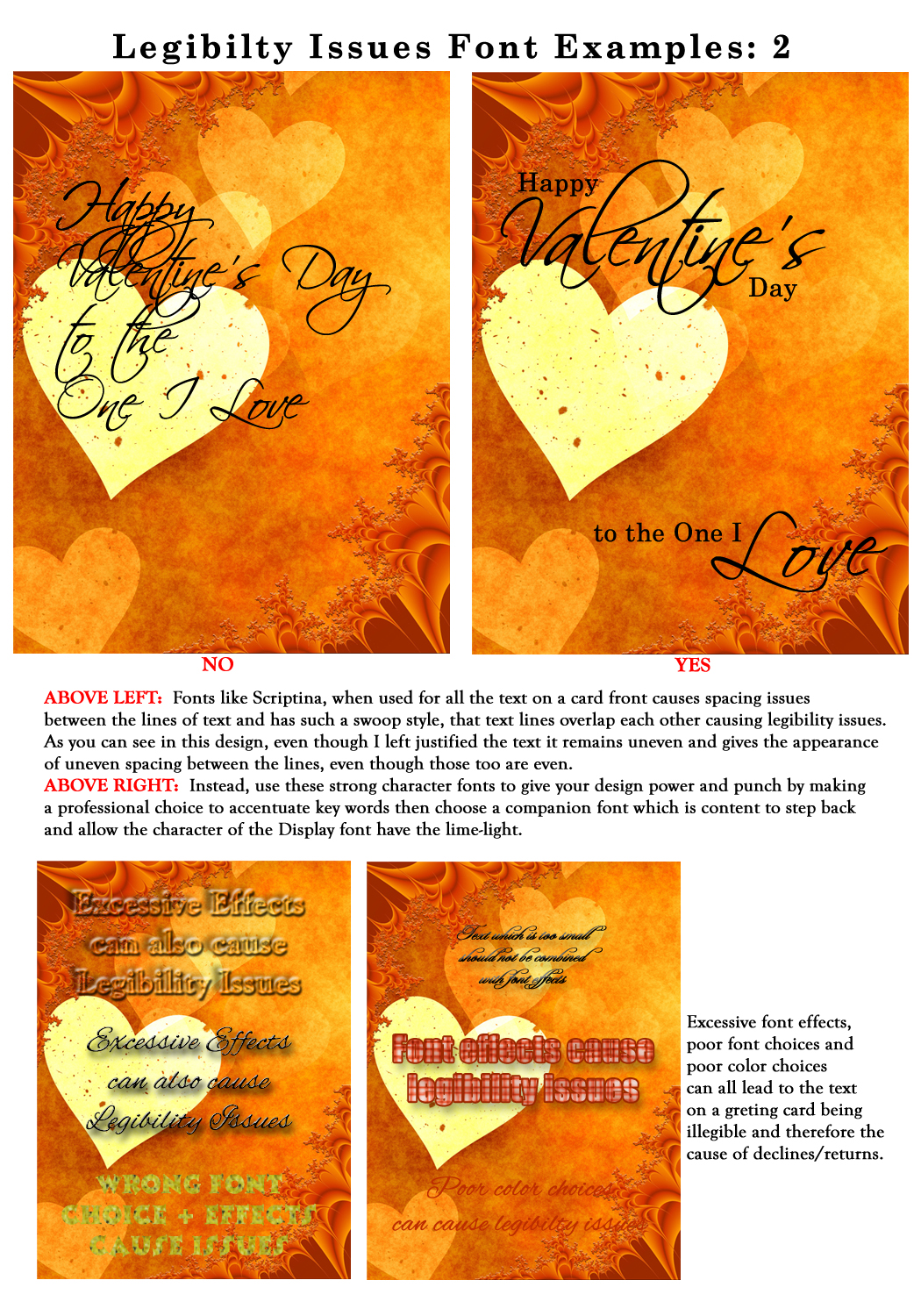
Occasionally there’s a need for a font that screams character, often referred to as Display typefaces, which includes everything from Comic Sans and bunny fonts to the Scriptina font. Applied sparingly these fonts can add a much-needed dash of spice or elegance to a design, but they can quickly become obnoxious if used throughout the design. Greeting card fonts need to be clearly legible. Declines may include, but are not limited to: text which is too small, written over cluttered areas within the image and/or text which overlaps other text, etc.
It may seem at first glance that legibility and readability are the same thing, but they are not.
Legibility refers to the design of the typeface, as in the width of the strokes, whether or not it has serifs, the presence of type design elements etc. It is easy to tell one letter-form from another in a legible typeface. For instance, decorative typefaces have low legibility because they are primarily meant to be seen at a glance, rather than read at length.
Conversely, typefaces designed for books and newspapers have very high legibility. You need to design the overall legibility based on the function of the text within your design. It seems like an obvious issue for GCU to have in the guidelines and one which none of us should ever be caught doing, but there are many artists who still make these mistakes and their cards may soon be tagged for decline or return due to legibility issues.
- As a general rule of thumb, if you can’t clearly read the text in the large view, it’s too small and therefore not marketable. If a customer can’t read the text, they won’t buy the card.
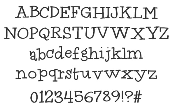
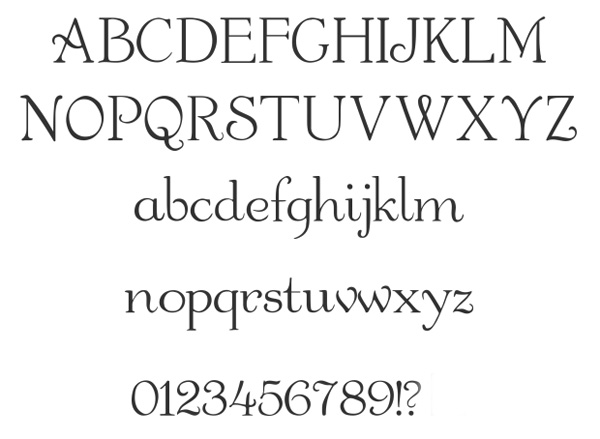
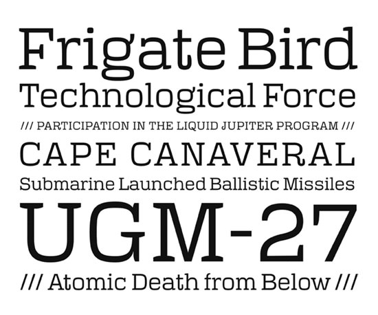
- When you need to keep the text small, due to space issues, consider staying away from script and/or decorative fonts. Stick with a font that works well in small print such as Sans-Serif and Serif font families like these: Century, Georgia, Times Roman, Arial, and Tahoma which all work well in small type.
- NEVER slap text across the face of a photograph or through any important element within the artwork or photo. Not only does this cause legibility issues, but it’s overall appearance is unprofessional and will get your cards declined. ALWAYS find a way to add the text to your card front which looks intentional and is clearly legible.

- Use fonts which scream character as accent points within your design, never use them for all the text on a design. They become difficult to read and overwhelm the card with chaos. Go back and review Font Combinations and make a good choice in your design to show a bit of character rather than overpowering your design with decorative text.
- Just because a font’s funky character works well for your imagery does not mean that it will be legible, so be careful when making your font choices. Choose typefaces with conventional letter-forms. Fonts composed of unique shapes, artistic deformations, excessive ornamentation or other fancy design elements cause the reader to have to process what they are looking at first, instead of just taking in the message. Artistic choice should never come at the cost of immediate comprehension in a greeting card design.
- Using fonts with strong character traits, such as Scriptina, can also cause issues with text alignment and spacing, both of which cause further issues with both legibility and balance within your design. Readability is the dynamic interaction of the font’s style, size, tracking, leading, color and other properties all of which combine to give the viewer one overall impression. They should all add up to a typographic style which has a strong degree of readability. In most cases, communication comes before style, so resolve readability first.
- Always be careful when choosing ‘font effects’, they can cause legibility issues, particularly when used in excess and/or when used with small type. Font effects will be touched on in detail next week, but these include shadow effects, beveling, and adding style presets.
- Contrast is one of the most critical factors in enhancing the visual aspects of your design. Text should be placed with the best possible contrast. For many older people light lettering—either white or light yellow—on a dark background, usually black, is easier to read than black lettering on a white or light yellow background.
- Leading (Space Between Lines of Text) – The recommended spacing between lines of text is 1.5, rather than single space. Many people who are visually impaired have difficulty finding the beginning of the next line when single spacing is used.
- As with any form of creating, break the rules ONLY after you completely understand the rules. Knowing the basics will help you make intelligent choices about what rules to break and how to break them.
Next week we’ll continue on our Typography journey into Font Effects . Till next week, I hope I’ve inspired you to go look through your store and see if you can weed out any images that the reviewers will find during their weeding which might fit TYPOGRAPHY: Font Legibility declines. Now’s the time to improve those card fonts before the weeding team declines them for the reasons we’ve talked about.
For great resources & tips visit the SalonOfArt
Share this:

Critique Clinic – May 31-June 2, 2013

How does it work? For three days a week (Friday-Sunday midnight), I will open the clinic to any artist who wants an honest peer review and critique of a card which gets plenty of clicks but no sales, so something’s probably not quite right, or you’ve got a new design you want to test drive, or you’re unsure about the marketability of a card. Or perhaps you’re a newbie who isn’t sure if a card is up to a marketable standard. Anyone is welcome to participate. In fact, I encourage everyone to at least look at the cards in question and read the critique comments – you may learn something. The purpose of the clinic is to help artists improve the commercial appeal and marketability of their cards.
THE RULES
- ONE card per artist only.
- Card must be intended for sale at Greeting Card Universe.
- To submit a card for critique, post a link to the card at GCU in the comments section of this clinic post. Allowances will be made if you’ve had a card declined, or made a new design you’d like advice on before submission. Give us the link where we can see the card, such as your private gallery, Flickr, Tinypic, etc. If you do give a private gallery link, be sure your private module gallery is ON. Please do not post links to your Manage Cards section – do you really want strangers tinkering with your cards? And please don’t ask us to critique a card that’s pending review – we can’t see it until it’s approved.
- Any artist is free to comment and/or give a critique of a submitted card. HOWEVER, post-and-run comments like “great card” or “you suck” will not be tolerated, nor will abuse. Criticism should be constructive, not destructive. Play nice or you will be banned.
- I also won’t tolerate temper tantrums if you decide your “artistic integrity” is being stepped on because you asked for a critique, and someone told you the photo you’re using isn’t in focus. If you can’t take honest criticism, don’t submit. Once gets you a warning; twice and you’re banned from submitting in the future.
- Artists who critique may do so by giving their opinion, posting an example of another card, or pointing the submitter to a video, on-line article, or other helpful suggestion.
- Don’t forget that artists who are giving you tips and helpful advice are volunteering their time and trouble. Be nice. A link back to their store on your website or blog is appreciated (but not mandatory).
- You are free not to take any advice offered. There’s no guarantee any card will be a bestseller, so don’t come into the clinic with unrealistic expectations.
- Rules may change as we go along and we see how things turn out, okay?
So without any further ado, I declare this week’s Critique Clinic open!
Share this:

Font Frenzy: 100 Free Commercial Fonts

Here’s another blog post listing 100 free fonts that the author says are free for commercial use. As always, double check any Terms of Use/Licensing Agreements. Below are three random examples. Have fun!
Idolwild
Gartoon

Villa Didot
Share this:

Rainbow Connection: Color Boards

If you’re starving for inspiration, there’s a place to go that’s always going to give you ideas: Pinterest. Today, I’ve gone on a little expedition to Pinterest to choose some interesting boards/pins to give you new colors to play with and new inspiration for your card designs.
![]()
Moods and Color Boards
Loads of colors, color palettes, and mood/color boards. You won’t be bored browsing through this collection.
Color Boards
More color combinations than you can shake a stick at!
Trendy Colors and Inspiration
Plenty of really cool stuff here, very useful in design work.
BONUS: Typography
Study some examples of stunning typography to get inspired for your own designs.
Share this:

Blast From the Past: Front of Card Text

FRONT OF CARD TEXT
Armed with your favorite graphic editing software, a show stopping illustration or photograph, a plethora of fonts, and a really great sentiment, how could you go wrong when you’re ready to design your greeting card?
Well…creating a good greeting card (by good, I mean commercial quality – marketable – a card that retail shoppers will find attractive and buy) is more than just slapping your text on the front and thinking you’re done. The placement of text on the front of a card is as vital as the illustration or photograph that accompanies it. This will make or break your design.
Here are some basic guidelines to text that will help you make cards that are so professional looking, they can stand up to the big boys *cough*Hallmark*cough* and win.
- Never use more than 3 fonts on a single design. Yes, there are exceptions to this rule. Look at this card of mine as an example. I can get away with it because despite the several fonts, the text is ordered so the eye is never confused. However, for the most part, you won’t need to violate this rule.

- Follow the baseline. What’s that? The baseline is an imaginary line on which your text will rest, and it should always be present in your design. For example, I’ll show you another card of mine. Because the end of the vine is curly, I can curve my text around it. Had the vine stuck straight out, doing curved text would have looked odd because it didn’t follow an existing baseline. How do you find the baseline? Look at your image. In most of your designs, the baseline will be straightforward (that is, straight across). Don’t gild the lily unless the design supports it.

- If you can’t read your font when you type out a block of text, it isn’t a good font. I’m aware there are a lot of decorative fonts out there that are fancy, funny or otherwise blinged out, but if the shopper can’t read what you wrote, all the pretty letters won’t matter. Make your text legible. Investing in a few good, legible, basic fonts (for the love of the Great Bird of the Galaxy, not Comic Sans) that are okay for commercial use will stand you in very good stead, and give you an excellent foundation to build on. Choose a font that compliments your design and is relevant to the subject. Don’t pick one because you think it’s cute. A whimsical curly font, for example, may be okay for a birthday card, but absolutely not on a sympathy card.
- Do not warp, twist, bend, wave or otherwise mess around with your text. If you want to curve your text like I showed you in my second example card (the baby shower invitation), then you need to learn Adobe Illustrator. Text effects may look okay on a website banner, but you will not attract shoppers when you put that scrunched, higgledy-piggledy, warped and waved text on a greeting card. It doesn’t look professional. Don’t do it.
- Always do a layout in your graphics editing program with your picture and text in layers so you can adjust as necessary. If you have multiple lines of text, you can play with the sizes and placements as long as you don’t forget that alignment is the most important thing. Here’s an example where I’ve been creative with the placement of each line, used a different font for emphasis, and manually adjusted the leading (that’s the space between lines), but the alignment of each line to the others and to the rest of the elements as well as to the card’s margins is what makes this a successful design. Repeat after me: the layout grid is my best friend.

- This may seem like a no-brainer, but make sure you use a font color that can actually be read against the background image. A good rule of thumb is: white or black, with color or bold for emphasis as needed (see my card here for an example). If white looks washed out, while black is too strong, consider using a color already present but at its lightest or darkest setting, such as navy blue text on a light blue background.

Share this:

Dash of Inspiration: Typography – Font Combination
A Dash of Inspiration, A Cup of Creativity by Doreen
Typography: Font Combination
Let’s keep this series going by moving into the TYPOGRAPHY grouping of the Submission Guidelines, and first up is:
TYPOGRAPHY: Font Combination
The Submission Guidelines state this:
Usually one typeface will do, however if you choose to combine fonts in a single design, the general rule is never more than two and if you combine … either keep it in the same family OR change it a lot! Don’t use slight variations in typeface when combining. Be brave or don’t tackle it at all. Declines may include, but are not limited to: combinations of fonts which cause chaos in the image, etc.
These examples and tips are what GCU speaks to in their submission guidelines. Incorporating great typeface combinations into your card designs is an art, not a science. As with all forms of art, there are no absolute rules to follow, but it is crucial that you understand and apply best practices when combining fonts within your designs.
- The farther apart the typeface styles you wish to combine are the more luck you’ll have creating a pleasing design. Fonts that are too similar look horrible together. If you are combining fonts you want to shoot for contrast and harmony while avoiding that middle ground which will result in conflict.
- Avoid combining Script fonts, unless they are radically different, they will conflict with each other and cause a chaotic design.
- When choosing to combine fonts, get enough point size difference between the fonts to create an obvious contrast.
- Assign each font choice to a specific role within your design for consistency and harmony.
- When looking for fonts to combine within your design, contrast the overall weight of the fonts. If you use two fonts with a very heavy presence, they will just look like they are mad at each other and fighting a war within your design.
- A good designer pays close attention to avoid that which make your eyes dart all over the page rather than settle and move through the design. If your eyes are unsettled, something in your design is in conflict.
- For a simple and professional look, consider using different fonts from the same typeface. Such as Times Roman BOLD with Times Roman Italic.
- Try not to combine fonts from different historical periods. For example Old Script looks better with an old font like Goudy Old Style which demonstrates a greater refinement than say Arial.
- Watch your font choices for individual personalities whose traits may unpleasantly multiply with large amounts of text, becoming obnoxious and repetitious, or loose it’s personality altogether in a font size that is too small.
- Look for a balance of neutral contrast within the fonts in a single design. You want them to both be content to play different roles without seizing all the attention or drowning out one another.
- Just as elements within your design should not mix moods causing an emotional conflict with the viewer, fonts also follow this same suit. Either pair the same general mood in your fonts, or choose one moody font and pair it with a neutral personalty.
- In order for the card to be legible and therefore marketable, the roles assigned to different fonts within the design must be clear. Your typeface choices need to be legible and have enough contrast or the visual hierarchy will break down.

Next week we’ll continue on our Typography journey into Font Legibility . Till next week, I hope I’ve inspired you to go look through your store and see if you can weed out any images that the reviewers will find during their weeding which might fit TYPOGRAPHY: Font Combination declines. Now’s the time to improve those card fonts before the weeding team declines them for the reasons we’ve talked about.
For great resources & tips visit the SalonOfArt
Share this:

Critique Clinic – May 24-26, 2013
How does it work? For three days a week (Friday-Sunday midnight), I will open the clinic to any artist who wants an honest peer review and critique of a card which gets plenty of clicks but no sales, so something’s probably not quite right, or you’ve got a new design you want to test drive, or you’re unsure about the marketability of a card. Or perhaps you’re a newbie who isn’t sure if a card is up to a marketable standard. Anyone is welcome to participate. In fact, I encourage everyone to at least look at the cards in question and read the critique comments – you may learn something. The purpose of the clinic is to help artists improve the commercial appeal and marketability of their cards.
THE RULES
- ONE card per artist only.
- Card must be intended for sale at Greeting Card Universe.
- To submit a card for critique, post a link to the card at GCU in the comments section of this clinic post. Allowances will be made if you’ve had a card declined, or made a new design you’d like advice on before submission. Give us the link where we can see the card, such as your private gallery, Flickr, Tinypic, etc. If you do give a private gallery link, be sure your private module gallery is ON. Please do not post links to your Manage Cards section – do you really want strangers tinkering with your cards? And please don’t ask us to critique a card that’s pending review – we can’t see it until it’s approved.
- Any artist is free to comment and/or give a critique of a submitted card. HOWEVER, post-and-run comments like “great card” or “you suck” will not be tolerated, nor will abuse. Criticism should be constructive, not destructive. Play nice or you will be banned.
- I also won’t tolerate temper tantrums if you decide your “artistic integrity” is being stepped on because you asked for a critique, and someone told you the photo you’re using isn’t in focus. If you can’t take honest criticism, don’t submit. Once gets you a warning; twice and you’re banned from submitting in the future.
- Artists who critique may do so by giving their opinion, posting an example of another card, or pointing the submitter to a video, on-line article, or other helpful suggestion.
- Don’t forget that artists who are giving you tips and helpful advice are volunteering their time and trouble. Be nice. A link back to their store on your website or blog is appreciated (but not mandatory).
- You are free not to take any advice offered. There’s no guarantee any card will be a bestseller, so don’t come into the clinic with unrealistic expectations.
- Rules may change as we go along and we see how things turn out, okay?
So without any further ado, I declare this week’s Critique Clinic open!
Share this:

Font Frenzy: 44 Free Fonts!
Our friends at Noupe.com have given us a list of 44 Fonts For Creative Designers, most free for private AND commercial use! Please read any Terms of Use or Licensing Agreements carefully. Below you’ll find some examples of the types of fonts on offer. There are a lot more – I recommend visiting the post and having a look for yourself.
There aren’t any script or handwriting fonts, no dingbats or ornamental fonts – these are the workhorses in the artist’s toolbox, base fonts on which you build our designs. Have fun!
Polaris

Valentina
Share this:

Blast From the Past: Typography

To continue with this week’s theme, we present a Blast from the Past (April 2012) – enjoy!
_________________________
Typography … why should you care?
Because you can have the most beautiful illustration, the most fabulous idea for the front of a greeting card, but if you choose the wrong font or set up your text in an ill-advised manner, it spoils the whole thing. Typography is important.
Bottom line: any typography you choose MUST be pleasing to the eye. When you choose a font or fonts, be aware of contrast, leading (that’s the space between the lines), kerning (that’s the space between the letters), length, and point size.
Remember, THE SOLE PURPOSE OF TYPOGRAPHY IS TO BE READ. Look at your typography at arm’s length. Get up and take a step back. Can you still read what you typed? If the font isn’t clearly readable, don’t use it.
KERNING: Some fonts weren’t created with proper leading or kerning. That’s the space between the lines of text (leading) and the space between letters (kerning). Just dashing your text off and slapping it on the card won’t look good, but if the font is otherwise well designed, you can play around with the leading and kerning in your graphics editing program. TIP: If you’re not sure the kerning is right, flip the text upside down. That way, you can clearly see the space between the letters without the word itself getting in your way.

FONT CONTRAST: If you’re planning to mix fonts – which can be a very good thing – be aware that fonts which are too similar don’t look good together, but neither do fonts that are too different. Again, the most hard and fast rule of typography is to keep it PLEASING TO THE EYE. TIP: to create CONTRAST not CONFLICT, you must consider weight (that’s how fat the font appears), size (mixing sizes is okay for emphasis), and whether or not the two (or more) fonts look good together. Fonts that look too much alike don’t work. Neither do fonts that aren’t similar enough.

SHADOW EFFECT: Sometimes, using shadow for emphasis can work wonders on a website, but will shadow print well on a greeting card? In my experience, the answer is… sometimes. Too heavy shadow, or shadow that hasn’t been applied properly, WILL NOT work on a greeting card. Shadow that makes a too heavy contrast won’t look good, either. Beware of blurring the lettering. Keep in mind that what looks eye-catching on a computer monitor won’t necessarily pop when printed on a card. TIP: When using darker background colors like green and blue, instead of black shadow, try a shadow in a shade darker or lighter than your background. This can provide the emphasis needed without overdoing it.

OTHER TEXT EFFECTS: I’ve said it before, and I’ll keep saying it – quit using text effects like beveling. Even web designers aren’t using beveling anymore. That effect came and went 20 years ago. It doesn’t look good printed 2D on a card. Let me repeat that – beveling does not print well. Period. Your cards will look much more professional if you are more judicious in your choices. There’s absolutely nothing wrong with flat text. It’s a flat card, after all. 🙂 In fact, most 3D type effects don’t print well. TIP: Print a sample out for yourself before submitting your design.
RIGHT FONT, RIGHT OCCASION: Fonts do have their own character (except Comic Sans, which has none). Choose the correct font considering the occasion you’re designing the card for. TIP: Avoid fonts that are too gimmicky unless you’re creating a “bespoke” font – that is, a font you’ve created with your own hand, which becomes more of an artistic element than an actual typeface.

Finally, just keep in mind the single most important thing: TYPOGRAPHY MUST BE READABLE AND PLEASING TO THE EYE. If you aren’t sure your design works, you can always submit a proposed design to the Critique Clinic for advice. Now go out there and have fun with fonts!
Share this:

Font Frenzy: Quarzo
In keeping with this week’s typography scheme, we’re bringing you a special script font called Quarzo. Very pretty and elegant, Quarzo should be used for more formal designs, not cartoons.
Remember, the font you choose should be relevant to the subject and the occasion. At the moment, you can get this fabulous Open Type font containing swashes, curly and refined ornaments, alternative caps, etc on sale for just $19.98 – a real bargain considering how expensive these type fonts usually are!