Dash of Inspiration: Typography – Font Choice
A Dash of Inspiration, A Cup of Creativity by Doreen
Typography: Font Choice

Let’s keep this series going by moving into the TYPOGRAPHY grouping of the Submission Guidelines, and first up is:
TYPOGRAPHY: Font Choice
The Submission Guidelines state this:
Find the right font to fit the occasion the greeting card is being designed for AND fits the style of your design. Pay attention to age, gender, and formality of both your design and the category you wish to place it in. Declines may include, but are not limited to: overly formal cursive, heavy blackletter font on cards for young children, elegant fonts on humorous images, excessive sizing which appears unprofessional, excessive use of dingbats and/or special effect fonts, etc.
We’ve talked a lot about Typography, offered links to a ton of good font choices and touched on typography layout within your card design … more articles on all of these subjects exist in the Community Blog, but let’s narrow in on Font Choice today and how the wrong choice can cause declines.
Overly Formal Cursive: This comes into play when creating cards for kids, men, and humorous imagery for example. Your font should be chosen based on many factors; age of the recipient, gender and feel of the overall design. Use contemporary fonts with contemporary designs. Use cartoon fonts with cartoon-style humor, use formal script fonts for formal occasions and so on. Poor choices which conflict with the subject matter and category will result in a decline.

Excessive Sizing: A common mistake by those new to greeting card design is to take an existing piece of art or photograph and ‘slap’ text across the front. When designing a greeting card, you absolutely must know where the best placement for the text is going to be during the design phase. Text on the front of a greeting card is not an afterthought, it’s part of the design. Though we’ll go into this further when we get to Text Placement in a future installment of this series, in this section GCU is cautioning against using text to fill up space by making it huge and/or placing the excessively sized text across the front of your design. Both are likely to cause declines, because both give an unprofessional appearance.

Excessive Use of Dingbats/Special Effect Fonts: There are many fun fonts out there, but just because they look cool doesn’t mean they are a good choice for a greeting card. Keep in mind that many of the special effect fonts were created for advertising and they work well for that purpose, but a small 5×7 greeting card makes these types of fonts nearly illegible and therefore distracting. The other type of font to be aware of are those in the dingbat category. Those which have the letter encased in some object. These, if used at all, must be used sparingly. Sometimes you can use these type of fonts for the first letter in Merry Christmas or Happy Halloween, but if you use these choices for all the text on your card, it’s likely to be declined.

Next week we’ll continue on our Typography journey into Font Combinations. Till next week, I hope I’ve inspired you to go look through your store and see if you can weed out any images that the reviewers will find during their weeding which might fit TYPOGRAPHY: Font Choice. Now’s the time to improve those card fonts before the weeding team declines them for the reasons we’ve talked about.
For great resources & tips visit the SalonOfArt
Share this:

Critique Clinic – May 17-19, 2013

How does it work? For three days a week (Friday-Sunday midnight), I will open the clinic to any artist who wants an honest peer review and critique of a card which gets plenty of clicks but no sales, so something’s probably not quite right, or you’ve got a new design you want to test drive, or you’re unsure about the marketability of a card. Or perhaps you’re a newbie who isn’t sure if a card is up to a marketable standard. Anyone is welcome to participate. In fact, I encourage everyone to at least look at the cards in question and read the critique comments – you may learn something. The purpose of the clinic is to help artists improve the commercial appeal and marketability of their cards.
THE RULES
- ONE card per artist only.
- Card must be intended for sale at Greeting Card Universe.
- To submit a card for critique, post a link to the card at GCU in the comments section of this clinic post. Allowances will be made if you’ve had a card declined, or made a new design you’d like advice on before submission. Give us the link where we can see the card, such as your private gallery, Flickr, Tinypic, etc. If you do give a private gallery link, be sure your private module gallery is ON. Please do not post links to your Manage Cards section – do you really want strangers tinkering with your cards? And please don’t ask us to critique a card that’s pending review – we can’t see it until it’s approved.
- Any artist is free to comment and/or give a critique of a submitted card. HOWEVER, post-and-run comments like “great card” or “you suck” will not be tolerated, nor will abuse. Criticism should be constructive, not destructive. Play nice or you will be banned.
- I also won’t tolerate temper tantrums if you decide your “artistic integrity” is being stepped on because you asked for a critique, and someone told you the photo you’re using isn’t in focus. If you can’t take honest criticism, don’t submit. Once gets you a warning; twice and you’re banned from submitting in the future.
- Artists who critique may do so by giving their opinion, posting an example of another card, or pointing the submitter to a video, on-line article, or other helpful suggestion.
- Don’t forget that artists who are giving you tips and helpful advice are volunteering their time and trouble. Be nice. A link back to their store on your website or blog is appreciated (but not mandatory).
- You are free not to take any advice offered. There’s no guarantee any card will be a bestseller, so don’t come into the clinic with unrealistic expectations.
- Rules may change as we go along and we see how things turn out, okay?
So without any further ado, I declare this week’s Critique Clinic open!
Share this:

Design Spotlight: Karen Bui

Today’s Design Spotlight falls on Karen Bui of Imaginary Story, whose sweet, playful, and deceptively simple designs never fail to delight!
_________________________

Hi, my name is Karen Bui, and I am currently an Architectural Technologist student living in the beautiful city of Calgary, Canada. I enjoy creating cute illustrations as a hobby.
I opened my shop at GCU because it is a great platform to share my illustrations. I mostly use Adobe Illustrator, but sometimes I doodle and clean it up in Photoshop. Sometimes I also enjoy creating 3D illustrations such as my Toasty Love card. I was inspired to create this design while eating toast.
You can see more of my designs at Imaginary Story on Zazzle.
Share this:

Nuts and Bolts: Holiday Calendar Heads-Up! May 2013

Really organized artists work about a year ahead of holidays, but everyone should be working 3-6 months in advance. Right now, here are the cards you should be working on (and any holidays beyond these in the calendar, too). You’ll find a very brief description of the occasion + theme suggestions. If you’re unsure, check the appropriate GCU category to see examples OR do an images search in your favorite search engine or on Pinterest.

DESIGNING IN MAY
October 14 – Columbus Day / Dia De La Raza
In the U.S., a federal holiday occurring on the second Monday in October and especially observed by Italian-Americans as a celebration of their heritage. Also observed in many Latin American countries honoring Christopher Columbus’ historic voyage to the New World. Themes include Spanish style galleons sailing, a character in a crow’s nest with a telescope, globe showing North America and South America, map of North/South America (public domain only).
October 14 – Thanksgiving (Canada) / Jour de l’Action de Grâce
In Canada, the official national holiday of Thanksgiving occurs annually on the second Monday in October and celebrates a successful harvest season. Similar themes to the American holiday can be used including pumpkins, gourds, turkey, ears of corn, cornucopia + a red maple leaf (symbol of Canada). Do not use Pilgrims or characters in Puritan costume.
October 16 – Boss’s Day
A holiday for workers to show appreciation to their employers. Office and professional themes dominate—phone, desk, computer, briefcase, memo pad, skyscraper, city skyline. Be careful of humorous cards: sarcasm or snarky, anti-management humor may not be appreciated by the recipient.
October 31 – Halloween / Samhain
The spookiest holiday on the calendar! Samhain is the Celtic/pagan observance, themes include positive depictions of witches, full moon, magic. Either “Blessed Samhain” or “Happy Samhain” is acceptable. Look for Holidays > Pagan Holidays > Samhain. Halloween themes include ghosts, witches, full moon, graveyard, monster, werewolf, mummy, vampire, wizard, spider, black cat, bat, pumpkin or jack o’ lantern, kids in costume, candy—especially candy corn and mini candy bars. Halloween has 69 sub-categories. Consider how best to leverage your designs.
November 1 – All Saints’ Day
A religious holiday honoring all saints past and present. While primarily a Catholic and Anglican holiday, the Methodist Church also observes All Saints’ Day to commemorate the departed of the local congregation. Themes include church, cathedral, stained glass with religious scene, cross, Bible, rosary (if appropriate), angel, candles, depictions of saints.
November 3 – Diwali / Festival of Lights (India)
Date changes each year. Diwali is a joyous holiday celebrated worldwide by Hindu, Jain, Sikh and some Buddhist faiths. Themes include small clay oil lamps, marigolds, candles, fireworks and sparks, lotus flower, characters in Indian costume like sari, the god Ganesha or goddess Lakshmi, elephant, paisley patterns, mehndi. Use bright colors.
November 3 – DAYLIGHT SAVINGS TIME
Don’t forget to put your clock back an hour!
November 11 – Veterans Day
An annual federal holiday. Veterans Day celebrates and honors those who served in the U.S. Armed Forces. Themes include patriotic elements like the American flag, bald eagle, Stars and Stripes, fireworks, parade, military service men and women + red, white, and blue. Often gives thanks to service members.
November 27 – Hanukkah
This year, Hanukkah (or Chanukah) begins on the evening of November 27 through December 6. A holiday celebrated by Jews worldwide as an important part of Jewish identity and heritage. Themes include the hannukiyah (nine-branch menorah – don’t make a mistake and use a seven-branch menorah), the number eight, dove, Star of David, candles, gelt (gold foil covered chocolate coins), dreidel—a special spinning top, check link for examples—the colors blue, white, and gold or silver.Some interfaith families combine Christmas and Hanukkah into one celebration called Chrismukkah in which themes from both Hanukkah and Christmas are combined.
November 28 – Thanksgiving (U.S.)
Celebrated annually in the United States on the fourth Thursday in November. A national federal holiday and a day of thanks for family and friends. Themes include turkey, autumn leaves, gourds, pumpkins, pumpkin pie, Pilgrims, ears of corn, cornucopia, parades, cranberries, a feast table, family gathering, football.
Share this:

Dash of Inspiration: Composition – Perspective
A Dash of Inspiration, A Cup of Creativity by Doreen
Composition: Perspective
Let’s keep this series going with the last area in the COMPOSITION grouping of the Submission Guidelines which is:
COMPOSITION: Perspective
The Submission Guidelines state this:
The horizon line is a theoretical line that represents the eye level of the observer. In general, the horizon line is the same as the horizon (the edge of the land against the sky). Linear perspective is a system for drawing objects that use lines and vanishing points to determine how much an object’s apparent size changes with space in relation to the horizon line, giving the piece depth. Declines may include, but are not limited to: the ocean tilted and “falling out of the image”, vertical lines not being vertical, tilting buildings, and windows, etc.
We’ve recently discussed this topic in a previous post, but to keep things all together in this series we’ll use some of the examples of previous posts here as well.
Tilted Horizons: If you’ve ever taken a beginner’s drawing class, one of the first things you’ll be taught when learning how to draw is to first establish your Horizon Line by drawing a faint horizontal line on the paper. In photography, the subject of today’s discussion, the same theory applies when framing through the viewfinder. A Straight Horizon is one of the first things taught in a beginning photography class.
Looking at a photograph with a tilted horizon causes havoc in our brain due to conflicting input between the inner ear and the brain. So our brain wants to tilt our head to straighten the horizon, yet our inner ear keeps sending out input that we are already level. Customers are not drawn to crooked horizons, so it’s no wonder GCU is declining them as unmarketable.

No matter how gorgeous a photograph is, if the horizon is crooked, the photo is useless. There is no stock agency and no publishing company that will accept a photograph with a horizon line that is falling out of the image … and neither will GCU.

Photo courtesy of Lauren – The crooked horizon in this image deems it unmarketable.
In landscape and scenic photography, the horizon line comes into play any time there is water meeting land, water meeting sky, sky meeting land, land meeting mountains, you get the idea. It doesn’t matter how slight the horizon is off, if it’s not straight it’s not acceptable. The amateur photographer may say, “but the subject is straight and I couldn’t get both the subject and the horizon straight.” Then take the photo for your scrapbook, but don’t attempt to get the photograph accepted as a marketable image. If you can’t relocate your position and perspective to get a straight horizon, don’t bother taking the photograph.

Photo courtesy of Hudson Tavares – Just because the trees are straight, does not make this crooked horizon photograph marketable.
Titled Vertical Lines: As a general rule of thumb, tilting buildings in a photograph used for a greeting card will be a consistent decline at GCU. Even if well-done, a tilted building on a small 5×7 card leaves the viewer feeling disoriented, it’s just not a marketable concept for the greeting card market. It doesn’t matter if the hillside is slanted and therefore so is it cottage, it’s all perspective and this overlaps with the Submission Guidelines category, Composition: Unprofessional.

Here are a couple of good reading/refresher articles on the subject:
Next week we’ll begin our journey into Typography. Till next week, I hope I’ve inspired you to go look through your store and see if you can weed out any images that the reviewers will find during their weeding which might fit Composition: Framing/Alignment.
For great resources & tips visit the SalonOfArt
Share this:

Critique Clinic – May 10-12, 2013
How does it work? For three days a week (Friday-Sunday midnight), I will open the clinic to any artist who wants an honest peer review and critique of a card which gets plenty of clicks but no sales, so something’s probably not quite right, or you’ve got a new design you want to test drive, or you’re unsure about the marketability of a card. Or perhaps you’re a newbie who isn’t sure if a card is up to a marketable standard. Anyone is welcome to participate. In fact, I encourage everyone to at least look at the cards in question and read the critique comments – you may learn something. The purpose of the clinic is to help artists improve the commercial appeal and marketability of their cards.
THE RULES
- ONE card per artist only.
- Card must be intended for sale at Greeting Card Universe.
- To submit a card for critique, post a link to the card at GCU in the comments section of this clinic post. Allowances will be made if you’ve had a card declined, or made a new design you’d like advice on before submission. Give us the link where we can see the card, such as your private gallery, Flickr, Tinypic, etc. If you do give a private gallery link, be sure your private module gallery is ON. Please do not post links to your Manage Cards section – do you really want strangers tinkering with your cards? And please don’t ask us to critique a card that’s pending review – we can’t see it until it’s approved.
- Any artist is free to comment and/or give a critique of a submitted card. HOWEVER, post-and-run comments like “great card” or “you suck” will not be tolerated, nor will abuse. Criticism should be constructive, not destructive. Play nice or you will be banned.
- I also won’t tolerate temper tantrums if you decide your “artistic integrity” is being stepped on because you asked for a critique, and someone told you the photo you’re using isn’t in focus. If you can’t take honest criticism, don’t submit. Once gets you a warning; twice and you’re banned from submitting in the future.
- Artists who critique may do so by giving their opinion, posting an example of another card, or pointing the submitter to a video, on-line article, or other helpful suggestion.
- Don’t forget that artists who are giving you tips and helpful advice are volunteering their time and trouble. Be nice. A link back to their store on your website or blog is appreciated (but not mandatory).
- You are free not to take any advice offered. There’s no guarantee any card will be a bestseller, so don’t come into the clinic with unrealistic expectations.
- Rules may change as we go along and we see how things turn out, okay?
So without any further ado, I declare this week’s Critique Clinic open!
Share this:

Design Spotlight: Betty Matsumoto-Schuch
Today’s Design Spotlight falls on Betty Matsumoto-Schuch of Bud & Tony fame – those cute kitties are always up to something sweet!
_________________________

I’d like to share this latest design that was inspired by my furiend Doreen Erhardt and her vehicle loving hubby.
All of my Bud & Tony designs have evolved from my cats … Bud & Tony, no surprise here. Since Bud went over the rainbow bridge 4 years ago, Tony has continued on for both of them. He’s even appeared on TV’s Animal Planet show: My Cat From Hell as he does have some ‘shooze’.
There’s never a dull moment in our house nor in my Bud & Tony cards, so I hope they all bring a smile or a good belly laugh to all those Cat people out there who can relate to their furry antics.
Share this:

Design Spotlight: Patty Cimlov-Zahares
Today’s Design Spotlight falls on Patty Cimlov-Zahares, who has a unique style all her own!
_________________________

I am a graphic design professional and art director who was always too busy with design and art direction, to do any illustrations (other than logo designs). Drawing is something I loved to do when I was younger, but for several decades I wasn’t drawing much. As art director and designer, I do rough sketches or comps, then hire professional illustrators or photographers for different projects.
Now, with more time on my hands, I’ve been having fun getting back into doodling and creating simple illustrations for my greeting cards and also for several of my design projects. For an illustration like this one, I start out with a rough sketch, usually on post-it notes or a small pad of paper, using ink pens (as I hardly ever draw with pencils), scan it, then trace and tweak my drawing in Adobe Illustrator, further enhancing it in Photoshop.
I created these toucan love birds for a wedding card and am waiting for approval for the same card for gay and lesbian couples. I photographed the background and blurred it, so the focus would be on the toucans. There are also gay and lesbian versions.
I’m a native Californian who lives and works in Silicon Valley and relaxes and plays in the water-front community of Discovery Bay with my husband, Mike and our Golden Retriever, Riley (also a subject in many of my cards).
Check out my web site with my portfolio
And a children’s book that I wrote and illustrated
I’m inspired by other artists here at GCU and love seeing their creations. Thank you for putting the spotlight on me!
Share this:

Design Spotlight: Joyce Geleynse
Today’s Design Spotlight shines on Joyce Geleynse, whose cards make an impact!
_________________________

My name is Joyce Geleynse and I have been part of GCU for five years; however, I haven’t really gotten serious about my store here until about a year ago or so.
I create art in the realism style. My passion is to create eye-catching, realistic images of every day objects and scenes. I greatly enjoy incorporating these images into cards that can end up in the hands of people all over the world.
I have chosen this particular card because it’s one of my better-sellers on GCU which leads me to believe there is a need for a card such as this one. Many people find themselves in the role of caregiver to someone who is old and/or disabled in some way. It’s a huge calling and often the person is in danger of burnout or breakdown from such an arduous task. This bright card can bring a ray of sunshine to someone who may desperately need it.
I work full time from my large studio in a tiny village in rural Eastern Ontario, Canada. I have five grown children and 16 grandchildren (with a 17th on the way!). My love for the simple country life, for family and animals, and my faith in God are all reflected in my artwork and in the cards I design. It is sheer joy for me to get up each morning and get to work in the studio. When I am not creating art, I can be found babysitting my grandchildren, visiting friends, reading books, watching history shows on PBS, singing for chronic patients at my local hospital, or enjoying dinner at a restaurant with my long-time girlfriends.
Joyce’s Art (website)
JoyfulArt on Zazzle
Joyful Art on Etsy
Joyful Art on Skreened
Joyce Gelenyse on Fine Art America
Share this:

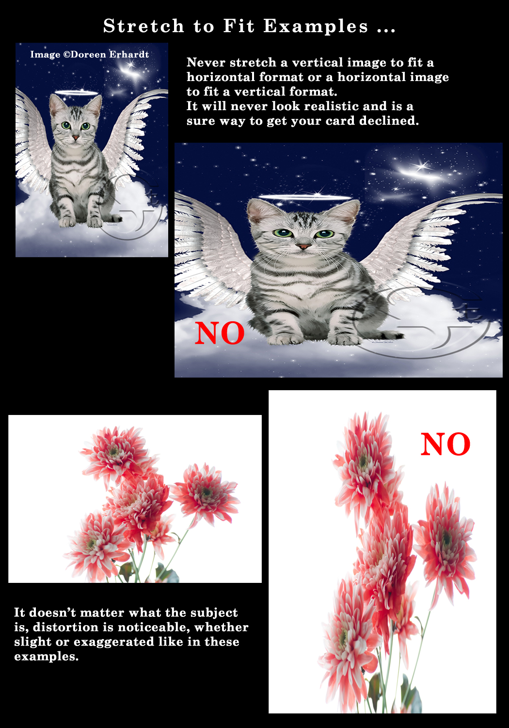
A Dash of Inspiration, A Cup of Creativity by Doreen
Composition: Framing/Alignment
Let’s keep this series going with the fifth area in the COMPOSITION grouping of the Submission Guidelines which is:
COMPOSITION: Framing/Alignment
The Submission Guidelines state this:
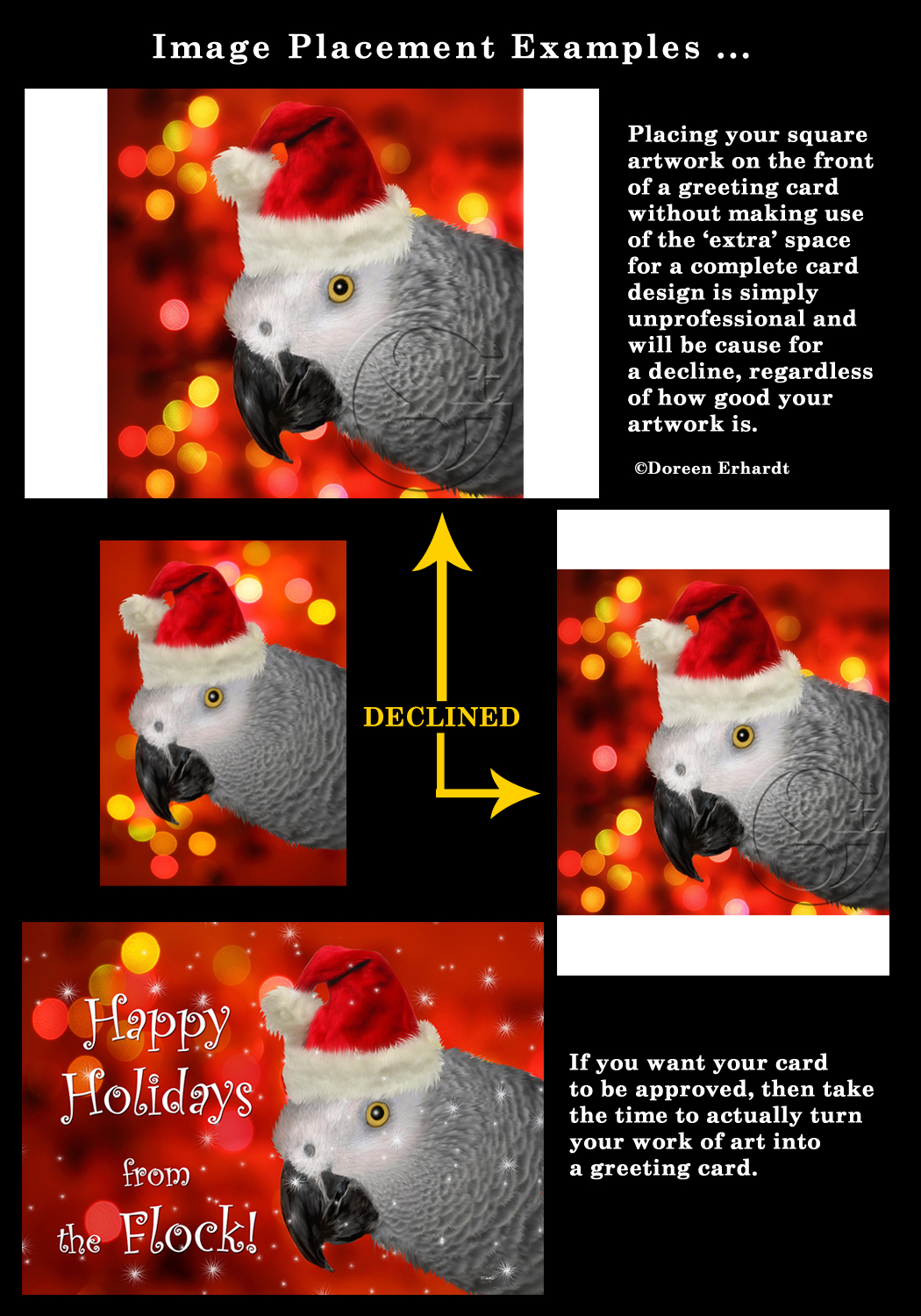
Care should be taken when adding a framed element to an image as well as when adding art to a card front. The format is 5×7 or 7×5 with a 1/4-inch trim line. When adding art to a greeting card front, the completed card must have a feeling of intention in the design. Declines may include, but are not limited to: slapping a square piece of art on a rectangle card surface, odd or unappealing frame techniques or matting such as ovals, poor alignment of the image so that the edges of the card are not evenly spaced, stretching an image as a method to re-size, etc.
So let’s talk about Composition: Framing/Alignment
Image Dimensions: Placing a square image on a rectangle card front without working to transform the image into a 5×7 card design just looks unprofessional, yet artists do it every day. Anytime an artist is going to put their imagery on a product, they absolutely MUST modify the image appropriately to fit the products dimensions. At GCU, this ‘slapping’ of artwork without modifications are no longer acceptable. Here are some visual examples of these types of declines:
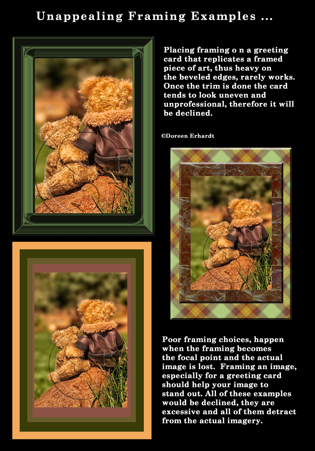
Unappealing Framing Techniques: We’ve discussed the unsightly use of beveled edges before. Beveling, when used with a light hand is perfectly acceptable for some uses, however framing your image on a greeting card with a large thick beveled frame is rarely appealing. Other framing techniques that are considered unappealing would be anything that makes the framing become the focal point rather then enhancing the imagery. Layer upon layer of borders could be considered poor technique as well. Look at these examples:
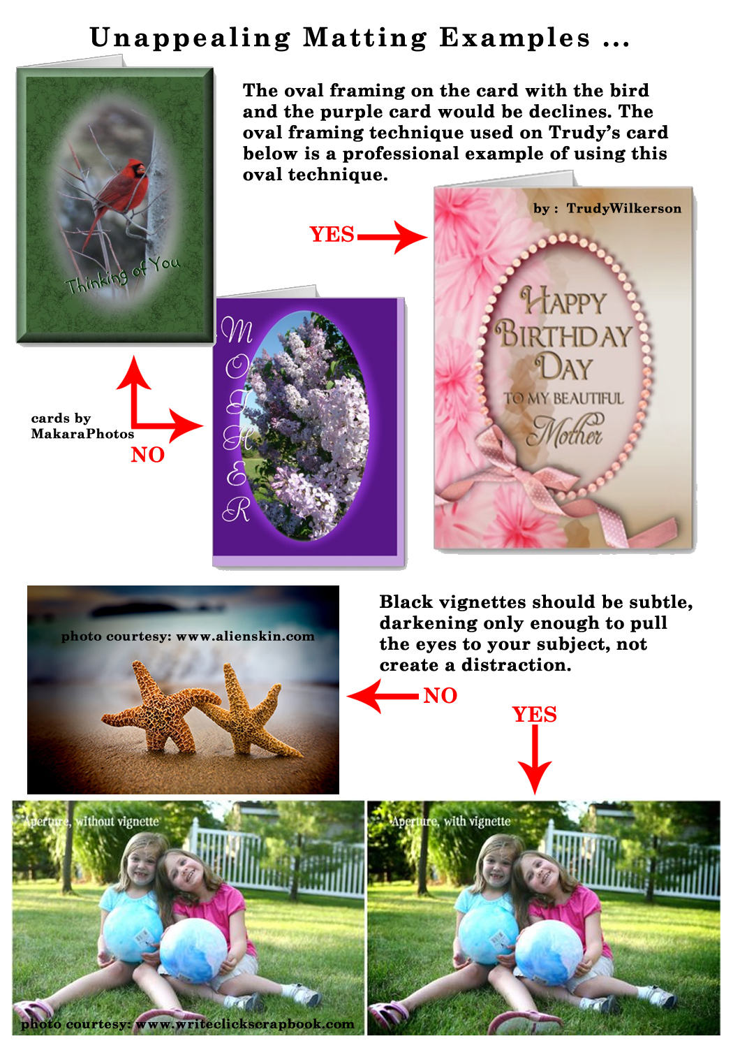
Unappealing Matting Techniques: As a general rule of thumb oval matting on a greeting card is out of date and not likely to be accepted by GCU. Oval frames are very old-fashioned, therefore an exception might be to use an elegant oval frame on a greeting card where you maintain the ‘vintage’ feel throughout the card design or when used to create a very feminine and simple design. In most cases though, oval framing just simply looks like you are trying to cover elements in a photograph that are otherwise distractions. It’s generally inappropriate for animal, landscape and masculine subjects. It can be an acceptable choice for Custom framing since it works sometimes, depending on the overall design for people portraits. Other unappealing matting techniques are unprofessionally applied vignettes. Look at these examples:
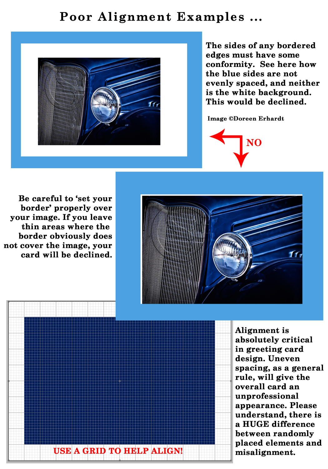
Unevenly Aligned Image: This has a commonality with the Balance of Elements segment. Just as text needs to have some alignment within the design, so do the edges of borders, framing, etc. This is simple to avoid, yet a common mistake that artists need to train their eyes to see. On greeting cards, the ‘alignment’ must look intentional and as a general rule of thumb, at least 3 of 4 sides must be evenly spaced. There are only rare exceptions where the 4th side being uneven looks appealing. A greeting card artist should be using an image creation tool that offers a Grid to lay over your image. This makes even spacing a breeze. Another common mistake that will cause a decline is not making your ‘frame/border’ cover the image equally leaving thin ’empty’ spaces on the card front.
Stretching an Image to Fit: This would seem something that need not be said, however I’m actually surprised how many images I run across on POD sites where people have actually taken a photograph/image and STRETCHED it to fit different dimensions. All I can say is DON’T EVER do that. Not only is it improper resizing, but it cause obvious distortion issues. If you need to change from a horizontal image to fit a vertical format or change a vertical image to fit a horizontal format, then do so via proper cropping and resizing methods.
Here is good reading material on this subject.
Next week we’ll have a quick refresher on Composition: Perspective since we’ve touched on this area before. We’ll then continue on to the next section of the Submission Guidelines: Typography in future installments of this series. Till next week, I hope I’ve inspired you to go look through your store and see if you can weed out any images that the reviewers will find during their weeding which might fit Composition: Framing/Alignment.
For great resources & tips visit the SalonOfArt


