Design Contest: Pot O’Gold – RESULTS


The voting is done and the winner is … Inkflo!
Just to remind everyone: I always include extra Bonus activities for artists to earn additional votes, which can make a real difference. Inkflo did all the extra activities, so earned the +19 votes up for grabs.
Inkflo, get in touch and let me know which prize you’d like to receive – a $10 Amazon.com gift certificate or 5 free card credits. The rest of you artists, get read for an Easter contest coming soon, and thanks for participating!
Share this:

Tips and Tricks: Basic Marketing


One aspect of making money from designing and selling your greeting cards is marketing. Don’t run away. Come back. This isn’t a scary topic, nor is it a dirty one. If you’re aiming to be a professional artist or photographer and/or greeting card designer, you will have to market yourself and your products.
In our digital age, on-line marketing has become paramount. Here are some basic tips to help you on the way to marketing your designs, bringing them to the attention of the buying public, and making more sales.
All of these basic marketing methods are geared toward improving your card’s rank in search engines and thus, it’s visibility. The quicker your card is picked up in searches, the quicker you’ll start selling.
Artist’s Notes: The first step is creating a product description in the Artist’s Notes field. This article on How to Write Product Descriptions and this article on Using the Artist’s Notes for Product Descriptions will help you if you’ve never done it before or need to brush up on your writing skills. Do you have to do this? You should. If not, your designs are pretty invisible to search engines and therefore, to shoppers.
Facebook: If you don’t have a Facebook fan page specifically for your art or photography, make one. If you don’t know how, here are some instructions on creating a FB fan page. Once you’ve done that, you can start posting links to new card designs. Get “likes” by asking friends and family, and by posting a request to other artists on the GCU Forum’s Artist Chatter topic board. You can try the Facebook Fan Page thread. Keep in mind, the more “likes” you get on a fan page, the more Facebook will include your posts in your fans feeds. When posting, keep it interesting, not just a sales pitch. Use a conversational voice like you would in your personal FB. Whatever you do, don’t spam. Limit yourself to no more than one or two posts per day maximum. You should be posting at least once a week.
Twitter: There’s nothing wrong with having a separate Twitter account solely for your art or photography projects and products if that’s what you choose to do. Some people like to separate business and personal. Other’s don’t. That’s up to you. You’ll need to use a service like Bitly to shorten URLs in your tweets. Rather than make tweets like “buy my cards pleeeeeeeze kthxby” try to make a little post either about the design, about how you felt when you made it, something relevant to the design – in other words, try to make your tweets interesting rather than just a sales pitch. And again, do not spam. There’s no quicker way to lose followers. Limit yourself to 1 or 2 tweets per day maximum, but make sure you tweet every day. Silence is a mood killer on Twitter.
Pinterest: Some people love it, some people hate it, but Pinterest is one of the biggest growing marketing tools out there. It’s true – the original link to the card you pin is only on your pin, BUT if someone else repins, a link pointing back to you and the original pin travels with it, so anyone can and will use that link to find the original pin and get the URL, ho worries. If you don’t want to get involved in Pinterest, that’s your choice. For those who do, creating boards and pinning your card designs is easy, fun, and yes, it does eventually help with sales by making your designs more visible.
Blogs: There are two ways of putting yourself out in the blogosphere – write your own blog or do guest posts on other people’s blogs. If you want to try your hand at blogging, our advice is not to just blog about your greeting cards. You won’t get much attention that way. Instead, write posts on topics you’re passionate about and include your greeting card designs as part of those posts. To make guest posts on other blogs, you’ll need to search out blogs relevant to your niche, start leaving good comments on their posts, and then ask the owner if you can do a guest post. Any artist can do a Design Spotlight or guest post on this Community blog at any time, even if you’ve done it in the past but want to highlight a new design – just drop me a note. You can also participate in Design Contests on this blog (I usually run a contest once a month). These are great opportunities for you to get a little promotion of new and old designs.
Web Pages: Lots of services out there like Squidoo, Weebly, Wix, etc., allow you to create specialty web pages on just about any topic. Create these individual web pages on topics relevant to your interests and/or niche card designs. Several GCU artists have had great success with this kind of promotion.
Forums: Suppose you like to hang out in a form for lovers of chihuahuas. You create some chihuahua based greeting card designs. What’s stopping you from promoting your new relevant designs to an audience tailor made for them? Some forums require you to ask before putting up commercial links – and if you aren’t sure, ask anyway as it’s only polite. Don’t just jump into a brand new forum where nobody knows you and start flogging your cards. You’ll be quickly banned. Instead, develop a relationship with people who share your passions. Then you’ll have that established relationship to help you when it’s time to do a little self promotion.
Comments: A lot of blogs and web pages offer guest books or comment boxes to their visitors. Find blogs or pages relevant to your passions and/or hobbies, or relevant to your card designs in some way. Leave comments on current posts. Make them good comments that are meaningful, not spam. Include your store URL as part of your signature, or links to promotional web pages of interest, which beings us to …
Signatures: Including your store URL or links to your promotional web pages, Facebook, Twitter, etc. in signatures you use for e-mail, Forum comments, blog comments, etc. is a very easy promotion method that helps spread the word about you and your products every time you participate in Internet activities.
Be Trendy: Keep an eye out for developing trends you can take advantage of with new card designs. Whether it’s this year’s most fashionable wedding schemes or popular fads in design, by incorporating trends into your cards AND bringing attention of that fact through your Artist’s Notes and other promotions, you stand a good chance of getting bumped up by search engines a lot faster. Search engines will give more weight to pages that speak to popular trends.
Bottom Line: Don’t go into this expecting instant results. You need to build yourself up with consistent effort. The work you do today will pay off a month, six months, or a year or two from now. But if you don’t start now, you won’t be able to enjoy the benefits later. Make your promotions relevant to the holiday, season, or niche that’s coming up.
Good luck!
Share this:

Dash of Inspiration: Sign of the Times
A Dash of Inspiration, A Cup of Creativity by Doreen
Sign of the Times

As some of you know, I do a far amount of promoting other artist’s cards on my fan page and various other sites, and in doing so I’ve noticed a couple things I thought worth mentioning.
When you put your copyright on your image front, here are some things to consider:
Never spell out copyright, not only is this unnecessary, it’s adding a lot of text to the front of your card that stands out and is rather unappealing to the consumer … I mention this because there are some of you who do this, in rather large text. For those who don’t know how to make the © symbol, here’s how:
PC Users: ALT+0169 (hold the ALT key down, leave it down and type in numeric 0169)
Mac Users: Simply enter Option + G
When you are adding your © to the front of a greeting card image, please consider that though creating greeting cards certainly is an art form, it is not nor is it expected to be by the consumer, a work of art. Painters and illustrators know how to add a whimsical signature to their artwork and this certainly is expected, however when was the last time you saw an obvious artist’s signature and copyright on a greeting card you purchased from one of the large greeting card publishing companies? Greeting cards for specific occasions and relations are different than fine art cards, they appeal to a different audience and quite frankly most customers don’t care who created it.
I know … you are adding it to protect your copyright, however you are much better off adding your © statement somewhere more difficult to see and more difficult to remove. From personal experience I had my obnoxious copyright statement on some old cards and I can tell you GCU is including these issues in their weeding efforts. Cards will most likely be returned to you for improvement … so I’m passing on the lesson learned.
When you put a signature on your greeting card fronts, I’m suggesting you take some things into consideration.
Your signature should be very small and hidden within the design whenever possible. If it sticks out like a sore thumb, you are likely limiting the card’s marketability and sales potential. Find a place where it will blend in and become part of the design. I’ve found there are some designs where it just isn’t possible to have it ‘blend in’, and those are the cases where I either don’t ‘sign’ the card front at all or if it’s an original painting or photograph of mine, I’ll add it to the lower corner fading it into the background.
Many of us start out adding a large proud signature to our card fronts, but on my older works (now being updated) I’ve had customers ask if they could get the card without the large copyright statement, or with it reduced due to it being such an ugly distraction. After all our Image By and store is on the back of the card. Trust me, those who feel impelled to steal your design, will do so regardless of your precautions. These people are like con artists, they know how to remove the ©, no matter how big and obnoxious it is. If you keep your original file that created the card, it has a date of creation and that goes a very long way to protecting you should there ever be a need. But … this is about marketability.
My other suggestions have to do with how you enter your Image By credits that not only show up under the thumbnail image, but also on the back of the card.
Many of you are not even bothering to use proper capitalization when entering your name or store name. You really should if you want to offer a professional appearance.
Some of you add your store URL rather than your business name and/or own name. Problem with that is it’s too long, gets truncated under the thumbnail and can mess with the alignment on the back of the card when it prints. Again, your storefront URL is on the back of the card and the link under each thumbnail takes the customer to your storefront, so there really isn’t any reason to do this.
I know that some of you will yell and scream at this advise, that’s okay. I’m only offering suggestions based on my own customer’s feedback from a few years ago and my own experience when browsing cards for promoting or purchasing … in other words … take it or leave it. Those who chose to take the advise, may very likely sell more cards at GCU.

Here’s an example of blending the © into the image. Hint: it’s in the tail.
See you next week for more inspiration! Now get to work on updating those old cards with better © statements!
Share this:

Critique Clinic – March 2-3, 2013

How does it work? For three days a week (Friday-Sunday midnight), I will open the clinic to any artist who wants an honest peer review and critique of a card which gets plenty of clicks but no sales, so something’s probably not quite right, or you’ve got a new design you want to test drive, or you’re unsure about the marketability of a card. Or perhaps you’re a newbie who isn’t sure if a card is up to a marketable standard. Anyone is welcome to participate. In fact, I encourage everyone to at least look at the cards in question and read the critique comments – you may learn something. The purpose of the clinic is to help artists improve the commercial appeal and marketability of their cards.
THE RULES
- ONE card per artist only.
- Card must be intended for sale at Greeting Card Universe.
- To submit a card for critique, post a link to the card at GCU in the comments section of this clinic post. Allowances will be made if you’ve had a card declined, or made a new design you’d like advice on before submission. Give us the link where we can see the card, such as your private gallery, Flickr, Tinypic, etc. If you do give a private gallery link, be sure your private module gallery is ON. Please do not post links to your Manage Cards section – do you really want strangers tinkering with your cards? And please don’t ask us to critique a card that’s pending review – we can’t see it until it’s approved.
- Any artist is free to comment and/or give a critique of a submitted card. HOWEVER, post-and-run comments like “great card” or “you suck” will not be tolerated, nor will abuse. Criticism should be constructive, not destructive. Play nice or you will be banned.
- I also won’t tolerate temper tantrums if you decide your “artistic integrity” is being stepped on because you asked for a critique, and someone told you the photo you’re using isn’t in focus. If you can’t take honest criticism, don’t submit. Once gets you a warning; twice and you’re banned from submitting in the future.
- Artists who critique may do so by giving their opinion, posting an example of another card, or pointing the submitter to a video, on-line article, or other helpful suggestion.
- Don’t forget that artists who are giving you tips and helpful advice are volunteering their time and trouble. Be nice. A link back to their store on your website or blog is appreciated (but not mandatory).
- You are free not to take any advice offered. There’s no guarantee any card will be a bestseller, so don’t come into the clinic with unrealistic expectations.
- Rules may change as we go along and we see how things turn out, okay?
So without any further ado, I declare this week’s Critique Clinic open!
Share this:

Design Spotlight: Jeff Bossler

Today’s Design Spotlight shines on Jeff Bossler of Alpine Seaside, who makes such lovely landscapes!
_________________________

My favorite card this month is a photo of Mt. Shuksan that I took last September on my birthday. This mountain has been my center of inspiration since childhood. Tooled with a brand new camera and the successful results of two eye operations, these things served as powerful reminders of the many great gifts that we are so blessed by, including the gift of sight and a landscape which speaks the language of beauty. What gives me great joy is the ability to share this with others. Also known as “Jeff Bush”, I have always strived to reflect an inspirational sense of “heightened reality.”
Born in eastern Pennsylvania, my non-stop daydreaming was always on the west coast. I moved west in the mid-1970s, working seasonal jobs including 7 years with the US Forest Service and various nursery, landscape, and agricultural jobs. During that 13 year period is when I accomplished most of the pen drawings and oil paintings you can find as greeting cards exclusively in my GCU store. I also just began my Alpine Seaside Landscapes prints and canvasses store at Society 6. My personal website is at alpineseaside.com.
Entrepreneur and father of two, I’ve worked and lived on Orcas Island in Washington State with my wife for the past 24 years. Now that the nest is empty, it’s time to re-enter my world of artistic expression again. As a “traditional artist” who remembers black and white TV, I am very excited by today’s tools of creativity and the marketing available today. GCU for me is a journey into a new world of creative challenges and fascinating possibilities.
One such challenge is the “return for edits” process. Once dreading it, I’ve come to realize this exercise works to strengthen an area of my mind which, as with many “artists”, gets little or no attention, but is essential to marketing success. In this and several other ways, GCU functions to stimulate curiosity and a sense of personal adventure for which I am thankful.
Share this:

Design Contest: Pot O’ Gold – TIME TO VOTE!

The day has arrived and it’s time to vote for your favorite St. Patrick’s Day card! Below you’ll find thumbnail images of the nominees (click on an image for larger view). One vote per person, please. Nominated artists, be sure to promote voting on your social media like Facebook and Twitter – every vote counts! Rally your family and friends.
Voting will continue until March 5. On March 6, I’ll announce the winner. Good luck and happy voting!
_________________________
1.  2.
2.  3.
3. 
4.  5.
5. 
6. 
7.  8.
8.  9.
9. 
Share this:

Tips and Tricks: Birthday on Holiday

When we’re talking “holiday” here, we mean ALL holidays – from New Year’s Day to Halloween and beyond. Some artists create a holiday design and make a relationship specific series. Others can’t stand the thought of mind numbing repetition so use a design only once. Well, no matter what path you choose to take in your craft, consider including one extra design while you’re creating – Birthdays on holidays.
It’s not uncommon for folks to have a birthday that coincides with a holiday. Remember a kid in class who had the incredible misfortune to be born on or around Christmas time? Yikes!
Well, even if you shun multiple uses for a design, you really should consider adding at least one birthday card to each holiday you’ve created cards for. If you’ve made a series speaking to a specific relationship or occupation, great – don’t forget to make an extra birthday card. It’s not that much extra work and you will reap the benefits. Cards like this sell over and over again. Just be sure to keep to the theme.
Share this:

Dash of Inspiration: Diaries of a Fontaholic, Part 4 (Final)
A Dash of Inspiration, A Cup of Creativity by Doreen
Diaries of a Fontaholic, Part 4 (Final)
Welcome to the Season Finale of ‘Diaries of a Fontaholic’. In today’s segment I’ll share some font tips that can make the difference between a professional greeting card, and a greeting card which looks amateurish … based solely on your choice of font and placement. We’ve chatted before about placement, kerning, etc., so be sure to check out the links below if you are new to the GCU Community Blog for more about fonts.
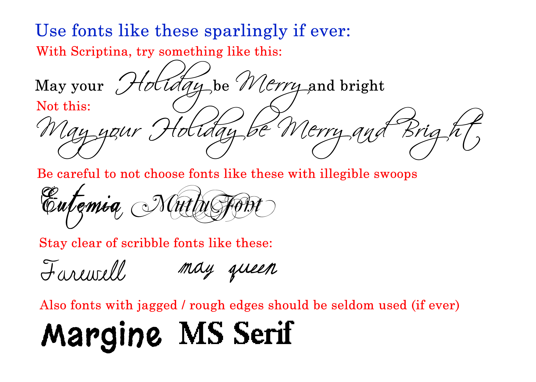
I know many of you are in love with the Scriptina font, and it has it’s uses, but it is one of those which falls into the ‘Use Sparingly’ category. Here’s why … Scrptina is a very ‘loose’ font, with sporadic kerning, so depending on the word(s) it can look terrific or horrible. This is a font best used for the ‘accent’ word on your image and best when combined with a font from what I called in previous posts, a ‘Companion Font’ such as; the Century Font Family.
Most of the ‘Specialty Use’ fonts I introduced last week and those like it, also fall into the use sparingly category. These types of fonts should be ACCENT fonts, not used on all the text. Remember, less is more when it comes to ‘bells and whistles’. Here’s an example of what I mean as an ‘accent font’ rather than using it for all the words on the card design.

We spoke in Diaries of a Fontaholic Part 2 about not using Comic Sans on the front of your cards and I offered many terrific alternatives for humorous card designs. So, check out that post to grab those replacement fonts.
I realize it’s easy to be drawn to those fonts with extra swoops and swirls, but in general fonts like Mutlu and Eutemia are just not legible, and so easily over-done, that even one word on a card front can often make the card go from fantastic to barely average. So be careful. These are the fonts where the swirls continue through every letter, both upper and lower case.
There are also many cards on GCU where artists have chosen to use scribbled fonts. These are rarely (if ever) a good choice, as they are unprofessional and most often not legible. A couple exceptions do exist, where a little of these fonts might apply in small doses, but the many on GCU are using this type of font in place of a script font and it just does not work.
Fonts which have jagged edges or rough edges should also be left behind. These types of fonts often give the appearance of resolution issues in your imagery. One exception is using the Eraser font (offered on Diaries of a Fontaholic Part 3) on a chalkboard, that’s a use where once expects to see that type of ‘chalky edge’.
Here are some links to related articles, if you missed them, you might want to tune in:
Nuts & Bolts Front of Card Text
Hope you enjoyed the Finale of Diaries of a Fontaholic … See you next week for more inspiration! Now get to work on updating those old cards with better font choices!
Share this:

Critique Clinic – February 22-24, 2013
How does it work? For three days a week (Friday-Sunday midnight), I will open the clinic to any artist who wants an honest peer review and critique of a card which gets plenty of clicks but no sales, so something’s probably not quite right, or you’ve got a new design you want to test drive, or you’re unsure about the marketability of a card. Or perhaps you’re a newbie who isn’t sure if a card is up to a marketable standard. Anyone is welcome to participate. In fact, I encourage everyone to at least look at the cards in question and read the critique comments – you may learn something. The purpose of the clinic is to help artists improve the commercial appeal and marketability of their cards.
THE RULES
- ONE card per artist only.
- Card must be intended for sale at Greeting Card Universe.
- To submit a card for critique, post a link to the card at GCU in the comments section of this clinic post. Allowances will be made if you’ve had a card declined, or made a new design you’d like advice on before submission. Give us the link where we can see the card, such as your private gallery, Flickr, Tinypic, etc. If you do give a private gallery link, be sure your private module gallery is ON. Please do not post links to your Manage Cards section – do you really want strangers tinkering with your cards? And please don’t ask us to critique a card that’s pending review – we can’t see it until it’s approved.
- Any artist is free to comment and/or give a critique of a submitted card. HOWEVER, post-and-run comments like “great card” or “you suck” will not be tolerated, nor will abuse. Criticism should be constructive, not destructive. Play nice or you will be banned.
- I also won’t tolerate temper tantrums if you decide your “artistic integrity” is being stepped on because you asked for a critique, and someone told you the photo you’re using isn’t in focus. If you can’t take honest criticism, don’t submit. Once gets you a warning; twice and you’re banned from submitting in the future.
- Artists who critique may do so by giving their opinion, posting an example of another card, or pointing the submitter to a video, on-line article, or other helpful suggestion.
- Don’t forget that artists who are giving you tips and helpful advice are volunteering their time and trouble. Be nice. A link back to their store on your website or blog is appreciated (but not mandatory).
- You are free not to take any advice offered. There’s no guarantee any card will be a bestseller, so don’t come into the clinic with unrealistic expectations.
- Rules may change as we go along and we see how things turn out, okay?
So without any further ado, I declare this week’s Critique Clinic open!
Share this:

Rainbow Connection: Another Color Palettes Resource

From the Big Fat Indian Wedding blog comes a terrific color palette resource, Color Palette Monday. Artists seeking inspiration and new colors to try in their designs should definitely check it out.


