Inspiration Station: Mom and Dad

Mother’s Day (May 12) and Father’s Day (May 12) and Father’s Day (June 16) are approaching. These are great card giving holidays, and every artist should ensure they’re represented in the categories. If you’re looking for inspiration for new designs, try Pinterest – you’ll find lots of boards and individual pins to give you plenty of food for thought.
![]()
Mother’s Day Cards
A variety of greeting cards to get those ideas bubbling.
Mother’s Day
Colors, textures, pretty things, and loads of inspiration to be found here.
Mother’s Day Boards
Each board contains plenty of goodies to get your creative juices flowing.
Father’s Day Cards
Fun stuff here, lots of designs to help you generate ideas.
Father’s Day Boards
Each board contains inspiring pins and plenty of ’em.
Don’t forget that modern Mother’s Day and Father’s Day isn’t just about moms and dads. Artists should also be designing cards for other family relations like uncle, sister, brother, aunt, etc. Be sure your design is as relevant as the verse. And speaking of verse, here are some places to go for text inspiration.
Mother’s Day Quotes and Sentiments
What do you write in a greeting card to Mom?
Father’s Day Quotes and Sentiments
What do you write in a greeting card for Dad?
Now armed with loads of inspiration, all you have to do is create! 🙂
Share this:

Dash of Inspiration: Diaries of a Fontaholic, Part 1
A Dash of Inspiration, A Cup of Creativity by Doreen
Diaries of a Fontaholic, Part 1
 Hello … My name is Doreen Erhardt … and I’m a Fontaholic … all laughing aside, I really am, and I know some of you are too.
This past week, it was time to go through my fonts and remove those which really aren’t appropriate for greeting card designs, add some new found treasures and in general do some font clean-up; making my card creation easier. That gave me the idea to pass along my ‘current’ list of favorite fonts; as well as some ‘specialty fonts’ and a few tips.
So, this will be a Three-Part series, introducing you to over 30 great font choices; all of which are okay for commercial use, most of which are free to download.
Pt-1: My 10 Favorite Script Fonts plus My 6 Favorite ‘Companion’ Fonts; Pt-2: My 7 Favorite Hand-Written Causal Fonts plus My 6 Favorite Comic-Sans Replacement Fonts; and Pt-3: Fonts to avoid and those which require a ‘light touch’, plus some fun ‘specialty’ fonts for occasional use.
Here we go … This first set of fonts are my favorite script fonts. They are very legible, great for both casual and semi-casual uses such as; Birthday’s, Mother’s Day, Sweet 16 etc. and they all have a professional feel to them when well placed within a design. Though some of these would work well for Weddings, I consider this area to be a ‘specialty’ font category, so I’ll share more elegant script fonts in Part 3.
In order to make things a bit easier for our dear Corrie who actually does the official posting on the blog, I’ve grouped the fonts, therefore offering fewer links. All you need to do is copy the font name and paste it into the search feature on the home page of the links provided in the groupings. When the font name shows up, click on that and you will be taken to the download page for that font, where it also show the license. 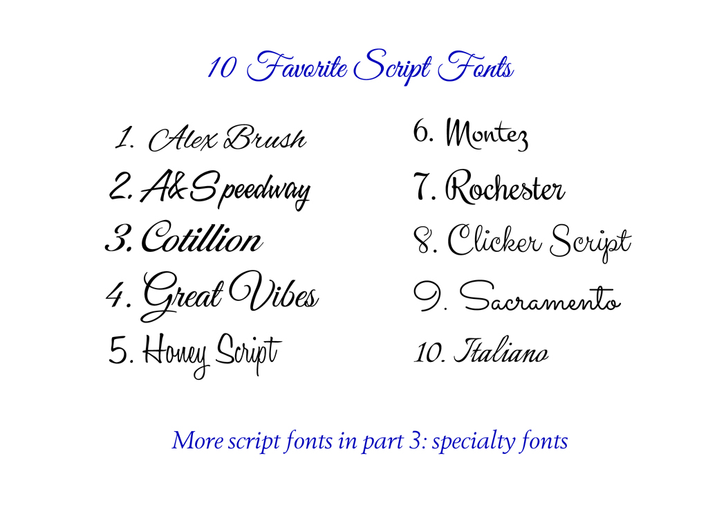 Alex Brush
Great Vibes
Rochester
Italianno
These 4 fonts can all be downloaded for free at FontSquirrel.com
Honey Script
Montez
Sacramento
Font Clicker Script Regular
These 4 fonts can all be downloaded for free (some would like a donation) at 1001Fonts.com
A&S Speedway can be purchased here.
Cotillion Script is indicated as Freeware, I received it as part of a CU package that was a gift, you may download it from Ffonts.net, do some more research I was not able to quickly find any license info.
Okay, this next group is what I like to call my ‘Companion’ fonts or ‘business’ fonts. These are cap-fonts in a variety of ‘styles’ which are great for combining with the script fonts so that you don’t overdo the use of a script font (which is easy to do). You want to choose companion fonts that are very legible in small print. In addition to this group, I also use some standards which most of us have; the Century Family, Garamond Family, Copperplate etc.  Bebas Neue
Stint Ultra Condensed
Font Six Caps Font
Engebrechtre Font Family
Marcellus SC Font
These 5 fonts can all be downloaded for free from 1001Fonts.com
You can purchase Felix Titling from MyFonts.com
Hope you enjoyed this installment of Diaries of a Fontaholic … See you next week for some wonderful hand-written and cartoon fonts!
Share this:

Critique Clinic – February 1-3, 2013

How does it work? For three days a week (Friday-Sunday midnight), I will open the clinic to any artist who wants an honest peer review and critique of a card which gets plenty of clicks but no sales, so something’s probably not quite right, or you’ve got a new design you want to test drive, or you’re unsure about the marketability of a card. Or perhaps you’re a newbie who isn’t sure if a card is up to a marketable standard. Anyone is welcome to participate. In fact, I encourage everyone to at least look at the cards in question and read the critique comments – you may learn something. The purpose of the clinic is to help artists improve the commercial appeal and marketability of their cards.
THE RULES
- ONE card per artist only.
- Card must be intended for sale at Greeting Card Universe.
- To submit a card for critique, post a link to the card at GCU in the comments section of this clinic post. Allowances will be made if you’ve had a card declined, or made a new design you’d like advice on before submission. Give us the link where we can see the card, such as your private gallery, Flickr, Tinypic, etc. If you do give a private gallery link, be sure your private module gallery is ON. Please do not post links to your Manage Cards section – do you really want strangers tinkering with your cards? And please don’t ask us to critique a card that’s pending review – we can’t see it until it’s approved.
- Any artist is free to comment and/or give a critique of a submitted card. HOWEVER, post-and-run comments like “great card” or “you suck” will not be tolerated, nor will abuse. Criticism should be constructive, not destructive. Play nice or you will be banned.
- I also won’t tolerate temper tantrums if you decide your “artistic integrity” is being stepped on because you asked for a critique, and someone told you the photo you’re using isn’t in focus. If you can’t take honest criticism, don’t submit. Once gets you a warning; twice and you’re banned from submitting in the future.
- Artists who critique may do so by giving their opinion, posting an example of another card, or pointing the submitter to a video, on-line article, or other helpful suggestion.
- Don’t forget that artists who are giving you tips and helpful advice are volunteering their time and trouble. Be nice. A link back to their store on your website or blog is appreciated (but not mandatory).
- You are free not to take any advice offered. There’s no guarantee any card will be a bestseller, so don’t come into the clinic with unrealistic expectations.
- Rules may change as we go along and we see how things turn out, okay?
So without any further ado, I declare this week’s Critique Clinic open!
Share this:

Nuts and Bolts: How to Write Greeting Card Verse

It’s not just the picture on the front of the greeting card that sells it – the message inside the card is usually the deal clincher or the deal breaker. Some shoppers prefer blank cards. The majority buy cards whose verses reflect their own feelings and emotions, and send the exact message they want to convey to the recipient.
Creating the perfect verse to go with your fabulous design isn’t easy for everyone, so here are some tips to help you craft an attractive message.
In General
- When writing greeting card verse – and by verse, I don’t mean poems exclusively, I’m simply referring to the text outside/inside the card – make sure what you write is appropriate to the occasion and the overall “feel” of the card. Study the front image. What does it say to you?
- When you’re starting to write, don’t get too hung up on grammar, spelling, etc. Just jot down your thoughts. Play around with ideas. Think about the occasion and the intended recipient. Is the card supposed to make the recipient laugh? Smile? Catch their breath? Feel better? Always keep the recipient in mind.
- Use ordinary language and a conversational style (unless you’re designing for very formal occasions such as wedding announcements). Shoppers prefer a down-to-earth voice to a forced or awkward formality.
- Stick to the point and get your message across without rambling or getting off topic.
- When you think your verse is ready, read it aloud. Here’s where you’ll catch clumsy phrasing, incorrect grammar, and phrases that just don’t sound right.
- If possible, read the verse to a friend or family member who will give you an honest assessment.
- Put yourself in the shopper’s place. If you were standing at a card rack in a shop, would you pick up this card? If you looked at the inside verse, would you be tempted to buy?
- Make certain to correct all spelling and grammar mistakes BEFORE submitting the card for review.
The Three P’s
There are three types of greeting card verse: Poetry, Prose, and Punchline.
Poetry: Rhymed, metered verse. See an example below. While poetry in greeting cards has fallen somewhat out of fashion these days, there are still shoppers who find sentimental or comic poetry appealing. Consider the theme of your design. What message would a shopper want to send to a recipient? In the example below, the theme is “reconciliation.” Both the image and the verse beautifully reflect that theme.

Silly me, silly you, what the heck did we both do? Wanna take another chance and rekindle our romance? (Inside Verse: I’m ready to kiss and make up … are you?)
Prose: Not rhymed. A written message meant to reflect the shopper’s feelings and thoughts. This type of verse is preferred by many shoppers. In the example below, the artist has created the verse as if the shopper were speaking directly to the recipient, sharing feelings of sympathy at the loss of a loved one. Consider the occasion your card is intended to address. What would you say to someone at such a time? Speaking from the heart is always a winner.

Inside Verse: I know for certain that we never lose the people we love, even to death. They continue to participate in every act, thought and decision we make. Their love leaves an indelible imprint in our memories. We find comfort in knowing that our lives have been enriched by having shared their love.
Punchline: Humorous verse, often with the the joke set up on the outside of the card, and the punchline delivered on the inside (though not always). See the example below. Obviously, the purpose of humorous cards is to make both shopper and recipient laugh. Consider how best to accomplish this goal with your design. Is there a play on words you can make? Some way to add zing to your visual joke? Try not to be too corny unless designing cards for younger children.

Inside Verse: So eat a whole cake, a whole gallon of ice cream, and have yourself a happy birthday!
I’m sure you can find many, many more examples of these three types of verses.
Don’t settle for generic, ho hum verses that could be found on any old card. Make your cards stand out. Be unique. Use your personal voice and your creativity to set yourself apart from the crowd. Write verses that are relevant to your design, appealing, and heartfelt, and your sales will soar!
Share this:

Font Frenzy: Plebeya on sale!

If you’re designing cards and you need a very nice cursive font that’s suitable for formal and semi-formal designs, look no further than Plebeya, a beautiful font for fancy work. The PRO version includes all the ligatures and swashes to make beautiful text, and is on sale for $17.99. The regular or swash caps versions are only $8.99 each. The sale ends on February 9, so I wouldn’t wait too long to pick up one – or two – if I were you!

Share this:

Nuts and Bolts: The Devil’s in the Details, Part II
A while back, I made a post showing how the tiniest visual detail can make or break a card design. Now I’m going to talk about the inside verse.
As most card designers know, shoppers are attracted by the image on the front of the card, but buy it because of the inside verse. It’s true. How many times have you seen people standing at a card rack, pulling out cards, looking inside, and putting them back? How many times have you done that yourself, looking for the perfect expression of your feelings?
Even a small tweak of a verse can make a very big difference. Here’s an example:  The design is by artist Janice Matson.
When she originally submitted the card to GCU, the inner verse read: “Hope your day is filled with your favorite things!”
The reviewer made a suggestion: “The expression on this little guys face begs an inside verse that matches as he looks a little surprised. If you’d like to work on a creative verse and resubmit we are happy to rereview.”
The end result: “You didn’t think I’d remember, did you? Hope your day is filled with your favorite things!”
The modified verse has more appeal to shoppers looking for that special card. Keep in mind while you’re designing your latest masterpiece – don’t automatically reach for a generic verse. Be creative. Think about what message shoppers might look for and put your imagination to work.
You don’t have to use rhymed, metered verse. That’s a myth. Today’s shoppers are looking for messages from the heart. To learn more, check out a previous Nuts and Bolts post about inside verse.
We’ve seen it ourselves in sales figures – customers love to buy cards expressing a special sentiments.
Share this:

Dash of Inspiration: Class of 2013
A Dash of Inspiration, A Cup of Creativity by Doreen
Class of 2013
It’s definitely time to update those 2012 Graduation Cards or you’ll be missing sales! I’ve already had 2013 Graduation Invitation sales.
Here’s a great tip: Even if you’re designs have the year as Custom Text, if you used a year that has gone by, take the time to update those cards. Any card that is out of date will be ignored by a large percentage of customers. I tend to use 2020 when designing custom text because customers immediately comprehend they can change the custom text since 2020 is in the future.
I’m a fan of gaining design inspiration from sites that ‘specialize’. Of course you should never copy a design layout, but I get many ‘wow’ moments looking for ‘techniques’, color palettes and how textures/patterns are mixed. So here are a couple places you might be inspired by …
Here are some links to visit for goodies to help you create new Graduation cards
Hi-Res Graduation Clipart from Etsy
Graduation Fonts from FontSpace (READ individual TOU!)
Set of 4 Digital Scrapbook Papers 12×12 – Graduation by desertheatdesigns
Graduation Sketches Brushes by ObsidianDawn at deviantART (READ her TOU!)
COLOURlovers Graduation Color Palettes
Remember when you are in ‘Graduation Creation Mode’ that there are graduations year-around in specific academic fields. Here is an interesting link to colors associated with specific areas of eduction.
The Colors of Your College Degree from ColourLovers.com
Okay, off you go to update those Graduation cards for the 2013 season! … See you next week!

Share this:

Critique Clinic – January 25-28, 2013
How does it work? For three days a week (Friday-Sunday midnight), I will open the clinic to any artist who wants an honest peer review and critique of a card which gets plenty of clicks but no sales, so something’s probably not quite right, or you’ve got a new design you want to test drive, or you’re unsure about the marketability of a card. Or perhaps you’re a newbie who isn’t sure if a card is up to a marketable standard. Anyone is welcome to participate. In fact, I encourage everyone to at least look at the cards in question and read the critique comments – you may learn something. The purpose of the clinic is to help artists improve the commercial appeal and marketability of their cards.
THE RULES
- ONE card per artist only.
- Card must be intended for sale at Greeting Card Universe.
- We will take an unlimited number of artists, including those who have submitted recently, HOWEVER I reserve the right to close a clinic for the day if the submissions become overwhelming. If the clinic has been closed, and you submit a card, your comment will be deleted.
- To submit a card for critique, post a link to the card at GCU in the comments section of this clinic post. Allowances will be made if you’ve had a card declined, or made a new design you’d like advice on. Give us the link where we can see the card, such as your private gallery, Flickr, Tinypic, etc.
- Any artist is free to comment and/or give a critique of a submitted card. HOWEVER, post-and-run comments like “great card” or “you suck” will not be tolerated, nor will abuse. Criticism should be constructive, not destructive. Play nice or you will be banned.
- I also won’t tolerate temper tantrums if you decide your “artistic integrity” is being stepped on because you asked for a critique, and someone told you the photo you’re using isn’t in focus. If you can’t take honest criticism, don’t submit. Once gets you a warning; twice and you’re banned from submitting in the future.
- Artists who critique may do so by giving their opinion, posting an example of another card, or pointing the submitter to a video, on-line article, or other helpful suggestion.
- Don’t forget that artists who are giving you tips and helpful advice are volunteering their time and trouble. Be nice. A link back to their store on your website or blog is appreciated (but not mandatory).
- You are free not to take any advice offered. There’s no guarantee any card will be a bestseller, so don’t come into the clinic with unrealistic expectations.
- Rules may change as we go along and we see how things turn out, okay?
So without any further ado, I declare this week’s Critique Clinic open!
Share this:

Design Spotlight: Ron Kanfi

Today’s Design Spotlight shines on an artist with a unique and irreverent sense of humor: Ron Kanfi from NobleWorks. Visit his store to see more of his work.
_________________________

Greetings and salutations! My name is Ron Kanfi, and I have been addicted to creating and publishing funny cards since 1983. I’ve published thousands of cards over the years, and picked this (medically approved, of course) saint card perhaps for its controversial flair but also because this provides for the opportunity to plug one of my books, “Saint Misbehavin; Modern Day Saints You Never Heard Of” benevolently published by Running Press. St. Dude proudly graces the cover of this scholarly collection of updated, current and oh-so relevant modern-day saints (editor’s note to self: as opposed to Latter-Day Saints). Most of my saints and saintesses were born as greeting cards which originally had a gold leaf embossed trim, as does the book cover the interior pages (available for easy ordering on Amazon, I’m just sayin’ ).
Saint DUDE, shown above, is the best selling card, of course, and has been smoking hot going on 13 years, a Bar Mitzvah! Though the cards do not include them, the book incorporates each saint’s bio and life story, also known as a hagiography (I am told) and of course what qualified them, and only them, amongst so many other righteous applicants, to be sanctified.
I have blissfully created a whole bunch of controversial humor content over the years, however the Saints cards seem to have hit a unique nerve. Some Catholics, including devout church-going folks, find them heartwarming and amusing, while others find time in their busy lives to partake in letter-writing protest campaigns and organize boycotts. Well, it is (still) a free country the last I checked. To each his own. No one is forced to buy, read or like them. Bette Midler once said, and I paraphrase –‘ F them if they can’t take a joke’. As far as I can tell and can see from my perch on top of Mount Sin, is that laughter and humor are pretty much come as close as us mere mortals can get to what some might call “God”, be Her who she may. Sorry for that rant. I will now dismount the soap box now.
I have lived with MS, or Multiple Sclerosis, since 1990. You guessed it: clearly I have been punished by God , mainly for publishing the Saint Cards and perhaps a couple of other deeds. And here I thought She was busy with all those world peace shenanigans–who knew? However FYI, on most days W/we get along sort of okay, God and I. Particularly those days when I remember to laugh, or at least smile, and, lucky for me, humor is my job, so I am all set. None the less things get a little ugly at times, but hey, shit happens, even to incredible being like myself. I got really good at getting up off the ground when things get bumpy, grab my cane and cheerfully hobble over to the next bump, laughing the whole way.
To feel a little better about myself, and hopeful to redeem at least a couple of my many sins, I founded Live Without Limits in 2010. Oddly enough, I noticed that MS fundraiser events were more often than not revolved around a physical activity, kind of chillingly ironic, if you ask me. For example, the bicycle-ride fund raising event did not offer any serious accommodations or bikes suitable for people with MS to use, like adult tricycles. The idea behind Live Without Limits is to promote the concept and encourage particularly advocate organizations to take one extra step beyond the ADA, and for companies that rent bicycles to offer three-wheeled bicycles so people who have MS can participate along with their friends and family in their own fund raising events. Often people with MS often have trouble with balance and these bikes would offer the stability that they are missing from standard bikes. These bikes are also great for the elderly or people with many other disabilities. At the moment, we’re looking for sponsors, and, one day, would like to see these bikes being available across the country. Honk, if you think this idea rocks and you want to be a part of it!
And on a final note, I’d like to leave you with this little pearl of wisdom I learned from my Mommy, or was it the Mayans? I’m not quite sure. Anyway, the point is you need not worry too much about always finishing what you started; it’s not the end of the world, if you know what I mean.
Share this:

Design Contest: Have a Heart RESULTS


The voting is over and the results are in – Judy Adamson has won our Design Contest: Have a Heart! Congratulations! And thanks to all our participants for a great contest. We’ll have a new contest for you shortly. In the meantime, have fun designing those fabulous greeting cards!


