Rainbow Connection: Manly Color Schemes!

Did you know that most men’s favorite colors are brown, blue, and green? Okay, there’s no law against orange or pink, but there are some colors that are just considered more masculine. Since savvy artists are currently working on Father’s Day cards, and of course GCU has all kinds of categories and sub-categories for cards with male recipients, here are three manly color palettes that appeal to the boys. Have fun!

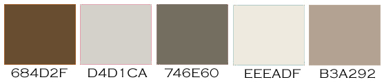

As always, these are RGB colors. I’ve given you the hex numbers to make it easy to use these colors in your favorite graphics editing program, or you can simply save the palettes to your own hard drive.
Share this:

Dash of Inspiration: Card Submission 101
A Dash of Inspiration, A Cup of Creativity by Doreen
Card Submission 101

We’ve had some great discussions on the forum for a ‘pre-review’, review of our cards in an effort to improve the review time and help us all become star submitters in the long-run … this gave me an idea. Though GCU has oodles of ‘how to’ tips and tutorials through the Wiki, GCU University and through the Community Blog, I found that we did not seem to have a ‘step by step’ guide to the actual submission process. Something that helped guide us to ensure we have crossed all our t’s and dotted all our i’s so to speak.
A second set of eyes is always a good thing when we are creating cards, but not always possible or convenient. However, with the right tool we artists should be able to do a good ‘self-review’ of our own card submissions prior to leaving them in the hands of the reviewers. Thus the creation of ‘Card Submissions 101’ … this step-by-step guide has received the thumbs-up from the GCU review staff, so you can rest assured that if you use this document as a reference when you are submitting cards, you will not only be well on your way to becoming a star submitter, but if we all use it, we will be saving a tremendous amount of time for the review staff … Ultimately a benefit to everyone by reducing the long review times.
I’ve created this as a PDF to be able to include text, visuals and links to the other tips and tutorials within each section for further answers when needed. This PDF is temporarily being hosted on a friend’s site, but I’m working with GCU to have them host the document so that you will be able to link to it and/or create a shortcut on your desktop. Please feel free to either print a copy for yourself.
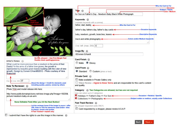
GCU Card Submissions 101 PDF Document (it may take a moment to load)
Now, nothing could be easier than submitting cards with 100% accuracy as long as your imagery meets the submission guidelines! … See you next week!
Share this:

Rainbow Connection: Color Palette Resource
Today we’re bringing you a fabulous resource of color palettes from Color/Moods, a French site. Don’t let that scare you! The color palettes are gorgeous and arranged by month. Below is an example of what you can expect from this beautiful archive. Have fun!

Share this:

Design Spotlight: Kate Taylor

Today’s Design Spotlight falls on Kate Taylor, who makes very sweet illustrations, indeed.
_________________________

Hi, I’m a freelance cartoonist /illustrator who works from home, which is in Yorkshire in the UK. My work has been used on many cards, calendars, in books and even animated for a children’s television series. I love to try and incorporate humour into my cards, and where possible, animals.
I particularly love drawing cats, but this favourite card from my civil partnership range, shows a happy couple arm in arm, standing with their devoted dog.
I love bright colours and hopefully my cards bring a smile to someone’s face.
In my spare time I like running marathons around the world. I’m not fast, but I like travelling, and as I run slowly, I get a good chance to look around and discover new places.
You can see more of my work at my website.
Best Wishes,
Kate

Share this:

Design Contest: Have a Heart – VOTE!

At last, the time has come to vote in our Design Contest: Have a Heart! Cast your vote for your favorite greeting card from the nominees below. If you’ve nominated a card, be sure to promote the voting on social media sites like Facebook, Twitter, etc. If you nominated another artist, suggest they participate in promotion with you. Every vote counts!
One vote per person, please. Voting will continue until January 22. The winner will be announced on January 23.
Good luck to all our nominees!
1.  2.
2.  3.
3. 
4.  5.
5.  6.
6. 
7.  8.
8.  9.
9. 
10.  11.
11.  12.
12. 
13.  14.
14.  15.
15. 
16.  17.
17.  18.
18. 
19.  20.
20.  21.
21. 
22.  23.
23.  24.
24. 
Share this:

Font Frenzy: Insolente

Insolente is a skinny cursive font with plenty of personality and includes ligatures as well as alternate character sets for those who work in Open Type. The font is versatile and works with formal as well as semi-formal designs. I know the alphabet looks a little weird, but trust me – go check it out and see for yourself how the letters connect together in such beautiful ways. Right now, Insolente is on sale for $7.50 – a bargain!

Share this:

Dash of Inspiration: Father’s Day Design Goodies
A Dash of Inspiration, A Cup of Creativity by Doreen
Father’s Day Design Goodies
If you aren’t already, you should be working on Father’s Day Cards to give your cards time to pass the review cycle and get indexed by search engines. Today I offer a few links to some fun goodies that will inspire you to think about Dad.
In order to have your cards stand out and be selected by customers, they should have a strong masculine feeling to them. Be creative, but use colors, themes, elements, fonts and verses appropriate for the recipient.
Curvy fonts, flowery imagery and cute baby animals are not appropriate for the ‘general’ shopper looking for a Father’s Day card. Think of what the men in your life enjoy, what they do in their spare time, the color choices they make, the shows they watch, what they like to collect or build … be inspired by them and you’ll make cards that sell!
Seamless Olive Green Patterns for Photoshop from WebTreats
Sportsmen Silhouettes Shape Preset from All-Silhouettes
Daddy Tie Font – Use this font sparingly!
Bubblegum Font from Font Squirrel – A nice alternative to the overly used Comic Sans
Dad Commercial Use Scrapbook Kits – Not Free, but very affordable!
Color Palettes for Men from Color Hunter
Working this far in advance will ensure that your Father’s Day Cards are in the market and ready when those shoppers come to visit … see you next week!

Share this:

Critique Clinic – January 10-12, 2013

How does it work? For three days a week (Friday-Sunday midnight), I will open the clinic to any artist who wants an honest peer review and critique of a card which gets plenty of clicks but no sales, so something’s probably not quite right, or you’ve got a new design you want to test drive, or you’re unsure about the marketability of a card. Or perhaps you’re a newbie who isn’t sure if a recently submitted card is up to a marketable standard. Anyone is welcome to participate. In fact, I encourage everyone to at least look at the cards in question and read the critique comments – you may learn something. The purpose of the clinic is to help artists improve the commercial appeal and marketability of their cards.
THE RULES
- ONE card per artist only.
- Card must be for sale at Greeting Card Universe.
- We will take an unlimited number of artists, including those who have submitted recently, HOWEVER I reserve the right to close a clinic for the day if the submissions become overwhelming. If the clinic has been closed, and you submit a card, your comment will be deleted.
- To submit a card for critique, post a link to the card at GCU in the comments section of this clinic post. Allowances will be made if you’ve had a card declined, or made a new design you’d like advice on. Give us the link where we can see the card, such as your private gallery, Flickr, Tinypic, etc.
- Any artist is free to comment and/or give a critique of a submitted card. HOWEVER, post-and-run comments like “great card” or “you suck” will not be tolerated, nor will abuse. Criticism should be constructive, not destructive. Play nice or you will be banned.
- I also won’t tolerate temper tantrums if you decide your “artistic integrity” is being stepped on because you asked for a critique, and someone told you the photo you’re using isn’t in focus. If you can’t take honest criticism, don’t submit. Once gets you a warning; twice and you’re banned from submitting in the future.
- Artists who critique may do so by giving their opinion, posting an example of another card, or pointing the submitter to a video, on-line article, or other helpful suggestion.
- Don’t forget that artists who are giving you tips and helpful advice are volunteering their time and trouble. Be nice. A link back to their store on your website or blog is appreciated (but not mandatory).
- You are free not to take any advice offered. There’s no guarantee any card will be a bestseller, so don’t come into the clinic with unrealistic expectations.
- Rules may change as we go along and we see how things turn out, okay?
So without any further ado, I declare this week’s Critique Clinic open!
Share this:

Rainbow Connection: Hot Wedding Colors 2013
January 1st has come and gone! We’re beginning a new year filled with exciting new colors and patterns. Two of the hottest color trends for weddings in 2013 are Greyed Jade and African Violet. Brides are pairing these sophisticated shades with white, cream and linen, soft yellow, and other complementary colors.
Bridal party invitations and wedding invitations continue to be best sellers, so it’s wise to offer trendy color schemes to brides looking for the latest fashions.
Don’t forget, what goes on in the world of weddings is reflected in the larger world of design. Use these colors for anniversary, birthday, or any grown-up greeting card to add a touch of trendiness.

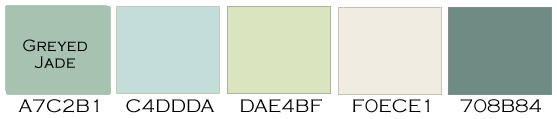
As always, these are RGB colors. I’ve given you the hex numbers to make it easy to use these colors in your favorite graphics editing program, or you can simply save the palettes to your own hard drive.
Share this:

Font Frenzy: Modern Poster on Sale!
Modern Poster has 8 fonts in its family. See a sample of one family below. This is a heavy font with some definite style to it, useful for when you want to create a design that requires bold typography to fill in space. Right now, the entire font family is just $5, so this is a very affordable addition to your font collection!
Have fun!