Tips and Tricks: Card Designer Checklist

Let’s face it, creating a gorgeous, wonderful, perfect card design is only half the battle. The other half is making sure you’ve done everything possible on your end to ensure no unnecessary delays during the card review process. Please don’t rely on the review team to point out your mistakes. That causes reviews to take longer and longer, and also leads to frustrating returns and declines.
Here’s a checklist of what you should be doing BEFORE you submit your cards for review.
Common Errors In Copyright
- If using third party elements, have you checked the terms of use? Is commercial use clearly permitted? Are there any restrictions on usage by commercial parties? If you’re not sure, don’t use it.
- If you believe an element is in the public domain, have you checked to be sure this is correct? Just because something is on-line, that doesn’t mean it’s free to use as you please.
- Are you using a copyrighted character (for example, Rudolph the Red Nosed Reindeer or Frosty the Snowman) anywhere on your card, or in the keywords, card title, or Artist’s Notes? If so, your card will be declined.
- Are you using a quote or work such as a poem written by someone else? Do you have permission? If you believe the work is in the public domain, have you double checked that it isn’t trademarked or under copyright?
- Are you using song lyrics in the title, keywords, inside verse, or keywords? That’s clear copyright violation unless you are the author of the song or have permission from the song’s creator.
- Have you taken photographs of a building, monument, structure, artwork, or statue? Have you checked to be sure the structure/art hasn’t been copyrighted or trademarked? For example, the Eiffel Tower can be photographed during the day without a problem, but once the structure is lit at night, it is trademarked by the City of Paris.
- Does your design include copyrighted/trademarked elements that are clearly identifiable (such as football team logo, make/model of automobile, corporate logo)? If so, your card will be declined.
Tip: Bottom line – if you didn’t create it yourself, double and triple check that it’s okay for you to use commercially. If there’s even the slightest doubt, don’t use it! See the section on Notes to Reviewers.
Spelling and Grammar
- Are all words spelled correctly and used properly? Beware of homonyms – words that sound the same but are spelled differently and may have different meanings.
- Is punctuation correct?
- Is grammar correct?
- Is holiday spelled/punctuated correctly? For example, Mother’s Day, not Mothers Day. Some holidays use the apostrophe, some don’t. Check the category at GCU to find out the preferred spelling.
Common Errors:
Your – Possession, as in “your baseball card collection.”
You’re – You are.
Its – Possession, as in “its baseball collection.”
It’s – It is.
Their – Possession, as in “their baseball collection.”
They’re – They are.
There – Location, as in “over there.”
Correct: “It’s your birthday today!”
Incorrect: “Its you’re birthday today!”
Tip: Read a contraction out loud. In the last example, if you read aloud, “Its you are birthday today,” you’d know immediately it was incorrect. If you read aloud the first example, “It is your birthday today,” you’d know it was right.
Card Design and Composition
- Are all elements and typography on the card within the safety margin?
- Does the font/typography suit the design and purpose of the card?
- Do design elements fit the purpose of the card?
- Is the composition balanced and pleasing to the eye?
- Does your design follow GCU’s submission guidelines?
- Is the photograph in focus? How’s the depth of field? Any distracting elements? How’s the lighting? Does it have the look of a professional photograph or a casual snapshot? See the submission guidelines!
- Have you included third party credits in the design? Are they unobtrusive and subtle? If you aren’t sure how to do this or when you should, read Doreen Erhardt’s Credit Where Credit Is Due.
Common Errors:
If elements are supposed to be centered, make sure they are actually in the center of the card.
Don’t confuse “cutting edge” design with plain old mistakes. Before you can break the rules of design, you have to have a basic understanding of those rules, and you also need plenty of experience as a greeting card designer.
Unprofessional looking photographs and snapshots – blurry, out of focus, red eye, etc. – should not be submitted at all.
Overly manipulated images are never acceptable. Use a light hand.
Tip: If you don’t think you need to read the submission guidelines, think again.
Card Title
- Are all words spelled correctly?
- Does card title address the purpose of the card? For example, “Happy Birthday Sister.”
- Does card title include some other unique description? If your birthday card features a pink flower, the title would be “Happy Birthday – Pink Flower.” Keep it concise but descriptive.
- Have you just used a string of words separated by commas as a card title? If so, that won’t do. Give your card a proper title or it may be returned.
Tip: If you were a shopper, would you find the card title attractive enough to click on it in a search so you can find out more? The card title plays a big role when it comes to being indexed by search engines and it’s the first thing shoppers see. If you want sales, you need to ensure your cards are looked at by shoppers, so give each card a good title.
Keywords
- Do all keywords reflect the card’s actual purpose? Like “happy birthday to my sister.”
- Have you included keywords describing the elements on your card? Like colors, patterns (stripes, polka dots, chevrons, etc), themes (old fashioned, contemporary, playful, etc).
- Have you included your name in the keywords? This is important for branding.
Tip: Use keyword phrases when possible, as search engines give a little more weight to unique keyword phrases. Example, instead of a string of words such as happy, birthday, sister – use happy birthday to my sister.
Category
- Have you chosen a category that fits your card literally and exactly? For example, if your card says, “Happy birthday, sister,” you’ll want to choose Birthday – Relationship Specific – Sister. If your card simply says, “Happy birthday,” you cannot put it in a specific relationship category.
- Is there a second category that fits your card literally and exactly?
- If there is not an exact match, have you posted in the Forum under Category Help or sent an e-mail to the review team and asked for a new category to be created? Do this BEFORE you submit the card!
Tip: Categorize your card only by what it actually is, not what what it could be. GCU accepts only very literal categorization. An image of a flower does not automatically mean the card can go into Mother’s Day and Birthday for Sister. If you’re designing a card and want to put it in Birthday – Relationship Specific Sister, your design must mention birthday AND sister somewhere on the card (inside or out) for it to go in that category.
Tip #2: Always design cards to suit a category, not the other way around.
Artist’s Notes
- Have you included a good product description that will entice shoppers to purchase your card?
- Does your product description include descriptive words and phrases that are unique to the card?
- Have you included third party credits as required by terms of use or licensing agreements (such as, “Photograph courtesy of Bob Jones.”)? Never include links to outside websites!
- If the card is in a foreign language, have you included an English translation in the Artist’s Notes?
Common Errors:
Never include links to other websites or stores, even if they’re your own. Never, never, never. If you want to promote your other POD shops, put those links in your store module – nowhere else.
Tip: Want to learn how to write product descriptions? Read this Nuts and Bolts article.
Notes to Reviewers
- Have you included all image source information such as links to the sources/terms of use or licensing agreements for all elements?
- If using elements – illustrations, photographs, poems, quotes, clip art – you believe are in the public domain, have you included proof of public domain status for the reviewers? Such as a link to a website stating the elements are public domain and free to use commercially. Be careful, as not everything old is fair game. For example, some translations of the Bible are trademarked.
- Do you have permission from the trademark/copyright holder to use their work? If so, state it here.
- If a person’s face is visible in a photograph, do you have a model release? Or the person’s permission (if it’s a relative or someone you know personally)? Include this information to avoid card returns.
- If elements are your own photographs/original illustrations, have you stated this fact? It’s especially important if, for example, you license your art with another company or your work is on-line elsewhere under a different name.
- When submitting a series of cards, has a card in this same series already been approved? Such as, you submitted a test card to find out if the design would be acceptable. If so, include the PID# of the approved card in your Notes to Reviewers to expedite reviews of the rest of the series.
Tip: Is there anything else you could explain that would help the reviewer expedite the card’s review? The more a reviewer has to research to find information on elements in your design, the longer the review will take.
The best overall tip I can give you is … READ THE SUBMISSION GUIDELINES (the GCU Wiki). Also read the various articles that have appeared on this blog on topic like those above. You’ll find lots and lots of tips here.
Armed with this checklist, you should be able to submit your cards with a much lighter heart, knowing you’ve done everything possible to ensure your designs go through the review process more smoothly and with less chance of returns and declines.
Share this:

Dash of Inspiration: Designer’s Schedule
A Dash of Inspiration, A Cup of Creativity by Doreen
Designer’s Schedule

There’s been a lot of discussion this past week on the lengthy review times at GCU. The Card Review Team offered some great tips on what would make the process quicker on their end, but as professional greeting card designers we should be working to the industry standard when planning our designs. If you’ve ever submitted to greeting card publishing houses, you know they only accept holiday specific designs certain times of year – usually anywhere from six-months to nine-months in advance of the occasion.
As a professional greeting card designer at GCU, you can not only reduce your own stress and frustration by designing well in advance of the holiday, but you need to understand lead-time and take that into consideration when you are planning your designs. I will be the first to admit it’s difficult to get into the spirit of Christmas in July, but if you wish to call yourself a professional designer … that’s exactly what you have to do.
Kate Harper once said this; “ You know you are a greeting card designer when you draw Easter eggs on Father’s Day.” That’s how far in advance that published greeting card artists work.
There is nothing wrong with creating Christmas designs while you are in the spirit of the Holiday Season, I do it all the time, but … you have very unrealistic expectations if you are creating them for that season’s market. Cards approved and in your store less than three-months before the buying season begins should be considered creations which will bring you sales the following year. Keep in mind the ‘buying season” for Christmas is not December, it’s September through November. You will certainly sell cards in December, but the season begins as early as August for bulk sales.
In addition to holidays, remember there are occasions that are time-sensitive. Wedding Season and Graduation Season, though they happen all-year-long, have peak seasons where the majority of the sales will come in.
Peak Wedding Season in much of the United States anyway, is May through July. Now add six-months lead-time to that for the bride to plan and make wedding purchases … that means you need to have new seasonal wedding cards / invitations uploaded, approved and in your store by November the previous year.
Peak Graduation Season is May through the end of June. You need to have your cards / invitations uploaded, approved and in your store by May 1st. So get your 2013 Graduation designs uploaded by the middle-end of March 2013.
The New Year is all about making changes for a better life, so do yourselves a favor and stop stressing over long review times and start planning ahead. I’ve created a brief (only a few major holidays) chart you can use to get started. This shows that your cards for these Holidays should be IN THE REVIEW CYCLE four-months ahead of the actual holiday … and keep in mind that is a MINIMUM time-frame.

Any artist is free to download and print this chart if they wish.
Now I’m off to make Father’s Day cards … see you next week!
Share this:

Critique Clinic – January 4-6, 2013

How does it work? For three days a week (Friday-Sunday midnight), I will open the clinic to any artist who wants an honest peer review and critique of a card which gets plenty of clicks but no sales, so something’s probably not quite right, or you’ve got a new design you want to test drive, or you’re unsure about the marketability of a card. Or perhaps you’re a newbie who isn’t sure if a recently submitted card is up to a marketable standard. Anyone is welcome to participate. In fact, I encourage everyone to at least look at the cards in question and read the critique comments – you may learn something. The purpose of the clinic is to help artists improve the commercial appeal and marketability of their cards.
THE RULES
- ONE card per artist only.
- Card must be for sale at Greeting Card Universe.
- We will take an unlimited number of artists, including those who have submitted recently, HOWEVER I reserve the right to close a clinic for the day if the submissions become overwhelming. If the clinic has been closed, and you submit a card, your comment will be deleted.
- To submit a card for critique, post a link to the card at GCU in the comments section of this clinic post. Allowances will be made if you’ve had a card declined, or made a new design you’d like advice on. Give us the link where we can see the card, such as your private gallery, Flickr, Tinypic, etc.
- Any artist is free to comment and/or give a critique of a submitted card. HOWEVER, post-and-run comments like “great card” or “you suck” will not be tolerated, nor will abuse. Criticism should be constructive, not destructive. Play nice or you will be banned.
- I also won’t tolerate temper tantrums if you decide your “artistic integrity” is being stepped on because you asked for a critique, and someone told you the photo you’re using isn’t in focus. If you can’t take honest criticism, don’t submit. Once gets you a warning; twice and you’re banned from submitting in the future.
- Artists who critique may do so by giving their opinion, posting an example of another card, or pointing the submitter to a video, on-line article, or other helpful suggestion.
- Don’t forget that artists who are giving you tips and helpful advice are volunteering their time and trouble. Be nice. A link back to their store on your website or blog is appreciated (but not mandatory).
- You are free not to take any advice offered. There’s no guarantee any card will be a bestseller, so don’t come into the clinic with unrealistic expectations.
- Rules may change as we go along and we see how things turn out, okay?
So without any further ado, I declare this week’s Critique Clinic open!
Share this:

Design Contest: Have a Heart


It’s a new year, so it’s time for a brand new Design Contest! We’re starting 2013 with Design Contest: Have a Heart whose theme is, of course, Valentine’s Day.
Just submit your Valentine’s Day card – any design you like – by leaving a comment on this post by January 10, 2013. On January 11, I’ll post the entries and open voting. The artist who receives the most votes will win a prize – either $10 at Amazon.com or 5 free card credits. Bonus votes are available – see below for details.
BONUS VOTES
- Pin 5 Valentine’s Day cards to a pinboard at Pinterest and receive 5 BONUS VOTES
- Nominate another artist’s design and receive 5 BONUS VOTES
- Make a blog post, post on a website, Squidoo lens, or other on-line page about Valentine’s Day or love/romance cards and receive 10 BONUS VOTES
Let’s get together and spread some LOVE around! Good luck to everyone.
Share this:

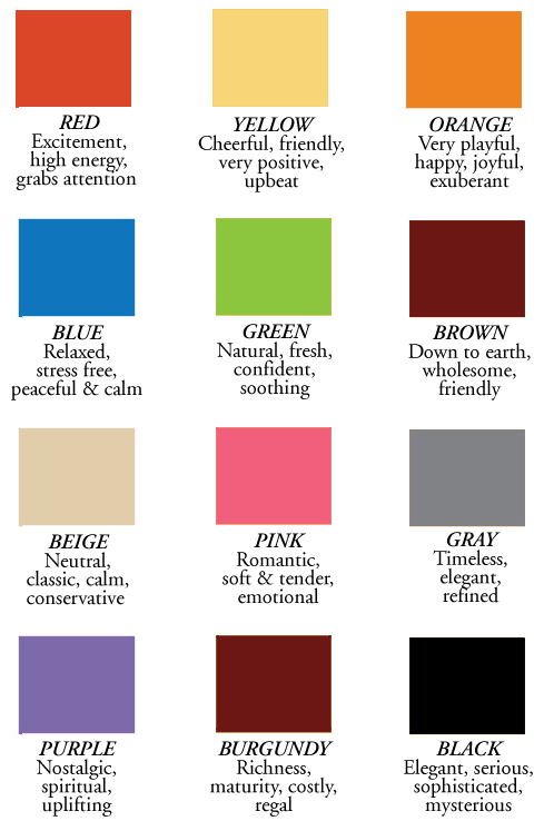
Rainbow Connection: What Your Color Choices Say

Rather than bring you a color palette or two today, I wanted to talk about color as a whole. Did you know the color choices you make in your designs can have an effect on a shopper’s decision to buy or not to buy?
For example, what color would you choose for a four year old girl’s birthday – black, lavender, or soft yellow? If you picked black or lavender, you probably won’t sell very many of these cards.
Below, you’ll find a brief chart outlining some of the meanings of basic colors that can influence shoppers. The colors you choose in your designs are just as important as the designs themselves, so I hope this will help you make appropriate choices for the message you’re trying to send.
Have fun!
Share this:

Dash of Inspiration: Out with 2012!
A Dash of Inspiration, A Cup of Creativity by Doreen
Out with 2012!
Since this will post on New Year’s Eve / New Year’s Day depending on where you are, we are keeping it short and sweet today …
2012 is officially over, so get your cards updated for 2013! I’ve already had requests and sales for 2013 graduation, so make the time to get it done early and be ready for those early-bird shoppers!
Here are some categories where you might find your cards in need update:
Graduation
Veterans Day
Invitations > Family Reunion Invitations
Mother’s Day & Father’s Day
Earth Day
May the New Year bring all of you happiness and the best year of sales yet!

Share this:

Critique Clinic – December 28-30, 2012
How does it work? For three days a week (Friday-Sunday midnight), I will open the clinic to any artist who wants an honest peer review and critique of a card which gets plenty of clicks but no sales, so something’s probably not quite right, or you’ve got a new design you want to test drive, or you’re unsure about the marketability of a card. Or perhaps you’re a newbie who isn’t sure if a recently submitted card is up to a marketable standard. Anyone is welcome to participate. In fact, I encourage everyone to at least look at the cards in question and read the critique comments – you may learn something. The purpose of the clinic is to help artists improve the commercial appeal and marketability of their cards.
THE RULES
- ONE card per artist only.
- Card must be for sale at Greeting Card Universe.
- We will take an unlimited number of artists, including those who have submitted recently, HOWEVER I reserve the right to close a clinic for the day if the submissions become overwhelming. If the clinic has been closed, and you submit a card, your comment will be deleted.
- To submit a card for critique, post a link to the card at GCU in the comments section of this clinic post. Allowances will be made if you’ve had a card declined, or made a new design you’d like advice on. Give us the link where we can see the card, such as your private gallery, Flickr, Tinypic, etc.
- Any artist is free to comment and/or give a critique of a submitted card. HOWEVER, post-and-run comments like “great card” or “you suck” will not be tolerated, nor will abuse. Criticism should be constructive, not destructive. Play nice or you will be banned.
- I also won’t tolerate temper tantrums if you decide your “artistic integrity” is being stepped on because you asked for a critique, and someone told you the photo you’re using isn’t in focus. If you can’t take honest criticism, don’t submit. Once gets you a warning; twice and you’re banned from submitting in the future.
- Artists who critique may do so by giving their opinion, posting an example of another card, or pointing the submitter to a video, on-line article, or other helpful suggestion.
- Don’t forget that artists who are giving you tips and helpful advice are volunteering their time and trouble. Be nice. A link back to their store on your website or blog is appreciated (but not mandatory).
- You are free not to take any advice offered. There’s no guarantee any card will be a bestseller, so don’t come into the clinic with unrealistic expectations.
- Rules may change as we go along and we see how things turn out, okay?
So without any further ado, I declare this week’s Critique Clinic open!
Share this:

Font Frenzy: Push Ups on Sale!

This font family is normally $10 apiece, but right now, you can buy them for $3 each or all three for $8.10, which is a totally cool deal! Push Ups is a casual handwriting font – two of the family are open face, meaning you can color them in if you like, and the third is solid. Great for any casual design or when you want to add a whimsical touch to cards.
Below you’ll find samples of each font in the family. Have fun!


Share this:

Tips and Tricks: Empty Categories – Wedding Anniversary

Most artists put their designs up on GCU hoping to make sales, however many neglect a very easy way of enticing shoppers to buy – creating cards for specialized categories that aren’t already bursting with other artists’ designs.
Some sub-categories under main categories are often neglected, leaving plenty of room for a clever designer to swoop in and grab that niche. Leverage your designs and make them work for you, and you’ll be rewarded. The trick is to identify the niche you want to design for and create more than one design. Make a couple or three. Keep track of sales. If your new niche cards prove popular, design more. This is a strategy we’ve used again and again, and it does work.
So today I’ll be pointing out some neglected sub-categories under the Wedding Anniversary category. What you do with the information is up to you. I’ll probably be doing this a little more often, focusing on empty/semi-empty categories just begging for freshly designed cards to capture those sales.
The number in parentheses indicates how many cards are in that category/sub-category. If a category has less than 50 cards in it, I consider that pretty empty, don’t you? These aren’t the only empty sub-categories under this main category, so be sure to check the full list of sub-categories on the GCU site.
EMPTY CATEGORIES – WEDDING ANNIVERSARY
Wedding Anniversary – Photo Cards/Your Picture Here (46)
Wedding Anniversary – Art Nouveau (0)
Wedding Anniversary – Beach/Coastal/Seaside (18)
Wedding Anniversary – Belated Wedding Anniversary (35)
Wedding Anniversary – Customize for Any Relation (0)
Wedding Anniversary – For Foster Parents (16)
Wedding Anniversary – For Goddaughter and Husband (13)
Wedding Anniversary – For Godson and Wife (9)
Wedding Anniversary – For Granddaughter and Husband (3)
Wedding Anniversary – For Grandson and Wife (5)
Wedding Anniversary – For Partner/Life Partner (27)
Wedding Anniversary – For Wife – From Pet (0)
Wedding Anniversary – In Remembrance Of (0)
Wedding Anniversary – Season Specific (19)
Share this:

Merry Christmas!

Wishing everyone a very Merry Christmas
and a prosperous, creative New Year!


